Educational Resources For Web Designers
Web design community is strong and hard-working. We have plenty of useful resources, tools and services created, developed and released every single day: apart from goodies such as free fonts or icons, there are also many educational resources and little time-savers that can significantly improve designer’s workflow. We permanently look out for the new projects and support them by presenting them on Twitter, Facebook, in our e-mail newsletter and, evidently, in Smashing Magazine’s posts.
Today we are glad to present one of such posts: an overview of handy new resources for web designers; most of them were released recently, but some of them are a bit older. Still, they were included to supplement the overview, making the post more comprehensive and complete. Please feel free to discuss the featured resources in the comments to this post. And, of course, thank you guys for creating and maintaining all these useful resources. Your efforts are deeply appreciated.
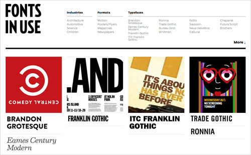
Fonts in Use
This site presents a catalogue for real-world typography samples and innovations in branding, advertising, signage and publishing. The regularly updated collection of trends and case studies is commented on by typography experts and gurus from around the world. The sharp, interesting comments and discussions will keep you engaged, all backed up by real examples.
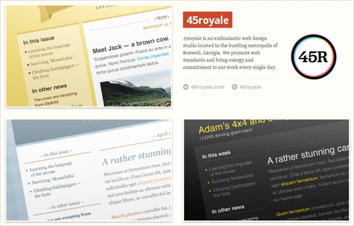
Free High-Quality HTML Email Templates
The page presents 38 free HTML email templates (including PSD and HTML files), created by talented professional designers. Every template has been tested in more that 20 popular email clients, including Outlook 2010, Gmail, Lotus Notes, Apple Mail and the iPhone. All of the Photoshop documents are layered and ready to be tweaked. You can download all of the templates for free (320 MB) and use them for any private or commercial project. In case you use Campaign Monitor to send out newsletters, you’ll also get Campaign Monitor’s templates as an extra goodie. Mailchimp users can choose from the professional templates for Mailchimp.
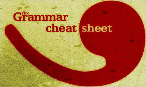
The Grammar Cheat Sheet
Never mix up your dashes again, learn how to set quotations marks and remind yourself to keep paragraphs short and topical. Overall, this article is a nice little overview of suggestions that would help you improve the quailty of your copy. For a closer examination of what else might go wrong, check out “The Trouble With EM ’n EN (and Other Shady Characters)” by Peter K Sheerin.
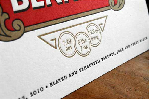
FPO: For Print Only
For Print Only is a blog that is dedicated to everything related to print design. FPO celebrates that print is not dead by showcasing the most compelling printed projects. Print is alive and well as witnessed by this well organized and inspirational resource.
Graphic Atlas: History of Printing
The site is a virtual study collection that showcases printing processes from early woodcuts to modern digital print. The print-identification tool guides you through a number of explorations that replicate the experience of identifying prints using common tools. Among other things, you’ll learn about such printing techniques as relief, letterpress, gravure, silver-dye bleach, dye sublimation and direct thermal. The object explorer allows you to view two images side by side to compare traits across processes. Characteristics such as size, format, color, texture, sheen and layer structure are explained as well.
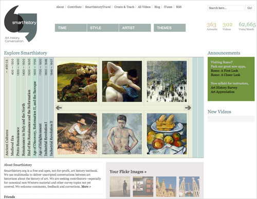
Smarthistory
Smarthistory.org is a free and open, not-for-profit art history textbook. The website covers a wide variety of the artwork usually found in art history classes, ranging from ancient cultures to post-colonialism. In addition to the audio and video, Smarthistory contains articles and images organized by style and chronology. As a bonus, the user interface itself is worth looking at. The appealing design and intuitive navigation (which allows you to browse by era, style, artist and theme) makes this experience not only educational but enjoyable. A comprehensive overview of the seeds that helped sew the graphic design field.
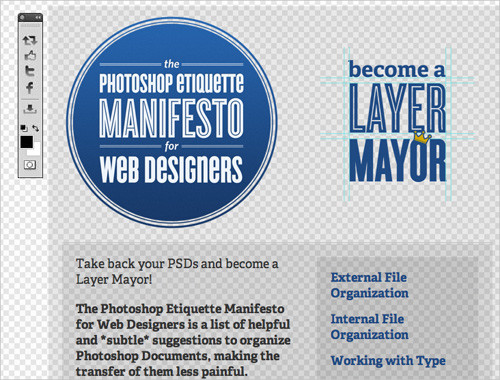
The Photoshop Etiquette Manifesto for Web Designers
This site lays out a number of guidelines for creating Photoshop files and workflows that are conducive to productivity and team collaboration. By following these guidelines, you make it easier for others to work with your files, and more likely that your project will go smoothly. Some of the things included are common-sense (proofread before exporting), but others aren’t necessarily something you’d think of if you’re not used to collaborating or working on big projects (use folders, keep logos as vector smart objects). It also includes helpful illustrations for each example, so there’s no confusion.
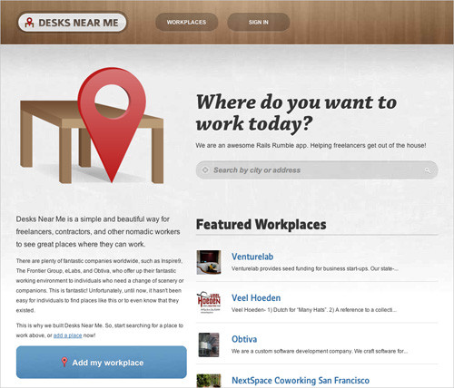
Desks Near Me
This site features places all over the world that designers and developers might like to work in, be they offices or cafés. The website provides detailed information, including hours of operation and reviews. Some places charge a small fee for use, and many throw in a few goodies like food, drink and access to equipment.
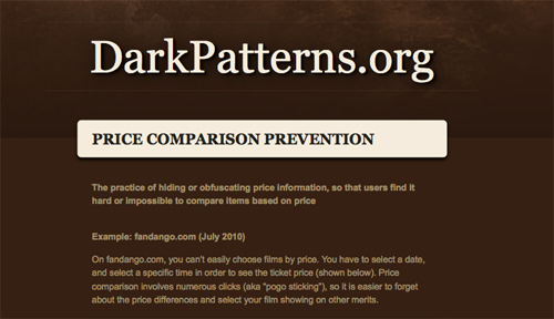
Dark Design Patterns
Dark Design Patterns aims to expose these black-hat designs whose sole aim is to misdirect and deceive visitors. Anti-usability design patterns that are currently identified on the website include the “Roach Motel,” “Bait and Switch,” “Privacy Zuckering” and “Forced Information Disclosure,” among others. Examples of each are included, and visitors can add their own in the comments on each page. It’s a great website to show clients when they ask you to implement a questionable “feature” on their website.
The ## Anatomy of a Perfect Landing Page
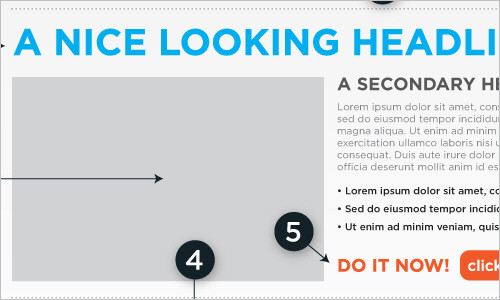
Formstack explains how design translates to users and ten key landing page features that draw them in. A useful breakdown of elements to include in your designs and things to keep in mind during your design-work.
100 Principles for ## Designing Logos and Building Brands
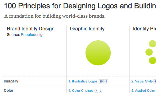
Inspiration can come from anywhere, but sometimes the simpler the better. From Brand Identity Essentials, here are some principals for designing logos and building brands. These cover example shapes, consistency, voice, meaning and flexibility.
Design Is History
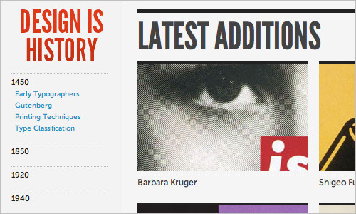
A wonderful reference site for all designers and provides brief overviews of a wide range of topics — for us, designers, it is improtant to understand where design originates from.
NounProject
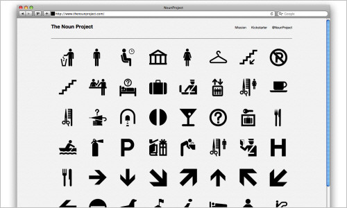
NounProject provides a huge collection of highly recognizable symbols, available for free download and use. The designers are committed to quality in what they do, and so the icons are indeed designed very well.
OnTwik
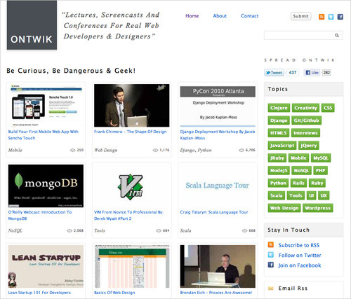
The website brings together lectures, screencasts and conferences from around the world. Both expert and novice developers and designers should be able to find topics of interest, whether it’s CSS and HTML5 or start-ups and creativity. Ontwik is free, and anyone can suggest content for the website; you can even submit your own lectures.
365psd: A Free PSD Every Day
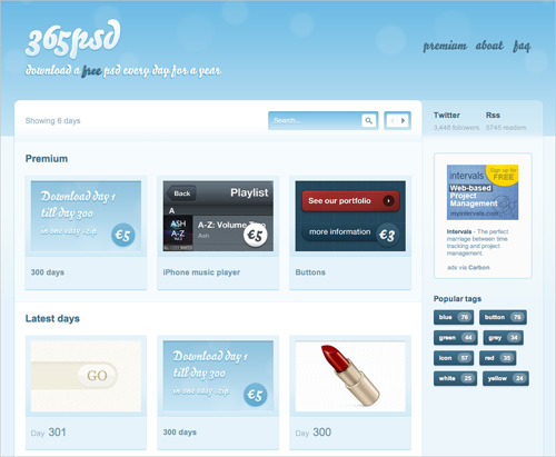
Every day, this site offers a free PSD file for you to download. These files are almost all design elements that you can use in Web and application designs, including buttons, progress bars, navigation elements and more, and they are well designed. Currently, there are more than 300 days worth of freebies, all tagged, browsable and searchable.
Bounce Rate Demystified
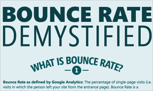
If you are doing business on the web and have Google Analytics set up for your website, it’s very likely that you know the bounce rate for your website. But, do you know anything about how it’s calculated, what your industry’s average bounce rate is or even what factors affect your bounce rate? Inspired by common questions, KissMetrics created this infographic to give you answers and some tips to help you improve your bounce rate.
Quotes on Design
A growing collection of useful quotes by designers for designers and developers.
IA TV
Information Architecture Television features a collection of videos from around the Web that all focus on information architecture. Hundreds of videos dating back to 2008 offer a great wealth of information on everything from design thinking to usability.

The Bazaar
On this site you can create galleries, upload your artworks and specify your products which you would like to sell. Once the buyer has checked out and has made the payment, your artwork is printed, wrapped and delivered.

A Collection of Materials Related to ## Interaction Design
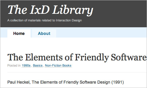
This IxD library provides you with an ultimate collection of posts, articles, PDFs as well as videos related to interaction design for you to read and gain more knowledge and inspiration.
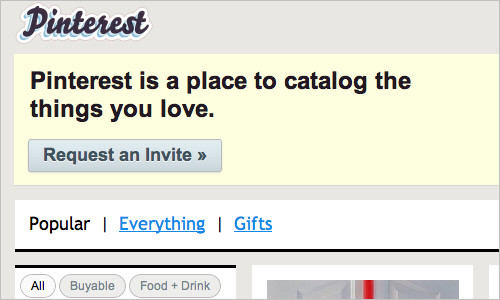
Pinterest: Catalog the Things You Love
Pinterest is a social catalog service. Think of it as a virtual pinboard — a place where you can post collections of things you love, and “follow” collections created by people with great taste.
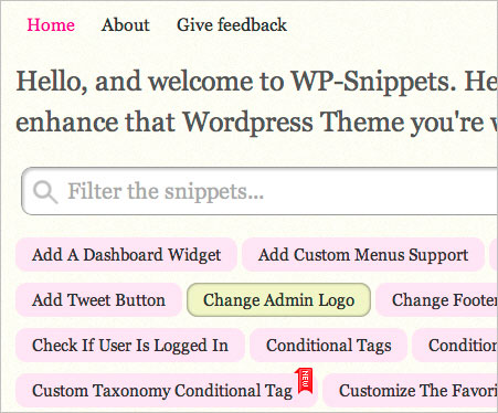
WordPress Snippets
WP-Snippets can come in handy when you’re designing a WordPress theme. Rather than start from scratch when building some functionality or another, why not grab a snippet of code that has already been tested? The website includes many useful snippets, from highlighting author comments to listing random posts to filtering the loop. Make sure to read the comments for each snippet because they could contain helpful information on whether the code works in certain WordPress versions.
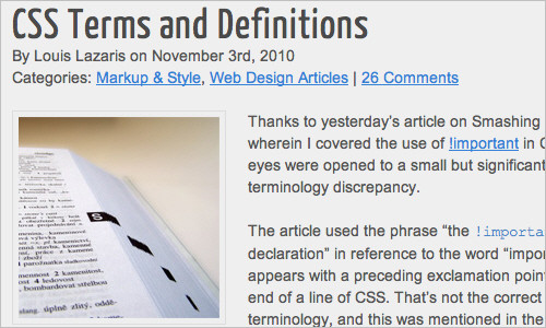
This article discusses the consistency in the use of terms with regards to CSS.
Last Click
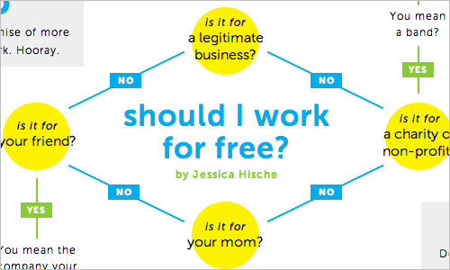
Should I Work for Free?
Who’s ready to stop working for free? Hopefully you are! If you have any doubts, consult this handy chart below. Start in the middle and work your way to your answer.
Email Etiquette for the Super-Busy
In a recent blog post, venture capitalist Fred Wilson talked about his ongoing struggle with email management and the various solutions he’s tried, concluding: “Every time I make a productivity gain, the volume eventually overwhelms me.” It’s a familiar problem. We’re all extremely busy, and we all get too much email. So what to do?

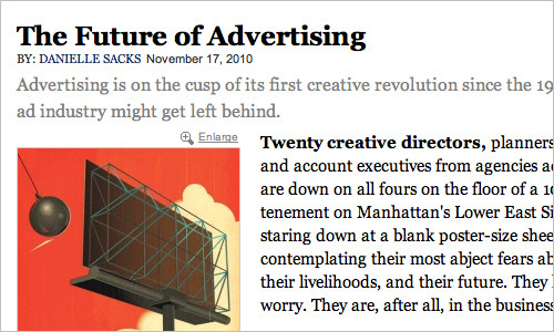
The Future of Advertising
An article on advertising; stating that advertising is on the cusp of its first creative revolution since the 1960s brings us to a new prespective. This involves the ad industry that just might get left behind. Click here to read and find out more. Very interesting read.
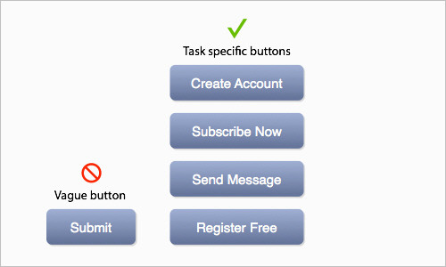
## Why Your Form Buttons Should Never Say ‘Submit’
When you see a ‘Submit’-button on a form, what comes to your mind? One could easily reason that clicking the button submits the user’s information into the system for processing. A ‘Submit’-button describes what the system does well, but it doesn’t describe what the user does at all. The article suggests to stop using the wording ‘Submit’ on buttons and provide more meaningful, task-specific names instead.
Further Reading
- Useful Learning Resources For Web Designers
- Never Stop Learning With Conference Live Streams And Videos
- Learning From The Past: Design Legacies & Arts
- Useful Web Services, Tools and Resources For Web Designers


 Celebrating 10 million developers
 SurveyJS: White-Label Survey Solution for Your JS App
 Register Free Now


