Five and a Half Habits of Highly Effective Designers
The bottom line is: we humans love theories. Yet as a wise person once said, “In theory, theory and practice are the same. In practice, they are not.” This article is about practice. It’s about five and a half — yes, half — habits that highly effective designers tend to share and which I’ve observed first-hand in the complicated, non-theoretical, absolutely real world. If practice is your thing, keep reading.

This article doesn’t provide an ultimate medicine for becoming a highly effective designer, but it might help you achieve a better workflow.
They Know When To Quit
Some of you might know Vince Lombardi as a football legend. I know him as the guy who ruined the world by uttering seven simple yet lethal words: “Winners never quit, and quitters never win.” You’ll find this unassuming little quotation’s fingerprints all over tragic events worldwide: co-dependent lovers who implode their relationships, leaders of warring nations who refuse to compromise for peace, CEOs who won’t back down from flawed strategies to save their company from bankruptcy, and blackjack players who double-down instead of retreating to their rooms.
Admittedly, Vince wasn’t the real offender. He was just a messenger for the real culprit: our humanness. The urge to persevere despite seemingly unconquerable conditions is as human as opposable thumbs. We’re so awful at cutting our losses that there’s even a technical term for this tendency: loss aversion. We strongly prefer to avoid losses than to achieve gains. It’s central to our inability to quit. Quitting has a bad rep, but it’s often the most rational option.

Quitting doesn’t necessarily mean pulling a Jerry Maguire, although it did work out well for him in the end.
As Seth Godin writes in a little book about quitting called The Dip, “Winners quit all the time. They just quit the right stuff at the right time.” It’s worthy, practical advice that can curb the runaway idealist in every designer. Bear in mind, we’re not just talking about quitting your job. We’re talking about quitting things on a daily basis. This entails: picking your battles at work; discerning not just your design goals, but your non-goals; relenting to client needs when necessary; and trading off some design idealism for business karma.
Ironically, quitting can be good for your career. So, that’s the first habit: learn to quit. Let things go. Kill your darlings.
They Redesign Processes
I remember when Agile software development methodologies were all the rage. I was working at Amazon as a program manager at the time, and our team was the first to adopt Scrum. Scrum was going to enable us to ship early, with twice the features and zero overhead (at least, that’s how we interpreted Ken Schwaber’s words).
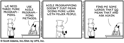
It would have been nothing short of a miracle, but then again, most of us were fresh out of school, and miracles, free pizza and unicorns were part of our reality. In the end, we shipped almost a year behind schedule, with fewer than half of the planned features. Worse, over 75% of the team quit within 90 days of launch (which is not necessarily a bad thing, as we just learned). Yippee ki-yay!
What’s most worrisome about failures such as these, though, is that they so often occur despite “gold standard” processes. It happens all the time.
Tomes have been written about why our best practices fail so frequently. For a literary (even theoretical) overview, I direct you to two books: The Design of Design by Fred Brooks, author of The Mythical Man-Month and recipient of the 1999 Turing Award; and The Black Swan, by the brilliant, Larry David-like Nassim Nicholas Taleb.
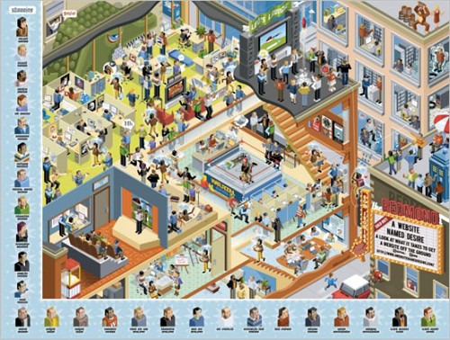
A Website Named Desire illustrates (see the screenshot above) the non-linear and highly erratic nature of the web design process in the real world.
To understand such failures from a practical standpoint, we must turn to another book: Predictably Irrational, by behavioral economist Dan Ariely. Ariely’s research confirms that predictable irrationality is often the root cause of process failures. Indeed, as A Website Named Desire illustrates, our biases, prejudices, quiet agendas, irrational actions and diverse portfolio of imperfections are more often to blame than the processes themselves.
Formal processes work when we accept the irrational nature of people and make room for those imperfections. Thus, the key to successful processes lies in how practically we implement and execute them, not in how well we adhere to an ideal.
Highly effective designers embrace and learn processes — and then tweak them to work well in reality.
They Combat Distortions Of Reality
Picture this. You’re reviewing final comps with a set of stakeholders. After multiple iterations, you’re finally feeling great about the design. Then, out of nowhere, a senior manager says, “I think we need to change the blue on the top bar. It doesn’t feel right. I showed it to my wife, who’s pretty good at picking colors, and she felt the same way.” He continues, and then delivers the final blow: “I know you worked hard to find the right color scheme, but picking colors is pretty subjective, right? It’d be worth taking another pass at this.”
Groan.
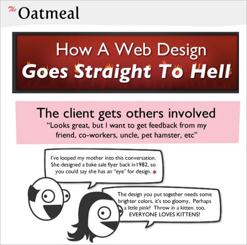
“How a Web Design Goes Straight to Hell,” a classic post on Matthew Inman’s “The Oatmeal”, humorously depicts distortions of reality.
“Design is subjective” is one among many prevailing distortions of reality — ideas that have gone unchecked for so long that they parade around as facts — in our organizations. You might recognize these other distortions: “Data and logic trump intuition,“ “Design is decoration,” and “More feedback leads to better designs.” Then there are those that hit closer to home, like “The page has a fold,” and (everyone’s personal favorite) “Make the logo bigger.” (Note that there is now much evidence out there against distortions like these.)
These clichés seem benign but, in fact, are extremely harmful. They are the proverbial elephant in the room at the heart of dysfunctional organizations. Highly effective designers work to resolve these distortions in their organizations.
They Find The Right Environment
People are brilliant scavengers. In a world of a million choices, we know exactly where to look when we need something. We’re good at identifying environments that meet our demands, almost without thinking. We instinctively know how to find certain things (keyword: certain).
When it comes to finding slightly more intangible things — true love, a good job, a great employee — many of us spend a lifetime searching awkwardly and failing repeatedly. We can’t wrap our minds around such abstract pursuits. God knows we try, though; how many times have you heard someone proclaim that they have made a spreadsheet to determine a life choice or a good partner?
Identifying a good work environment falls into the same category. We’re usually terrible at it. Here’s a little secret: highly effective designers are most often products of a good work environment and know how to seek them out.
What does a good work environment look like?
The answer is hidden in a brilliant presentation on clients by Michael Bierut. I recommend watching the whole thing, but if you don’t have the time, then watch the four-minute section from 13:00 to 17:00. In it, Michael answers the questions “What do I look for in a client?” and “What should I look for in a work environment?”
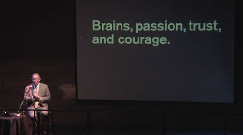
Michael Bierut’s presentation on clients also answers the question “What should I look for in a work environment?”
The simple answer is trust, passion, courage and brains. Each quality has obvious benefits. In a trusting environment, stakeholders can rely on their designers’ gut instincts. Where there is passion, the will to make meaningful progress will flourish. Courage enables designers to take risk and bring cutting-edge designs to market. Brains — not genius, but real-world, common-sense brains — bring it all together.
All four of these qualities must exist simultaneously to make a good environment. Take one away, and the environment will eventually become dysfunctional. For instance, take away trust, and you end up testing 41 shades of blue to find the right one.
They Habitually Rewrite The Habits
In the software industry, we strive to build “perfect” (read: bug-free) things that can’t be improved. This is a worthy goal, but it can have negative side effects. For example, we often conclude that certain practices, processes and lines of thinking have reached their zenith and can’t be modified. We start treating real life like a line of code — a meticulously crafted string, neatly concluded by a semicolon, that reaps a perfect, logical result (needless to say, I’m not referring to Web development here).
Reality — or should I say practice — proves that this kind of thinking is a mistake.
If this article were written a decade ago, it would have listed different habits. A decade from now, I expect some of the habits will have changed; for example, eventually we’ll all agree that “Design is subjective” is a distortion of reality. Heck, if you had written this article, you might have listed completely different habits.
Highly effective designers are aware of this. They’re always questioning, rethinking, improving and refining the dogma. Their methods are best captured by an old Chinese proverb: “All things change, and we change with them.”
There you have it: the final habit. It’s one and a half times as important as the other habits.
Now you know what the “half” means.
Further Reading
- 10 Principles Of Effective Web Design
- Principles of Great Design: Craftsmanship
- Five More Principles Of Effective Web Design
- Clear And Effective Communication In Web Design


 SurveyJS: White-Label Survey Solution for Your JS App
 Try ProtoPie AI free →
 Celebrating 10 million developers

 Register Free Now

