Are Touchscreen Tablets Effective Design Tools?
Regardless of the final platform — desktop, tablet, mobile — most designers start their explorations on paper. Depending on the designer’s preference, the paper may be bound or unbound, lined or unlined, smooth or ridged. And while the materials may differ, the goal is the same: to quickly explore a variety of concepts.
The designer’s sketching tools haven’t changed much over the years, but the role of sketches has evolved. Instead of rushing to convert them to a more polished form, designers now often share early sketches with clients. Their roughness suggests that the designs aren’t “done,” which encourages feedback and facilitates collaboration.
Further Reading on SmashingMag:
- Next-Generation Responsive Web Design Tools
- Finger-Friendly Design: Ideal Mobile Touchscreen Target Sizes
- Design Mock-Ups Need Dynamic Content: Tools And Plugins
While interest in sketches has increased, sharing them with team members is still challenging. Most sketchbooks are too small to invite everyone to huddle around and look at. Besides, teams are often distributed around the world, so a digital format is essential. Scanning produces high-quality images but is often a hassle because scanners are typically a shared office resource. Photographing with a smartphone or digital camera works fine if the lighting conditions are just right.
What would really benefit designers is the digital equivalent of a sketchpad and pencil. Sure, Wacom tablets have been around for a long time, but they tie designers down to the laptop or desktop computer. Personally, one of my favorite things about sketching is being able to walk away from my desk. No email. No Twitter. No distractions.
When the iPad came out, it seemed like it would address designers’ sketching woes, but the early styluses and applications were disappointing. One year later, there are far more tools to choose from, but they still have a long way to go.
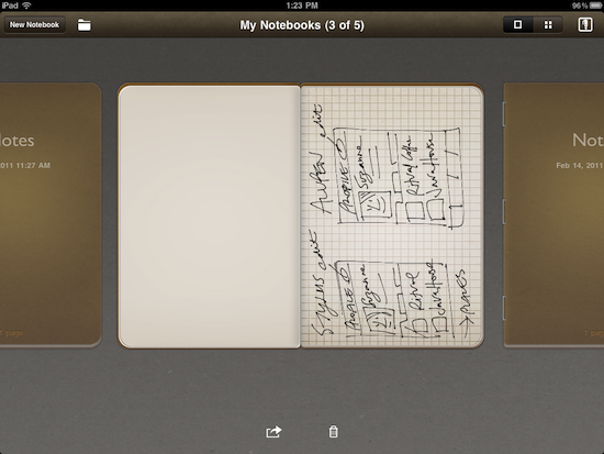
In this article, I’ll share my personal evaluation of touchscreen tablets as design tools, specifically for early UI sketches and storyboards. To help guide the evaluation, I created a few pen and paper sketches for comparison. Then, I tried to recreate these sketches using a sketching application and a variety of styluses. As you’ll see, the current devices, apps and styluses all have a number of weaknesses. If you’re like me, you may want to stick with your old notebook and pencil a while longer.

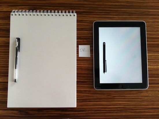
iPad with stylus beside a 9 × 12 sketchbook with pen.
The Devices Reviewed
Touchscreen tablets hold much promise as design tools, but several limitations should be pointed out.
First, the screen real estate doesn’t come close to a typical 9 × 12 sketchpad. The diagonal length of the iPad is 9.7 inches (246.4 millimeters), the XOOM is 10.1 inches (256.5 mm), the Touchpad is 9.7 inches (246.4 mm), the Playbook is 7 inches (177.8 mm), and the LG G-Slate is 8.9 inches (226.1 mm).
Secondly, these capacitive screens can’t sense pressure, which makes it impossible to incorporate common sketching techniques such as shading into a design.
Lastly, none of the latest tablets can produce ballpoint precision, no matter what the application or stylus. This is a technical limitation: the low-resolution sensor panels can’t detect a stylus’ input if it falls between adjacent capacitive elements; hence the large tips on most styluses.
Touchscreen technologies are rapidly evolving to minimize these last two limitations.
The Applications
The XOOM, Touchpad and Playbook haven’t released sketching apps yet, so this evaluation was limited to Apple’s App Store, which contains dozens and dozens of drawing apps.
Because most preliminary UI sketches are drawn freehand, I eliminated template-heavy apps such as OmniGraffle and Freeform. Next, I ruled out apps like SketchBook Pro, since their broad feature set is more appropriate for full-color drawings and paintings.
My final list included Adobe Ideas and Penultimate. If your sketches have limited text, you may want to use Adobe Ideas because the app has stroke smoothing as well as a full-screen view. On the other hand, if you plan to include a lot of annotations and UI text, then I recommend Penultimate for its ease of use and ability to handle sketching and writing equally well. The one big downside with Penultimate is the lack of a full-screen view. To see Penultimate in action, I’ve prepared a video for you towards the end of this article.
The Styluses Reviewed
Choosing the right application is important, but what really differentiated my touchscreen sketching experiences were the styluses themselves.

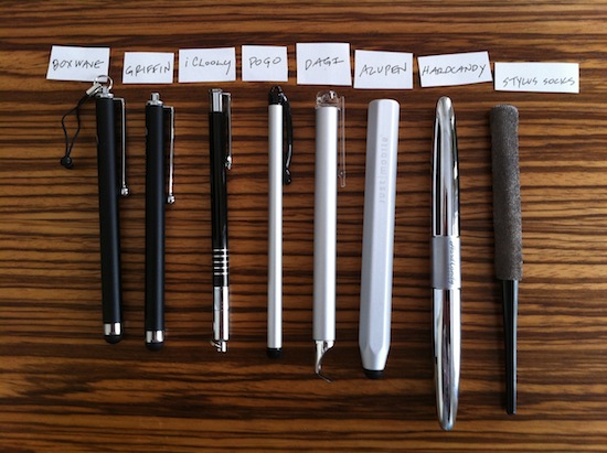
Eight popular styluses: BoxWave, Griffin, iClooly, Pogo, Dagi, AluPen, Hard Candy, Stylus Socks.
In deciding which one to buy, here are some questions to consider and ask yourself:
1. What Types of Tasks Will You Be Performing?
Most styluses on the market — Griffin, BoxWave, AluPen, Hard Candy — have a rubber tip. Other materials you’ll come across are capacitive fabric (on the Stylus Socks), foam (Pogo), plastic (Dagi) and metal (iClooly). In my experience, the rubber-tipped ones work well for sketching and text, whereas the rest tend to work well for either one or the other. For example, the Stylus Socks is great for sketching, and Dagi seems better for cursive writing. Unfortunately, the Pogo foam tip didn’t work well for either task.
2. How Does It Feel in Your Hand?
The styluses vary in weight, finish and length. For example, the aluminum Pogo is quite light at 0.6 ounces, whereas the chrome Hard Candy is the heaviest at 4.2 ounces. The other styluses weigh slightly more than the Pogo, similar to a good-quality ballpoint pen. Similarly, the grip varies from stylus to stylus; the Griffin is smooth, the AluPen is textured like a chunky pencil, and the Stylus Socks is tapered like a paintbrush. The weight and grip that feel most comfortable are generally a matter of preference.
3. How Do You Want to Carry the Stylus?
This is a minor detail but it can be a deal-breaker for some people. If you want to attach the stylus to your tablet, then it’s worth noting that the Griffin, BoxWave, Dagi and Pogo all have a clip. The Stylus Socks, Hard Candy and AluPen styluses don’t have any contraption to attach them to a tablet, although the AluPen does have a nice case. A few of the styluses also have a pen at one end; it’s optional on the BoxCase but built into the Hard Candy.
Having tried out these eight styluses, I recommend the Griffin and BoxWave for their superior sketching and writing and because they “just feel right” in my hand. Although they were better than the others, they still weren’t ideal for UI text. I often found myself incorporating dashes instead of descriptive text because the results were not optimal. If your sketches have limited text, then the Stylus Socks and AluPen are strong alternatives. To see how these four styluses work with PenUltimate on the iPad, watch the video below:
Looking Ahead
Even though there are many weaknesses across the board (with the devices, applications and styluses), touchscreen tablets still hold promise as a design tool. The following changes would improve their effectiveness:
- Increased precision. Whether it comes from the device, the stylus, the software or some combination of the three, far greater precision is needed by the designer. And achieving this precision shouldn’t require unnaturally slow sketching or tedious zooming.
- A stylus for every occasion. In theory, having one magic stylus would be convenient, but why not have different styluses for different creative tasks? Various lengths, grips and tips could be offered, as done for paper sketching.
- Alternative tablet sizes. Current tablet dimensions would suffice for one or two small UI sketches. But larger tablets would be invaluable for more involved sketches like storyboards. Current costs make this prohibitive for most people, but eventually the prices will come down.
Some of these ideas might not be far off. Products are evolving from their first generation, plus there are opportunities for better hardware integration between tablets and styluses. For example, Apple filed a stylus patent back in 2008 that included accelerometers that can transmit more precise positional information to the iPad. Developments like these will surely inspire additional tablet innovation in the months and years to come.
References
- iPad’s technical specifications
- XOOM’s technical specifications
- TouchPad’s technical specifications
- PlayBook’s technical specifications
- “Apple Takes Huge Steps Towards a Graphics Pen for iPad”
Products Coming Soon
(vf) (ik)


 Try ProtoPie AI free →
 Celebrating 10 million developers
 SurveyJS: White-Label Survey Solution for Your JS App
 Register Free Now


