CSS3 vs. CSS: A Speed Benchmark
I believe in the power, speed and “update-ability” of CSS3. Not having to load background images as structural enhancements (such as PNGs for rounded corners and gradients) can save time in production (i.e. billable hours) and loading (i.e. page speed). At our company, we’ve happily been using CSS3 on client websites for over a year now, and I find that implementing many of these properties right now is the most sensible way to build websites.
Until today, all of that was based on an assumption: that I can produce a pixel-perfect Web page with CSS3 quicker than I can with older image-based CSS methods, and that the CSS3 page will load faster, with a smaller overall file size and fewer HTTP requests.
As a single use case experiment, I decided to design and code a Web page and add visual enhancements twice: once with CSS3, and a second time using background images sliced directly from the PSD. I timed myself each round that I added the enhancements, and when finished, I used Pingdom to measure the loading times.
Here’s a fictitious Web page for Mercury Automobiles that might have been online had the Interweb existed back in the 1950s. The page was designed to showcase specific widely compliant CSS3 properties that in the past would have had to be achieved using background images.

Above is a diagram that breaks down where I applied visual enhancements first with CSS3, and then with CSS background images (i.e. the image-based approach):
- linear-gradient
- border-radius
- radial-gradient
- text-shadow
- box-shadow with RGBa
The Experiment Process
Day 1
I coded the HTML and CSS from a structural standpoint. That means no rounded corners, no shadows, no gradients and no images aside from logos and car photographs. I decided to include Web fonts at this phase because I wanted to focus on stuff that could also be done with the Web-safe font of your choice (Helvetica, Georgia, etc.). Furthermore, @font-face was around long before CSS3.

This gave me a blank canvas to add visual enhancements. The index page shows the end of my day 1 work, as well as what unsupported browsers will display, the appearance of which is structurally intact and visually pleasing. More on this later, but the way I see it, older browsers aren’t penalized with a broken layout, and modern browsers are rewarded with a few visual bonuses. Part of implementing CSS3 is about planning ahead and designing websites that look fine as a fallback.
Day 2
Starting with the base index page, I created a CSS3 page. It took 49 minutes to complete. Here is the CSS code (css3.css):
/*-----CSS3 Started on 2/26/11 at 7:28 AM CST-----*/
h1 {
    text-shadow: -3px 2px 0px #514d46; }

#nav {
    -moz-box-shadow: 0px 0px 12px rgba(88, 83, 74, .7);
    -webkit-box-shadow: 0px 0px 12px rgba(88, 83, 74, .7);
    box-shadow: 0px 0px 12px rgba(88, 83, 74, .7);
    background-image: -moz-linear-gradient(top, #5c5850, #48473e);
    background-image: -webkit-gradient(linear,left top,left bottom,color-stop(0, #5c5850),color-stop(1, #48473e));
    background-image: -webkit-linear-gradient(#5c5850, #48473e);
    background-image: linear-gradient(top, #5c5850, #48473e); }

nav a {
    -moz-border-radius: 12px;
    -webkit-border-radius: 12px;
    border-radius: 12px; }

nav a:hover {
    background-color: #3a3e38;
    background-color: rgba(47, 54, 48, .7); }

nav a.active {
    background-color: #070807;
    background-color: rgba(7, 8, 7, .7); }

body {
    background-image: -webkit-gradient(radial, 50% 10%, 0, 50% 10%, 500, from(#FBF8E3), to(#E6E3D0));
    background-image: -moz-radial-gradient(50% 10%, farthest-side, #FBF8E3, #E6E3D0); }

#learn_more, #details img {
    -moz-border-radius: 8px;
    -webkit-border-radius: 8px;
    border-radius: 8px;
    -webkit-box-shadow: inset 0px 0px 8px rgba(88, 83, 74, .2);
    -moz-box-shadow: inset 1px 0px 1px rgba(88, 83, 74, .2);
    box-shadow: inset 0px 0px 1px rgba(88, 83, 74, .2); }

#learn_more a {
    -moz-border-radius: 8px;
    -webkit-border-radius: 8px;
    border-radius: 8px;
    background-color: #cc3b23;
    background-image: -moz-linear-gradient(top, #cc3b23, #c00b00);
    background-image: -webkit-gradient(linear,left top,left bottom,color-stop(0, #cc3b23),color-stop(1, #c00b00));
    background-image: -webkit-linear-gradient(#cc3b23, #c00b00);
    background-image: linear-gradient(top, #cc3b23, #c00b00); }

a {
    -moz-transition: all 0.3s ease-in;
    -o-transition: all 0.3s ease-in;
    -webkit-transition: all 0.3s ease-in;
    transition: all 0.3s ease-in; }

/*-----CSS3 Finished on 2/26/11 at 8:17 AM CST (49 minutes) -----*/
Day 3
I added visual enhancements by slicing and CSS’ing background images directly from the PSD. Even though there is less code, all of the extra app-switching and image-slicing added up to a total of 73 minutes to complete. Check out the page for the CSS image-based approach. Here’s the code (css.css):
/*-----CSS (the image-based approach) Started on 2/27/11 at 12:42 PM CST-----*/

#header {
    background: url(../img/navbg.png) left top repeat-x; }

body {
    background: #e6e3d0 url(../img/radial_gradient.jpg) no-repeat center top; }

#nav {
    background-color: transparent; }

h1 {
    background: url(../img/mercuryautomobiles.png) no-repeat center center;text-indent: -9999px; }

#learn_more {
    background-image: url(../img/learn_morebg.jpg);}

#details img {
    background-image: url(../img/detailsbg.jpg);}

#learn_more a {
    background: url(../img/learn_more_abg.jpg) no-repeat;}

.css3 {
    background: url(../img/css3_hover.png) no-repeat center top; }

.smashing {
    background: url(../img/smashing_hover.png) no-repeat center top; }

.trent {
    background: url(../img/trentwalton_hover.png) no-repeat center top;}

.css3:hover {
    background: url(../img/css3_hover.png) no-repeat center -20px;}

.css:hover {
    background: url(../img/css_hover.png) no-repeat center -20px;}

.smashing:hover {
    background: url(../img/smashing_hover.png) no-repeat center -20px;}

.trent:hover {
    background: url(../img/trentwalton_hover.png) no-repeat center -20px; }

.css {
    background: url(../img/css_hover.png) no-repeat center -50px; }

/*-----CSS (the image-based approach) Finished on 2/27/11 at 1:55 AM CST (1 hour and 13 minutes)-----*/
Production Time Results
So, we’re looking at a 24-minute difference: 49 minutes to add visual enhancements with CSS3, and 73 minutes to do it with images. For me, CSS3 was not only quicker but far more enjoyable, because I was focused on only one window (my CSS editor), unless I opted to pull some of the code from CSS3 Please. On the other hand, slicing images and switching from Photoshop to FTP to the CSS editor and back again was a hassle, and it did take longer.
It’s also worth noting that I did my best to stack the deck against CSS3. I coded it first so that any initial hashing out would be done before heading into day 3. Also, the images I did slice are as optimized as I could reasonably make them: one-pixel repeating slivers, and medium-resolution image exports. Overall, 24 minutes may not seem like a lot of time, but this is a fairly simple page. Imagine how much time (and money) could be saved over the course of a year.
What? Still not convinced?…
File Size And Loading Time Results
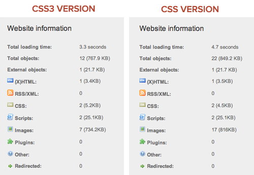
I took both of my pages over to Pingdom Tools to compare file size and loading times.

Both pages are pretty fast, but CSS3 prevailed, with 10 fewer requests and a file size that was lighter by 81.3 KB. While loading times were close, the larger PNG files used on both pages accounted for most of the heft, which amounted to a .75 second difference on average. And when we’re talking 3 to 6 second loading times, those differences sure can add up.
| CSS3 | CSS | Difference | |
|---|---|---|---|
| Size | 767.9 KB | 849.2 KB | 81.3 KB |
| Requests | 12 | 22 | 10 |
For argument’s sake, I created yet another version of the image-based CSS version, with a sprite containing all four images used in the original version, and then I measured loading times. This CSS Sprited version did improve things, taking HTTP requests from 22 to 19 and the overall size from 849.2 KB down to 846.7 KB. The way I see it, these differences are minimal and would have added to the development time, so it’s all relative.
Without getting too sidetracked, I think the difference in loading times is significant. If a website gets 100 hits a day, the difference may not matter much, but on a higher traffic website the effect compounds. Shaving seconds or even milliseconds off the loading time of a website is no small improvement in user experience. The image-based approach could lead to upwards of a 15 to 27% drop in page traffic (based on a 5 to 9% per 400 ms rate). That’s a lot of dinero to lose. I wonder how much time and money could be saved by serving a CSS3 border-radius sign-up button on a website with as much traffic as Twitter’s.

Another striking example is all the CSS3 that can be found in Gmail’s interface. The CSS3 gradients and rounded corners are there to increase page speed. Speaking of Gmail’s continued use of HTML5 (and CSS3), Adam de Boor had this to say about speeding up page rendering:
“Google’s current goal is to get Gmail to load in under a second. Speed is a feature.”
And this:
“The company has found that using CSS3 can speed the rendering time by 12 percent.”
Convinced yet? No? Okay, I’ll keep going…
Thinking About The Future
Website Updates: The Easy Way and the Hard Way
CSS3 really pays off when it comes to making updates and future-proofing Web pages from a maintenance perspective. Looking at the Mercury Automobiles website, think about what would have to go into changing the height of the three-column car images or the width of the bubble hover states for the navigation. For the sake of a quick production, I sliced these images to match precisely. One option would be to open Photoshop, rebuild and resize the images, update the appropriate CSS properties, and upload. Another would be to plan ahead and slice “telescoping” images, making one end a short rounded corner cap and another longer image on the opposite end that slides to fill the interior space. You’ve probably seen and done this before:
<div class="border_box_top"></div>
<div class="border_box_bottom">
    <img src="your_content_here.jpg" />
</div>
This isn’t ideal. While the technique comes in handy in a variety of instances, adding extra HTML just to achieve a rounded corner doesn’t seem efficient or sensible.
What If You Want to Go Responsive?
Serving different-sized images and changing the font size to suit a particular screen resolution simply couldn’t happen without CSS3. It’s wonderful how all of these new properties work together and complement each other. Imagine how time-consuming it would be to res-lice background images to accommodate varying image and font sizes that display at different screen resolutions. Yuk.
The Take-Away
For me, this simply proves what I’ve known all along: CSS3 pays off when it comes to production, maintenance and load times. Let’s revisit the numbers once more…
| CSS | CSS3 | Results | |
|---|---|---|---|
| Production time | 73 minutes | 49 minutes | CSS3 33% faster |
| Size | 849.2 KB | 767.9 KB | CSS3 9.5% smaller |
| Requests | 22 | 12 | CSS3 45% fewer |
Yes, this is just one experiment, and the outcome was influenced by my own abilities. This isn’t meant to finally prove that implementing CSS3 no matter what will always be the right way to go. It’s just food for thought. I encourage you to track development and loading times on the websites you work on and make the best decision for you and, of course, your client.
We’re all concerned about browser compatibility, and opinions will differ. For me and most of my clients, this would be a perfectly acceptable fallback. Perhaps with more experiments like this that yield similar results, these statistics could be cited to both employers and clients. If a website could be produced 49% faster (or even half of that) with CSS3, imagine the benefits: money saved, earlier launch times, more time spent on adding “extras” that push the product over the top, not to mention a better browsing experience for everyone.
Further Reading and Resources
- “Why We Should Start Using CSS3 and HTML5 Today,” Smashing Magazine This editorial takes a realistic and encouraging look at the state of browser support and calls for the industry to move toward innovation rather than wait for a gate to be installed.
- “CSS3 + Progressive Enhancement = Smart Design,” Perishable Press A comprehensive look at CSS3 that first examines the benefits of CSS3 over image-based methods, including less bandwidth, quicker implementation, increased flexibility, reduced HTTP requests and fewer server resources.
- “Google Gmail to Harness HTML5,” Macworld Google is all about speed, and this interview with Adam de Boor reinforces its view that, along with HTML5, CSS3 renders pages faster.
- “CSS Three — Connecting The Dots,” Smashing Magazine Coming up with creative and sensible ways to get the most out of CSS3 will require experimentation. Right now, there are tons of property combinations and uses out there waiting to be discovered. All we have to do is connect the dots. It’s time to get your hands dirty and innovate!
- Download the Mercury Automobiles .zip file Feel free to pick things apart and learn more.
Further Reading
- Take Your Design To The Next Level With CSS3
- Push Your Web Design Into The Future With CSS3
- CSS3 Cheat Sheet (PDF)
- Learning CSS3: A Reference Guide


 Celebrating 10 million developers
 SurveyJS: White-Label Survey Solution for Your JS App
 Try ProtoPie AI free →


