Innovative Techniques To Simplify Sign-Ups And Log-Ins
There are many ways to design sign-up and log-in forms. Most designers are familiar with the conventional ways. But understanding and applying a few innovative techniques could make your forms simpler and more efficient to fill out. In this article, we’d like to present a couple of new ideas that might be useful for your next designs. Please notice that before using these techniques, you should make sure that they make sense in the context in which you are going to use them. We’d love to hear about your case-studies and usability tests that affirm or dismiss the suggestions proposed below.
Simplifying Sign-Ups
The purpose of every sign-up form is for users to complete it successfully and send it in. However, if the form is long and complicated, then the user’s excitement for your website could turn to displeasure. Here are a few innovative techniques that will make your forms faster and easier to fill out.
Ask for a User Name After The User Has Signed Up
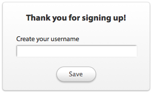
Sign-up forms typically ask users to create a name that is unique to the website. However, coming up with a unique user name that’s not taken could take trial and error and, thus, time. Instead of hassling people for a user name when they sign up, you might want to consider asking afterwards. This way, you won’t lose sign-ups from frustrated users, and you’ll prevent users from creating random and forgettable names just to satisfy the form’s requirements.
Require Users to Type Their Password Only Once
Many sign-up forms ask users to type their password in two different fields. The reason is understandable. Forms mask passwords for security reasons, so that snoopers can’t see them. And to cut down on typographical mistakes and increase the chances of correct input, two separate entries are required.
In reality, though, this allows for greater error, because it forces users to type more. They can’t see the characters they’re inputting, making it difficult to know whether they’re typing the right password each time.

A more efficient approach would be to ask users to type their password in once, but then include a box they can check to unmask the password, so that they can check it. This option could reduce the number of text fields and decrease the work that users have to do to sign up.
- jQuery Plug-In for Masking Passwords
Auto-Fill City and State Fields Based on User’s ZIP Code
If you require the user’s home address, then consider auto-filling the city and state fields based on the ZIP code. The form will be faster to fill out because users won’t have to waste time and energy manually selecting their city and state from drop-down lists.
- Using AJAX to Get City and State from ZIP Code

Auto-Complete the Country Field
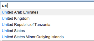
The conventional way for users to specify their country is to select it from a drop-down list. A more efficient way would be to use an auto-complete text field. Instead of making users scroll through an alphabetical list of every country in the world, the text field would allow users to select their country from a small subset of countries that match the letters they type. The user needs only to type a few letters to see their country in the menu.
Allow Users to Auto-Fill Their Payment Address From the Shipping Address
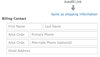
If a user is buying a product, they’ll have to submit payment and shipping information. Most of the time, the addresses will be the same, so let them auto-fill one from the other. You could include a link saying “Same as shipping information” in the payment section, and when clicked, it would repeat the shipping data in the payment fields.
- Copying Billing and Shipping Address Information with jQuery
- Copy Form Input Data to Another Input Field with jQuery
Don’t Check the Newsletter Option by Default. Offer a Preview Instead
Most website owners pre-check the newsletter box, hoping to get more subscribers. Chances are, it will work. But a subscription is meaningless if the user has done so only because they have overlooked or misunderstood the option. If they’re not interested, they’ll unsubscribe sooner or later. Forcing them to subscribe won’t help you in the long run. And receiving a newsletter without having explicitly asked for it can turn users off.
A more effective approach would be to make users want to subscribe by showing them a preview or excerpt of the newsletter. This way, they’ll know what they’re missing if they don’t subscribe. You’ll also sleep well knowing that users who subscribe have done so because they’re genuinely interested in your content.

Combat Spam by Hiding a Text Field With JavaScript, Instead of Using CAPTCHA
If you get a lot of spam, then putting a CAPTCHA on your form may be necessary. What’s not necessary is making the CAPTCHA an obstacle that turns users away. Traditional CAPTCHAs that ask users to retype distorted letters have been proven to hurt conversion rates. With the extra hassle they force on users, it’s no wonder.
A simpler approach that won’t lower your conversion rate is to use a hidden and required text field generated with client-side Javascript. Spambots can’t fill in the field because they can’t interact with objects in client-side JavaScript; only users can. This method is simpler and less intrusive and so will reduce spam without hurting your conversion rate. The only problem is that it relies on JavaScript to work which might be suboptimal in some cases. You could also use Honeypot Captcha approach: you can create a honeypot form field that should be left blank and then use CSS to hide it from human users, but not bots. When the form is submitted, you check to make sure the value of that form field is blank. If it isn’t, then you can safely ignore the submission because it was submitted by a spam bot.

Simplifying Log-Ins
The purpose of every log-in form is to get the user into their account. Some log-in forms do this better than others. Here are a few innovative techniques that will help your users log in more efficiently.
Allow Users to Log in With Their Email Address
Remembering an email address is easier than remembering a user name. User names can be unwieldy, and people remember their email address because they use email all the time. Give users the option to log in with their email address as well as a user name. The flexibility could save them the time and headache of recovering the user name if they forget it.
Log Users in Without Leaving the Page
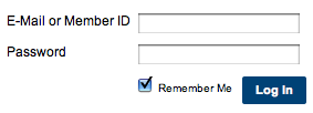
Logging in is a common task, and users will want to be able to log in from anywhere on your website. So, as soon as they do it, redirect them back to the current page. This will make logging in faster and allow users to get right back to their task.
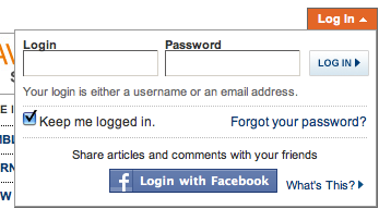
There are a couple of ways to make this happen: a drop-down box or a modal window.
The drop-down box will open without taking users off the page. It takes up only a small part of the page, making it a fast and lightweight option.
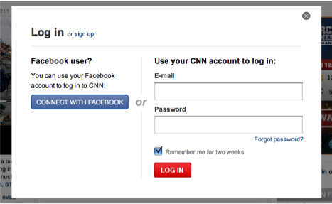
A modal window also keeps users on the current page, but it opens up at the center of the window, putting the focus entirely on the log-in form. This option gives you room to add supplemental information to the form.
Auto-Focus the First Text Field
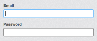
Once the user sees the log-in form, they’ll be ready to log in. Make the process more efficient by automatically focusing on the first field. This saves them the time and effort of hovering and clicking. The user can keep their hands on the keyboard and start typing away. The auto-focus should also clearly highlight the text field so that the user knows they can start typing.
Allow Users to Unmask Their Password
This option is almost as useful for logging in as it is for signing up. If users can’t see the characters in the field, they could easily mistype the password. If their input is rejected, they’ll know that they mistyped something and will have to re-enter their password until they get it right.
The problem is that users don’t know which character was mistyped and so can’t fix the mistake before submitting the form on the first attempt. This creates more work than necessary and makes users slow down their typing. Avoid this by adding a checkbox that allows users to unmask their password before submitting it.

Use a Question Mark Icon for the Password Recovery Link
Users should have no trouble finding the password recovery link on your form. Instead of using a “Forgot your password” link, consider using a simple question mark button, which won’t take up a lot of room or get lost among other links. Because the question mark is a universal symbol for help, users will not wonder where to go when they’re having password trouble.
 Use a question mark icon for the password recovery link.
Make the “Submit” Button as Wide as the Text Fields
The log-in button isn’t just for taking action: it also lets users know what action they’re about to take. A small log-in button has weak affordance and can make users feel uncertain about logging in.
A wide button gives users more confidence and is hard to miss. The button’s label also becomes more visible, so that users are clearer about the action they’re taking.
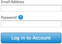 Make the “Submit” button as wide as the text fields.
Allow Users to Log in Via Facebook, Twitter or OpenID
Nearly everyone has a Facebook, Twitter or OpenID account, and letting them log in with it brings big benefits. They can use your website almost instantly, without having to go through the sign-up process. Also, they won’t have to manage multiple user names and passwords across different websites.
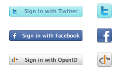 Allow users to log in via Facebook, Twitter or OpenID.
Of course, you could even go further and use Facebook Connect to actually prefill data that your users might have to type; in the example below, on Friend.ly, a Facebook application, the only thing that the user needs to do before starting using the service is just click on the “Register” button. The information about the user is loaded automatically which raises a huge privacy concern. You might not want to use this approach in practice.
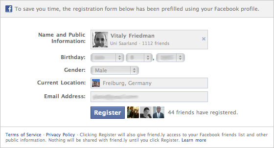 Use Facebook Connect to actually prefill data.
Conclusion
Your sign-up and log-in forms shouldn’t make the user’s life difficult. Spending time filling out a form is no one’s idea of a party. These innovative techniques will make your forms simple and efficient, so that users can sign up and log in quickly and start enjoying your content. For further ideas and examples, you might want to consider taking a look at Joshua Johnson’s article 20 Great Sign Up Form Examples to Learn From.
Further Reading
- Logins, Menus, Toggles And Other Fancy Modules
- New Approaches To Designing Log-In Forms
- Better Password Masking For Sign-Up Forms
- How To Log In To WordPress Using A Social Network


 Celebrating 10 million developers
 Try ProtoPie AI free →

 SurveyJS: White-Label Survey Solution for Your JS App

