Relationship Engineering: Designing The Happily Ever After
I remember when we first met. We hit it off instantly, and it didn’t take long before I was in love. I introduced her to my family, and they all loved her, too. Hell, I even convinced my wife that she was perfect. We’ve been happily together now for years. I spend a good portion of my day with her and, yes… sometimes she joins my wife and I in bed. Although, not much sleeping gets done; I’m typically too busy studying curves.
Save your scarlet letter. If you’ve read part one — Relationship Engineering: Designing Attraction — you know that I’m not talking about some affair. I’m describing my relationship with Apple and their slew of gadgetry. Even when it’s not practical, I still find myself wanting the latest Apple iWhatever.
It seems I’m not alone in this addiction; according to a recent survey, 74 percent of iPad purchasers already own a Mac and 66 percent of them own iPhones. Not only does Apple engineer marvelous products, they also engineer extremely strong relationships with their audience.
In part one, we explored the ways in which brands spark our proverbial flame and get us interested in their products. Here we’ll delve into what keeps that flame alive and converts our interest into love and possibly even obsession.
Momentum
Maintaining a long-term relationship is not easy; things can easily become stale. Looks and personality are crucial in developing attraction, but people need more from a serious relationship. To create a strong and long-lasting bond, two other elements are needed: simplicity and reward.
Simplicity and reward dance a delicate equilibrium. Each influences the impact of the other. If the relationship is too simple, its rewards are dulled; too difficult, and the relationship might break. Achieving a harmony between the two will build a momentum that keeps the relationship moving.
The back and forth of simplicity and reward creates a wave of satisfaction, which people undoubtedly want to ride. Select brands are making huge waves by implementing these principles to create exciting and engaging experiences. Let’s examine some of the factors that determine simplicity and reward.
Simplicity
Sophisticated relationships are the product of simplicity. You could begin a relationship with someone on the other side of the world, but its sophistication would remain fairly juvenile; the distance makes it complicated. However, if that person moved across the street, your relationship would have more opportunity to flourish.
Difficulty is inevitable in relationships, but a bond will rarely survive continuous strife. So, we gravitate towards people who are easy to get along with. This criteria is defined in different regards: geographical proximity, conversation flow, harmony of beliefs and so on.
Simplicity is even more important when it comes to the products we choose. Our evaluation of simplicity with a product is often more fickle than with a person. This is especially true on the internet where options are bountiful and only a click away. It’s our responsibility as designers to ensure every aspect of the experience has as little friction as possible.
It’s easy to mistake complexity for sophistication. And quite often, products and interfaces are made unnecessarily complex with extraneous features. As designers, we need to recognize that a truly sophisticated experience is one that transforms complexity instead of accentuating it.
Apple vs. Microsoft
Let’s compare the support pages of Apple and Microsoft and derive a simple friction analysis — an evaluation of how easy it is for a user to achieve a goal. We’ll assume the user has arrived at this page in need of some assistance with their operating system. Areas of the page offering contact with a human have been highlighted in green to indicate low friction as it puts the problem-solving in the hands of the company. Yellow areas indicate self-help mechanisms, which add mild friction. If an area is irrelevant or offers very little help, it has been marked in red.
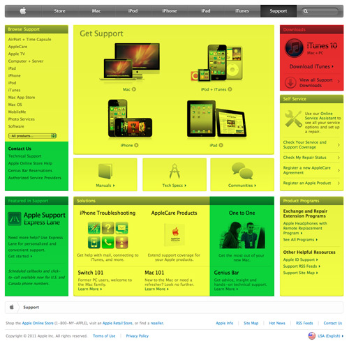
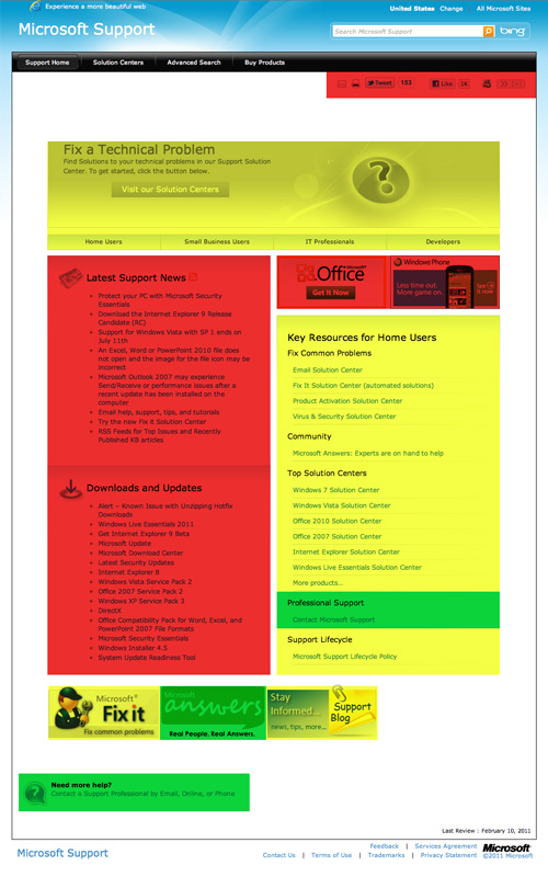
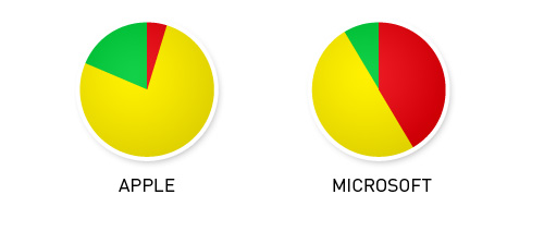
Apple offers less friction in their customer support process and, and in doing so, strengthens the relationships with their customers. They offer more self-help options and many more ways of contacting an actual person. It’s interesting that Microsoft devotes nearly half of their page to push products, social media and news. They ignore the fact that someone is going there for help. It’s like trying to confide in a friend, but instead of offering guidance, they ask you to buy some Girl Scout cookies and suggest that Thin Mints taste even better frozen. It makes things difficult and hurts the long-term relationship.
Netflix vs. Blockbuster
Started in 1985, Blockbuster once ran supreme as the media rental giant. Brick-and-mortar stores across the country offered convenient access to movies. Instead of purchasing a movie, you could simply rent it. It seems trivial today, but the idea was novel at the time.
Blockbuster quickly grew into a multi-billion dollar empire with thousands of stores in the U.S. and seventeen other countries. However, Blockbuster is currently in Chapter 11 bankruptcy. Why?
Consumer needs drive the evolution of simplicity, and Blockbuster failed to address the complexities in their business model. Why should we be required to drive to a store to pick up and return movies? Why should movie rentals be so expensive? And why should we be charged late fees? Netflix addressed these questions, and took an evolutionary leap by harnessing the power of the web.
Netflix’s rental-by-mail service revolutionized the industry. Browsing movie choices on your home computer is much easier than going to a store only to realize the movie you want is out of stock. Because Netflix offered a subscription instead of a pay-as-you-go model, they removed even more complexity from the process by eliminating due dates and late fees.
Unlike Blockbuster, Netflix did not just change the industry once and ride the wave. They continued to innovate. Realizing the complexities in their own business model, they introduced a new solution to simplify things even further: on-demand streaming. Members can instantly stream a movie to their home computer, cellphone, iPad, gaming console, DVD player or one of many other devices. By removing friction, they built stronger relationships with their audience.
Netflix and Blockbuster both offer the same experience: entertainment. However, Netflix made the process of achieving that experience much simpler. The evolution of an industry is driven by demand, but determined by simplicity. Netflix knew this, and became a blockbuster of its own.
To Sum Up
- Simple relationships are sophisticated relationships.
- A friction analysis can be an effective tool in measuring simplicity.
- Survival relies on eliminating friction from the user experience.
- Thin Mints taste great out of the freezer.
Reward
Relationships are exciting, especially in the early stages of courtship. We have an entire hierarchy of rewards to achieve. In some relationships, the rewards are purely physical, while others go deeper and offer rewards such as marriage, children and bingo partners.
The satisfaction of a reward is driven by desire. The stronger the desire, the greater the satisfaction. In order to build someone’s desire, there must be something concrete that they lack. Traditional advertising often features a sexy celebrity using their product. In addition to its sex appeal, this technique also outlines numerous deficits which we desire to fill. We may lack the product, but more importantly, we lack celebrity. Fame has been elevated to a virtue within our society, and it’s perceived to be extremely satisfying.

By paralleling a product with a celebrity, brands aim to raise the perceived satisfaction of their product (for more on this, pick up a copy of Cialdini’s Influence). You may have had no previous desire for the product, but the advertiser unveiled something you lack, and that lacking triggers the emotion of desire.
Another common way of increasing satisfaction is through challenge. We, as humans, love a good challenge. Puzzles, sports, even video games are all unnecessary challenges that we willingly bring into our lives. Defeating an opponent, whether concrete (e.g. an opposing sports team) or more abstract (e.g. solving a puzzle), offers a sense of satisfaction.
Challenge must be carefully managed, because it goes against the bonding power of simplicity. Desire will increase as things become more difficult, but only to a point. Once the amount of difficulty outweighs the anticipated satisfaction, people become frustrated. And frustration can flip peoples’ desire for reward into desire for your demise.
Call of Duty
The video game industry is arguably the most successful implementer of the challenge methodology. Most games set forth a hierarchical reward system, which rewards players for achieving certain objectives — the more difficult the objective, the greater the reward. This system builds an extremely strong bond with the player.
Activision’s Call of Duty is one of the hottest video game franchises on the market. The latest release of Call of Duty: Black Ops set the first-day sales record not only for a video game, but for the entire entertainment industry. In fact, it pulled in $360 million in North America in one day, which is more than four times what Avatar made in its opening weekend.
The game features a compelling story mode, but the real relationship-building aspect of the game is its multiplayer mode. Each player starts off with a limited array of weapons and perks. They are rewarded with in-game currency for achieving different objectives, which can be used to unlock new munitions, upgrade weapon attachments, customize camouflage and even modify face paint. Leveling up to the highest rank and unlocking everything requires a significant amount of gameplay, but that’s only the beginning.

After you’ve been promoted to the highest rank, you’re given the option to go “Prestige” and start from scratch. You sacrifice everything you’ve unlocked in exchange for a new medal next to your name. The medal is nothing more than an icon but, within the community, it’s a badge of pride. Not only does this set the pros apart from the n00btubers, it builds an obsession that keeps players coming back for each release in the series.
Groupon
Being frugal is hip nowadays. Thanks to companies like Groupon and LivingSocial, coupons have been revitalized in a big way. Instead of clipping them from newspapers circular ads, however, people receive them daily in their email.
Leading the pack is Groupon, which offers a deal-a-day from local businesses. What started in Chicago with a half-off pizza coupon has skyrocketed into a worldwide movement with more than thirty-five million users. So, how has Groupon started such a craze over something as simple as a coupon? Simple… by creating a low-friction, high reward system, for both consumer and retailer.

Groupon is capable of offering discounts upwards of 90% off by using a mechanism known as the “assurance contract.” Each retailer offers a high-level discount through Groupon, but only honors that discount if a set number of people purchase it. Groupon will then take a 50% cut for facilitating. If the number of purchases isn’t met, the deal is off and everyone who purchased the coupon gets their money back.
This “can’t lose” system encourages people to take prompt action. Not only does the expiration timer add a sense of urgency, but the fact that a certain number of people must participate adds incentive to share the offer with friends and family.
Groupon also offers a $10 reward for referring a friend. They could have simply asked people to refer a friend, but the reward makes it all the more appealing. However, the reward can only be redeemed after the friend makes a purchase on Groupon. This encourages you to constantly annoy your friends about the service, since you now have a stake in their actions.
Groupon is an elegant example of reward mechanics in action. Harnessing urgency, assurance contracts, and social incentives is a powerful way to create millions of relationships. Ultimately though, the system relies on the balance of reward and complexity. Offering great rewards yields great rewards.
To Sum Up
- Rewards increase engagement, but only if the anticipated satisfaction is greater than the difficulty required in achieving it.
- Difficulty will raise the anticipated satisfaction to a point. If the threshold is broken, however, satisfaction quickly flips to frustration.
- Outlining deficits invokes the desire to achieve them.
- Game mechanics build enjoyable difficulty and encourage participation.
Fragility
Love is precious. Regardless of how much time and effort is put into a relationship, it remains fragile. We make all efforts to preserve it: we tailor our lives around the other person; we buy them gifts to show we care; we sacrifice for their sake. The idea that the relationship could end abruptly keeps us in a state of caring and preservation.
We also act with a preservation mentality with the products we love. People love wrapping their mobile devices in sleek, designer cases. They have a close relationship with their phone, and shelling out the extra money for a case helps preserve that relationship.
Honestly though, how often has a case actually saved your device from an otherwise irreparable demise? Chances are, not very often. Yet, the mobile accessory market is booming. Apple is cashing in on the must-have-a-case syndrome with its Smart Cover made specifically for the iPad 2. Some estimate that the new Smart Cover could ring in $1 Billion for Apple in 2011.
Still, you can’t help but wonder why such a large market has been built up around the preservation of devices which are only designed to last for a couple of years. I believe it has to do with the design of superficial fragility.
Why does the iPod have a mirrored back? Why not a brushed aluminum case like the iPad? Because the mirrored surface is very fragile. It’s hard to even take an iPod out of its box without scratching it. Scratches on the back don’t affect the performance of the device, but they do affect our perception of it. This superficial fragility is effective planned obsolescence, which is the lifeblood of the tech industry.
Planned obsolescence is essentially the engineering of a product to have a predetermined lifespan. The hope is to hook people into repeat purchases once the product is deemed useless or obsolete. This concept is nothing new. It has been driving profits and innovation in numerous industries — from gadgets to fashion — since the 1930’s.
Sometimes this technique actually prevents you from using the product any longer. For example, the lithium batteries in most of our electronic devices utilize integrated circuits to restrict the number of times the battery can be recharged. Even though the battery is capable of a full-recharge, the integrated chip prevents it.
Other times obsolescence is all about perception. The fashion industry relies on seasons and fads to dictate when you should purchase new clothing. Software companies use versioning to implement new features, which puts you behind the curve of innovation.
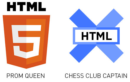
Even the Web design industry relies heavily on perceived obsolescence. Web technologies evolve so quickly that using something that was hip last year could render you obsolete this year. “Your site’s built in XHTML and not HTML5?! Gasp!”
It’s easy to view planned obsolescence as an unethical practice, and in some cases it may be. However, use of this tactic forces brands to respect the fact that without us, they cannot survive. This urges them to act responsibly and to keep pace with innovation. It all comes back to the balance of simplicity and reward. Upgrading is a difficulty, but we’ll do it if the rewards are high enough.
Angry Birds
The Angry Birds franchise is a prime example of obsolescence done respectively. Like most games, the product obsoletes when someone has completed every objective. For some, this means finishing every level. For others, it requires earning three stars on every level. Still others will continue to play until they’ve acquired all of the hidden bonuses. Eventually, a player will hit their idea of “complete” and the product becomes obsolete in their mind.
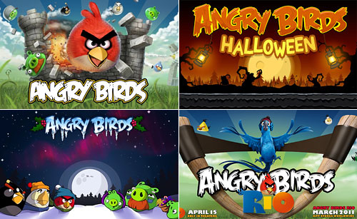
Expansions can rejuvenate an otherwise stale relationship. Angry Birds expansion packs serve as a love-cycle reboot. Rovio (the creators of Angry Birds) could release updates for the game to offer new levels or challenges. Instead, they release separate stand-alone apps, requiring players to make new purchases. This is a small price to maintain a loving relationship.
This form of obsolescence puts the power in the hands of the consumer. It doesn’t force an upgrade. It simply offers a way to keep the relationship alive. If the brand continues to offer rewarding experiences, there’s no need to force obsolescence. People will continue to upgrade out of choice.
To Sum Up
- Fragility strengthens relationships and fosters a worship mentality.
- Obsolescence powers the wheel of innovation.
- Breakups (planned obsolescence) must be handled respectively to bring your audience back. People should want to upgrade, not be forced to.
Conclusion
Relationships are the puzzle pieces of our lives. Good relationships fit into the bigger picture; bad ones are tossed aside. The bonds we make with people run parallel to those with products. Brands that nurture relationships become integral to the human experience and ensure their own survival in the marketplace.
The web is the most prolific matchmaker ever. As designers, developers, and digital mavens, we have a responsibility to understand and respect the relationships that we build through our work. People want products that look sexy, and many designers have become really good at sparking that initial interest. However, that’s only part of the battle. Long-term relationships require design in a much broader sense than just visuals; they’re interactive and on-going experiences, which need to be nurtured. Would you date your product? Would you marry your brand?
Other resources
- Assurance Contracts
- Cialdini’s Influence
- Game Mechanics
- Simplicity, Apple, and 37Signals
- Planned Obsolescence
Further Reading
- Why You Should Get Excited About Emotional Branding
- The Personality Layer
- Redesigning With Personality
- What’s Brand?


 SurveyJS: White-Label Survey Solution for Your JS App

 Register Free Now
 Celebrating 10 million developers


