5 Copywriting Errors That Can Ruin A Company’s Website
No matter how brilliant a website’s design, no matter how elegant its navigation, sooner or later visitors will decide whether to take action because of something they read. In the end, the effectiveness with which a website converts visitors hinges on words.
If a new website is going to hit all the right notes, its content must be just as well crafted as its design and programming. However, as you might imagine, there are many ways to go wrong with content in a Web development project.
The errors discussed in this article have the potential to undo a website and are issues that I run up against time and time again in my nearly 12 years of producing Web content. Half the battle in avoiding these traps is simply recognizing them: all too often, content is handled as an afterthought, hurriedly completed to meet a project’s deadline. I hope these content tips will help you stay ahead of the game and build a better website in your next project.
Error #1: Writing Inwardly
Having worked in-house for many years, I’ve fell victim to the inward-focus syndrome on many occasions. It’s easy to do. You spend all day dealing with the intricacies of your products and services. You’ve made a huge intellectual and emotional investment in every product innovation and point of differentiation. You love thinking about your products, you love improving them, and you love talking about them. It’s only natural that you want to shout from the rooftops and tell the world your product’s story in all its splendor.
Problem is, the rest of the world isn’t interested in your story. Customers don’t have time to admire your greatness. They’re too busy searching for ways to make life better for themselves. A high-level Web page answers one question of the reader above all: What’s in it for me? To illustrate, we’ll stick with products, although this applies to other types of pages as well.

A well-written category-level product page talks a bit about features, a little more about benefits and a great deal more about the experience. This last element is especially important and exactly where most pages come up woefully short. Let’s use a mundane example of this principle in action by considering a hypothetical Web page for a packaging machine:
Feature: Up to 100 cycles per minute.Benefit: Faster production.
Experience: Getting more product out the door per shift means you’ll blow away your productivity goals and be a hero. You might even get a promotion.
A typical Web page written about this machine would be 80% features and 20% benefits. However, if I were writing it, I’d budget 50 words on the features, 100 words on the benefits and 150 words on the experience.
Note:
- Setting a “word budget” forces discipline. Not only that, it relieves the anxiety over having to determine how to approach each individual product page, thus eliminating one of the biggest causes of delay in Web development projects.
- Focusing on the experience forces you to think about the target audience of the page in question. The experience I described speaks to an operations person. If my audience is made up of C-level executives or purchasing agents, then I would need to describe a completely different experience. If I’m writing for all three audiences, I may have to rethink my word budget. In any event, having an audience in mind prevents a Web page from devolving into that cursed, watered-down, “everything for everyone” messaging that says absolutely nothing.
- The purpose of a high-level page is to get people interested in the product. Once they’re interested, they may crave more information about features and benefits. Perfect. Tell the long version of your story on a detail-heavy product sub-page. Companies need not neglect features and benefits; they just need to suppress the urge to hit visitors over the head with them the minute they walk through the door.
To see how this plays out in real life, consider this conversion optimization case study, documented on ABtests.com. A firm achieved a 200% increase in conversions by replacing feature-oriented copy with benefit-oriented copy. The high-converting page focuses on what the applicant wants, rather than what the service (DesignCourse.com) offers:
- “Become an amazing designer.”
- “Start earning real money.”
- “It’s fun and exciting.”
- “No tests, no hassles.”
If you’re still not convinced, listen to legendary copywriter John Caples, who is quoted in Made to Stick (page 179) by Chip Heath and Dan Heath:
Caples says companies often emphasize features when they should be emphasizing benefits. “The most frequent reason for unsuccessful advertising is advertisers who are so full of their own accomplishments (the world’s best seed!) that they forget to tell us why we should buy (the world’s best lawn!).” An old advertising maxim says you’ve got to spell out the benefit of the benefit. In other words, people don’t buy quarter-inch drill bits. They buy quarter-inch holes so they can hang their children’s pictures.
Quick Tips for Writing Outwardly
- Before you start writing, collect feedback from customers and prospects. Ask them why they buy from you, why they don’t, and how doing business with you has affected them.
- Start with an outline. Associate every feature with a benefit and every benefit with an experience.
- Have a customer read a draft and then explain to you why they would want to buy the product. If the customer “gets it,” you’re a star.
- Do the same thing with a person who knows nothing about your product and industry. If that person gets it, you’re a rock star.
Error #2: Burying The Lead

Websites are a poor medium for subtlety. Visitors decide whether to stay on your website within a few seconds. If you can’t communicate why a page is important to them immediately, your conversion opportunities will vanish. Look at the two paragraphs below. Which conveys your most important message more quickly?
Your most important message is here., sed do eiusmod tempor incididunt ut labore et dolore magna aliqua. Ut enim ad minim veniam, quis nostrud exercitation ullamco laboris nisi ut aliquip ex ea commodo consequat. Duis aute irure dolor in reprehenderit in voluptate velit esse cillum dolore eu fugiat nulla pariatur. Excepteur sint occaecat cupidatat non proident, sunt in culpa qui officia deserunt mollit anim id est laborum.
Or:
Lorem ipsum dolor sit amet, consectetur adipisicing elit, sed do eiusmod tempor incididunt ut labore et dolore magna aliqua. Ut enim ad minim veniam, quis nostrud exercitation ullamco laboris nisi ut aliquip ex ea commodo consequat. Duis aute irure dolor in reprehenderit in voluptate your most important message is here. Excepteur sint occaecat cupidatat non proident, sunt in culpa qui officia deserunt mollit anim id est laborum.
Online marketers like to sneer at newspapers, but we can learn a lot from print journalists. For instance, they don’t bury the lead. To illustrate, here are a few leads I recently pulled from the Wall Street Journal:
- “Companies cranked up hiring in April to the fastest pace in five years…”
- “European markets snapped a three-session losing streak as gains in the banking sector and better-than-expected US jobs data for April sparked a rally.”
- “Women may have fared better than men during the recession, but they are not making up lost ground as fast as men in the recovery.”
Now look at your Web pages. How do your leads stack up? Are you leading with the main point? Are you giving visitors a reason to read further? If an in-house writer is not familiar with Web writing techniques, they may approach the project as if they were writing a novel, assuming that visitors will read their new website from start to finish.
This assumption is disastrous. People skim and scan Web pages, their eyes bouncing around like pinballs. For any given Web page, visitors are likely to read the headline and the first few lines of text; beyond that, any body content they read is gravy. Expecting someone to read an entire page of content sequentially from beginning to end is wishful thinking, period. The most important words on the page must be the easiest to find, read and comprehend.
Quick Tips for Unburying the Lead
- Before writing, ask, What is the key takeaway I want visitors to have after they visit this page? That’s your lead.
- Highlight your lead idea in a bold font. This is especially helpful when you can’t work it into the first sentence.
- Use plain language.
- Keep your most important points above the fold, as sub-headings, as the first sentence of a paragraph and as bullet points.
Error #3: Mediocre Meta Material

Some of the most important text in a Web document isn’t the on-page content at all. Certain meta elements have an enormous impact on the user experience, brand awareness and conversion. Meta elements are bits of HTML code that are read mainly by search engine robots. However, two meta tags in particular speak to humans as well, and mastering them is critically important for copywriters.
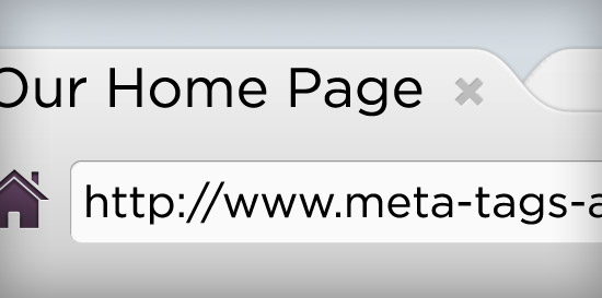
- Meta Title. The meta title describes the subject matter of the page and is ideally 65 characters or fewer. Visitors see the meta title in their browser tab and in search engine results; it is the most important piece of information that Google and other engines read on a given page.
- Meta Description. The meta description, ideally 155 characters or fewer, is a snippet of text that is displayed under a link on a search engine results page (SERP). The meta description has little if any SEO value but is important for conversions.
Meta Titles
Because Google values meta titles so highly, including primary keyword phrases in them is imperative, preferably towards the beginning of the title. For human readers, a title tag should clearly and straightforwardly describe the nature of the page. In addition, the tag can also carry a branding message.
Here is an example of a strong meta tag, taken from the services page of a client of mine:
Enterprise-Level Credit Card Processing, Merchant Accounts — BluePay
At 68 characters, we’ve gone slightly over our recommended maximum. But having branding keywords (i.e. BluePay) at the end is OK: Google may truncate the last few characters, but visitors will see the branding message in their browser tab, especially if they bookmark the page. The title tag will further extend brand awareness if the visitor tweets the page or likes it on Facebook:

Meta Descriptions
A meta description can set your page apart from others on a SERP. Here are seven tips for crafting a good one.
- Don’t overuse keywords. This will make your description look spammy. For example, “We have promotional coffee mugs, custom mugs, custom coffee mugs, and custom mugs for coffee.”
- Don’t use multiple exclamation points!!!! Excessive punctuation can be interpreted as aggression. It pushes people away.
- Avoid extravagant claims. They undermine your credibility.
- Include an incentive to click through to your page:
- “Order one, get one free.”
- “10% off your first order.”
- “Learn how our service can reduce operating costs up to 15%.”
- Focus on the user benefits of your product or service.
- Bad example: “High R-factor insulation.”
- Better example: “Insulation to keep your home warm and toasty.”
- Mention your location if you are a local business. This helps searchers instantly connect your business to their need.
- Establish your credibility:
- “In business since 1965.”
- “BBB accredited.”
- “Over 5000 satisfied customers.”
(Whereas title tags are always displayed, description tags are not. Today, Google doesn’t always pull meta descriptions into its SERPs; instead, it might excerpt on-page content related to the user’s search terms.)
Quick Tips for Meta Magnificence
- If an SEO is working on your project, have them generate title tags based on their keyword research, and then tweak as needed.
- If you do not have an SEO, back up a step and reflect on why you are building the website. I believe that an unoptimized website is not worth building.
- Title tags should be consistent in style and form to enhance the user experience. Meta descriptions need not be consistent at all.
- Because of character limitations and the need for concision, writing these tags can be time-consuming. Remember, though: you don’t have to achieve perfection for launch. Tags can be changed at any time, and analytics experts often suggest that they should be.
Error #4: Saying Too Much
Brevity is the soul of conversion. Find out why.
Error #5: Weak Or No Calls To Action

Assuming that you’ve written a brilliantly persuasive page, it’s still next to worthless without a strong call to action (CTA). It’s flat out wrong to assume that visitors will be so inspired by your brilliant copy that they will pick up the phone and call, or fill out an online form and beg you to contact them.
In the real world of Web marketing, visitors want to be led. If they have to stop and think about how to take the next step, you’ve already lost them.
CTAs generally fall into one of four types, listed here in descending order of commitment:
- Place an order;
- Enroll, subscribe, enter;
- Get a quote;
- Learn more.
Recognizing the need for a call to action on every page is step one. Matching the right CTA to the page is step two. High-level product category pages normally call for a “soft” CTA, such as “Request more information” or “Schedule a consultation.” In contrast, detailed product-level pages require a “hard” CTA, such as “Order now.”
A call to action must be clear and compelling:
- “Order now to save 15%,”
- “Get your artist’s rendering within 24 hours,”
- “Learn the 5 secrets to permanent weight loss.”
Calls to action are strengthened by:
- Testimonials: It’s worked;
- Credibility statements: It’s reliable;
- Warranty or guarantee: It’s risk-free;
- High value: It’s worth having;
- Urgency: It’s now or never.
Unfortunately, the calls to action on business websites often seem like afterthoughts: vague, lame and boring. Remember: customers want to be led. Effective leadership requires more than “Call for more information.”
One last vital point about CTAs: having a primary and secondary CTA on each page is often a good idea. A prospect may not be ready to order, but they may be willing to download a white paper that they would read and remember. Today’s white paper could be tomorrow’s conversion.
Five Case Studies that Illustrate the Power of Strong Calls to Action
- Hyundai increased conversions by 62% by adding SEO text, bigger pictures… and a CTA.
- RIPT Apparel added “Limited 24-hour availability” to its CTA and increased sales by 6.3%.
- Notify, by the Weather Channel, redesigned its landing page to focus on the CTA. Conversion rates increased by 225%.
- Express Gold Cash changed its CTA from “Submit” to “Request a pack” and improved its conversion rate by 47.7%.
- Natural Air increased conversions by 590.6%(!) by adding a CTA with pricing.
Two Tips for Strong Calls to Action
- The main reason why firms don’t include strong CTAs on their website is that they don’t have them. Before getting too far into website development, conduct a brainstorming session to begin the process of identifying action steps that website visitors would be eager to take.
- For CTAs to be effective, design and content must be joined at the hip. The position of an arrow, the font and color of a button can make or break a call to action. Don’t segregate your writers and designers. We’ve found that a team approach to Web projects fosters continual interaction between all contributors and results in a far better product all around.
Keep Your Eye On The Conversion Ball
In case you haven’t noticed, or you skimmed to the end, as Web readers often do, the errors and fixes discussed above revolve around one thing: conversion. One of my favorite quotes comes from advertising icon David Ogilvy. He said, “If it doesn’t sell, it isn’t creative.” Ogilvy, arguably the greatest copywriter who ever lived, understood the primacy of persuasion. You may prefer a soft sell or a hard sell, but if your Web page isn’t selling, why is it there?
Resources And Tools
- My favorite character counter, handy for composing title tags and meta descriptions.
- Test readability with this awesome online testing tool.
- Detailed information on content-related SEO topics.
- Modern words of wisdom: for spot-on copywriting technique, read Don’t Make Me Think by Steve Krug.
- Classic words of wisdom: perhaps the greatest “how to” copywriting book of all time, Tested Sentences That Sell by Elmer Wheeler is available online.
Further Reading
- Quick Course On Effective Website Copywriting
- How Copywriting Can Benefit From User Research
- Better User Experience With Storytelling – Part One
- Recent Trends In Storytelling


 Register Free Now


 Celebrating 10 million developers
 SurveyJS: White-Label Survey Solution for Your JS App

