Orbit and Reveal: jQuery Plug-Ins For Image Sliders and Modal Windows
Crafting a polished and unique experience for your users is becoming ever more critical as the Web gets more overloaded. Standing out is hard. To the rescue come frameworks such as jQuery, which offer a modular, highly customizable experience for your visitors.
Today, we are thrilled to introduce two new jQuery plug-ins that were developed exclusively for Smashing Magazine readers to liven up your developer tool belts: Orbit, a new slider; and Reveal, a modal plug-in.
Why Create Our Own?
Quickly, before diving into the details, some background would be helpful. There are hundreds of jQuery image and content sliders and probably thousands of modal plug-ins. So, why create our own? We wrote these for a number of reasons, the most important ones being:
- Flexibility. We use these plug-ins for clients, internal projects, our apps and a number of other places. We can easily tweak and re-use the code for specific and special implementations.
- Experience. There is no better way to learn how to create better plug-ins and code than to do it yourself and release it publicly. Orbit has undergone a number of iterations and rewrites, which we learned from. Reveal has undergone only a few. We got Raptorize right the first time and haven’t had to update it.
- Better interactions and development. Perhaps the biggest driver was that, across our team, we used a number of plug-ins that have different quirks and features, but none of them nailed the features and interactions that we wanted. Developing plug-ins allowed us to work from a uniform codebase, iterate and optimize our work.
Have a look at a couple of our previous articles:
- Spicing Up Your Website with jQuery Goodness
Demonstrates several creative techniques for increasing usability with jQuery. - Stronger, Better, Faster Design with CSS3
Introduces some powerful uses of the upcoming CSS3 standard.
Orbit: jQuery Image Slider
First up is our new jQuery slider, Orbit. At a mere 4 KB, Orbit can handle images, linked images and straight-up content blocks. Setting it up takes just a few minutes, and it has some styles out of the box. We started working on Orbit because of all the many jQuery image sliders, none seemed straightforward to implement or had nice default styles. After several iterations and releases, the addition and removal of a number of features and some serious learning, we had a plug-in that perfectly fit our needs.
Let’s dive into the code, shall we?
The Code
To get started, you’ll need jQuery and the Orbit plug-in (make sure jQuery is attached first).
<script src="js/jquery.min.js" type="text/javascript"></script>
<script src="js/jquery.orbit.min.js" type="text/javascript"></script>
Now we can quickly hook up the CSS that we need:
<link rel="stylesheet" href="css/orbit.css">Finally, let’s dig into the mark-up.
<div id="featured">
   <img src="overflow.jpg" alt="Overflow: Hidden No More" />
   <img src="captions.jpg"  alt="HTML Captions" />
   <img src="features.jpg" alt="and more features" />
</div>
Just a couple of notes before moving on:
- Orbit will dynamically determine the height and width of your set of images and scale accordingly, but make sure that all of your images are the same size or else the larger ones will peek out at the sides.
- You’ll notice that the
idof the parent div isfeatured, but it doesn’t have to be. When you call the Orbit plug-in, you can set your own selector, and then the magicalorbitclass will be applied.
All we need to do now is activate the Orbit plug-in.
<script type="text/javascript">
   $(window).load(function() {
      $('#featured').orbit();
   });
</script>
There you have it: Orbit, implemented and ready to be used with all of the default settings. To see more options, clean up the slider and do more advanced customization, please continue reading.
Neato Options
Of course, you’ll want some other features like HTML captions, bullet navigation (with thumbnails), and using content instead of images. Here’s the low-down on how to get these going.
Here are all of the plug-in parameters and their default states. The options are commented out to the right. Go nuts!
$('#featured').orbit({
  animation: 'fade',               // fade, horizontal-slide, vertical-slide, horizontal-push
  animationSpeed: 800,             // how fast animations are
  timer: true,                     // true or false to have the timer
  advanceSpeed: 4000,              // if timer is enabled, time between transitions
  pauseOnHover: false,             // if you hover pauses the slider
  startClockOnMouseOut: false,     // if clock should start on MouseOut
  startClockOnMouseOutAfter: 1000, // how long after MouseOut should the timer start again
  directionalNav: true,            // manual advancing directional navs
  captions: true,                  // do you want captions?
  captionAnimation: 'fade',        // fade, slideOpen, none
  captionAnimationSpeed: 800,      // if so how quickly should they animate in
  bullets: false,                  // true or false to activate the bullet navigation
  bulletThumbs: false,             // thumbnails for the bullets
  bulletThumbLocation: '',         // location from this file where thumbs will be
  afterSlideChange: function(){}   // empty function
});
Full HTML Captions
Orbit has full HTML captions, so you can add styles, links, lists or whatever else your coding heart desires.
- Add a span with the class
orbit-captionand an ID of your choosing after the slider div. Put whatever HTML you’d like to appear in the caption inside. They’re block level, so anything goes. - Add the span ID you chose to the
data-captionattribute of the corresponding image tag.
Check it out:
<div id="featured">
   <img src="overflow.jpg" alt="Overflow: Hidden No More" />
   <img src="captions.jpg"  alt="HTML Captions" data-caption="#htmlCaption" />
   <img src="features.jpg" alt="and more features" />
</div>
<!-- Captions for Orbit -->
<span class="orbit-caption" id="htmlCaption">I'm a badass caption</span>
Want to animate those captions? Just change the captionAnimation parameter (fade, slideOpen, none).
Bullet Navigation
Getting a new bullet navigation is as easy as passing a parameter when you call the Orbit function. The bullet navigation is natively an unordered list, but in the example and in the kit we’ve replaced them with nice little round bullets. (Changing this is a just a matter of changing the CSS to whatever you’d like.)
<script type="text/javascript">
   $(window).load(function() {
      $('#featured').orbit({
         bullets: true
      });
   });
</script>
Orbit can now pull thumbnails for your bullet navigation! First, create your thumbnail and save it somewhere in your file directory. Below is the HTML, CSS and JavaScript to make it work:
<!-- THE MARKUP -->

<div id="featured">
   <img src="overflow.jpg" alt="Overflow: Hidden No More" />
   <img src="captions.jpg"  alt="HTML Captions" data-thumb="captions-thumb.jpg"/>
   <img src="features.jpg" alt="and more features" />
</div>

// The JS
<script type="text/javascript">
$(window).load(function() {
   $('#featured').orbit({
      'bullets' : true,
      'bulletThumbs': true,
      'bulletThumbLocation': 'orbit/'
   });
});
</script>

/* The CSS: Just provide a width and height for the thumb.
All bullet navigation thumbs will have a class added "has-thumb"
*/

.orbit-bullets li.has-thumb {
   width: 100px;
   height: 75px; }
Using Text
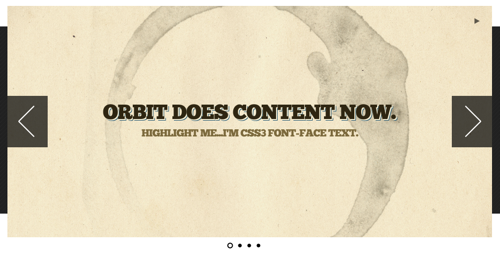
Orbit is text-compatible, too. It can be mixed with images, but just make sure your text is in a div tag and has a background of some type (otherwise the images behind it will be visible). To make the text look nice, give it a background (so that other images in Orbit don’t bleed behind it). Just drop it right into the mark-up, this way:
<div id="featured">
   <div class="content" style="">
      <h1>Orbit does content now.</h1>
      <h3>Highlight me: I'm text.</h3>
   </div>
   <img src="overflow.jpg" alt="Overflow: Hidden No More" />
   <img src="captions.jpg"  alt="HTML Captions" />
   <img src="features.jpg" alt="and more features" />
</div>
Using only text? Orbit relies on image sizes to get its dimensions. However, you can just go into the Orbit CSS and find the .orbit div declaration and set it to the exact pixel width and height you want.
Making Orbit Shine
Orbit looks fairly reasonable out of the box (so to speak), but getting a real polish requires a couple more bits of work: in particular, getting a load before images pop in, and adding fixes for some less fortunate browsers (i.e. IE).
Glorious, Seamless Loading State
For those in pursuit of the ultimate polish, we’ve made it easy to create a simple loading state for your slider. Add the following declaration anywhere in the CSS (just replace featured with your slider’s ID, and use your own images’ widths and heights):
#featured {
      width: 940px;
      height: 450px;
      background: #000 url('orbit/loading.gif') no-repeat center center; overflow: hidden; }
   #featured img,
   #featured div { display: none; }
Apply the CSS to your unique slider ID, because the plug-in won’t know the ID until after it loads. Adding this CSS will prevent any unstyled content from flashing before the plug-in finishes loading. These styles are in the demo CSS in the kit.
Non-Relative Positioning
The way Orbit works is that your container gets wrapped by another container. This means that if you are positioning your slider absolute or want to center it with margin: 0 auto, applying these to your slider’s ID (#featured in this example) won’t work. The best way to solve this is to put all positioning pieces on your ID and div.orbit-wrapper.
#featured, div.orbit-wrapper {
   position: absolute;
   top: 50px;
   left: 50px;
}
Note: You could also just position the parent container of the Orbit slider if there is one.
As we all know, IE< is not a designer or developer’s best friend, but we’ll try to make it easy on you. As of version 1.1, Orbit works in IE7+, but because CSS3 transforms and RGBa aren’t available, we have to perform some magic to fix the timer and caption default background. The easiest way to fix these issues is to hide the timer and to use Microsoft’s proprietary alpha solution. You can use the following conditional declaration in the header of your document.
<!--[if IE]>
   <style type="text/css">
      .timer { display: none !important; }
      div.caption { background:transparent;
      filter:progid:DXImageTransform.Microsoft.gradient(startColorstr=#99000000,endColorstr=#99000000);
      zoom: 1; }
   </style>
<![endif]-->Orbit helps you make your images slide around. Check out our demo to see the plug-in in action. It works best in Chrome, Safari, Firefox 3.5+ (but is tested for IE 7+, Firefox 3.5+, Chrome and Safari).
Reveal: jQuery Modals Made Easy
You can create beautiful modal windows on your page with our jQuery Reveal plug-in. Modal windows allow developers to make critical information stand out. Setting up Reveal modals takes only three easy steps. Attach the needed files, drop in the modal mark-up, then add an attribute to your button.
We created Reveal because we couldn’t find a simple solid solution. We often used and reused our own scripts to create modals because existing plug-ins were too heavy (they allowed for Flash integration and a hundred other things), and they didn’t use basic CSS to create flexible, reusable code. We think we’ve solved both of these issues with Reveal.
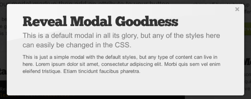
Reveal is useful because it’s easy to implement, compatible with modern browsers (with some graceful degradation, of course) and lightweight (coming in at only 1.75 KB). What this means for you is that it’s fast, sexy and just works.
Let’s see how you can get Reveal working!
Step 1: Attach the Required Files
/* Attach the Reveal CSS */
<link rel="stylesheet" href="reveal.css">

/* jQuery needs to be attached */
<script src="jquery.min.js" type="text/javascript"></script>

/* Then just attach the Reveal plug-in */
<script src="jquery.reveal.js" type="text/javascript"></script>
Clearly, you need the Reveal kit (.zip) to do this, so please download it first.
Step 2: The Modal Mark-Up
<div id="myModal" class="reveal-modal">
   <h1>Modal Title</h1>
   <p>Any content could go in here.</p>
   <a class="close-reveal-modal">×</a>
</div>
Just give your modal div the class reveal-modal and a unique ID (we’ll use the ID to launch this modal). The anchor with the class close-reveal-modal provides a button to close the modal (although by default, clicking the faded black background will also close the modal). Placing the mark-up just before the closing body tag is usually best.
Step 3: Attach Your Handler
<a href="#" data-reveal-id="myModal">Click Me For A Modal</a>By putting the data-reveal-id attribute on the anchor, the plug-in, when clicked, matches the value of the data-reveal-id attribute (in this case, myModal) with an HTML element with that ID. Basically, put the data-reveal-id attribute on an object, and make its value the ID of your modal.
While the data-reveal-id is a great way to make firing a modal easy, it will often need to be fired programatically. That’s easy enough, too:
/* Programmatic Launching Of Reveal */

<script type="text/javascript">
$(document).ready(function() {
   $('#myButton').click(function(e) {
      e.preventDefault();
      $('#myModal').reveal();
   });
});
</script>
Options
Good plug-ins have options, and this one has just a few, but important ones:
$('#myModal').reveal({
   animation: 'fadeAndPop',                 // fade, fadeAndPop, none
   animationspeed: 300,                     // how fast animations are
   closeonbackgroundclick: true,            // if you click background will modal close?
   dismissmodalclass: 'close-reveal-modal'  // the class of a button or element that will close an open modal
});
If you are wondering how to use the options when you’re using the data-reveal-id implementation, it’s easy: just take the option and add the data- before it, and pass a valid value. Here it is with the default values:
<a href="#" data-reveal-id="myModal"
data-animation="fadeAndPop" data-animationspeed="300"
data-closeonbackgroundclick="true" data-dismissmodalclass="close-reveal-modal"
>Click for a modal</a>Surprise your visitors with some elegant modal windows. Download our lightweight modal plug-in and start popping up informative and varied dialogs on your pages. Check out the demo to see this plug-in in action.

Bonus: Raptorize jQuery Plug-In
We’ve all been there: sitting at your desk, coding a large website, knee-deep in Extreme Cheddar Doritos, sipping on a liter of Code Red Mountain Dew, when you realize that this page would be…

You immediately race home to grab your Jurassic Park DVDs, so that you can screencap a velociraptor attack. Then you realize how hard it would be to make a raptor run across the website you’re coding. Plus, how will you get that distinctive velociraptor screech? We’ll let you in on a little secret…
We’ve already done it.
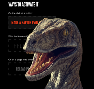
Raptorize was created because there was a meme going around the design community about putting velociraptors in visual designs, and we thought there was serious potential for that to live in code. We also wanted to play with some animations, HTML5 audio tags and the Konami Code!
First things first: you need to download the Raptorize kit. It has:
- An awesome raptor graphic, courtesy of Raptorize;
- MP3 and OGG audio files for the HTML5 audio on Webkit and Firefox;
- Our jQuery plug-in, which makes the magic happen;
- The jQuery library, to make all of the pieces work together;
- An sample HTML file that has all of the set-up pieces.
First, attach the scripts and activate the plug-in in the head of your document:
<script src="https://ajax.googleapis.com/ajax/libs/jquery/1.4.3/jquery.min.js"></script>
<script>!window.jQuery && document.write('<script src="jquery-1.4.3.min.js"></script>')</script>
<script src="jquery.raptorize.1.0.js"></script>
<script type="text/javascript">
   $(window).load(function() {
      $('.myButton').raptorize();
   });
</script>
The only thing to know here is that you need an anchor or element with the class myButton.
And there you have it. You’re done!
The Options
What’s that? You want to be able to control the entrance handler? You can! Raptorize can be activated on a click event (which is the default), on a timer that fires only after the page has loaded, or on the legendary Konami Code. Our personal favorite is the Konami Code (but it only works once per page load).
//The options for this plug-in
<script type="text/javascript">
   $(window).load(function() {
      $('.button').raptorize({
         'enterOn' : 'click', //timer, konami-code, click
         'delayTime' : 5000 //time before raptor attacks on timer mode
   });
});
</script>
Go ahead, try the Konami Code: ↑ ↑ ↓ ↓ ← → ← → B A.
If you don’t want to store the Raptor image and sound files in the same directory as your JavaScript, just open the plug-in and edit the location of the assets in the first two variables of the code (raptorImageMarkup and raptorAudioMarkup).
While the awesomeness that is the Raptorize plug-in is 100% original code, the idea of including a glorious raptor in a design is not. We owe credit to Phil Coffman and Noah Stokes for the raptor assets and the brilliance of adding a raptor to a design.
Want to relive the glorious ’90s cinematic action-adventure dinosaur flicks on the pages of your website? We have the solution for you.

Hopefully these tasty new treats will liven up your pages and make for a more enjoyable experience for you and your visitors.
Further Reading
- Freebie: Responsive jQuery Slider Plugin Flexslider
- How To Migrate From jQuery To Next.js
- JavaScript Awesomeness — Or How To Animate Without jQuery
- Replacing jQuery With Vue.js: No Build Step Necessary


 Try ProtoPie AI free →
 SurveyJS: White-Label Survey Solution for Your JS App


 Register Free Now

