Are You Ready For A Web Design Challenge?
This is not a normal Smashing Magazine post. I’m not going to teach you something new or inspire you with examples of great work. Instead, I want to encourage you to complete a Web design challenge. I believe this will help to address a weakness that exists in many of our design processes.
If you complete this challenge, it will make it easier for clients to sign off on your designs, and it will improve the quality of your work.
So, what are we waiting for? Let’s get started.
The Challenge
If you’re like me, you did some form of higher education in art and design and will know about “the crit.” These meetings involve the class coming together with tutors to analyze and provide constructive criticism on each other’s work.
These were terrifying meetings in which I justified my design approach and defended it against criticism. Although I hated every minute of them, I believe they nurtured one of the most useful skills I have as a Web designer.
The ability to logically justify our designs is a skill many of us lack. This is the heart of the challenge I wish to lay down.
My challenges is this: Write a blog post justifying the design approach you took to one of your websites. Then, encourage other Web designers to provide feedback and ask questions.
Admittedly, this might sound like a lot of effort, so let me explain why it is worth your while.
Why This Challenge Is Worth Undertaking
As I said in a previous article, being a great designer is not enough. You can produce outstanding work and be the envy of your peers, and yet struggle to convince clients of your approach. The reason is that clients do not understand design the way your colleagues do. Therefore, you need to be able to articulate what makes your design right.
Our ability to justify our choices is crucial to our relationship with clients. Without it, clients will lack confidence in our abilities or, worse, feel excluded from the process. A lack of confidence leads to micro-management, and exclusion leads to frustration and resentment. Therefore, explaining our approach is vital.
However, it isn’t just about the client. It’s also about your personal development. If you don’t have a clear idea of what works, then improving will be difficult. Design critiques are as much about improving the quality of your work as justifying it to others.
Unfortunately, this requires that we overcome two barriers.
First, many of us don’t fully understand why we have designed a website a certain way. We design at a subconscious level, based on years of experience. When you have been driving for a while, you cease to think about the process of driving. Likewise, design decisions are often handled at a deeper level than the conscious mind.
Secondly, many designers haven’t had to justify their approach in the past. Either they haven’t gone through the rigorous critiques that I experienced in university or they don’t have the experience required to articulate their decisions.
It is for these reasons that this challenge is so valuable. By writing a blog post about a particular design and encouraging feedback, you move your decisions from the subconscious to the conscious level and gain valuable experience in articulating them.
Of course, knowing where to start such a challenge can be a challenge in itself.
Where To Start
If you are not used to thinking about design at a conscious level, then you might struggle to begin. While there is no right way to do this, I can share the approach that I use.
When discussing my design with others, I tend to look at the various components that make up the product. These usually are:
- Grid,
- Layout,
- Color,
- Typography,
- Imagery,
- Styling.
Ask yourself, why did you approach each of these elements the way that you did? Let’s consider each in turn.
Grid
Why did you use that particular grid structure on the website you are reviewing? Can you articulate your reasons for using a 12-column grid instead of a 16-column one? What about the margins and padding? If a client complained that there was too much white space between columns, would you have a response?
Another common issue is when you purposely break out of a grid. Was the choice intentional, with good reasoning, or just an impulsive decision? What would you say if the client asked about it?
The choice of grid might be based on the content or on the constraints of the style guide. It could have to do with making the website work on mobile devices or with allowing flexibility for future changes. Whatever the reason, you need to be able to clearly articulate them to yourself and the client.

Layout
Layout and grid might sound the same, but they’re not. By layout, I am referring to white space and the placement of elements on the page. These are often points of conflict between the designer and client, so being able to explain your approach is important. For example, how would you justify all of the white space that Google has chosen to use on its home page?
Why did you leave so much white space on the page? Was it to draw the user’s eye to a particular element, or perhaps to improve readability?
What about the positioning of elements? Why is the search box in the top-right corner? Is it because this is the convention and people look for it there, or perhaps because you wanted to associate it with other elements that are in proximity?
Color
Color is probably the most controversial of subjects, and so we need to understand our motivation. I tend to approach color selection in one of four ways:
- Corporate branding guidelines
The palette has been defined by the guidelines, and I work within these constraints. - Theory
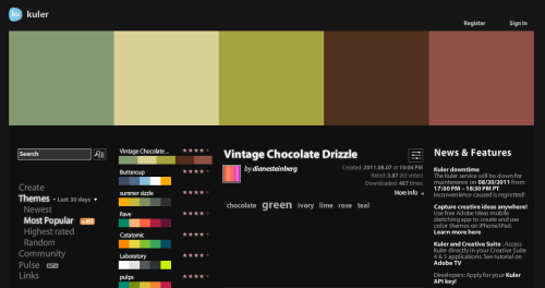
I use a tool such as Kuler, which produces a palette based on established theory. - Emotional response
The extensive research done on people’s responses to colors informs my palette. - Main image
If the website has a dominant image that has already been approved by the client, I use it as the basis for the color palette. There are great tools for extracting color palettes from images.

By explaining your choices in these objective terms, you prevent color from becoming a matter of personal preference and thus avoid conflict.
Typography
Something as seemingly simple as typography consists of many different decisions. These decisions extend far beyond the selection of typeface and encompass line height, size, weight, kerning and much more.

You need to be able to speak confidently about your choices if you are to demonstrate your expertise and convey that what you do is a lot more complex than it might appear. Taking the time to explain the complexity behind your typographic decisions might sound boring, but it will impress. It will also force you to put more consideration into your choices.
Imagery
To many clients, imagery is merely about subject matter. But we know it is about much more. We select imagery based on the mood it sets, the colors it contains and even things such as the eye line of the person in the photograph.
We need to be able to articulate these decisions so that others recognize that you cannot easily substitute one image for another without significantly affecting the design.
Do you know why you selected one image over the thousands of others in your library? What made that image special? Can you explain this to yourself and the client? Was it really more than a “That’ll do” decision?
Styling
For me, styling refers to screen elements that are not directly content-related: buttons, links, call-out boxes and the plethora of other elements that need to be decided on.
How you style these elements can dramatically shape the feel of the website. From the chrome buttons on Apple’s website to the sketched buttons of Moredays, styling can make a huge difference.

Can you explain why your styling creates the right feel? Have you shown the client alternative approaches? Did the client sign off on moodboards, which set the style? If so, refer back to them when justifying your design.
Reference Material
In fact, whenever justifying a design, always refer to the material that has already been agreed upon. For example, if the client has signed off on moodboards, we should use these to justify our choice of typography (“I used the same typeface that we agreed on in the moodboarding stage”). We can also refer to the target audience, business objectives, branding guidelines and even previous comments by the client.
But remember, being able to explain your design is only half of the objective in this challenge. The other half is about improving the quality of your work.
Improving Our Work
Getting into the habit of justifying your decisions will inevitably improve the quality of your designs. Instead of leaving it to the subconscious, the act of considering imagery, layout, typography and so on becomes a part of your conscious decision-making process.
The act of discussing your process refines it and makes you more efficient as a designer. For example, in carrying out the challenge, you will probably struggle to justify some of your design elements, elements that in hindsight would have been better left out or presented differently. This will inform your next website, and over time you will find that your designs become more refined, simpler and more effective.
So, What Are You Waiting For?
Smashing Magazine has a quite large readership and a remarkable community. We have an amazing opportunity to start talking about our work and providing each other with constructive criticism. Write a blog post on one of your designs, justifying your approach. Then link to it in the comments below. Encourage other people to provide feedback on your design, and take their criticism to heart. Finally, don’t forget to make comments and ask questions of other people who have posted their own work.
My hope is that this post will not only help us speak confidently about our designs and improve the quality of our work, but encourage a dialogue about the design process. We are good at showing off our products but bad at explaining how we came up with them. As a community, we could benefit from more discussion about the process itself, rather than endless inspiration galleries.
Further Reading
- “Design Something Every Day!,” Jad Limcaco
- “Be A Better Designer By Eating An Elephant,” Alexander Charchar
- “How to Drastically Improve Your Designs,” Jad Limcaco
- “Things I Wish I’d Known Earlier In My Career,” Vitaly Friedman


 Try ProtoPie AI free →
 SurveyJS: White-Label Survey Solution for Your JS App
 Celebrating 10 million developers
 Register Free Now


