9 Conversation Techniques For Designers
Designers are visually literate creatures. We use visuals to express our ideas, whether by building wireframes, sketching interfaces or pushing pixels. As a result, the majority of knowledge captured when we design a product is some form of “corporate memory”: a combination of assets and documentation. This creation of visual artifact is widely regarded as our most effective means of communicating thought through a product. However, creating a product takes more than just documentation, and much of it is communicated not visually, but verbally.
“Product design and development is a combination of creativity and analysis. But it depends on communication.”– Michael Bremer
Why Are Product Conversations Important?
Due to the growing popularity of iterative product development, the spoken word has become an integral part of the design process. The shift in focus from documentation to collaboration has put greater emphasis on communication. Now more than ever, there is a need to articulate a design “voice” during the early stages of conversation about a product, and to maintain it throughout the process — although this is easier said than done. While conveying one’s findings and opinions in discussion is important for designers, deciding what to say and how to say it often proves difficult.
Because team members and stakeholders sometimes hold different opinions on a product, navigating these conversations can be quite challenging. This social facet of designing digital products has been described by Löwgren and Stolterman (PDF) as follows:
“If a design process aims to create an information system in an organization, then individuals, groups, and teams can be seen as kinds of material. The challenge is to design the social “components” together with the technical components as a systemic whole.”
Influencing The Product Conversation
The extent to which design is embraced in a project varies greatly. At an organizational level, it is influenced by numerous factors, such as the company’s culture, leadership and strategy. At a product level, one could argue that it is largely determined by the team itself. That being said, teams often struggle to discuss the subtler, more experiential aspects of their digital products. As a result, technical terminology can dominate the conversation, prematurely steering the conversation towards “How should we do this?” without giving adequate consideration to “What should we do?” and “Why should we do it?,” thus minimizing the influence of design early on.
To avoid this trap, good designers need to become good conversation starters. By developing our conversational skills, we become better equipped to discuss the conditions required for a great user experience and to influence any decisions that affect it. Maintaining a healthy dialogue on design is important also because the conversations that are conducted as the product is being created will influence the implicit “conversation” that the product will have with the user. Tim Leberecht of Frog Design highlights the importance of conversation to both the design process and the product experience itself, by suggesting that designers should focus on…
“… creating a memorable, auratic and yet reproducible experience for consumers. Conversations are part of this experience; they are integral to the “aura.” Designers visualize it. They unearth, discover, and articulate the consumer stories. They invent the product stories. And then they connect both.”
In this article, we’ll examine the role of conversation in the design process, and how the words we use shape the products we ship. We’ll outline nine ways by which designers can maintain a consistent design conversation during a project, helping to create a better product.
Get T-Shaped
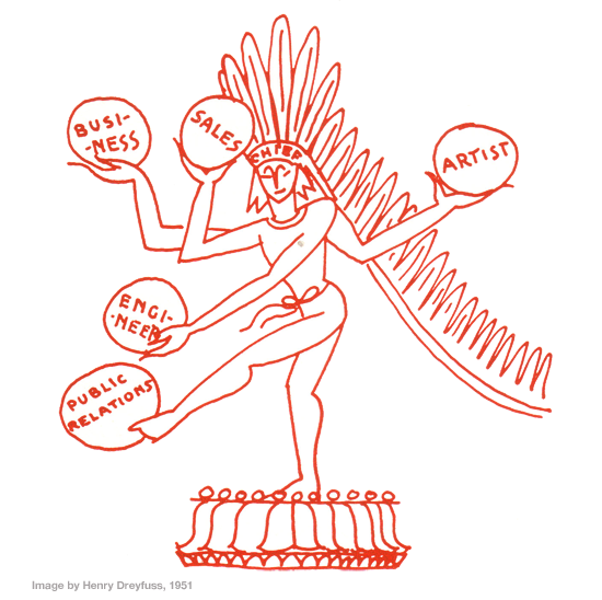
Better collaboration leads to better products. Designers need to ensure that they can communicate effectively with their team members from various other disciplines. To do this well, familiarize yourself with the kind of language used in each discipline, such as business and engineering. Being able to conduct a conversation using the appropriate vocabulary enables you to find out what you need to know faster, and it helps to establish your credibility on the team.
“While each discipline on the product team has its role to play, it is the true teamwork and collaboration of a cohesive product team that makes great user experiences possible.”– Pabini Gabriel-Petit
Designers should also be knowledgeable across the various domains that an issue spans within a project, which will give them a broader perspective on the problem they’re trying to solve. Tim Brown of IDEO maintains that designers should try to become “T-shaped.” This is achieved by cultivating deep analytical skills (the vertical stroke of the T), as well as broad empathy towards the other skills and disciplines encountered in business (the horizontal stroke of the T).
Familiarity with the dialects of various disciplines is important not only in a practical sense, but strategically, too. At a recent AIGA event, it was suggested that it is up to designers to learn the vocabularies needed to be able to communicate the value of design to business managers and executives. In doing so, designers will better justify their representation in the boardroom in future. By becoming skilled communicators and demonstrating the value of design, we increase the likelihood of this happening. Aspiring Chief Experience Officers (CXOs), take note.
In assuming the role of “generalizing specialist” on a multidisciplinary team, designers establish a clearer picture of the problem and the means to address it. They also become armed with the necessary vocabulary to communicate with all those involved in the project.
So, don’t retreat into a silo. Get T-shaped!
Ask The Simple Questions
“Question everything generally thought to be obvious.” – Dieter Rams
We often forget that simple questions are a powerful way to spark conversation. Designers sometimes back away from asking such questions, for fear of coming across as poorly informed. Canadian designer Bruce Mau describes it thus:
“The fear for so many people is that, in asking these kinds of questions, they will appear naïve. But naïvety is a valuable commodity in this context. Naïvety is what allows you to try to do what the experts say can’t be done.”
Apparently stupid questions can lead to illuminating discussion. At the outset of a design process, asking such questions is especially important, because they provoke a deeper consideration of the purpose of a product. In this situation, the onus is on the designer to put forward these questions. You might be surprised by the assumptions of stakeholders and, more importantly, by how enlightening it is to question them. Question absolutely everything, especially those things that are considered obvious.
- Who is this product for?
- What problem is this solving?
- Is this really a problem?
- Are we trying to do too much?
- Is this feature for you or our users?
- Do you think this solution is good enough?
A good team will always appreciate a thorough approach and a close examination of its strategy. Try to avoid posing elaborate questions that imply the answer you are looking for. Instead, formulate your queries to spark a conversation and to discourage monosyllabic responses. Both stakeholders and users can reveal a lot by answering such disarmingly simple questions. Nobel Prize-winning physicist Richard Feynman, one of the brightest minds of the 20th century, was a great believer in the value of asking dumb questions. He encouraged people to question accepted solutions and to be unafraid to look ridiculous.
Asking the “stupid” questions is one of the smartest things a designer can do. But be respectful and tactful in how you go about it.
The only stupid questions are the ones you don’t ask.
Define The Problem, Continually
“When you start with the idea of making a thing, you’re artificially limiting what you can deliver.” – Peter Mehrolz in ‘Experience Is the Product’
In order to solve a problem, you must first define it. Such an assertion might seem obvious, but you’d be surprised by how many people fail to recognize this. When a project commences, there is often a tendency to start designing a solution without having thoroughly discussed the problem itself. Basing a product’s direction on a set of assumptions or hunches is a very risky strategy, often resulting in a design that fails to address the user’s needs. Luke Wroblewski notes:
“In many organizations, [the] problem is defined with a written or numerical representation of a market opportunity. Think business model, business requirements document, etc. While these documents are great at defining the aspirations (or net present value) of a product, they rarely fully define the problem a product team needs to address.”
By diving headfirst into a solution, a team might find it difficult to overcome the oversights that they failed to recognize early on in the process.
Learning what the problem is rests on the designer’s shoulders. It’s your responsibility to ensure that the problem that a product aims to solve is discussed in depth at the start of the project. In addition, there should be a continuing conversation to evaluate the problem as it is being addressed. This is necessary because a lot can change during a project. A team will often lose sight of these changes, so make sure you don’t. If this does happen, adjust your approach accordingly, and discuss the changes with the team.
Noted design thinker Horst Rittel once wrote:
“A design problem keeps changing while it is treated, because the understanding of what ought to be accomplished, and how it might be accomplished is continually shifting. Learning what the problem is is the problem.”
By conducting an open conversation on the problem throughout the project, the designer ensures that all new information that affects the situation is quickly shared and absorbed into the solution.
Problems change — this is inevitable. Plan for it.
Find The User’s Voice, Then Use It
Don’t confuse yourself with the user, and don’t confuse the user with the customer. It’s not uncommon for a team to lose sight of who exactly they are building a product for. Marty Cagan of SV Product Group wrote an excellent article highlighting typical product management mistakes. To find your user’s voice is to develop empathy for them and understand their situation. For if you don’t understand your users, then you likely won’t fully understand their problems.
“We systematically overestimate the value of access to information and underestimate the value of access to each other.”– Clay Shirky
The phrase “going native” is often used by anthropologists and ethnographers to describe their immersion in a user’s environment. One of the pioneers of user-centered design was industrial designer Henry Dreyfuss (author of Designing for People, which came out in 1951). When commissioned by the company Singer back in the ’60s to design a new sewing machine, he and his team enrolled in an intensive sewing class. He knew that if he was to design a better machine, then he needed to know exactly what operating one felt like. The lesson here is that rolling up your sleeves and putting yourself in your user’s world has no substitute; it’s one of the most effective ways to develop a sense of who they are and what their problems might be.
Where resources allow, conduct research to find out more about the people you are designing for. When possible, get out of the office, spend a day on site, and put yourself in the user’s environment. Find out what they do and how they do it, and observe their daily routine. By doing this, you will gain insight into how the product might fit into their life and find meaningful ways it could assist them. If the nature of the product or budget constraints do not allow this, then spend a day conducting one-on-ones with prospective users. And if that is not possible, then at least carry out telephone interviews or Web-based surveys.
Designers are responsible for introducing the user’s “voice” into the design process. When required, we should act as a conduit for the user, voicing opinions from their perspective. By understanding their problems and regularly weaving their voice into the conversation, we can help ensure that the user’s needs stay central to the process.
Know whose problem you are solving, and speak on their behalf.
Tell A Story, Sell A Story
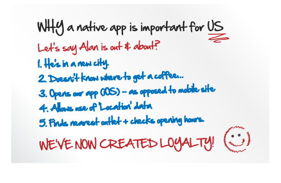
To be a designer is to be a storyteller. Everything we produce has a narrative, whether accidental or intentional. Because design at its core is concerned with communication, storytelling is a natural extension of any thorough design process.
“Stories reveal a user’s-eye view of the landscape and provide an extremely effective way for getting people, both users and designers, involved and talking with one another.”– Tom Erickson
Sometimes, a lack of a coherent vision can run a project askew. Joseph Selbie observed the following, based on his firm’s study of in-house Web design teams:
“Members of teams performing less well not only tended not to understand the application as a whole, they saw no need to understand it as a whole: programmers did not care to know about users, user researchers did not care to know about programming limitations, and stakeholders were uninvolved and were considered “clueless” by the rest of the development team.”
Communication breakdowns such as this are a recipe for disaster.
To prevent these situations, designers can call on storytelling as a means of optimizing collaborative effort and understanding among team members. Compelling stories can clarify the direction of a product and strengthen a team’s empathy with users. In sharing a narrative, all parties have a cohesive vision of the project’s goals and, as a result, are more likely to create a better product.
In his excellent essay “Design as Storytelling,” ex-Apple researcher Tom Erickson notes the following:
“Stories are a sort of equalizer. It doesn’t require much expertise or training to listen to and tell stories. Team members from any background can be made part of the process of telling and collecting stories. And once stories have been gathered, team members can discuss the stories, argue about their interpretation, and generate hypotheses about users’ problems, needs and practices.”
By reducing the mystery of the disciplines involved in a project and putting focus on what needs to be built, a story helps to establish a common language among everyone involved.
Cindy Chastain also highlights the need for such an approach in her article “Experience Themes,” in which she expands upon the storytelling process and explores how innate characteristics such as pleasure, emotion and meaning can be infused into the product experience.
Storytelling doesn’t just describe relationships: it also helps to build them. Try to translate your stories into the priorities of your users and weave them into your product. While the methods and materials of design give form to a digital product, Roger Sametz and Andrew Maydoney argue that the ultimate goal of manipulating type, color, imagery, space and time is to tell stories, “to engage ‘teller’ and ‘listener’ in a dialogue that builds comprehension, commitment, participation, loyalty and trust.”
Employ storytelling methods not only to strengthen the team but to strengthen the product’s relationship with its users.
Express Your Doubts
“If a man will begin with certainties, he shall end in doubts. But if he will be content to begin with doubts, he shall end in certainties.” – Francis Bacon
Doubt may seem like an unusual quality to voice in any product conversation, but it is essential for designers. Positive doubt is the beginning of wisdom, not the end of it. To be able to investigate and synthesize effectively, you must first remain open to all possibilities. Doubt calls on reason, encouraging the application of more rigorous evaluation methods. Questioning assumptions ensures that potentially unusable or redundant features are carefully filtered. It encourages a more thorough exploration of a concept, a product and its goals.
Gordon MacKenzie, author of Orbiting the Giant Hairball cites “attachment to outcome” as one of the biggest obstacles to creativity. As soon as you become attached to a particular outcome, you feel compelled to control and manipulate what you’re doing; and, in the process, you shut yourself off to other possibilities. Milton Glaser observes the same:
“Doubt is better than certainty, If you think you know everything, you’re wrong. Rather doubt your abilities a little to give yourself room for improvement, but don’t doubt them so much that you’re too scared to try.”
The designer’s responsibility is to ensure that many possibilities are explored and tested — prototypes are your friend. “Pet” functionality often lingers in products without adding value. Don’t be afraid to test the viability of such features and to eliminate them when necessary. Bear in mind that stakeholders sometimes need to see a bad idea realized in order to realize that it’s a bad idea.
Voicing concerns over whether a product is “good enough” isn’t whining. It simply demonstrates that you actually give a darn and that you possess the ability to recognize quality in your craft. Don’t compromise: view conversations as opportunities to refine and improve the product.
If you think something is not right, speak up and explain why.
Inform Your Intuition
“Designers will have to learn a foreign language to win them [managers, business analysts and developers] over. That language is data.” – Louis Rosenfeld
During product discussions, designers will regularly contribute opinions on the spot about various aspects of a design. If this occurs too early in the process, though, the information available to inform the decision might be limited — and so our intuition comes into play.
A designer’s intuition is developed over time through a combination of knowledge and experience. We can use this intuition to make the quick decisions that are often required during a design process. However, intuition-based decision-making is potentially problematic in team situations, where decisions usually need to be made collectively. If other people disagree with your choice, you cannot simply state that your intuition is more relevant or valuable than that of others.
In this situation, designers can use analytical methods to inform their decisions. Some relatively quick techniques exist to gather data, such as A/B testing and user surveys. The results of these can be interpreted and used to support your argument — when they actually do support it.
Nevertheless, striking a balance between data and design is important. Data should inform the process, not dictate it — otherwise, every product would be designed by statisticians! Adam Mosseri, a product designer at Facebook, gave an enlightening presentation on the subject called “Data-Informed, Not Data-Driven.” He details how Facebook intelligently interprets its vast amount of data but doesn’t allow itself to become a slave to it. James Landay, a researcher with Microsoft, sums up this need to compromise by calling for…
“… a balance between analytical approaches to design (e.g. computer science, data mining and quantitative HCI experimentation) and more design-oriented approaches that are good at creating products that make an emotional impact on people and create a desire to own them.”
The difficulty with pushing certain recommendations about the user experience of a product is that not everyone will always agree. When discussing a design, use soft words and hard arguments to confidently communicate your view. Where necessary, use data to support your intuition, but never blindly follow it through the process.
Great products are designed by people, not pivot tables. Never let anyone convince you otherwise.
Explain Your Decisions
“Designers get up in front of people and explain why they’ve made the decisions they’ve made. And if you can’t do that, you can’t call yourself a designer.” – Mike Monteiro
Designing a digital product requires many decisions to be made. Collaborative decisions will be made via numerous media, such as meetings, instant messaging, email and even informal chats over lunch. Designers will also make many decisions independently, based on their own research and intuition. Over the course of a project, these decisions combine to form a long chain of interconnected thoughts, as the product begins to take shape. Keeping a mental record of all of this information is not feasible, because we would forget why certain decisions were made.
Kees Dorst captures the situation in Understanding Design:
“Every designer knows the moments of complete disorientation while leafing through piles of sketches (What was the reason for this!).”
To avoid this scenario, keep track of decisions and the reasons they were made, so that you can explain them when required. Simple annotations on wireframes might be sufficient to jog your memory.
- “We chose this approach because…”
- “The team preferred this concept because…”
- “I decided to place this here because…”
- “Users prefer this method because…”
- “This prototype was deemed least usable because…”
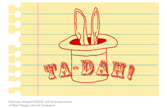
When presenting a design, whether to an internal team or to a client, discussing the evolution of the product is sometimes useful. Avoid the lure of the Ta-dah! moment, revealing a concept without any context. Instead, introduce the work and briefly explain how you arrived at it. Engage your listeners.
A record of decisions is also useful when reviewing a project. If a stakeholder comes along in six months and asks, “Why were radio buttons used here instead of a drop-down menu?”, or “What happened to the mock-up that had modal error messaging instead of a status bar?,” you’ll need to have an answer. These conversations will be a lot more amicable if you can explain why those choices were made. Having a simple log on hand of those long-forgotten decisions can be invaluable.
Explain your decisions. Transparency will bring people on board.
Embrace Failure
Failing sucks; there’s no getting around it. Having said that, no one should ever be ashamed of failing. If you’ve never failed, then you probably haven’t achieved much either — unless you’re one of the lucky ones. A designer will experience various kinds of failure in their working life, some small and easily rectifiable, others large and valuable in their lessons.
If a product or even a feature is rejected, yet the team is still functioning as a unit, that in itself should be considered a small victory. Many successful designers in all disciplines often recall the many false starts and dead ends they had to experience before finding a great solution.
“I made 5,127 prototypes of my vacuum before I got it right. There were 5,126 failures. But I learned from each one. That’s how I came up with a solution. So I don’t mind failure.”– James Dyson
When something is rejected, try not to sweep it under the rug — only then would it become a true failure. Avoid pointing fingers and attributing blame. Instead, focus on the product and the ways in which it failed to deliver. Get the team together, put your product up on the autopsy table, and ask the difficult questions.
- Why did users reject this product?
- Why did this feature tank in our usability testing?
- Was this the right feature in the wrong place?
- Was it the right product at the wrong time?
- How can we avoid making the same mistakes again?
Nothing is morbid about conducting a post-mortem, as long as you identify the probable cause of death. You may never know for sure which factors contributed to the product’s downfall, but you will have a good idea. Learn from them. Ryan Jacoby recently suggested that in order for designers to get it right, they need to be “interested in being wrong.” He goes on to say:
“Great designers and innovators see evaluation moments as learning opportunities. They couple confidence with humility and curiosity.”
This captures well the incessant curiosity and mental dexterity of a good designer — traits that enable us to learn from our mistakes.
By conducting a frank conversation on the product and its shortcomings, designers can turn a negative situation into a positive one. The experience and insight gained will help you avoid similar errors in judgement in future projects. When the critique is complete, chalk it up to experience and move on.
Failure is probably the most expensive form of feedback you’ll ever get, but also the most valuable. Make sure to use it.
Conclusion
The path of every project will be unique, as will be the conversations that guide it. What we can do, however, is plan for more productive conversations, using approaches such as the ones explored above to guide the process along. The examples provided are but a few of the many conversations we can have while working on a product — they are not a bulletproof formula. Over time, a designer will learn to cultivate the conversations that they feel are necessary — and these will likely vary from project to project.
While a certain amount of solid documentation will always be needed, it is less important now than it may have been in the past. A 10-minute chat in the hallway today will often prove more informative and productive than a 20-page document next week. Fast iteration demands clearer lines of communication. By becoming keener listeners and speakers, designers can help secure the information and decisions that are needed to advance the product in the right direction.
Remember: there is no formula for a great solution, but rather many paths. Nevertheless, clear communication can make the path smoother and the solution smarter.
Related Articles
- “Design Conversations, Not Products,” Tim Leberecht
- “On Being T-Shaped,” Tim Brown
- “Experience Is the Product,” Peter Merholz
- “Defining the Problem,” Luke Wroblewski
- “The Top 12 Product Management Mistakes, and How to Avoid Them” (PDF), Marty Cagan
- “Bringing Holistic Awareness to Your Design,” Joseph Selbie
- “Design as Storytelling,” Tom Erickson
- “Experience Themes,” by Cindy Chastain
- “Data-Informed, Not Data-Driven,” Adam Mosseri, UX Week 2010
- “Are We Becoming Too Analytical?,” James A. Landay
- “To Get It Right, Be Interested in Being Wrong,” Ryan Jacoby
- “Paula Scher on Failure,” Jay Dixit
Related Books
- Designing for People, Henry Dreyfuss
- Orbiting the Giant Hairball, Gordon MacKenzie
- Inspired: How to Create Products Customers Love, Marty Cagan
- Storytelling for User Experience, Whitney Quesenbery and Kevin Brooks
- Understanding Design, Kees Dorst
Illustration by Damien Weighill, in collaboration with Blast Design, for Conqueror: Endless Possibilities
Further Reading
- Recent Trends In Storytelling And New Business Models For Publishers
- When A Thousand Words Is Worth A Picture
- 8 Strategies For Successful Relations With Clients
- Taking A Customer From Like To Love


 Celebrating 10 million developers
 Register Free Now

 Try ProtoPie AI free →
 SurveyJS: White-Label Survey Solution for Your JS App

