How To Establish Your Grid In Photoshop
Method 1
The first method uses GuideGuide by Cameron McEfee to set up vertical columns. Instructions on installing it can be found on the GuideGuide page. There is also a video tutorial on using it that was put together by Russell Brown at Adobe.
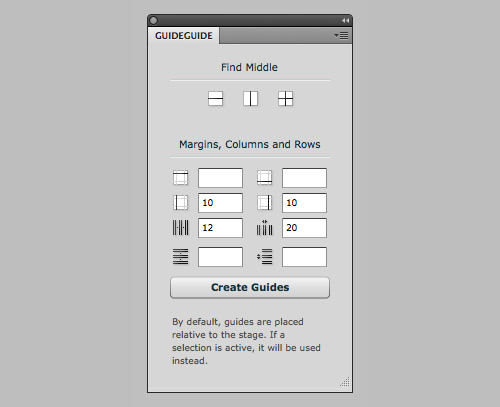
Set Up Your Grid in 5 Seconds
- Determine the margins, number of columns and gutter widths. Then click “Create Guides.”
- If the canvas for your design comp is wide, do the quick math so that the margin lengths allow for the grid to be constrained to your 960 pixels. For example, if the canvas is 1200 pixels wide, then the left and right margins would be 120 pixels each.
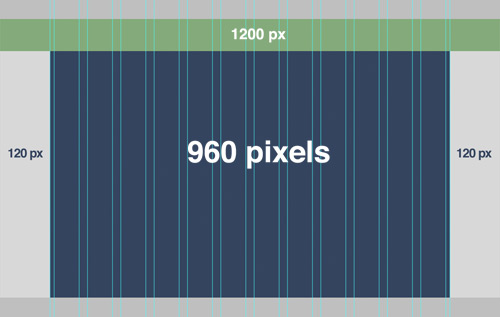
An example of 12 columns with 20-pixel gutters and margins set to 120 pixels.
You can also set a baseline grid this way, but you’d end up with a lot of guides. A better option might be the method featured on a Method & Craft video by Mike Precious…
Method & Craft’s Extensible Baseline Grid
Here is a brief summary of the steps for setting up an extensible baseline grid.
- Establish the grid’s baseline value, then create your pattern template. The baseline grid is determined by the leading (or line height) of the body text. For example, if the main body copy of your design is set in 13-point Helvetica, with the leading at 18 points, then you would set up an 18-pixel baseline grid.
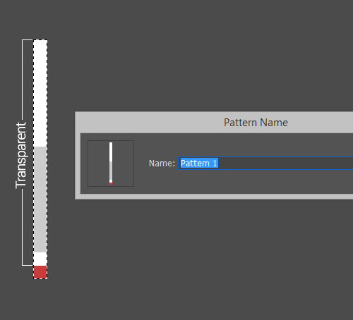
- Create a Photoshop file that is the height of your baseline grid, fill the bottom pixel, and leave the remaining pixels transparent. In this case, the dimensions of your canvas would be 1-pixel wide and 18-pixels tall.
- “Select All,” and then save this as a new pattern. You can do this by going to Edit → Define Pattern…
- Go to Adjustment Layer → Pattern, and select your newly created grid pattern.
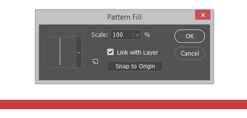
- Adjust the opacity as desired.
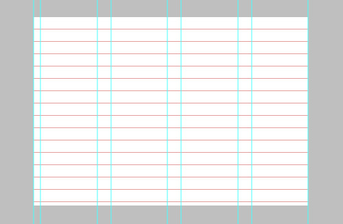
An example of method 1 with the columns and baseline grid together.
Advantages
- You get an optional baseline grid, which you can use independent of the vertical column grid. A baseline grid can create visual clutter when laid over top a design comp. With this method, it can just be toggled on when needed.
- If you prefer to use guides for your grid, this is the better solution.
- You can hide and show the grid through an easy shortcut.
Drawbacks
- Using vertical guides to mark other elements in the document can be difficult because you might confuse them with the grid.
- Compared to method 2, your options for the grid are not as specific or comprehensive (such as setting the height of the horizontal module).
- Grid lines are determined mathematically and won’t necessarily align with the pixel grid. This means that your guides could in some cases fall unevenly and end up being positioned down the middle of the actual pixels.
- This method requires two separate processes to create a vertical and baseline grid, compared to just the one method coming up.
Method 2
Modular Grid Pattern is an all-in-one grid solution. The tool creates a vertical columnar grid and a baseline grid all as one pattern. There are two ways to go about using Modular Grid Pattern:
Application Panel In addition to Photoshop, this also works with Fireworks, GIMP and Microsoft Expression Design. Please note that you must have the latest software (Adobe CS5 or the equivalent of one of the other applications) and an Internet connection for this panel to work. That being said, if you have already created a pattern and saved it in your library, then you would be able to access it without needing anything else.
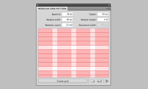
Web app This works in Chrome, Firefox, Safari and Opera. The Web app enables you to create a grid pattern and download it straight from the browser in all formats.
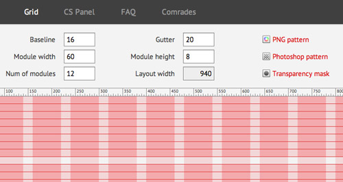
Whichever way you choose, just pick a module width, gutter width and baseline number, and Modular Grid Pattern does the rest. You can also specify a height for the horizontal module.
Advantages
- This is a fast way to get it all; an all-in-one layer.
- You have the option to download a Photoshop pattern file, PNG or transparency mask.
- You can label the patterns and put them in a folder so that you can come back to the grid with virtually no set-up required at all.
- Frees your guide to be used for other purposes.
- You can specify a height for the vertical module to establish an overall vertical rhythm.
- The grid can be overlaid with varying degrees of opacity, so you can make it less distracting as you are designing.
- Supports applications other than Photoshop.
Drawbacks
- If your canvas is wide, then making the grid a pattern will make it extend across the entire page, which could be annoying and make it harder to see the boundaries of the content. This can be fixed in a couple of ways:
- Apply a layer mask to constrain the grid to just the main content area.
- Draw a rectangle the size of the main content area (for example, 960 × 1200 pixels), and apply the grid as a layer style, with the fill set to 0% in this case.
- This method forces you to choose a baseline grid, preventing you from just creating vertical columnar modules.
- It requires you to manually hide and show the grid layer, without the benefit of a keyboard shortcut.
Concluding Thoughts
We hope these methods will increase your efficiency and precision in establishing a grid. In the end, the way you set up the grid will depend on your workflow. Evaluate your needs, then choose the method best suited to them. Either method requires minimal set-up but can save much time and frustration.
Additional Resources
- Enhancing Grid Design With GuideGuide, A Plugin
- A Better Way To Design For Retina In Photoshop
- Grid-Based Web Design, Simplified
- Useful Photoshop Tools and Techniques For Your Workflow


 Register Free Now
 SurveyJS: White-Label Survey Solution for Your JS App


 Celebrating 10 million developers

