Six CSS Layout Features To Look Forward To
At W3Conf, I gave a talk on how the CSS Working Group is attempting to solve the concerns of Web developers with multiple proposals. There are six layout proposals that are relevant to us, all of which I described in the talk. Here is a little more about these proposals and how they will help you in developing websites in the future.
Further Reading on SmashingMag:
- Killer Responsive Layouts With CSS Regions
- CSS Inheritance, The Cascade And Global Scope
- Using Sketch For Responsive Web Design
- CSS Grid, Flexbox And Box Alignment
Generated Content For Paged Media
This proposal outlines a set of features that would modify the contents of any element to flow as pages, like in a book. A video demonstration shows how to use paged media to generate HTML5 slideshows (look at the demos for GCPM in the Opera Labs Build to play with the features more). To make the content of an element be paged, you would use this syntax:
@media paged {
  html {
    width: 100%;
    overflow-style: paged-x;
    padding: 5%;
    height: 100%;
    box-sizing: border-box;
  }
}
This would make the content look something like this:
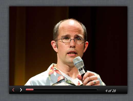
Here, @media paged indicates that the browser understands paged media and that all of the selectors specified for it should have their styles applied when paged media is supported. Then, you indicate which selector you want to be paged (in the above example, the selector is the html element itself) by specifying the property overflow-style: paged-x. This will simply make the content paged; if you want paged controls to be visible, you need to specify overflow-style: paged-x-controls.
The properties break-before, break-after break-inside can be used to control where the content falls within the pages. For example, if you want headings to only appear with their corresponding content and never at the end of the page or standing alone, you can specify that:
h3, h2 {
break-after: avoid;
}
This ensures that if a heading occurs on the last line of a page, it will be pushed to the next page with the content that it introduces.
API
Two properties are available on an element whose content is paged: currentPage and pageCount. You can set the currentPage property via JavaScript, which would trigger a page change on that element. This would then trigger an onpagechange event on that element, which you could use to run other scripts that are required when the page changes. The pageCount property stores the total number of pages in the paged element. These properties are useful for implementing callbacks that should be triggered on page change; for example, to render notes for a particular slide in a slide deck.
Multiple Columns
- W3C Editor’s Draft
- Demo
- Browser support: Opera 11.1+, Firefox 2+, Chrome 4+, Safari 3.1+, IE 10+
Multiple columns are now available in most browsers (including IE10!), which makes them pretty much ready to use on production websites. You can render the content of any element into multiple columns simply by using column-width: <length unit> or column-count: <number>. As with paged content, you can use break-before, break-after or break-inside to control how the content displays within each column. You can also make one of the child elements span the whole set of columns by using column-span: all. Here is how that would look:
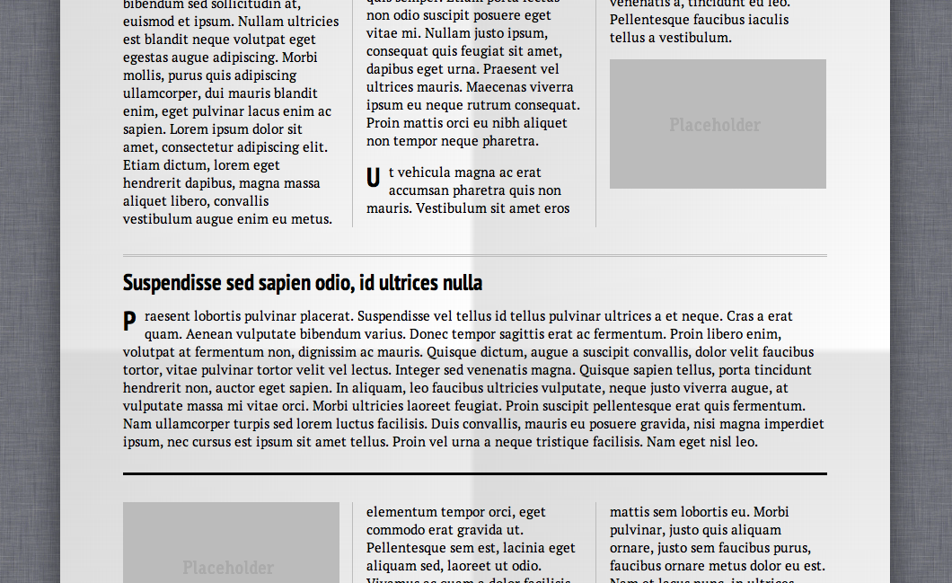
Columns are balanced out with content by default. If you would prefer that columns not be balanced, you can set that by using column-fill: auto property. Here is an example of the default behaviour (i.e. column-fill: balanced):

And here is an example of the column-fill: auto behavior:
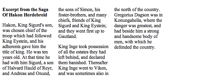
Note that the last column is empty, and each column is filled one after the other.
Regions
- W3C Editor’s Draft
- Demo
- Browser support: IE 10+, Chrome 15+, Safari 6+
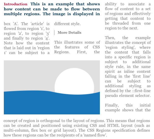
The closest equivalent to regions would be InDesign’s linking of text frames. With the properties in this proposal, you can make the content of selected elements flow through another set of elements. In other words, your content need not be tied to the document flow any longer.
To begin, you need to select elements whose content will be part of a “named flow,” like this:
article.news { flow-into: article_flow; }Here, all of the content in the article element with the class name news will belong to the flow named article_flow.
Then, you select elements that will render the contents that are part of this named flow:
#main {
flow-from: article_flow;
}
Here, the element with the ID main will be used to display the content in the flow named article_flow. This element has now become a region that renders the content of a named flow. Note that any element that is a region establishes new “block-formatting contexts” and “stacking contexts.” For example, if a child element is part of a flow and is absolutely positioned, it will now only be absolutely positioned with respect to the region it belongs to, and not to the whole viewport.
You can also tweak the styles of content that flows through a region:
@region #main {
  p { color: indianred; }
}
API
An interface named getNamedFlow and an event named regionLayoutUpdate are available for elements that are regions.
getNamedFlow
This returns the flow that that particular region is associated with. The properties available are:
overflowA read-only boolean that tells you whether all of the content of the named flow fits within the regions that are part of the flow or whether it overflows.contentNodesA NodeList of all the content elements that belong to the flow.getRegionsByContentNodeThis returns all of the regions that a particular content element would flow through. A very long paragraph might flow through more than one region; with this method, you can retrieve all of the regions that that paragraph element flows through.regionLayoutUpdateThis event gets triggered every time an update is made to the layout of a region. If the region’s dimensions are altered, then the child content elements that are part of that region might alter, too (for example, a few might move to another region, or more child elements might become part of the region).
Exclusions
- Draft specification (a combination of two proposals: “Exclusions” and “Positioned Floats”)
- Demo
- Browser support: IE 10+
Exclusions allow inline content to be wrapped around or within custom shapes using CSS properties. An element becomes an “exclusion element” when wrap-flow is set to a value that is not auto. It can then set the “wrapping area” for inline text outside or within it, according to various CSS properties. The wrap-flow can take the following values: left, right, maximum,both, clear or the default value of auto. Here is how each of these values would affect the inline content around the exclusion element:
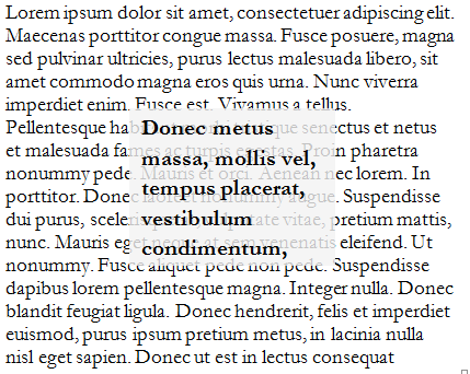
wrap-flow: auto
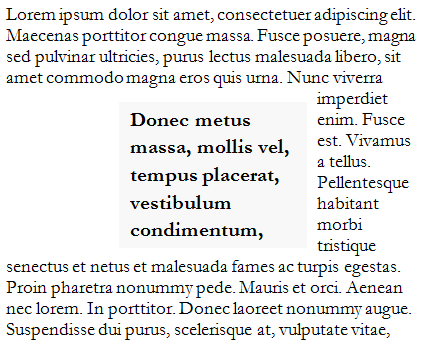
wrap-flow: right
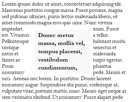
wrap-flow: both
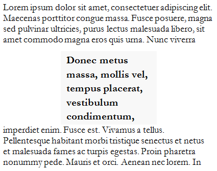
wrap-flow: clear
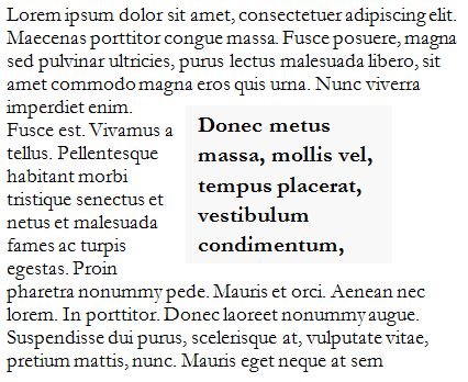
wrap-flow: maximum
The wrap-margin property can be used to offset the space between the boundary of the exclusion element and the inline text outside of it. The wrap-padding property is used to offset the space between the boundary of the exclusion element and the inline text inside it.
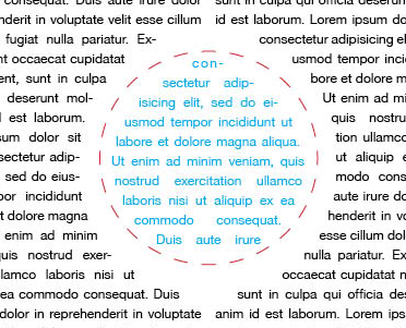
In the above image, the space between the content outside of the red dashed circular border and the black text outside of it is determined by the wrap-margin, while the space between the red dashed circular border and the blue text within it is determined by the wrap-padding.
Now comes the fun part: specifying custom shapes for the wrapping area. You can use two properties: shape-outside lets you set the wrapping area for inline text outside of the exclusion element, while shape-inside lets you set the wrapping area for inline text inside the exclusion element.
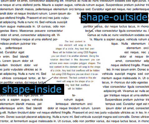
Both of these properties can take SVG-like syntax (circle(50%, 50%, 100px);) or image URLs to set the wrapping area.
Exclusions make magazine-like layouts on the Web a trivial matter and could spark the kind of creative use of content that we are used to seeing in print!
Grid
- W3C Editor’s Draft
- Demo
- Browser support: IE 10+
Grid properties allow you to throw block-level elements into a grid cell, irrespective of the flow of content within the grid parent element. An element becomes a grid when display is set to grid. You can then set the number of columns and rows with the grid-columns and grid-rows properties, respectively. You can then declare each child selector itself as part of a grid cell, like so:
#title {
grid-column: 1; grid-row: 1;
}

#score {
grid-column: 2; grid-row: 1;
}
You can also use a template to plan the grid:
body {
  grid-template: "ta"
                 "sa"
                 "bb"
                 "cc";
}
In this syntax, each string refers to a row, and each character refers to a grid cell. In this case, the content of grid cell represented by the character a spans two rows but just one column, and the content represented by b spans two columns but just one row.
Now you can set any of the child element’s grid-cell position:
#title {
grid-cell: 't';
}
This will make the element with the ID title within the body element to be positioned in the grid cell represented by the character t in the grid-template property.
If you are not using grid-template, you can also declare how many columns or rows a particular element should occupy with the grid-row-span and grid-column-span properties.
Flexbox
Flexbox allows you to distribute child elements anywhere in the box (giving us the much-needed vertical centering), along with flexible units that let you control the fluidity of the child elements’ dimensions.
Note that this specification has changed substantially since it was first proposed. Previously, you would invoke Flexbox for an element with display: box, but now you would use display: Flexbox to do so. Child elements can be vertically aligned to the center with flex-pack: center and horizontally aligned to the center with flex-align: center. Also note that all elements that obey the Flexbox need to be block-level elements.
How Do Various Properties Interact With Each Other?
You might wonder how to use these properties in combination. The following table shows which of these features can be combined.
| Paged Media | Multiple Columns | Regions | Exclusions | Grid | Flexbox | |
|---|---|---|---|---|---|---|
| Paged Media | ✓ | |||||
| Multiple Columns | ✓ | ✓ | ✓ | ✓ | ||
| Regions | ✓ | ✓ | ✓ | |||
| Exclusions | ✓ | ✓ | ✓ | |||
| Grid | ✓ | |||||
| Flexbox | ✓ |
As you can see, the multiple-column properties can be used in conjunction with generated content for paged media, regions and exclusions. But grid, Flexbox and regions are mutually exclusive (i.e. if an element is a grid, it cannot be a Flexbox or region). Do note that, as Alan Stearns says in the comments, while a grid container cannot be a Flexbox or a region, a grid cell could become a region, or a Flexbox child item could be a region.
A Note Before You Rush Out To Use Them In Client Projects
The specifications are always changing, so be careful with them. Except for multiple columns, I would recommend using these strictly in personal projects and demos. The syntaxes and properties used in some of the demos are different from what you would find in the actual specifications, because they have changed since the builds that support a previous version of the specification came out. Also, because they are still unstable, all of these properties are vendor-prefixed, which means you have to add support for each prefix as support is added.
If you do use these features, just make sure that the content is readable in browsers that do not support them. The easiest way to do this would be to use feature detection and then use CSS to make the content readable when the feature is unsupported.
Help The Working Group!
Do these layout proposals sound exciting to you? Jump on the www-style mailing list to provide feedback on them! Just note that the mailing list will flood your inbox, and you should carefully filter the emails so that you pay attention only to the drafts you are interested in.
Write demos and test how these work, and if you find bugs in the builds that have these properties, provide feedback to the browser vendors and submit bug reports. If you have suggestions for changing or adding properties to these proposals, do write in in the mailing list (or you can bug me on Twitter)!
These are exciting times, and within a few years the way we lay out Web pages will have changed dramatically! Perhaps this will finally sound the death knell of print. (Just kidding.)


 SurveyJS: White-Label Survey Solution for Your JS App
 Try ProtoPie AI free →
 Celebrating 10 million developers
 Register Free Now


