A User-Centric Guideline To Product Pages
Product pages for e-commerce websites are often rife with ambitions: recreate the brick-and-mortar shopping experience, provide users with every last drop of product information, build a brand persona, establish a seamless check-out process.
As the “strong link in any conversion,” product pages have so much potential. We can create user-centric descriptions and layouts that are downright appropriate in their effectiveness: as Erin Kissane says, “offering [users] precisely what they need, exactly when they need it, and in just the right form.”
Further Reading on SmashingMag:
- What Is User Experience Design? Overview, Tools And Resources
- Better Product Pages: Turn Visitors Into Customers
- Infinite Scrolling, Pagination Or “Load More” Buttons?
- Guidelines For Better Navigation And Categories
Beyond that, a user-centered creation process for product pages can help brand the information as well as reduce the content clutter that so often bogs down retail websites.
User-centric product copy garners positive results because it anticipates the user’s immediate reaction. As Dr. Timo Saari and Dr. Marko Turpeinen, authors of “Towards Psychological Customization of Information for Individuals and Social Groups” suggest, individual differences in processing information implicates dramatic variances in type and/or intensity of psychological effects, such as positive emotion, persuasion, and depth of learning (2).
We can describe products in various ways. Highlighting certain aspects of a product will elicit different reactions from various users. Gearing product descriptions to a particular audience encourages those users to effectively process the information, heightens persuasion, and increases the potential to predict what the users want (but didn’t know they needed). The effort required of user-centric product descriptions demands that we understand how certain descriptors, contexts and inclusions of details affect the target user, and that we then put our discoveries into action.
This article offers a user-centric guide to producing product pages and provides examples of successful e-commerce websites that present user-centric approaches to product page descriptions and layouts.
Get To Know Your User
Approaching product page description and layout from a user-centric perspective demands that we have a rich understanding of the target user. As Saari and Turpeinen suggest, Web customization starts with some type of model, be it individual, group or community. With your user models in place, you can best assess what they need and how to write for them.
In her book Letting Go of the Words, Web usability expert Janice Redish suggests these strategies for getting to know your target user:
- Scope the email responses that come through the website’s “Contact Us” form and other feedback links. Consider the profiles of the senders. You can discover commonalities in lifestyle, technological capability, education level and communication preference through these channels.
- Talk to the customer service or marketing employees at your company. Don’t approach them with a broad demand to describe the typical client. Rather, ask questions about their interactions with clients. Who is calling in? Who is stopping by the office? What queries and complaints are common?
- Offer short questionnaires to visitors to the website. Redish suggests asking people “a few questions about themselves, why they came to the site, and whether they were successful in finding what they came for.”
- If possible, acquire a sense of the client simply by observing the people who walk through the front doors of the business. This is a great way to pick up on key phrases, jargon, emotional behavior and demographics.
Once you’re able to confidently brainstorm the major characteristics of your target user or group, then developing the models to guide the writing process comes next.
Keep in mind that gathering and compiling this information can take as little or as big an investment of time and money as you (or the client) can afford and still be effective. As Leonard Souza recently noted, even stopping in a nearby coffee shop to engage five to ten people in your target demographic can yield useful insight. With a bit of flexibility, you can find learning opportunities that are convenient and on the cheap.
The models created from your user research can be fashioned into personas, which Souza describes as “tools for creating empathy among everyone in the project.” Use personas to guide user-centric copywriting by establishing very specific user goals and preferences.
A persona is a fictional person amalgamated from the characteristics of your target user. You can get creative here with the persona’s name and image, but not too creative. The persona must be mindfully constructed according to the age, education, family status and other personal details culled from your research.
Now that you have a persona to please as you construct a product description and layout hierarchy, staying user-centric is that much easier. Take a look at the product description from Lululemon, a British Columbia-based yoga-wear retailer:
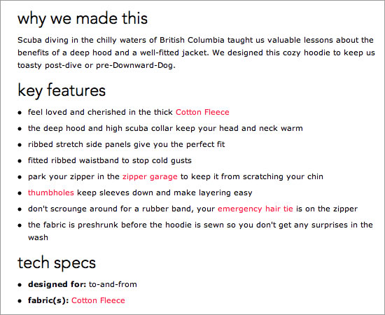
Product description from Shop.lululemon.com
The product description assumes that the reader knows a specific set of jargon: How many non-yoga participants would know what downward-dog means? Or “pipes”, as the “Key Features” section refers to arms? This content drives right to the needs and preferences of a very specific user. She wants warmth (four of the “Key Features” note the thermal quality of the product), convenience (pre-shrunk fabric, easy layering), and motivation for an active lifestyle (she recognizes the yoga jargon and enjoys giving her “pipes some air time”).
A rich understanding of the user has made this product page effective and delightfully specific to both the user and the brand.
Master S.M.A.R.T. Content and Layout
Without specific, measurable, actionable, relevant and trackable user goals driving the copy on the product page, the information will sag. I draw here from Dickson Fong’s enlightening article “The S.M.A.R.T. User Experience Strategy“ to suggest that care should be taken to develop user goals that guide the writing process for product pages.
The S.M.A.R.T. formula will keep you on track as you plot out product details and decide what descriptive angle to use.
Fong provides an excellent user goal for a product page: “I want to learn more about this product’s design, features and specifications to determine whether it fits my budget, needs and preferences.”
This will help you create a checklist when assessing what to present first and what to offer as optional information when structuring the layout of the page (more about that in the “Create Information Hierarchies” section below). It provides direction when you’re writing content and helps you focus on the benefits to the user. And as Darlene Maciuba-Koppel suggests in The Web Writer’s Guide, “In copywriting, your end goal is to sell benefits, not products, in your copy.”
For users, benefits and accomplished goals go hand in hand. A product that doesn’t fit their budget, needs or preferences offers them little benefit. So, in order for S.M.A.R.T. goal-driven product pages to serve user-centric purposes, the text must follow suit. Fong suggests presenting relevant content details that are specific to the consumer of that product type.
Let’s take Fong’s S.M.A.R.T. user goal for product pages and assess the specifications at play on the following two pages from Dell:
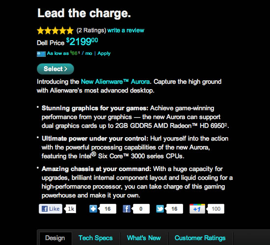
Product page for Alienware on Dell.com
Featured on Alienware, Dell’s computer subsidiary for high-performance gaming, the description for this desktop computer has been tailored to the primary browsing goal of a very specific user. The needs and preferences of the user have already been predicted in the bullet-point outline, highlighting optimum graphics and top-notch liquid-cooling capabilities, thus harmonizing the checklist of features with a checklist of benefits for the user. A number of the product’s features could have been highlighted, but for optimal ease, the specifics most likely to help the user accomplish their goals are featured.
With the next Dell desktop computer, another goal of the target user is covered in the description:
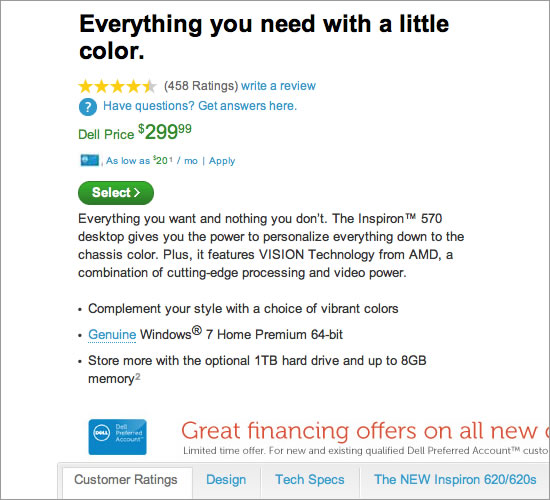
Product page description for Inspiron 570 on Dell.com
With a noticeable absence of technical details and a heavy emphasis on product personalization, this description plays to a user with very different needs than the Alienware shopper’s. Even the tabs have been re-arranged to best meet the user’s goals. The Inspiron 570 page shows “Customer ratings” as the first tab, while the Alienware page offers “Design” first and then “Tech specs.”
These decisions are all geared to accomplishing very specific user goals: find the required information and assess the benefits.
Use Personal Pronouns
Consider again Dell’s description of its Inspiron 570:
Make It YoursThe Inspiron 570 desktop is everything you want and nothing you don’t. Available in vibrant colors, so you can complement your style or stand out from the crowd. Plus, you can build your desktop according to your needs with a choice of multiple AMD processors and NVIDIA ATI graphics cards as well as other customizable features. So whether you are surfing the Web, emailing friends and family, downloading music and photos or blogging about it all, the Inspiron 570 desktop can handle it.
Your wants, your style, your needs, your friends and your Internet past-times. Including the title, eight instances of “you” or “your” turn up in this 86-word segment!
Personal pronouns in product descriptions are perfectly appropriate and quite effective at engaging users, because, as Redish states, “People are much more likely to take in [messages] if you write with ‘you’ because they can see themselves in the text.”
With Dell’s content, the personal pronouns target a specific user (one who is savvy enough to download music and email and who is interested in customization and feeling unique), while also managing a broad gender appeal.
Outdoor equipment retailer REI employs personal pronouns in its online product descriptions, creating dynamic scenarios aimed at a specific user:
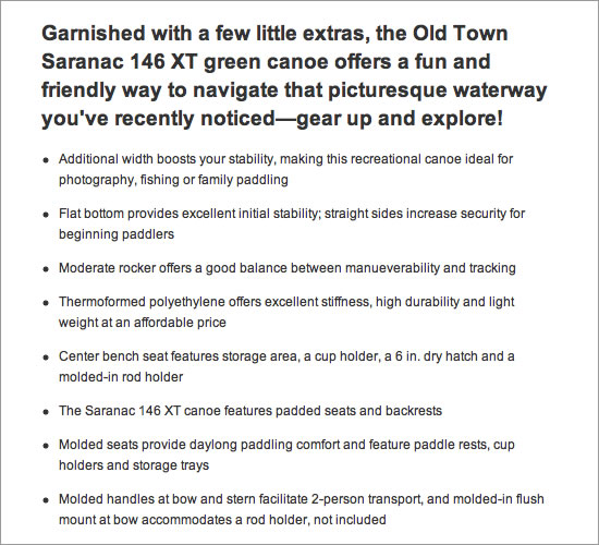
Product description for REI.com
The description asserts that this canoe will help you navigate a waterway that “you’ve recently noticed,” anticipating a specific user reality (or dream).
The product showcase is devoted to the user’s needs and showing how the user will benefit from purchasing the canoe. Using “you” is the clearest and most direct way for this retailer to grab the user’s attention and to convince them, at any time of the year, that this canoe is the right buy.
Angie King backs this up in her article “Personal Pronouns: It’s Okay to Own Your Web Copy.” She suggests that using first- and second-person pronouns helps users connect with the content, and “reflect[s] the way real people write and speak,” fostering an immediate connection.
For a product description to speak directly to a specific user or group, the “you’s” should flow freely.
Use Information Hierarchies
Adopting a user-centric approach to the layout and copy of product pages helps you tackle the challenge articulated by Kean Richmond: “How do you cram so much information into a single Web page?”
In addition to technical specifications, shipping information, item details and preference options (and don’t forget that compelling product description), product pages must also list every describable service that the product performs for its user, including customer benefits (as Darlene Maciuba-Koppel explains, too).
By all means, provide the user with every last detail possible. Answer every conceivable question, or make the answer visible for discovery. Do so with information hierarchies that are based on a rich understanding of targeted users. This will keep each page tidy and drive users to complete your business goals.
In a structure in which, as Kean Richmond states, “all the important information is at the top and [the rest] flows naturally down the page,” details that might not be a top priority for the target user can be tucked into optional tabs or presented at the bottom of the page. The key is to gauge the structure of the page with the sensibilities of the targeted user in mind.
Look At User Context
Here’s where you become a mind-reader of sorts. Erin Kissane points to the approach of content strategist Daniel Eizan in understanding what specific users need to see on the page in order to be drawn into the information. Eizan looks at the user’s context to gauge their Web-browsing behaviors. Eizan asks, What are they doing? How are they feeling? What are they capable of?
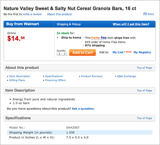
Establishing user context aids in planning an information hierarchy, and it is demonstrated by small and large e-retailers. On the big-box side, we have Walmart:
By making the price and product name (including the unit number per order) immediately visible, Walmart has anticipated a possible user context. A Walmart visitor searching for granola bars has perhaps purchased the product before. With the unit price made visible, perhaps the anticipated user is judging the product based on whether this box size will suffice.
Details such as “Item description” and “Specifications” are options that are convenient to the user who is making a large order of a familiar product.
The user’s context shapes the hierarchy: the user seeks a quick calculation of units per product versus price. The targeted user does not immediately need an ingredients list, allergy information or a description of the flavor. But if they do, they are available in a neat options-based format.
Walmart has built its reputation on “Everyday low prices,” and the brick-and-mortar philosophy has crossed over to its website. Walmart anticipates users who have some familiarity with its products and who have expectations of certain price points. These factors play into the information hierarchy across the website.
Now look at the product page of a different kind of retailer, nutrition bar manufacturer Larabar:
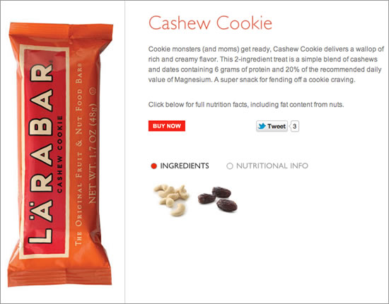
Cashew Cookie product page from Larabar.com
Here is an online presentation of a retail product that is similar to Walmart’s Nature Valley granola bar (though some might argue otherwise).¬†However, the information hierarchy clearly speaks to a different user — a specific user, one who might be looking for gluten-free snack foods or a vegan protein solution. The Larabar user’s context is much less urgent than the Walmart user’s. The product page does not reveal pricing or unit number. Ingredients are visible here, with simple images that (when scrolled over) provide additional nutritional information.
The anticipated user has more time to peruse, to browse several varieties of product, and to read the delightful descriptions that help them imagine the tastes and textures of the bars.
This user might be very much like the targeted Walmart user but is likely visiting the Larabar website in a different context. This product page offers more immediate information on nutrition and taste, selling to a user who is perhaps hunting for a solution to a dietary restriction or for a healthy snack alternative.
However, the red-boxed “Buy Now” is positioned in a memorable, convenient spot on the page, leaving no guessing for the user, who, after reading a description of this healthy bar full of “rich and creamy flavor,” will likely click it to find out the purchasing options.
With these two pages for (arguably) similar products, we see two completely different ways to structure product details.
Both are effective – for their targeted users. A person seeking gluten-free snacks for a camping trip might be frustrated having to search through the hundreds of granola bar options on Walmart’s website. But they wouldn’t be going there in the first place; they would use a search engine and would find Larabar.
Information hierarchy solves the content-overload challenge that can overshadow the process of constructing a product page, and it is an opportunity to bolster user-centric copy and layout. As mentioned, the key is to gauge the user’s context.
Conclusion
While a user-centric consideration of product pages is not the only way to go, it does provide a focused approach that has appeared to be effective for some pretty successful e-commerce players. Consistency in product pages is key, especially when building a brand’s presence; a reliable guide can ease the writing process. The user-centric method does require some primary research, but this lays a sturdy foundation by which to gauge every bit of content on the page according to how it benefits the user.
As Maciuba-Koppel says, as a content writer or designer, your goal should not be to sell products, but to sell benefits.
Now watch the conversions multiply.
(al) (fi)
References
- Writing for the Web: Creating Compelling Web Content Using Words, Pictures And Sound Lynda Felder (New Riders: 2011)
- “The S.M.A.R.T. User Experience Strategy” Dickson Fong (Smashing Magazine)
- “Personal pronouns: It’s okay to own your Web copy” Angie King (Brain Traffic)
- “A Checklist for Content Work” Erin Kissane (A List Apart)
- “Writing Copy that Works for a Living” Erin Kissane (A List Apart)
- _The web-writer’s guide_Darlene Maciuba-Koppel (FocaPress: 2004)
- “Letting Go Of The Words”: Writing Web Content that Works. Janice Redish (Morgan Kaufman Publishers)
- “Anatomy of an Effective Product Page Design” Kean Richmond (Six Revisions)


 SurveyJS: White-Label Survey Solution for Your JS App
 Celebrating 10 million developers

 Register Free Now
