The Future Of Screen Typography Is In Your Hands
We do more reading on the screen today than we did even a year ago. If we are ever to have a golden age of reading on the screen, this might be the start of it.
Tablets, Nooks and Kindles make buying a book or magazine for the screen almost unavoidable. With smartphones, we carry our reading material with us and enjoy instant Web access, enabling the reading experience to flow smoothly from one device to another. And those devices probably have stunning HD reader-friendly screens. Throw in companion services like Readmill and 24symbols, which allow us to share our reading experiences, and we have perfect screen-based access to all aspects of the written word.
So, why isn’t Web and screen typography keeping up?
Further Reading on SmashingMag:
- Balancing Line Length And Font Size In Responsive Web Design
- Typography Keyboard Layout [Free Download]
- 16 Pixels: For Body Copy. Anything Less Is A Costly Mistake
- Space Yourself
Good Typography Cannot Be Handcrafted Anymore
In the past, typography was viewed as living only when it reached paper. Once a publication was edited, typeset and printed, it was done. Nothing changed after that. Good typography and readability were the result of skilled typesetters and designers.
Today, typography exists not only on paper but on a multitude of screens. It is subject to many unknown and fluctuating parameters, such as operating system, system fonts, the device and screen itself, the viewport and more. Our experience of typography today changes based on how the page is rendered, because typesetting happens in the browser.
In all of this, the browser is probably the most important part of the screen typography equation. Ironically, the lack of support in modern browsers is the single biggest hurdle to good Web typography.
Type-as-service providers are offering an alternative, with an increasing number of fonts that are fairly cheap and easy for us designers to use when typesetting text. But they, too, want better support of Web typography.
Identifying What’s Missing
Let’s look at some of the basic things that are missing from most, if not all, screen-reading experiences. When we say basic, we mean the things that you read and benefit from whenever you look at a book or magazine on paper or screen.
- Kerning and spacing of individual characters;
- Basic ligatures (fi, fl)
- Other ligatures (fj, ffi, ffl, ffj and more);
- Lining and old-style numerals;
- True small-caps;
- Replacing uppercase with small-caps for abbreviations;
- Superscripted symbols such as © and ™;
- Language-based quotation marks;
- Correct replacement of en and em dashes, and the spacing around them;
- Spacing of ! ( ) [ ] / ; :.
Doesn’t seem like much. Except that it is. The elements in this list are some of the things that help us read, process and understand information. They represent in many ways the difference between how a soulless machine would relate to text and how thinking, organic humans do it.
Those of you who were around during the desktop publishing boom might see similarities. In 1999, QuarkXPress did not support OpenType, InDesign was just born, and you had to use “expert” cuts of fonts to be able to work with small-caps and old-style numerals. So, we had to create workarounds for micro-typography — such as Apple-Script frameworks for QuarkXPress, where the script traversed documents and isolated hyphens, dashes, ligatures and small-caps abbreviations, replacing them with the correct typographical equivalents.
In many ways, 2012 is the new 1999. We have the freedom to work with any font we like via the @font-face selector. But our main tool, the browser, does not have any OpenType features to speak of. We have to create workarounds.
Can we use the same type of solution that we used back in the old days of print?
We say yes.
Time to Fix the Problem
We researched existing JavaScript libraries and found a ton of great stuff. But none focused on micro-typography as a whole. When we started the project, we laid out five clear goals:
- Correct micro-typography, including as many of the elements in the list above as possible;
- Degrades so that devices without @font-face or JavaScript support are not negatively affected;
- OS independence;
- Browser independence;
- Correct markup;
We named the project OpenTypography, and we named the solution Typesetter.js.
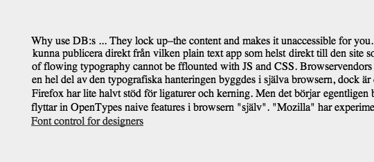
JavaScript and @font-face and styles disabled.
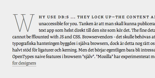
JavaScript disabled.
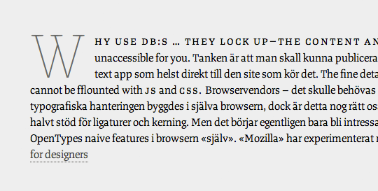
JavaScript enabled and @font-face-enhanced Web typography.
Typesetter.js
Typesetter.js has two ingredients: a JavaScript and a custom font file
The JavaScript traverses the DOM, finding and replacing things like quotation marks, ligatures, en and em dashes, ellipses and more. It also finds ©, ®, ™ and wraps them in sup tags.
Most importantly, it finds uppercase abbreviations and wraps them in abbr tags, giving us true small-caps. This is possible thanks to a bit of CSS and the services of font-on-demand houses such as Fontdeck and Typekit.
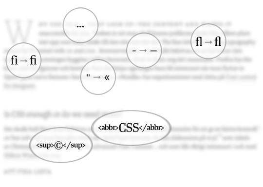
Finding, replacing and wrapping.
Here is a rundown of how Typesetter.js works.
1. The JavaScript
The code is divided into two parts, giving you the option to use the small-caps replacement. But let’s start by looking at how the small-caps replacement works.
Here is the sample HTML that we will use to explain what the script actually does:
<p class="typo">The fine details of screen typography can be improved with JS-scripts and CSS.</p>

<p class="typo">That is the goal of "Typesetter.js" — an open-source solution by Andreas Carlsson and Jaan Orvet © 2011</p>
Our sample text rendered with Georgia and browser-native typographic features.
In this text, we want to find all-uppercase words.
The code starts by getting all elements of a user-chosen class, in this case .typo. These elements are stored in an array.
mainArray[0] = 'The fine details of screen typography can be improved with JS-scripts and CSS.';
mainArray[1] = 'That is the goal of "Typesetter.js" — an open-source solution by Andreas Carlsson and Jaan Orvet © 2011';
Each array element is then looped one at a time and split into a sub-array containing each word as a string.
subArray[0] = 'The';
subArray[1] = 'fine';
subArray[2] = 'details';
subArray[3] = 'of';
subArray[4] = 'screen';
subArray[5] = 'typography';
subArray[6] = 'can';
subArray[7] = 'be';
subArray[8] = 'improved';
subArray[9] = 'with';
subArray[10] = 'JS-scripts';
subArray[11] = 'and';
subArray[12] = 'CSS.';
Each item in the sub-array is tested to see whether the character count of the word and the count of the uppercase letters (ASCII values between 65 and 90) are equal. If so, the word is treated as an uppercase abbreviation.
The test actually checks the first and last character of the sub-array item. If they are uppercase, then it is fair to assume that the whole word is an uppercase abbreviation, and then we would run a more specific test. Here is what the script returns from our sample text:
- “The” =
false(do not run specific test) - “details” =
false(do not run specific test) - “Andreas” =
false(do not run specific test) - “CSS.” =
true(run specific test) - “JS-scripts” =
true(run specific test)
As you can see, the test also spots uppercase words when they are used with a hyphen or have an trailing period.
Our special uppercase test creates an index array that holds the indexes of the uppercase words (i.e. it identifies where in the full sentence they occur). After the whole sub-array is tested, we would have the sub-array and the index array containing the all-uppercase indexes.
indexArray[0] = '10';
indexArray[1] = '12';
Now that we know where all of the uppercase words are in the string (i.e. sentence), we can prepare them for small-caps replacement.
Small-caps replacement is done by extracting the word, converting the letters to lowercase, wrapping the whole word in an abbr tag and inserting it into the sub-array again.
subArray[0] = 'The';
subArray[1] = 'fine';
subArray[2] = 'details';
subArray[3] = 'of';
subArray[4] = 'screen';
subArray[5] = 'typography';
subArray[6] = 'can';
subArray[7] = 'be';
subArray[8] = 'improved';
subArray[9] = 'with';
subArray[10] = 'js-scripts';
subArray[11] = 'and';
subArray[12] = 'css.';
Now we only need to convert that array into a string and replace the original HTML element with the new small-caps-ified HTML element.
Before:
<p class="typo">The fine details of screen typography can be improved with JS-scripts and CSS.</p>

<p class="typo">That is the goal of "Typesetter.js" — an open-source solution by Andreas Carlsson and Jaan Orvet © 2011</p>
After:
<p class="typo">The fine details of screen typography can be improved with js-scripts and css.</p>

<p class="typo">That is the goal of "Typesetter.js" — an open-source solution by Andreas Carlsson and Jaan Orvet © 2011</p>
Our sample text set with Tanger Serif from Typolar, using the @font-face rule. Uppercase words are now wrapped in abbr tags.
Nice and neat. Now for the second part of the script, the one that replaces quotation marks, ligatures, en and em dashes, and ellipses; renders characters such as © in superscript; and converts numerals to old style by wrapping them in a user-defined class.
The code is fairly self-explanatory:
var charReplacements = function() {

/* Quotation marks
‹ = ‹
› = ›
« = «
» = »
‘ = ‘
’ = ’
“ = “
” = ”
*/

var quoteCharClose = "»";
var quoteCharOpen = "«";
var triggerID = "#display";
var smallcapsClass = "old-style"

$(triggerID).each(function() {
$(this).find('*').each(function() {
    if (($(this).html()) != 0) {
        if (($(this).find('img').length) === 0) {
        // Performs replaces on any element that is not an <img alt="" />
        $(this).html( $(this).html().replace(/(...(.)?)|(.s.s(.s)?|(..(.)?))/g, "…"));
        // Finds and replaces .. | ... | .... with an elipsis

        $(this).html( $(this).html().replace(/fl/g, "fl"));
        // Replaces fl with ligature

        $(this).html( $(this).html().replace(/fi/g, "fi"));
        // Replaces fi with ligature

        $(this).html( $(this).html().replace(/s-s/g, " ‒ "));
        // Replaces | space en-dash space | with: | space em-dash space |

            $(this).html( $(this).html().replace(/"([s.,])/g, quoteCharClose + "$1"));
        // Replaces | " space | with | » space |

        $(this).html( $(this).html().replace(/s"/g, " " +  quoteCharOpen));
        // Replaces | space " | with | space « |

        $(this).html( $(this).html().replace(/(d+)(?=((?!).)*(-tag with the .old-style-class but ignores digits within a a-tag. Read full explanation here https://www.phpbuilder.com/board/archive/index.php/t-10221442.html

        if ( (($(this).children().length) === 0) || ($('this:contains("u00a9")')) ) {

            $(this).html( $(this).html().replace(/u00a9/g, "<sup class=""sup"">©</sup>") );
            // Superscripts (c)

            $(this).html( $(this).html().replace(/u00ae/g, "<sup class=""sup"">®</sup>") );
            // Superscripts (R)
        };
    };
   };

});
});
};
Most of the typographic details in the script are declared in the variables at the beginning. This is the beginning of a “settings” type of solution that we are working towards building.
”Settings” is a pretty important feature because typographic rules change depending on the language; for example, quotation marks and the spacing of em dashes. English, French and German each use different quotation marks, so the designer needs to be able to easily change the typographic settings.
Now we have pretty decent typography in our example:
<p class="typo">The fine details of screen typography can be improved with js-scripts and css.</p>

<p class="typo">That is the goal of «Typesetter.js» — an open-source solution by Andreas Carlsson and Jaan Orvet <sup class="sup">©</sup>

<span class="old-style">2011</span></p>
Our sample text with much better micro-typography than what the browser supports natively.
We have covered a lot, but the most important part is still to come!
2. The Custom Font File
Let’s move on to the font file itself.
Putting Small-Caps and Old-Style Numerals in Place
Our text is now wrapped in classes; we can use CSS to set it in small-caps and old-style numerals. Since no browser supports OpenType, we cannot use the regular font-variant: small-caps rule, because this would only shrink the uppercase letters, resulting in thinner and lighter characters.
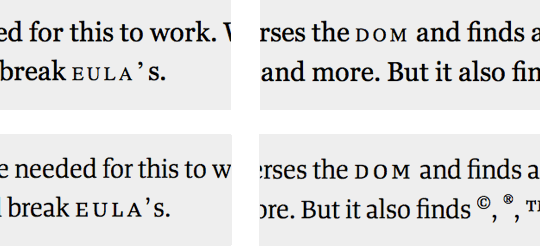
The font-variant: small-caps rule merely shrinks uppercase letters, resulting in thinner and lighter characters. To get real small-caps, we have to use our custom subsetted font file.
The font file we need is a subset of the regular cut; in it, the uppercase characters have been replaced with small-caps characters, and the lining numerals have been replaced with old-style numerals. (Remember the days of “expert set fonts”? It’s a bit like that. If you don’t remember, you’re better off for it.)
We can now specify in our CSS files to use the subset for abbr tags. This will give us true small-caps on the Web and allow us to choose between old-style and lining numerals in our text.
abbr {
   font-family: "Tanger Serif Expert", Cambria, Georgia, serif;
   letter-spacing: 0.15em;
   text-transform: lowercase;
   font-variant: small-caps;
   font-weight: 650;
}
Get the Font File
Fontdeck supports the OpenTypography project by kindly serving subsetted fonts in addition to its main fonts.
Other type services and foundries make subsets available as well. We keep an updated list with examples at OpenTypography.
Create Your Own Font File
If you have experience working with fonts, then creating your own subsetted font files is fairly straightforward.
Open the regular cut in your favorite font editor. Copy the small-caps glyphs, and paste them where the uppercase and lowercase glyphs are. Copy the old-style numerals to where the lining numerals are. Once this is done, you only have to generate a new font file and convert it to all the required Web font formats: TTF, OTF, WOFF, EOT, SVG.
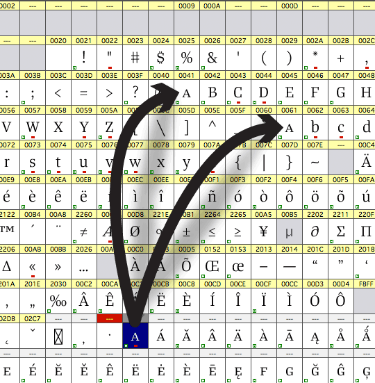
You can easily create your own subsetted custom font file. Just replace uppercase and lowercase glyphs with the small-caps versions and the lining numerals with the old-style ones.
Now you have your own custom Web font ready to be used with Typesetter.js
But be sure to check the license to make sure you are permitted to adjust the font file and to embed it via the @font-face selector.
Get Involved In The Future Of Typesetter.js
We are currently testing Typesetter.js in our Dropbox- and Markdown-based CMS, Skrivr, but Typesetter.js is at a very early stage and needs more development in order to work seamlessly with all of the great things that the Web and digital-screen community is creating.
Mainly, we want it to be faster. Another question we’re facing is whether to use RegEx or not. Also, how do we create a better solution for targeting parts of the DOM and isolating those that shouldn’t be replaced?
You’ll find all the latest information, examples, code and more at OpenTypography, which is also the best place to get in touch and let us know if you are interested in bringing better typography to the screens around us.


 Celebrating 10 million developers
 SurveyJS: White-Label Survey Solution for Your JS App
 Register Free Now


