Is There Ever A Justification For Responsive Text?
Depending on who you follow and what you read, you may have noticed the concept of “responsive text” being discussed in design circles recently. It’s not what you might imagine — resizing and altering the typography to make it easier to read on a range of devices — but rather delivering varying amounts of content to devices based on screen size.
One example of this is an experiment by designer Frankie Roberto. Another is the navigation menu on the website for Sifter App. Roberto and Sifter are using media queries to actually hide and display text based on screen size (i.e. not rewriting or delivering different content based on context — as one would do with mobile-focused copy, for example).
Further Reading on SmashingMag:
- Truly Fluid Typography With vh And vw Units
- Introducing Responsive Web Typography With FlowType.JS
- Balancing Line Length And Font Size In RWD
- A Case Study On Art-Directed Responsive Web Typography
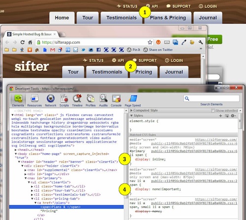
Having looked at how this technique works, I wouldn’t endorse it yet, because its practical value is not clear. Also, describing this as “responsive” could legitimize what is possibly a less than optimal coding technique. Below are screenshots of how it works on the Sifter website:

Altering the tabbed content in the navigation menu at Sifter. Large view.
How Is This Accomplished?
In this example (and in Roberto’s demo), you’ll notice a couple of things. The screenshots show two versions of the Sifter website at different screen sizes to demonstrate what is happening at two breakpoints.
When you view the website on a large device, the second-last menu tab will show the full label of “Pricing & Plans.” On smaller devices (anything up to the size of a tablet), the label changes to just “Pricing.” This particular example might not be a big deal, but my main concern is that this is being regarded as “responsive text.” It’s not. It’s simply hiding bloated content, and if the content is not important enough to show on smaller screens, then it’s probably not vital at any size.
Does the change in wording mean that information on Sifter’s plans is offered only to users on large devices, or is the “Plans” part redundant? We can assume not, because the tab at all screen sizes links to the …/plans page. This is potentially confusing for users on small devices: they clicked on “Pricing” but are sent to a page that outlines the plans first.
To show and hide the “Plans &” part of the tab, Sifter’s designer has wrapped the element in a span. For a single menu item, this isn’t the end of the world, but good luck going down the path that Frankie Roberto demonstrates with his paragraphs. I can’t imagine what a nightmare it would be to maintain multiple versions of actual page content and then tie them into breakpoints! (Not to mention our earlier question about whether text that is hidden at certain sizes is redundant in the first place.)
Hopefully, we all know to avoid hiding content with display: none !important;. Responsive design is many things; its many little tricks and techniques constitute a wonderful approach to making websites flexible. But hiding elements on a screen in this way should not be one of them.
It’s Just a Demo, Though, Right?
Frankie Roberto’s demo is just that: a demo. He’s clear about that, and he offers a suggestion for a use case. I applaud the effort — everyone should experiment with the Web. The Sifter website is a live website, though — not a demo or proof of concept — and what it has done is being described as “responsive text.”
I’m a huge fan of the concept of “one Web.” If you find you have to hide parts of your content on smaller devices, then you might need to refocus your efforts and write less bloated copy or reconsider your wording of page elements.
One of the joys of working “mobile-first” is having to maintain a sharp and critical eye in order to cut bloat (a capacity we should always exercise, of course). Responsive text seems to be the polar opposite of this approach. You are practically admitting from the outset that too much text is on the page. You are making the dangerous assumption that someone on a small device wouldn’t want to read the hidden text.
Maintenance Problems Will Come Hard And Fast
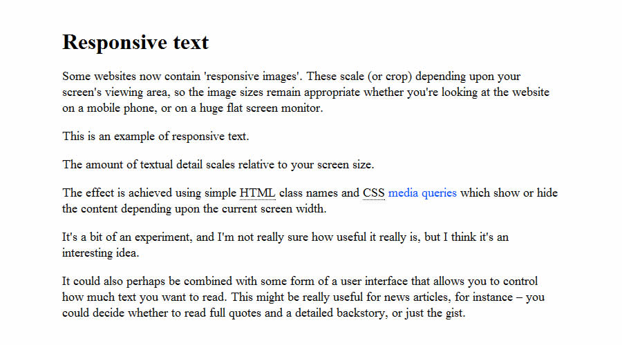
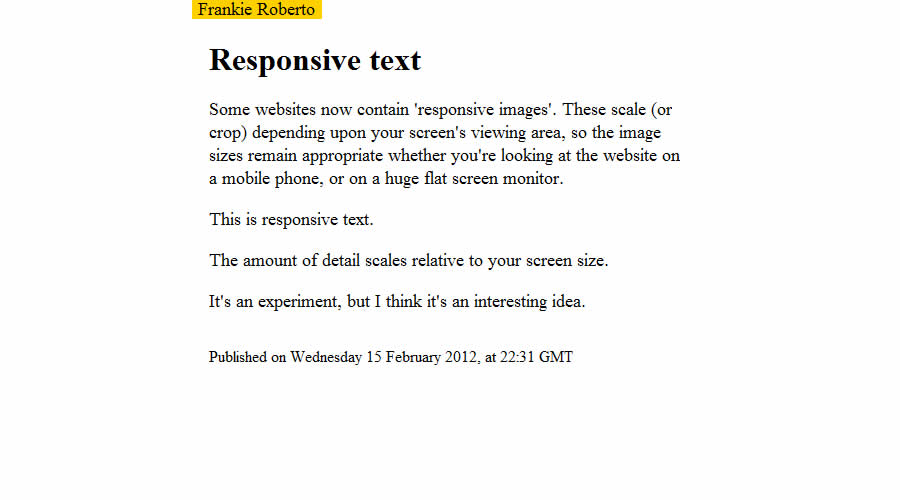
Frankie Roberto achieves a clever effect in his demo. On a large screen, you see all of the copy. And as the screen shrinks, so does the amount of content (and vice versa, of course).

Roberto’s full content, on a desktop screen.

On a smaller screen, the content is reduced.
Achieving this in the demo is easy. A CSS class is applied to the excess paragraphs to hide them.
Some Potential Problems to Consider
- The copy will have to be highly structured in order for it to be readable when parts of it are hidden on small devices. For example, if a content block has 10 lines, then it should still flow when lines 2, 5, 9 and 10 are hidden on a tablet and lines 2, 4, 5, 9 and 10 are hidden on a phone.
- The writer would need some mechanism in the CMS for flagging the breakpoints in the content. The method for updating content would end up being rather technical as a result.
If the message you are communicating on a small screen is sound, then there is nothing you could really “enhance” it with. Anything you add would simply be bloat.
Are There Any Potential Uses For Responsive Text?
I don’t think there are. But I realize this is just my opinion, and I encourage readers and the wider Web community to evaluate it for themselves and disprove me with solid examples.
When discussing this on Twitter the other day, I got interesting responses from a number of fellow designers. Many agreed that whatever you display on a small screen should be your content everywhere, because that is the distillation of your message.
Roberto (@frankieroberto) suggests a potential use case for adaptive news content; for example, showing a summary, a mid-length version or the full article depending on the device. This does sound like a useful way to digest news, but in such a fast-moving environment, I can’t imagine copyeditors would thank you for assigning them to write content that adapts so extensively and still makes sense in these different contexts. But it’s something to think about.
Stephanie Rieger points out that producing bloat-free content on a big website can be incredibly time-consuming:
@welcomebrand @froots101 Discussions with stakeholders reveal last round of copywriting took 6 mths End result, hide text on ‘lesser’ screen
No argument there. I’m working on rebuilding a large website, too, and am encountering the same issues. But I’m not sure that hiding content based purely on screen size is wise. If it’s not relevant or worth displaying, don’t simply hide it: delete or unpublish it.
In Conclusion
My interpretation of the Sifter website and what its designer is trying to achieve may be wrong (this is an opinion piece, remember!). Feel free to tell me as much in the comments below. But from my quick look at the design, code and copy, I won’t be embracing responsive text anytime soon, despite it being an interesting experiment and endorsed by some very clever folks.
I struggle to think of a use case that withstands the basic scrutiny that I apply to content for my clients, which is that if all of the content is not good enough to show on all devices, then the amount of content is not optimal. I recognize that this is a harsh stance, so do check out the code and experiments covered here so that you can make up your own mind.
Remember, just because something is “responsive,” it might not be best for your project.


 Register Free Now


 Try ProtoPie AI free →
 Celebrating 10 million developers


