The Smashing Book #3 Cover Design
After some doubting on my end (as I was slightly concerned about the timing), I decided to take on the project. This was just too good an opportunity, as the briefing basically said “Do your thing. We want your design”. It would have been foolish to refuse such a fun, creative challenge. In this post, I’d like to shed some light on the creative process behind the cover design and the rationale behind the cover design.
Sketches & Ideas
My basic idea for the cover design was to do something in combination with the logo, using the shape of the letter “S” as my starting point. I thought I would try out some kind of a geometrical pattern overlaying the logo. When I described this basic concept to Smashing Magazine team, there was already a positive reaction. They were really quite intrigued by the idea, and couldn’t wait to see what I would came up with.
Another idea I had in mind was an “Escher-like” surrealistic 3D effect. Once I sketched both ideas, I was less convinced of this 3D idea as the “S” would be too obvious, while the initial concept was to hide the “S”. What I wanted to achieve was some kind of a blend between some sort of pattern and the logo, making the logo a bit less obvious, but still there at the same time.
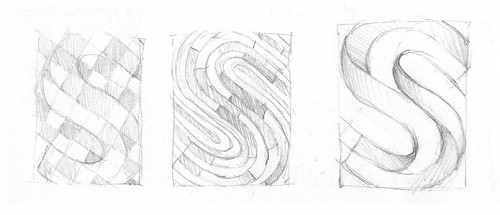
My sketches for the cover design. Large preview.
At first I tried to stick with only very minimal shapes (like circles and straight lines, etc.) keeping it all strictly geometrical. But the problem was that the “S” shape from the logo didn’t allow me to do this. As soon as I tried to overlay this on top of the logo, things got messy, because the “S” doesn’t follow the straight lines, or perfect circles; I was afraid this would be the case, but then thought I would just have to try it anyways to see if it could work. Sometimes the clear vision I had in my mind was wrong, and only knew for sure if I made a quick test. So I decided to start from the “S” shape instead, and go from there, which resulted in a more organic form, though still rather minimal.

Experiments showing some of the steps. Large preview.
The First Design Proposal
While covering the entire “S” with the pattern, I realized I was facing a problem: Where do I put the title? So then the idea came to mind for using the wavy line (which crosses the “S”) that is part of the logo, and trying to create some white space in the lower part of it. I also removed a bit of the pattern outside the “S” shape to avoid busyness, and to create a bit of a rest. In a way, I was thinking of creating some sort of transition between the logo and a new design.
The result was some sort of blend (or mix if you like) between the two, if you know what I mean. As an extra touch, I decided to add these white dashed lines. I thought it gave the design this extra detail (though later on, I changed my mind, which isn’t uncommon). Smashing Magazine’s team wasn’t much fond of it either, so we decided to just leave them out.
Choosing & Applying the Colors
As for colors, I decided to keep the palette “warm”, making the link again with the logo. I was mostly inspired by this particular image from my Inspiration Stream. I find it really hard to explain, in a practical way, how I apply colors. For me it has a lot to do with intuition; a feeling that certain colors go well together, and others don’t. It’s a very subjective matter, and who am I to say that, for example, a certain type of soft brown in combination with a flashy red doesn’t work well?
When I applied the colors to this design, I kept in mind that the segments could contrast well with each other. So I tried to apply them in a way that allows a dark brown segment to correspond with a lighter segment, such as yellow or orange. I also tried to make sure I was applying the same color again with a bit of space in between them (especially the darker and lighter ones, as they stand out the most).
Same goes for the blue version. Since the blue contrasted a lot with the warm colors, I made sure the blue was applied to separate locations, and also in proportion. To see if the colors are well applied — in this case with enough contrast — I usually do the test by looking at it from a distance. I enlarge the design, making it as big as possible on my screen, and I step away to look at it from a three meter distance.
After this test I decided to adjust the segment at the top that uses a gradient of yellow and pink; to me this one felt out of place, like the pink didn’t really fit in with the color palette. So I changed that segment into a yellow gradient, which is in harmony with the rest. In my first experiments, I had some magenta and pink in the mix, which was a “leftover”. It was only after this test that I felt I needed to change it. It would have made sense to keep it if there would still be magenta and other segments of pink in the design. But since this was the only segment, it felt out of place.
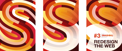
First steps of the initial design. Large preview
Adjusting The Design
Vitaly and his team really liked what I was proposing, especially the geometrical forms, and so it seemed that I was on the right track. One of the remarks was that the design might become a bit too complex at some point. There was also the suggestion to add more bright colors — such as blue — to match the new “Smashing” branding. Plus, there was the concern as to whether the large white area at the bottom didn’t distract too much, making it a bit difficult to recognize the “S” logo icon.
Adjusting the design, simplifying the shape, adding in some blue. Large preview.
Keeping this feedback in mind, I tried to find a balance between the original design and a lightweight version in terms of complexity — also trying to find the right balance between recognizing the “S” while maintaining the original design. I decided to reduce the segments, going from four divisions to three, instead. In this phase of the design I also began working with an empty Illustrator template to start composing the entire cover, including the back and the spine.
Another variation of the adjusted design. Large preview.
Change Of Plans
Right before I finished, as I showed Vitaly and his team the two designs (shown here above) Smashing Magazine published the article to announce the preorder of the book. They showed the initial cover design, eager to get the buzz starting for the new edition of the book. As it turned out, they also made the decision to publish a second, smaller book which wasn’t discussed in the beginning. To announce this book, which is to be called “Smashing Book #3⅓ — The Extension”, Smashing Magazine decided to create a temporary alternative blue version which was based on my initial design. In a way I found this good news, because apart from changing a few small details, I really liked my initial version. So I thought it might have a good chance after all.
Dealing With Feedback
In my humble opinion, I believe you become a great designer if you try to find the middle ground of what the client likes and what you like. After all, you design for the client, not for yourself. The client has to be 100% satisfied. But don’t get me wrong here, it’s not a one-way communication where the designer blindly follows what the client dictates to them. Sometimes the client’s feedback doesn’t offer any valuable point. Then it’s up to you to explain to the client why you think his or her direction is a bad idea.
But if it’s a matter of suggestion to try things out, or perhaps personal preference (like in this situation), than it’s up to you to make sure the design gets better. So the “middle ground” I just referred to doesn’t mean you end up with a lesser design. It’s our job to always try to top our initial design — sometimes it works out, sometimes it doesn’t, and sometimes the client may also agree with you.
Usually that happens to be the case for me, especially with clients who actually choose “me” because they like “my design style”. What I’m trying to say is, you just have to try to push yourself to the limit, being as creative as possible, to make it better, while taking feedback into account. In a lot of cases you’ll succeed, and it’s always very fulfilling when that actually happens.
Final Design
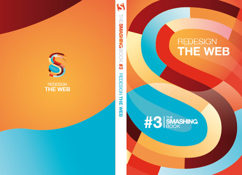
I had much hesitation when I started working on the previous designs. Based on the feedback, I was almost 100% convinced that it wouldn’t improved the design. I was afraid if I reduced the amount of divisions, it wouldn’t be that strong anymore, that the effect would be lost. But I believe I was wrong. Even though I still liked the initial design a lot, I had a hard time choosing which design I really preferred the most — the new ones seemed strong too, especially with that blue added into the mix. Smashing Magazine guys had the same feeling.
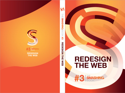
Initial design which is now final, including back and spine. Large preview.
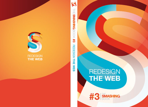
Since there will be two books now instead of one, Vitaly and his team decided to go for one of the new designs for this second book, and keep the initial design for the original #3 edition.
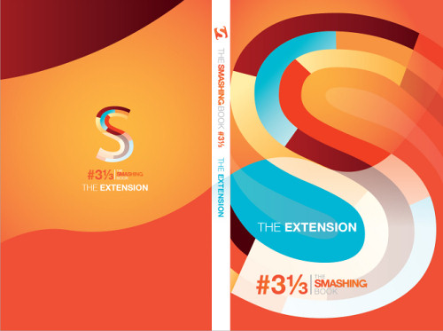
Design for the smaller additional book: #3⅓ The Extension. Large preview.
These designs are now 99% final as the spine will most likely change (at least if we stick to our initial plan). There is some idea for the spine that still has to be worked out, and so this part may just be temporary. A final item still needs to be delivered to me first, to check how it relates to what we originally had in mind. It all sounds rather abstract, I know, but I thought I would show you the cover in its entirety so you can get a better idea of how things will look.
Editor’s note: Veerle Pieters has also published this post on her blog. The team here at Smashing Magazine sincerely appreciates and respects Veerle’s dedication to creative quality work and her creative direction in this project.
The book is available in our Smashing shop.
Further Reading on SmashingMag:
- 50 Examples Of Stellar Use Of Light, Shadow And Texture
- Colorful Inspiration For Gray Days: Illustration And Photography
- Responsive Web Design: Meet The Brand New Smashing Book 5


 Register Free Now
 Try ProtoPie AI free →


 SurveyJS: White-Label Survey Solution for Your JS App

