Beercamp: An Experiment With CSS 3D
I recently had the pleasure of organizing this year’s Beercamp website. If you’re unfamiliar, Beercamp is a party for designers and developers. It’s also a playground for front-end experimentation. Each year we abandon browser support and throw a “Pshaw” in the face of semantics so that we can play with some emerging features of modern browsers.
This year’s experiment: a 3D pop-up book á la Dr. Seuss. If you’ve not seen it, hop on over and take a look. The website was a test to see how far SVG and CSS 3D transforms could be pushed. I learned a lot in the process and wanted to share some of the techniques that I found helpful when working in 3D space.
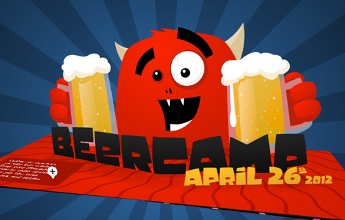
“Beercamp 2012: A Tale of International Mischief”
Before we jump in, please note that explaining everything about the website without boring you to death would be damn near impossible. For your sake and mine, I’ll provide just brief takeaways. As you skim through the code snippets, be aware that jQuery is being used and that a lot of code has been removed for simplicity (including browser prefixes).
Further Reading on SmashingMag:
- Front-End Challenge Accepted: CSS 3D Cube
- Adventures In The Third Dimension: CSS 3D Transforms
- 53 CSS-Techniques You Couldn’t Live Without
- Creating Responsive Shapes With Clip-Path
Finally, please remember that this is an experiment! It will not work in all browsers. It does not degrade gracefully, and the markup is less than poetic. Put your convictions on hold for a moment and let’s have some fun.
Takeaway #1: Exploring 3D Space Is Fun
Before I started building the Beercamp website, I did some “research” into what makes pop-up books so much fun. As I flipped through the paper-crafted version of Dr. Seuss’ Oh, the Places You’ll Go, I found myself inspecting each page from multiple angles. Seeing how things looked from different perspectives was fun, and interacting with the environment was engaging.
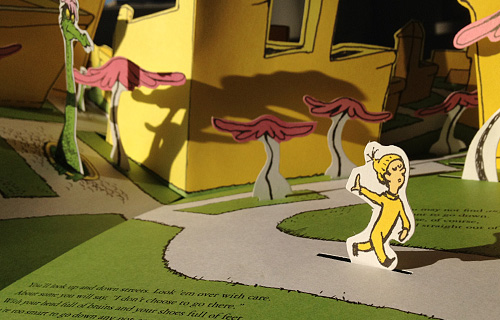
The inspiration for Beercamp: Dr. Seuss’ “Oh, the Places You’ll Go.”
I wanted to create that same engagement in my digital version with intuitive and unobtrusive controls. Thus, the scene rotates based on the mouse’s coordinates, allowing the user to move the book around without much effort. Achieving this was pretty easy:
1. Set up a listener.
This is for the mousemove event.
$document.mousemove(rotateScene);2. Calculate the rotation.
I wanted the book to rotate between -15 and 15 degrees, based on where the mouse is located along the x axis. This can be calculated using the following:
rotationY = -15 + (30 * e.pageX / $body.width());3. Apply the rotation.
$scene.css('transform': 'rotateY(' + rotationY + 'deg)');Pretty simple, right? The only problem is that our friends on iPhones and iPads don’t have mouse coordinates. They do, however, have a gyroscope. Rotating a phone is very similar to rotating a book, so adjusting the scene based on the device’s orientation made for an intuitive and delightful interaction. Setting this up was similar but slightly more involved.
1. Set up a listener.
window.addEventListener('deviceorientation', rotateScene, false);2. Determine the orientation.
Before we can calculate the rotation, we need to know whether the device is in landscape or portrait mode. This can be determined by evaluating window.orientation:
- Landscape
Math.abs(window.orientation) == 90 - Portrait
window.orientation == 0
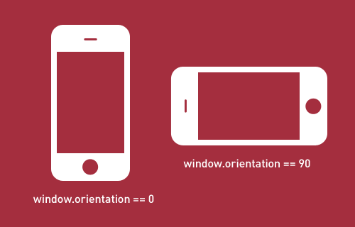
Determine the device’s orientation by evaluating window.orientation.
3. Calculate the rotation.
Now that we have the orientation, we can pull in the appropriate values from the gyroscope. If the device is in landscape mode, we’ll tap the beta property. Otherwise, we’ll use gamma.
var theta = (Math.abs(window.orientation) == 90) ? e.beta : e.gamma;
rotationY = 0 + (15 * (theta / -45));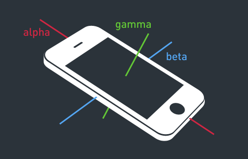
The deviceorientation event enables us to pull alpha, beta and gamma rotation values. Note that these values are relative to the current orientation of the device. The image above shows the axes of a phone held perpendicular to the ground in portrait mode.
4. Apply the rotation.
$scene.css('transform': 'rotateY(' + rotationY + 'deg)');Takeaway #2: Depth-Sorting Is Notoriously Buggy
A number of browsers support 3D transforms, but few do so elegantly. Apart from general efficiency issues, the biggest hindrance is improper depth-sorting.
Depth-sorting is required when two planes intersect in three-dimensional space. The rendering engine must determine which plane (or, more specifically, which areas of the plane) should be rendered and which should be clipped.
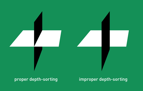
Depth-sorting varies across browsers.
Unfortunately, each browser implements depth-sorting differently and, therefore, has its own issues. The best we can do to combat the glitchy pop-through of underlying elements is to keep planes away from each other.
The Beercamp website involves numerous plane intersections. Initially, I had all of the pages rotating around the same point in 3D space (0, 0, 0). This meant that just about every plane in the book was fighting to be on top. To counter this, the pages needed to be positioned as if they were next to each other along the spine of an actual book. I did this by rotating the pages around an arc, with the open page at the pinnacle.
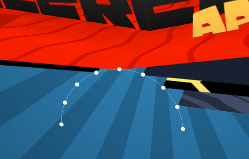
Rotating pages around an arc helps to prevent clipping.
function updateDrag(e) {
    …
    // operate on each spread
   $('.spreads li').each(function(i) {
        // calculate the angle increment
        var ANGLE_PER_PAGE = 20;

        // determine which slot this page should be turned to
        var offsetIndex = per < 0 ? 5 + curPageIndex - i : 5 + curPageIndex - i - 2;

        // calculate the angle on the arc this page should be turned to
        var offsetAngle = per < 0 ? offsetIndex - per - 1 : offsetIndex - per + 1;

        // calculate the x coordinate based on the offsetAngle
        var tarX = 5 * Math.cos(degToRad(offsetAngle * ANGLE_PER_PAGE + 10));

        // calculate the z coordinate based on the offsetAngle
        var tarZ = 5 * Math.sin(degToRad(offsetAngle * ANGLE_PER_PAGE + 10));

        // position the page
        $(this).css('transform', 'translateX(' + tarX.toFixed(3) + 'px) translateZ(' + tarZ.toFixed(3) + 'px)');
    });
}
This technique helped to clear up most of the depth-sorting issues, but not all of them. Further optimization really relies on the browser vendors. Safari seems to have things worked out on both desktop and mobile. Chrome Stable struggles a bit, but the latest Canary works wonderfully. Firefox does a fine job but suffers from slow frame rates. It’s a tough battle to win right now.
Takeaway #3: Vector Space Is Tricky But Useful
Building the pop-ups was by far the most difficult aspect of the project, but also the most satisfying. Other pop-up books have been built on the Web, but I’m unaware of any that use realistic pop-up mechanics. This is with good reason — achieving it is deceptively complex.
The magic of programming pop-up mechanics lies in the calculation of vector space. A vector is essentially a line. Knowing the lengths and directions of lines enables us to perform operations on them. Of particular use when building pop-ups is the vector cross product, which is the line that runs perpendicular to two other lines in 3D space.
The cross product is important because it determines the upward rotation of each pop-up piece. I’ll spare you the headache of play-by-play calculations (you can view the math below if you’re really interested). Instead, let’s try a visual representation.
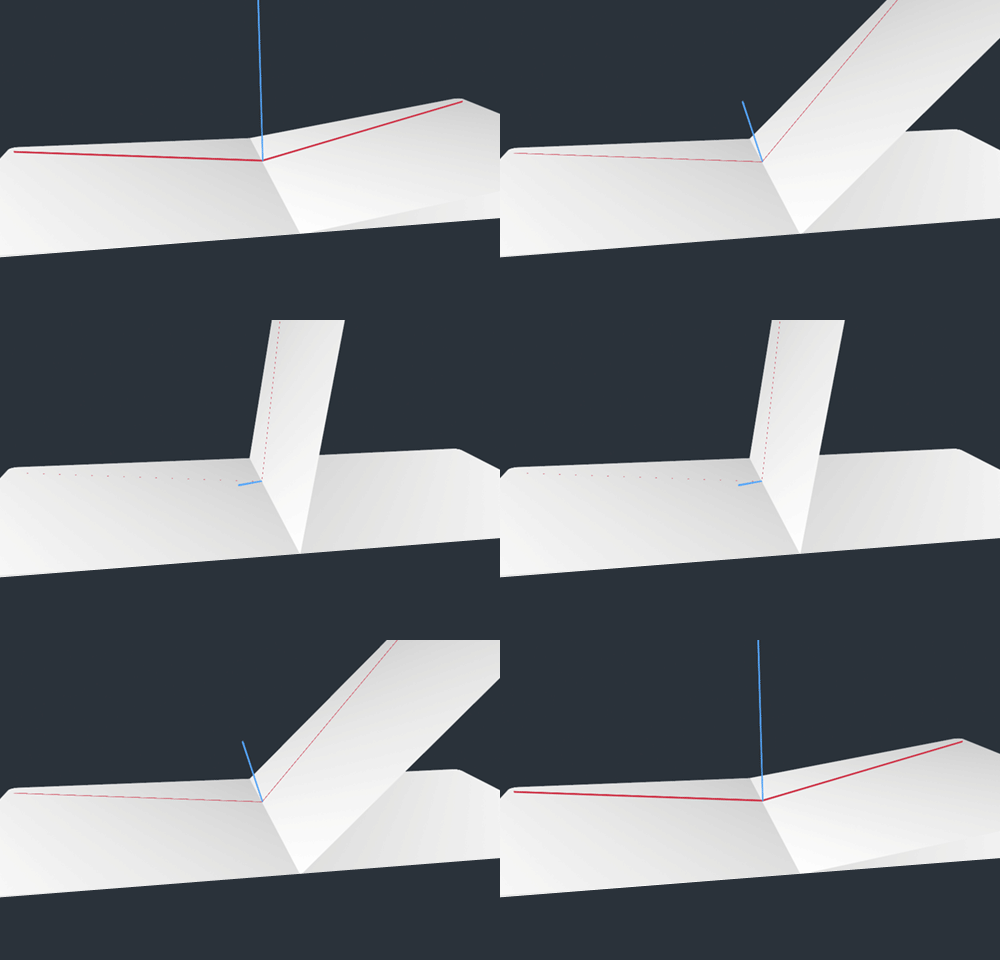
The vector cross product in action.
We start by determining two points where each pop-up piece touches the page within 3D space. Those points are used to define a vector for each pop-up piece (the red lines). Using those vectors, we can calculate their cross product (the blue line), which is essentially the line at which a physical pop-up folds in half. Rotating each piece up to the cross product then gives us perfectly aligned pop-ups!
This is not exactly easy math in my opinion, but it is extremely useful. If you’re interested in playing with vectors, I strongly recommend Sylvester. It really simplifies vector math.
function setFold() {
    var points = [];

    // origin
    points[0] = [0, 0, 0];

    var adj = Math.sqrt(Math.pow(POPUP_WIDTH, 2) - Math.pow(POPUP_WIDTH * Math.sin(degToRad(-15)), 2));

    // left piece: bottom outside
    points[1] = [-adj * Math.cos(degToRad(-180 * fold)), adj * Math.sin(degToRad(-180 * fold)), POPUP_WIDTH * Math.sin(degToRad(-15))];

    // right piece: bottom outside
    points[2] = [adj * Math.cos(degToRad(-180 * 0)), POPUP_WIDTH * Math.sin(degToRad(-180 * 0)), POPUP_WIDTH * Math.sin(degToRad(-15))];

    // left piece: top inside
    points[3] = [-POPUP_WIDTH * Math.cos(degToRad((-180 * fold) - 90)), POPUP_WIDTH * Math.sin(degToRad((-180 * fold) - 90)), 0];

    var len = Math.sqrt(Math.pow(points[1][0], 2) + Math.pow(points[1][1], 2) + Math.pow(points[1][2], 2));

    // normalize the vectors
    var normV1 = $V([points[1][0] / len, points[1][1] / len, points[1][2] / len]);
    var normV2 = $V([points[2][0] / len, points[2][1] / len, points[2][2] / len]);
    var normV3 = $V([points[3][0] / len, points[3][1] / len, points[3][2] / len]);

    // calculate the cross vector
    var cross = normV1.cross(normV2);

    // calculate the cross vector's angle from vector 3
    var crossAngle = -radToDeg(cross.angleFrom(normV3)) - 90;

    // transform the shape
    graphic.css('transform', 'translateY(' + depth + 'px) rotateZ(' + zRot + 'deg) rotateX(' + crossAngle + 'deg)');
}
Takeaway #4: SVG Is Totally Tubular
I know, I know: you’ve heard the case for SVG before. Well, you’re going to hear it again. SVG is an incredible technology that works really well in 3D space. All of the illustrations on the Beercamp website were done in Illustrator and exported to SVG. This provided numerous benefits.
Benefit 1: Size
Because the pop-up pieces required large areas of transparency, the file-size savings of SVG were enormous. PNG equivalents would have been 200 to 300% larger than the uncompressed SVGs. However, we can reduce file size even more by exporting illustrations as SVGZ.
SVGZ is a compressed version of SVG that is incredibly small. In fact, the SVGZ files for Beercamp are up to 900% smaller than their PNG equivalents! Implementing them, though, requires some server configuration. This can be done easily with an .htaccess file:
AddType image/svg+xml svg svgz
AddEncoding gzip svgz
Benefit 2: Flexibility
The flexibility of SVG is perhaps its most highlighted benefit. The graphics on the Beercamp website are scaled in 3D space to fill the browser window. There are also hotspots on each page that allow the user to zoom in for more details. Because everything is handled with SVG, the illustrations remain crisp and clean regardless of how they’re manipulated in 3D space.
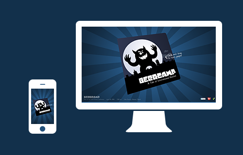
SVG files are inherently responsive.
Benefit 3: Self-Contained Animation
All of the SVGs on the Beercamp website are implemented as background images. This helps to keep the markup clean and allows images to be reused in multiple locations, such as with the pop-up pieces. However, this means we lose DOM access to each of the nodes. So, what if we need some animation on the background SVGs?
SVG allows us to define animations within the file itself. All of the pop-up images in the final Beercamp website are static, but an earlier version featured animated beer bubbles. To increase performance in some of the less-capable browsers, these were taken out. However, the SVG animations ran very smoothly in WebKit.
SVG animation gets less hype than its CSS cousin, but it’s just as capable. Within an element, we can add an animate node to specify typical animation settings: properties, values, start time, duration, repeat count, etc. Below is an excerpt from one of the Beercamp bubbles.
<circle fill="#fff" opacity=".4" clip-path="url(#right-mug-clip)" cx="896" cy="381" r="5">
    <animate attributeType="XML" attributeName="cx" from="890" to="881" begin="7s" dur="5s" repeatCount="indefinite" />
    <animate attributeType="XML" attributeName="cy" from="381" to="100" begin="7s" dur="5s" repeatCount="indefinite" />
</circle>
Takeaway #5: Experimentation Is Messy But Important
Now that the practical tidbits are out of the way, I’d like to say a word about experimentation.
It’s easy to get boxed in by the reality of developing websites that are responsive, cross-platform, cross-browser, gracefully degrading, semantically perfect, progressively enhanced, _______, _______ and _______ (space to fill in upcoming buzzwords). These techniques are useful on production websites to ensure reach and consistency, but they can also limit our creativity.
I’ll be the first to admit it: the Beercamp website is buggy. Browser support is limited, and usability could be improved. However, the website is an experiment. It’s meant to explore what’s possible, not satisfy what’s practical.
A dogma is emerging in our industry — and the buzzwords above are its doctrine. Experimentation enables us to think beyond that dogma. It’s a wonderful exercise that indulges our curiosity, polishes our talent and ultimately advances our industry. If you’re not experimenting in some capacity, you should be.
The State of CSS 3D
CSS 3D has yet to hit a tipping point. Browsers simply don’t support it well enough, but there is promise on the horizon. Mobile Safari, with its hardware acceleration, renders 3D transforms extremely fast and with very little depth-sorting issues. It’s only a matter of time until other manufacturers release stable implementations. It’ll be interesting to see how CSS 3D techniques hold up against other emerging technologies, such as WebGL.
Remember Flash? Me neither.
You’re Invited
By the way, Beercamp is being thrown by nclud at the Front-Trends Conference in Warsaw. If you’re headed to the conference, you should stop by and say hello!
Related Links
- “An Introduction to CSS 3-D Transforms,” David DeSandro, 24 Ways A good primer on CSS 3D.
- Animation, W3C
- Sylvester This JavaScript library simplifies vector and matrix math.
- Beercamp 2011 Last year’s Beercamp website by Dave DeSandro.
- Front-Trends Conference Takes place 26 to 27 April 2012 in Warsaw, Poland.


 SurveyJS: White-Label Survey Solution for Your JS App

 Register Free Now
 Celebrating 10 million developers


