Creating Mobile-Optimized Websites Using WordPress
“Mobile Web design.” Unless you’ve been hiding under a bush for the last 18 months, you’ll know that it’s one of the hottest topics in the industry at the moment. Barely a week goes by without new tips being unveiled to help us hone our skills in making websites work as well — and as fast — as possible on mobile devices.
If you own or have designed a WordPress website for the desktop and are considering going mobile, the process can be fairly daunting. You probably know of responsive design and might have heard of the mobile-first approach developed by Luke Wroblewski, which entails planning the content and design for mobile devices first and then desktops second, rather than the other way round.
Further Reading on SmashingMag:
- Creating Mobile-Optimized Websites Using WordPress
- How To Become A Top WordPress Professional
- Useful WordPress Tools, Themes And Plugins
- Writing Effective Documentation For WordPress End Users
But if your WordPress website has a desktop theme in which everything is set in pixels, then the thought of adopting a responsive design might have you running for the hills.
It doesn’t have to be that way.
Here are four ways to make your WordPress blog or website mobile-friendly, ranging from the quick and dirty to the complex but potentially very beautiful. As well as outlining the pros and cons of these methods, we’ll include information on plugins that will help without actually doing all the work for you, and we’ll provide some code that you can use for a responsive design.
Plugins: The Quick Way To Make Your Content Mobile-Friendly
Designing for content is increasingly becoming more common than squeezing content into a pixel-perfect design, as documented here on Smashing Magazine.
If your website is more about content than design (say you run a blog that is content-heavy and designed for reading), then you won’t be too fussed about what your website looks like on mobile devices. You just want people to be able to read it without having to zoom in, move the viewport around or generally tie themselves up in knots until they decide to leave.
If this is the case, then a simple plugin might do the trick. Below are some plugins to consider.
WPtouch
WPtouch, which comes in free and premium versions, strips out your existing theme and displays your content and not much else, but the result is user-friendly, robust and easy to read.
WPtouch is widely used on websites, including Stephen Fry’s blog and Social Media Examiner. You can see below how the plugin renders those two websites. The premium version has options to modify the colors and some styles, including a bespoke menu at the bottom of the screen, as seen on Social Media Examiner.

Social Media Examiner desktop design
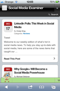
Social Media Examiner mobile design, using WPtouch
WordPress Mobile Pack
The WordPress Mobile Pack has some color options and can be used as a mobile switcher if you want a completely different theme for mobile devices. It also has a mobile interface for editing posts, although this has been superseded to some extent by the WordPress apps for iOS and Android.
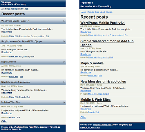
WordPress Mobile Pack screenshots
BuddyPress Mobile
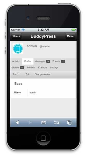
If your website runs BuddyPress, then you’ll need a plugin to ensure that none of its functionality is lost on mobile devices. BuddyPress Mobile has theming options, and you can edit the style sheet to make the mobile design your own.
Mobile Themes: The Next Level Up
If you want a consistent design across desktop and mobile, but you don’t yet have a theme or you want to develop one, then a mobile theme might be the answer.
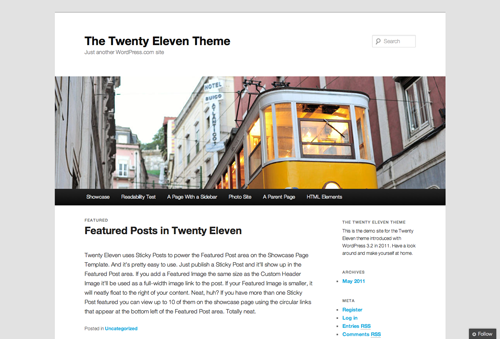
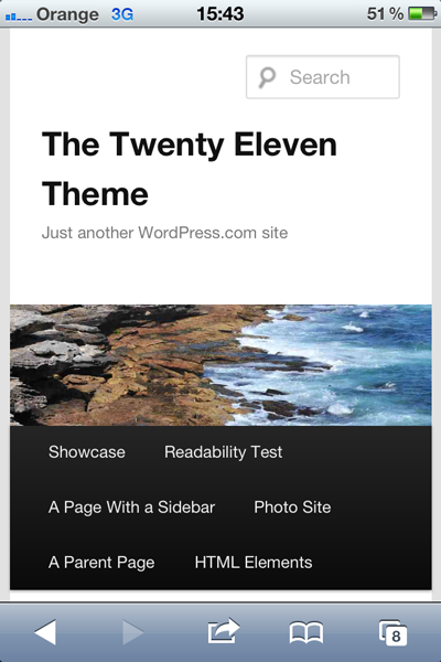
More and more mobile themes have sprung up over the last year. In particular, Twenty Eleven, WordPress’ default theme since version 3.0, is responsive enough for many websites.
Below are some other themes that include a mobile or responsive style sheet.
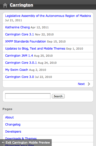
Carrington
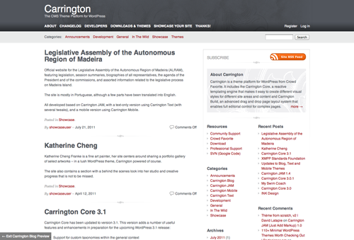
The Carrington family of themes can be used as parent themes. You can edit the CSS and functions to suit your needs, and it has a mobile version.
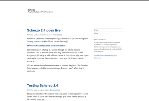
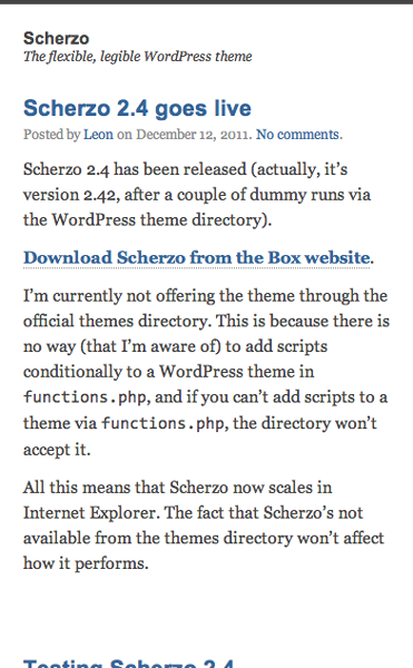
Scherzo
Scherzo is clean and minimalist and would be great to use as a parent theme. It uses a mobile-first responsive design.
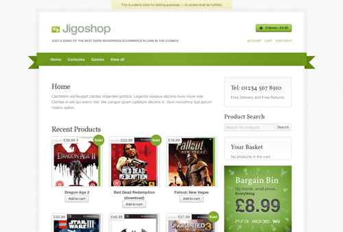
Jigoshop
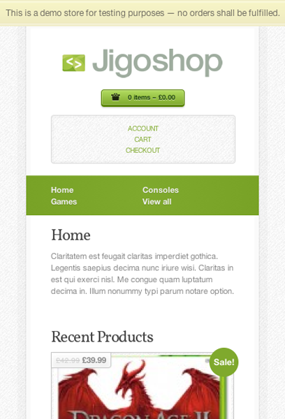
E-commerce websites are trickier to make mobile-friendly, but Jigoshop can help. It’s a full e-commerce plugin and theme, with a responsive layout that can be tweaked to suit your design.
A Different Theme For Mobile Devices
In the days before responsive design gained traction, websites commonly had two versions: desktop and mobile. The mobile version might have been on an m. subdomain or have a .mobi extension. Some websites out there still do this, mainly huge news websites that serve different content depending on the device.
Fewer WordPress administrators are choosing to do this now, but if you do want to go down this route, then serving two versions of your website from the same database is possible, by using a mobile switcher.
Here are two plugins that make this possible:
- WordPress Mobile Pack This tool, already mentioned above as a theme that makes your website mobile-friendly, can also be used as a mobile switcher, detecting mobile devices and using a separate theme of your choice.
- WPtap Mobile Detector This targets mobile devices and enables the theme of your choice.
Using one of these plugins enables you to develop a completely separate theme for mobile devices, with its own layout, navigation and content structure.
Or, Finally, Make Your Current Theme Responsive
If you don’t want to throw out your existing theme, then the best way to give mobile users an experience that is at least visually similar to the desktop version is to build responsiveness into your theme.
A responsive theme contains media queries in the theme’s style sheet to define CSS that applies only to devices of a specified maximum or minimum width. A truly responsive theme has a fluid layout that adapts to mobile devices and larger screens to some extent already, but with some extra styling to make the layout optimal for mobile devices.
1. Defining the Media Queries
To get started, you will need to define media queries in the style sheet. Most of the styles already in your style sheet apply to desktop and mobile, so you only need to add CSS that is different for mobile devices. This will go at the end of your theme’s style sheet.
Start by defining the screen width you are developing for. There are two main approaches to this:
- Start with the narrowest screen width you are targeting (which will usually be mobile phones in portrait orientation); add all of the CSS needed for this screen width; and then add successive media queries for wider screens. This is known as the mobile-first approach, and it has the benefit of making websites faster on mobile devices because only the CSS needed for those devices is loaded.
- Start with the widest screen width (usually desktop monitors) and work down, adding CSS that applies to each screen width in turn. While this might slow down loading on mobile devices, it has the advantage of working in IE 8 and below, which doesn’t understand media queries. At the moment, most websites are developed this way because they involve making an existing desktop design responsive, so this is the approach we’ll cover here.
A media query consists of three main parts:
- The
@mediarule; - The media type (the most common being
printandscreen— we’ll usescreen); - The maximum width of the screen you are targeting.
You could have a media query to target mobile phones (and other small devices such as the iPod Touch) in portrait orientation that have a width of 320 pixels:
@media screen and (max-width: 320px) {

}
The CSS to be applied to that screen width and any screen narrower than it would be written between the braces.
An alternative to the @media rule would be to create a linked style sheet with the CSS for each screen width. But I don’t do that because it adds another server request with the potential to slow the website down; and managing all of the styles becomes harder if they’re in more than one place.
Here are other media queries for commonly targeted screen sizes:
(max-width: 480px)Works for mobile devices in either portrait or landscape mode, because they are 480 pixels wide in landscape orientation but are still narrower than this maximum width in portrait.(max-width: 780px)Works for iPads and other large tablets in portrait mode and any screens narrower than them.(max-width: 1024px)Works for iPads in both orientations, as well as for small desktop browsers.
You can run one media query after another so that each change you make applies to the screen size you’re querying, plus any widths queried further down in the style sheet. In this case, you would work with wider screens first. For example:
@media screen and (max-width: 480px) {

}
If you are ignoring tablets, you would include this media query first and add any CSS for mobile phones in both portrait and landscape modes (for example, any changes to graphics or text size). You would then follow it with this:
@media screen and (max-width: 320px) {

}
Here, we’re adding any styles that apply only to phones in portrait mode (such as layout changes). You don’t need to repeat the CSS that applies to both landscape and portrait modes because this will still apply. In the same way, you don’t need to repeat any styles that will stay the same for desktop views because they will cascade down from the earlier parts of the style sheet.
2. Making the Layout Responsive
Phew! So, now we’ve defined media queries, and we’re ready to roll with some mobile-friendly CSS. Below are the main things you will need to work on for a standard WordPress website. Let’s assume your website’s markup is similar to that of the Twenty Eleven theme (i.e. html → body → header (or div #header) → #main → #content → #primary → #secondary → footer (or div #footer). You might need to substitute your own elements and IDs for the ones in the examples below.
Overall width of website You’ll need to change this so that it displays correctly. Add the following code between the braces of your first media query:
body {
width: 100%;
float: none;
}
This ensures that the website’s body fills the width of the device and removes any floats. At this point, you might also want to change the background image if there is one (more on that shortly).
You will now have the following code at the bottom of your style sheet:
@media screen and (max-width: 480px) {
   body {
   width: 100%;
   float: none;
   }
}
Width of content and sidebar In portrait mode in particular, there isn’t room for a sidebar to the right of the main content. Add the following code to the media query relating to devices with a maximum width of 320 pixels:
#content, #primary, #secondary {
width: 100%;
float: none;
margin: 10px 0;
}
Footer content, especially widgets If your footer has widget areas or other elements with floats applied, you will need to override them for mobile devices in portrait mode.
If you want the footer widgets to be full width in both landscape and portrait modes, then simply add footer.widget-area to the CSS for the sidebars and content.
However, you might want the widget areas to be laid out side by side in landscape mode, depending on how many you have. In that case, you’ll need to do the following:
- Work out the percentages for the widths, padding and margins (some box-model maths for you!);
- Add the relevant code to your media query for devices with a maximum width of 480 pixels;
- Add a separate query for devices with a maximum width of 320 pixels after the one you’re working on, with the following code:
footer .widget-area {
width: 100%;
float: none;
margin: 10px 0;
}
You might also need to adjust the text alignment and borders and padding, depending on your existing theme. Margins should be set to 0 on the left and right; suit them to your theme at the top and bottom, but generally they should be smaller than in the desktop version.
Image sizes The images in your design might still break the layout or break out of their containing elements, making your website shrink when viewed on a mobile device. There is an easy fix for this:
body img {
max-width: 100%;
}
This will ensure that images are never wider than their containing element. You might need to tweak the CSS if images sized further up in the style sheet have greater specificity.
However, this solution isn’t ideal. The images might look smaller, but mobile devices will still have to download their full sizes, which will slow down response times and possibly lose visitors, as well as annoy users on expensive data plans (more of them are out there than you might think). There a number of solutions to this, some of which you will find in this roundup of articles on responsive images. You may recall the mobile-first approach mentioned earlier; one benefit of this approach is that it serves different-sized image files to devices based on screen width.
Text size So, our layout is working, and everything displays nicely. But now that the website is narrower, the text might appear huge. We’ll need to adjust the text’s size with the following code:
body {
font-size: 60%;
line-height: 1.4em;
}
This sets the font size as a percentage of the size set for it further up in the style sheet.
4. Changing the Navigation Menus and Creating an App-Like Interface
Sometimes mobile users will want to access specific content; for example, visitors to a store’s website will want to find the store’s location easily, and visitors to an e-commerce website will want to shop with a minimum of clicks (or taps). Sometimes you might want to adjust the navigation to make the website look more like an app.
Here are some methods you can follow to do this:
- Use CSS to turn menu items that are visible on the desktop into drop-down menus, using code similar to what you would use to create a second-level drop-down menu on a desktop website.
- Use conditional PHP or a plugin such as Mobble to display a different menu depending on the device, as seen on the website that I developed for Centenary Lounge:
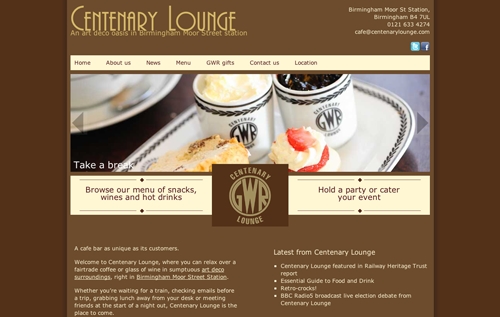 Centenary Lounge desktop website
  Centenary Lounge mobile website
 - Use CSS to display menu items as a vertical list of buttons to give the website an app-like look, such as on Cafe Blend:
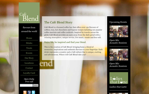 Cafe Blend desktop website
 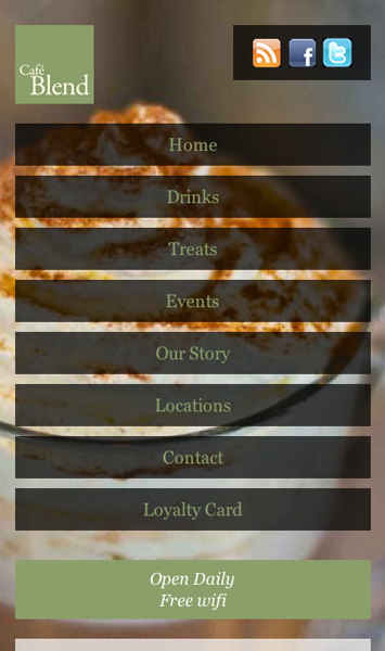 Cafe Blend mobile website
 - Use a plugin such as Dropdown Menus to display menu items as a drop-down walker, freeing up screen real estate.
- Use background images combined with media queries and floats, to create a grid of visual buttons for your navigation, giving the home page an app-like feel.
- Use fixed positioning to fix the navigation to the bottom of the screen, minimizing the need for scrolling, as seen earlier on Social Media Examiner.
The possibilities are limited only by your imagination and creativity!
5. A Problem!
You’ve added the media queries above, but your smartphone still displays the desktop version. Don’t worry! This is because many smartphones use a virtual viewport that is equal to the width of a small desktop, which prevents desktop-designed websites from breaking when rendered in the browser. This can be easily fixed by placing the following code in the head of each page. Because yours is a WordPress website, you need to add it only once, to the header.php theme file:
<meta name="viewport" content="width=device-width">What this does is tell the phone to treat the size of the screen as its actual size, not the virtual size… if that makes sense.
Summary
Here’s what we’ve looked at in this article:
- Four different ways to make a WordPress website mobile-friendly: with a plugin, with a prebuilt responsive theme, with a separate mobile theme, and by making the existing theme responsive;
- Media queries for responsive design and how they target different device widths;
- Some common styles to make a WordPress website responsive in its layout, images and text.
As you can see, no one option is necessarily the best; it will depend on the website, on the budget and on the time and capability of those involved. Over time, most mobile-friendly WordPress websites will have responsiveness built into them, instead of using a separate theme, mobile website or plugin.
Hopefully this article has given you a starting point to make your WordPress website mobile-friendly. This is just the beginning of the possibilities. To further develop your mobile website, you might want to consider a mobile content strategy; a mobile-first design; APIs and native device functionality to create an even more app-like experience; and more.
Enjoy!


 SurveyJS: White-Label Survey Solution for Your JS App
 Celebrating 10 million developers
 Try ProtoPie AI free →
 Register Free Now

