Create A Responsive, Mobile-First WordPress Theme
Let’s assess the situation. WordPress is an extremely popular, flexible, easy to use and open-source blogging and CMS system. More and more mobile devices are flooding the market every day, changing the way people use the Internet. And the need is growing for more beautifully designed and coded WordPress themes that work well across all of these devices. So, what are we waiting for? Let’s get to work!
At first, the idea of designing and developing a fully responsive, mobile-ready WordPress theme might be overwhelming. You might be thinking, “How do I handle a responsive design with all of this flexible content that a WordPress theme has? What should I consider when designing for touch devices? And do I really have to get rid of drop-down menus and other hover elements on mobile devices?”
Further Reading on SmashingMag: Link
- Modifying Admin Post Lists In WordPress
- Useful Free Admin Plugins For WordPress
- Ten Things Every WordPress Plugin Developer Should Know
- Inside The WordPress Toolbar
But after doing some research and looking more closely at some of the responsive WordPress themes and theme frameworks out there, you will probably wrap your head around the idea pretty quickly, and the evolving world of WordPress theme design will sound like a huge opportunity that you can’t wait to get started on.
It’s All About Preparation
Having a detailed design concept is even more important for a responsive WordPress theme than for a static-width theme. At this stage, you haven’t decided anything, so nothing will get in your way of creating a clever and practical layout that adapts smoothly to different screens.
First, consider what you want to achieve with your WordPress theme, which user group you are targeting, and what their needs are. With these considerations, you can create a list of useful elements for your layout.
Creating the Theme’s Concept
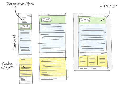
Using this list, you can plan your theme by sketching the layout at various screen sizes.
When sketching, be aware that the layout widths you choose are only rough reference points to represent the common screen sizes of today’s smartphones, tablets and desktop computers. Your goal should always be to create a responsive design that adapts smoothly to a wide diversity of screen sizes.
Ethan Marcotte, author of Responsive Web Design, described his approach to responsive Web design in a recent interview, explaining:
I’m a big, big believer of matching breakpoints to the design, not to individual devices. If we’re after more future-proof responsive designs, we should stop thinking in terms of “320px,” “480px,” “768px,” or whatever — the Web’s so much more flexible than that, and those pixels are a snapshot of the Web as we know it today. Instead, we should focus on breakpoints tailored to the design we’re working on.
While working on your concept sketches, also think about which layout options to offer in the theme (such as header and sidebar options or multiple widget areas) and how they will adapt to different screen sizes as well.
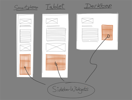
An optional sidebar element in a responsive layout.
Tools for Concept Sketching
Which tool you use to develop the theme’s concept is not important. Just choose one that allows you to work quickly and that doesn’t interrupt your workflow.
If you feel most comfortable sketching on a piece of paper or in a notebook, go for it. You could also try sketching on an iPad using a popular app such as Paper by FiftyThree or Bamboo Paper, together with a digital pen like Wacom’s Bamboo Stylus. Working directly on a tablet will make sharing your ideas later with the developer a lot easier. One of my all-time favorite articles is Mike Rohde’s “Sketching: The Visual Thinking Power Tool,” which promotes sketching as a simple visual tool for thinking.
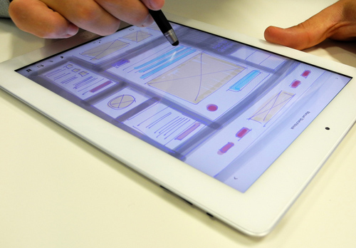
Use your tablet a simple fast sketching tool.
A Good Concept Saves Time
If you develop the concept precisely at the beginning of the project, you will save a lot of time and effort later in the design process. The layout will adapt to different screen sizes more intelligently if you have thought a lot about the design’s behavior before even opening Photoshop (or your software of choice).
Theme-Specific Challenges to Consider
Because designing a WordPress theme with very flexible content is quite a different challenge than designing a static website, at this early stage of the process you should find solutions to the following theme-specific problems:
1. WordPress’ Navigation Menu
Until responsive Web design found its way into WordPress theme designs, most themes seemed to rely on good old-fashioned drop-down menus to give users multi-level navigation. But because drop-down menus rely on mouse hovering, they don’t work well on touch devices.
We already have some smart solutions for developing responsive, touch device-ready navigation. Brad Frost has a very helpful resource comparing common solutions for responsive menus in his post “Responsive Navigation Patterns.”
2. Responsive Layout Options
Most themes offer users at least some layout options, such as left or right sidebar, header widget and footer elements. To offer this kind of flexibility in a responsive theme, you will have to consider how all of the layout elements will behave on different screen sizes. For instance, if you want to offer a left sidebar option, consider that the content of this sidebar would appear above the main content area on mobile devices. In most cases, this wouldn’t be the best solution because mobile users want to read the most important content first (such as the latest blog post) without having to scroll down a sidebar.
3. Flexible Widget Areas
Widget areas are another challenge for responsive designers. After all, designing one is not easy if you don’t know what kind of content the user will put in it. So, you need to make sure that the design works no matter which and how many widgets are used in the widget areas.
Enough Headaches. Let’s Get To The Fun.
Because you are creating a responsive website, designing the entire website pixel by pixel in Photoshop and then just handing it over to the developer would result in too static a design and too time-consuming a process.
Working With Reference Points
Instead, the design process should be used to figure out the general look and feel of the theme. At this stage, you should also work more intensively on the challenges mentioned, such as responsive navigation, layout variations and flexible widget areas.
How you prepare the design for further development will depend partly on the nature of the project and how closely you will work with the developer. In general, showing your design in the three layout versions is a good starting point: smartphone, tablet and desktop. These “screenshots” can then be used as reference points for development.
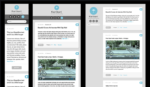
A responsive layout in three variations.
Designing in the Browser
Design details such as font sizes, white space and button styles can be defined later directly in the browser. Because browsers often treat these elements differently, designing and testing them directly in their final environments is way more efficient.
Designing for Touch Devices
Because your design will also be used on touch devices, you have to consider the special requirements of these devices. Using a finger to navigate a website is entirely different than using a precise mouse cursor.
This is why buttons and form input fields need to be at the right size. Font sizes and white space should also be applied more generously, so that users can navigate easily and read content comfortably.
Exercise Your Communication Skills
Staying in constant communication with the developer during the entire process is very important (i.e. if you are not the developer yourself). Especially in a responsive design process, incorporating the developer’s knowledge into your decisions will keep you from having to change things later on.
Development
After wrapping up the design process, the first decision to make is whether to code the theme from scratch or to use a blank or starter theme (such as Automattic’s Toolbox or the newer _s theme).
If you want to work with one of the popular responsive frameworks such as Twitter’s Bootstrap or ZURB’s Foundation, then you could use a starter theme that already includes the framework, such as BootstrapWP or WordPress Foundation. Another popular starter theme is Bones, which uses 320 and Up as a mobile-first boilerplate.
Of course, the way you start a theme will always depend on the project and your personal preferences. But if you’re still learning, then a blank theme would serve as a solid foundation for development.
Go Mobile First
A smart approach is to design and develop for the smallest layout first (i.e. smartphones) and then work your way up to tablet and desktop screen sizes. To get further insight into the mobile-first approach to Web design, read the book Mobile First by Luke Wroblewski.
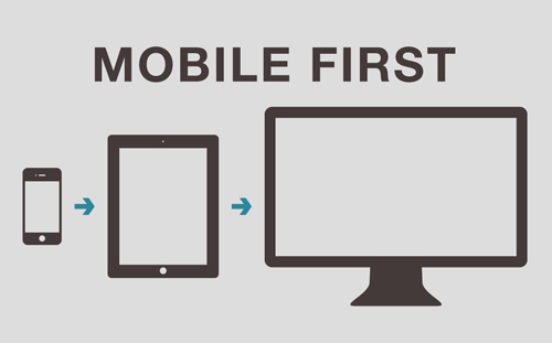
Design and develop your WordPress theme starting with the smallest size first.
Supporting Media Queries in Old Browsers
With the smartphone layout as your default, you will need to rely on a JavaScript solution such as Respond.js to support media queries in old browsers (such as Internet Explorer 7 and 8).
Alternatively, you could add CSS classes for old IE browsers through conditional comments, and then add CSS styles to set a maximum width for old IE browsers outside of your media queries. You can find a detailed explanation of this method in the article “Leaving Old Internet Explorer Behind.”
Images in a Responsive Theme
With the release of high-pixel-density devices such as the new iPad and new MacBook Pro, you will also need to reconsider the images in your theme.
Alternatives to images would be to use a CSS solution or use icon fonts. Fewer images will also result in a much more lightweight theme, which will speed up performance on slow mobile Internet connections. Trent Walton shares his reflections on the Retina-optimization of Web design in his article “In Flux.”
Test, Test, Test
Particularly when developing a responsive theme, testing your work live as soon and as often as possible is critical. This way, you can quickly correct styles during development as necessary. Also, test whether fonts are easy to read and whether images, gallery sliders and embedded elements such as video work correctly on different devices.
How to Test on Mobile Devices
Of course, checking your theme on one of the many screen-resolution-testing tools, such as Screenfly, during development is very helpful, too.
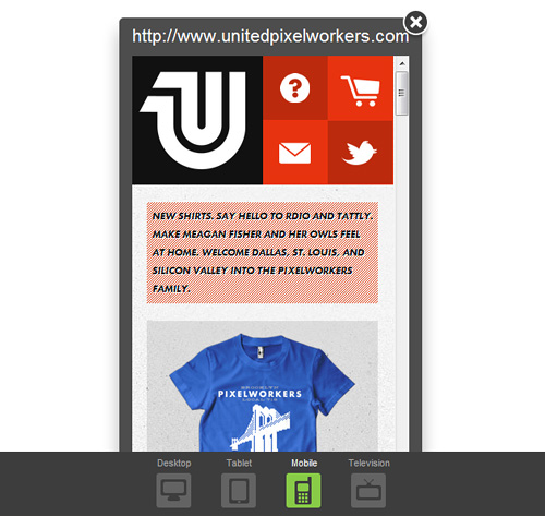
The mobile version of United Pixelworkers’s website tested with Screenfly.
But because of the different behavior of mobile browsers, touchscreens and high-density screens, constantly testing your theme on actual devices is important.
Unless you work for a big company, finding ways to test your theme during the development process can be quite a challenge. Of course, you won’t be able to test on all of the devices out there, but besides the devices that you own, you could ask friends, family, other freelancers and coworkers to help you test. You can also visit your local electronics store to test on the devices there.
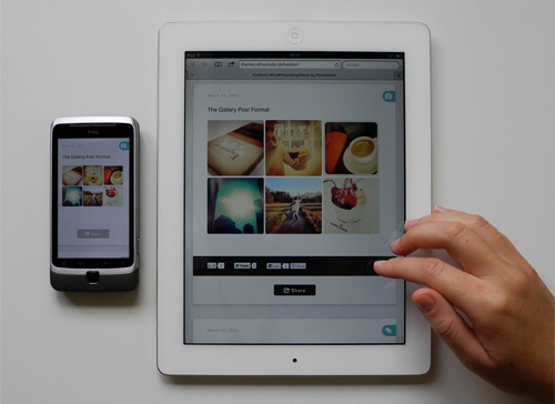
Test your WordPress theme on various devices as often as you can.
A helpful post with a lot of testing advice is part 5 of the recent “Build a Responsive Site in a Week” tutorial series on .NET magazine.
Responsive Theme Vs. Mobile Plugin
A mobile theme plugin such as the popular WPtouch plugin can be a great temporary solution to give mobile users a better experience on an existing website. In most cases, offering visitors an optimized mobile experience with the help of a plugin is probably better than not optimizing at all.
But in the long term, a fully responsive theme has many advantages to a plugin:
- The website can maintain its unique branding across all devices.
- Users will get the same experience on all devices and thus have less trouble navigating the website.
- The website will be easier to maintain (the administrator won’t need to install and update the plugin).
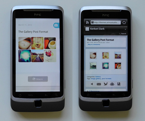
A responsive WordPress theme on the left, and a mobile plugin at work on the right.
Conclusion
Responsive Web design is often still described as a trend. And some might quietly hope that the trend will pass sooner or later. But responsive Web design is so much more than a trend: it’s a new mindset, as has been said:
It’s such a shame that Responsive design is often degraded to being a ‘Web design trend’. It isn’t. It’s a new mindset.
In a multiple-device world, where the Internet seems to be available everywhere, responsive Web design feels so much more like a natural process that is just starting to show its potential.
So, what should our job as theme designers and developers be? Because responsive WordPress themes are still so new and in constant development, we must not be afraid to start from scratch, search for improvements and continue learning. And let’s share our knowledge and experience with each other along the way.


 SurveyJS: White-Label Survey Solution for Your JS App
 Celebrating 10 million developers
 Register Free Now
 Try ProtoPie AI free →