Mobile Considerations In User Experience Design: “Web or Native?”
We appreciate your time and your interest, and thank you for your support and love.
We are happy to present a yet another sample chapter from the book. In his chapter, Aral Balkan explores what “native” actually means, what options designers and developers have and gives practical advice on what you need to know when deciding on tools for your next mobile-optimized project. The sample is also available for free download in PDF, EPUB and MobiPocket or .ZIP with all files.
— The Smashing Editorial Team
As you probably know, user experience design is the discipline concerned with all aspects of the design of interactive products. Although it incorporates important elements of graphic design and motion design, it is primarily concerned with the design of interaction. Its closest cousin in the design realm is product design. As user experience designers, we design virtual products. Furthermore, since hardware design and software design are so intrinsically linked and inseparable, the line that separates product design from interaction design — if it exists at all — is a faint one.
Further Reading on SmashingMag:
- 6 Common Problems With The UX Process, And 6 Solutions!
- The Lean UX Manifesto: Principle-Driven Design
- Fitting After Effects Into A UX Workflow
- How To Integrate Motion Design In The UX Workflow
A Web Designer Is a User Experience Designer
Essentially, a Web designer is a user experience designer with specialized knowledge of the medium of the World Wide Web. The materials of a Web designer are the core (HTML, CSS, JavaScript) and auxiliary (LESS, Stylus, etc.; HAML, Jade, etc.; jQuery, MooTools, etc.) frameworks of the Web and the components within those frameworks. These frameworks and the components within them are made of code. It is this code that determines the design limits and behavior of these materials.
Designing an application is as much about drawing a pretty picture of an application as designing a car is about drawing a pretty picture of a car. Just as an automotive designer must have intimate knowledge of the various materials that go into making a car, so too must a Web designer understand the materials that go into a website or application.
As interaction designers, we are interested not simply in the aesthetics of an interactive object but in how it behaves. This is especially important when you are designing applications (which are behavior-based objects) as opposed to designing documents (which are content-based objects).
Designing Documents vs. Designing Applications
Even designing interactive documents well — especially in a responsive manner for the Web — requires specialized knowledge. At a bare minimum, it involves an understanding of responsive design principles and progressive enhancement. Drawing pretty pictures, on the other hand, is art, not design.
Interactive products or applications, however, are a completely different ball game. Designing for an interactive medium requires skills in graphic design, motion design and, most importantly, interaction design. The most important aspect of an interactive product is its interactions. These interactions are constructed in code.
Unfortunately, due to increased specialization on teams, the role of Web designer and Web developer has been artificially separated. While such a separation may be necessary when working on a team, these labels should define the current tasks of the team members, not sandbox their knowledge. You might focus on certain areas more — especially in particular projects — but you must understand that the primary reason we build products is to satisfy user needs and that every role on a development team has an effect on the user experience. This is why working in small interdisciplinary teams is imperative, where every member is responsible for always thinking of the user first.
Designing for the User First
When building a product, design leads development and development informs design. This is a cyclical, iterative process in which the goal is to continually improve the product to better meet the needs of users.[1]
Every decision you make for your product should stem from the user. You must think of the user’s needs first, before considering your own needs. In other words, practice what we call “outside-in design.” Think about the user’s needs and their context, design what the user will see and interact with, and then go about deciding how to solve all the problems that creates for you.
Outside In Is Good, Inside Out Is Bad.
Is your first question in a new project which server-side technology you will use or what your database schema will look like? Stop! This is a wrong approach. You’re trying to solve your own problems, not the user’s. That’s inside-out design, and that’s a Very Bad Thing.™
Purpose of This Chapter
Two of the core decisions you will need to make during the design process is whether to make the product cross-platform and whether it should be native.
The purpose of this chapter is to empower you, as a user experience designer, to understand your medium so that you can answer these questions informedly, starting by looking at what exactly we mean by an application being “native.”

What is “Native”?
Have you noticed how people throw around the term “native” willy-nilly without grasping what it really means? Let’s change that, starting with what native is not.
Native Is (and Is Not) Ones and Zeros
If we are going to be pedantic, “native” — insofar as digital devices are concerned — refers to the absence or presence of electric current in the transistors that power our computing devices. We usually visualize this as the basic cliché of digital computing: binary code, a series of ones and zeros. We call these binary instructions machine language.
While it is true that computers were once programmed in binary using switches, we no longer write applications at a level that is so close to the metal. However, every other computer programming language we have devised — assembly language, C, Python, Java-Script, etc. — is eventually translated into the ones and zeros of machine language. These are further translated into the presence or absence of electric current in transistors.
Each of these technologies is built upon layers of abstraction. Python is written in C, for example. The purpose of each level of abstraction — each higher layer in the layer cake of technologies that comprise the modern computing ecosystem — is to make it easier for developers to author applications.
So, although technically correct, using “native” to mean programming in binary is a rather meaningless definition in today’s world.
So, now that we know what native is not, let’s figure out what it is.
Native as Culture
“Native” refers to the technologies — i.e. languages and frameworks — that form the culture, language, conventions and norms of a platform. It is the base level of abstraction that comprises the core symbols, gestures and interactions that users employ to communicate with applications on a given platform. These elements are of utmost importance because they constitute the culture and norms of a platform.[2] They are the language—both visual and behavioral—that users learn to communicate in when using a platform. Conversely, they are also the words, phrases and concepts that applications on a given platform use to communicate with users. The more usable and consistent these are on a given platform, the more advantages there are to creating native applications for that platform.
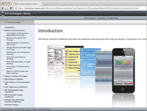
At one end of the spectrum we have Apple’s iOS, with its detailed “Human Interface Guidelines” and its elegant and consistent Cocoa Touch framework. A native productivity app on that platform that conforms to the guidelines will inherit much of the usability inherent in the core frameworks and will seem instantly familiar to users who are already familiar with other applications on the platform.
At the other end of the scale, we have native platforms like Android that are heavily customized by manufacturers, carriers and users to the point that there is little, if any, consistency between different Android phones and applications. Designers of native applications on such platforms might have a harder time providing a consistent user experience.

For example, my iPhone app, Feathers, has a custom keyboard that I made for users to enter extended Unicode symbols. On iPhone, it works exactly like the built-in iPhone software keyboard. Achieving this took some effort, but it was not impossible. If I were to port the application to Android, I would have to know which of the many software keyboards the user has installed and then customize its behavior to match. Needless to say, this would involve a lot more effort and might not even be feasible. The Swype keyboard that comes on some Android phones, for example, is patented. So, on an Android device with a Swype keyboard, I cannot make my keyboard behave exactly the same way as the system keyboard.
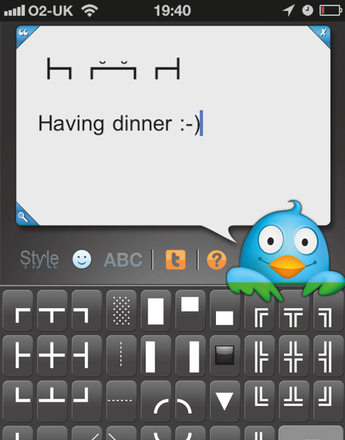
The compromise would be to make a single custom keyboard and use that regardless of the user’s system keyboard. Of course, it would neither look nor feel like the main keyboard and thus wouldn’t provide the same seamless experience of Feathers on iOS. Instead, users of the app would have to learn to use two different types of keyboards in the app and have to exert cognitive effort when switching from one to the other.
Similarly, on native platforms that do not have a strong, consistent visual language and culture—such as Android—or on native platforms that are notorious for being confusing to use—such as Windows—non-native applications will have less of a handicap. They might even provide better usability and user experiences in some situations.
A great example of a non-native application providing a better user experience on certain native platforms is Gmail. Using a desktop mail client on an operating system (OS) such as Windows could require you to find and install the application itself, keep it updated, keep your mail synced between your various devices, and make sure messages are checked for viruses and other malware. Compare that to the simplicity of Gmail, in which you enter a URL in the Web browser of any device and — boom! — you have your mail. End of story. Beautiful.
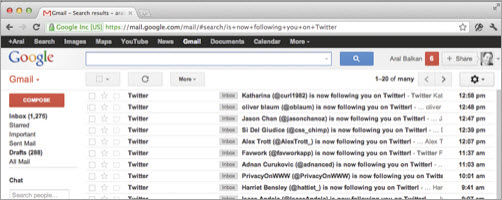
Gmail is also a great example of how creating good cross-platform user experiences can require a lot of platform-specific optimizations. Although the Gmail app runs across desktop and mobile platforms, there are actually several highly optimized versions of the app.
The Web as a platform itself, however, has few user experience consistencies of its own. Although Web applications share common features, there is no “Human Interface Guidelines” document for the Web (maybe there should be).[6] Instead, we focus on documenting good coding and design practices, such as progressive enhancement. Different browsers (that is, native applications that run Web apps) implement the bahavior of core form controls differently. And that’s why a Web application could behave differently in different browsers even if it has the same markup, components and code.
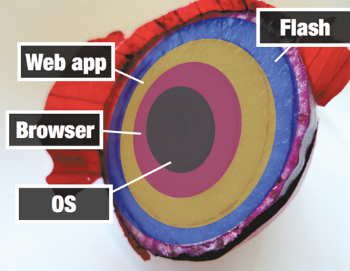
Hybrid Applications
So, we’ve got native applications, which refer to the culture of the platform that they run on, and we’ve got Web applications, which run in a browser on the Web. But we’ve missed a third category that many modern applications fall into: hybrid apps.
We need to understand the strengths of various technologies and use them where appropriate. Declarative Web authoring technologies (primarily HTML and CSS) are great for creating complex documents and styling them beautifully. Thus, many designers of native applications use HTML and CSS when they need to display rich content. These types of applications are called hybrid applications because they employ a mix of native and Web technologies.

The Facebook app on iPhone is one example of a hybrid app, in which certain sections (such as the news feed) are rendered using Web technologies.
Similarly, as we saw before, Web applications can also be hybrid. A website authored in HTML, CSS and JavaScript and that uses Flash to display rich interactive content is an example of a hybrid Web application.
Many applications today are hybrids, and if you are accomplished in HTML, CSS and JavaScript, it is safe to say you will never go hungry regardless of which platform or platforms end up becoming the most popular in the decades ahead.
Overcoming Ideological Bias
All too often, technology and design decisions are made based not on a desire to choose the best materials and tools for the job but on ideology. The Web standards advocate who blindly recommends the Web platform and Web authoring technologies for any project, regardless of the users’ needs is, unfortunately, all too common. Developers who blindly recommend Flash and native iPhone or iPad apps for any project are all too common, too. The old adage “When all you have is a hammer, everything looks like a nail” comes to mind. So, it is important to recognize such biases and to base your decisions on the needs of your users, not on ideology. It is also important to be able to recognize ideological views so that you can steer the discussion back into the realm of design.
Some advocates of Web standards hold a core assumption that the Web platform and Web authoring technologies are, by nature, a force for good. One wouldn’t dispute that the Internet and, by extension, the Web have had as radical a democratizing effect on the world as the Gutenberg Press (if not more so). However, the Web platform and authoring technologies are inherently neither good nor bad, and they could easily be used for either end.
In the case of the Web platform, the common assumption is that it is inherently good because any document or application placed on it is universally accessible. While this may be true for open collections of documents — as was the norm for content in the early days of the Web — it is generally not true for what we would consider a modern Web application today. Take Facebook. Facebook is a Web application. It is not open. It is free, but what this means is that you, the user, are not Facebook’s customer. You are Facebook’s product.[7]
Your personal information and behavioral traits are what Facebook sells to its real customers, advertisers. Is this in any way inherently better or more open than having to buy a commercial application from Apple’s App Store?
Not really.
In fact, you could easily argue that buying a license for a commercial iPhone app is a more honest and up-front transaction. You pay for it and thereby own a license to use it. You become the customer of the company or individual who made the application. There is transparency in how the company makes its money. In many ways, this is a much more traditional commercial relationship.
Of course, even commercial apps can use your data in devious ways, so being vigilant about your personal information these days is important. But the point is that simply being a Web application does not somehow magically make it a force for good in the world.
Are Native Applications and Platforms Endangered Species?
As Jeremy Keith famously put it at the Update Conference, “Writing a native app is like coding for LaserDisc.” The implication here is that native platforms, like CD-ROMs and LaserDiscs, will be obsolete soon since the Web is “catching up.”
I sure hope that is not the case, because the Web itself is a native platform and is becoming even more so (in the traditional sense) with the rise of OS’s such as WebOS and Chromium, which are based on native Web authoring technologies. We have to understand that what the Web is supposedly catching up to is a moving target. New features, user experience enhancements and more are being added to native platforms all the time. It’s not like Apple will decide on 1 September 2012 that iOS is “done” and stop creating new versions of the OS or new models of iPhone and iPad, at which point the Web can take a few years to finish catching up.
We know that “native” refers to the core culture and language of a platform, so predicting the demise of “native” is analogous to saying that different devices will not have distinct cultures in the future.
The assumption inherent in this view is that a monoculture will arise in the future in which every application on every device will speak via the components of the Web and be authored using native Web authoring technologies, and moreover that these applications will all be served from the Web platform. If anything, this is a gray and chilling vision of the future, in which people will have even less control of their own data and in which their devices will simply become dumb terminals that hook up to great silos in the sky (“the cloud”) that are controlled by large corporations.
Instead of owning a license to a word-processing application, for example, you would write everything in Google Docs. Google, for its part, will be analyzing every word and sentence, trying to understand more about who you are and what makes you tick so that it can use that information to better manipulate your commercial behavior.
This is not to say that Web applications are necessarily evil, but they are definitely not inherently good.
Blurring of the Lines
We keep hearing that “the Web is catching up to native.” What people mean when they say this is that Web authoring technologies are getting better access to device features such as touch, hardware-accelerated graphics, GPS, accelerometer support and cameras. What is rarely mentioned, however, is how native applications are catching up to Web applications. In some respects, the strides that native applications are making are far more important because they threaten the core user experience advantages that Web applications have historically enjoyed over native applications.
The three main areas in which native applications are catching up to Web applications are ease of deployment and access, automatic updates and seamless access to data.
Ease of Deployment and Access
One of the core user experience advantages that Web applications have historically had over native applications is the ease with which they can be deployed and accessed. Click the “Upload” button in your FTP application of choice[8] and your app becomes accessible to anyone who has the URL anywhere in the world.[9] Simples.
No need to download a Zip file, then search for an application to unzip it with, then look for where you downloaded it to, then unzip it, then install it, then run it, only to find out that it doesn’t support your graphics card. Eek! Is it any surprise that Web applications like Gmail and Google Docs have enjoyed such phenomenal success, especially on native platforms with poor usability?
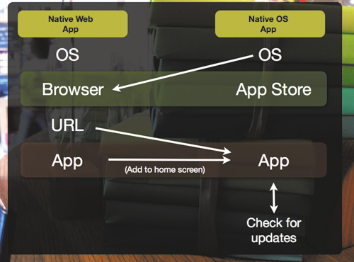
However, native apps are catching up to the ease of deployment and access offered by Web applications thanks to the development of app stores. With an app store like Apple’s, the process of finding an application is as easy as hitting a URL in a browser. In fact, you can hit a URL to reach an app in the App Store and, from there, simply click a button to download and install it.
Automatic Updates
Web applications, by nature, have always provided automatic updates. In fact, we don’t even think about the “version” of a Web application because the Web is inherently version free.
You’re always using the latest version of Gmail, and you don’t care what version it is.
It’s not Gmail 7; it’s just Gmail.[10]
Native applications, by contrast, have usually had clunky update mechanisms that interrupt the user’s flow. That, too, is changing with more and more native applications implementing seamless updates. When, for example, was the last time you noticed Google Chrome updating? Never. It does it silently.
Seamless Access to Data
The other huge advantage that users of Web applications have traditionally enjoyed is the ability to access their data from any device. You never have to worry about syncing email from your desktop to your mobile phone when using Gmail. It’s always there. Compare this to the nightmare that has traditionally plagued syncing on native platforms.
Native apps, however, are again catching up. With Apple’s iCloud, for instance, manual synchronization is becoming a thing of the past. Your data is simply, transparently and automatically available on your Apple devices and is kept constantly in sync without your having to worry about it. Although iCloud is primarily an Apple-centric continuous client solution, other cross-platform technologies, such as Dropbox, bring similar advantages to other platforms.
Just Another Client
Did you read the previous section thoroughly? Good. Then you may have noticed the common thread in all three areas where native applications are catching up to Web applications. They are all areas where the advantage in user experience is due to a characteristic of the Internet and not the Web. The Web is just a stack of technologies — namely, HTTP and URLs — on top of the Internet stack. So, native applications are catching up to the Web by taking advantage of the very same characteristics of the Internet that the Web does.
Furthermore, we are seeing the rise of a new type of user experience pattern, called the continuous client. A continuous client experience — as originally proposed by Joshua Topolsky[11] — lets a user seamlessly continue an experience across devices and contexts.
For example, if you are reading your Twitter stream on your computer and then grab your phone, you should be able to continue reading the stream from the same place. And when you get home, you should be able to continue from the same place again on your TV.
A good example of a continuous client in the wild is the Trillian instant-messaging application. It can store chats in the cloud, share chats between all of your devices in real time, keep track of and synchronize your read and unread messages, and even make use of “presence technology” to know on which device you’re currently active so that it can send current notifications only to that device.
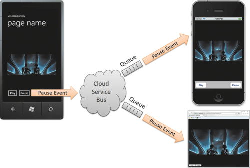
If you think about it, in the age of continuous client experiences, the Web becomes JAC (just another client). It may be the best client to use in certain contexts, but users have the choice of switching to native clients without worrying about synchronizing data. Soon, continuous clients will be a core expectation instead of a novelty, especially as high-level technologies, e.g. iCloud, make it easier for developers to implement them.

The Future is Native
The Web today is just another native platform and one that, going forward, has to compete on its own unique merits and not on the advantages bestowed upon it by the Internet, because other native platforms are also implementing those same advantages.
The tricky question to answer when deciding whether to use the Web platform or other platforms for your next application is whether the advantage lies in exposing the user interface of your application as a native app or in exposing it via a URL and serving it via HTTP.
As Web applications catch up to native platforms with features like Local Storage and the ability to run while the device is offline, the line between Web and native applications blurs even further. This is taken to its logical extreme in OS’s like Palm’s WebOS and Google Chrome, where the native technologies are Web technologies.
We need to understand that a Web application running on such an OS is a native application. At that point, our decision is between different native OS’s and native frameworks. That choice will be greatly influenced by which native OS’s offer a superior user experience. Subsequently, our technology choices will be between different native authoring technologies — HTML, CSS and JavaScript for native Web applications, Objective-C and Cocoa Touch for native iOS apps, Java and Android SDK for Android apps, C# and .NET for Windows Phone apps, and so on and so forth.
Regardless of which platforms and technologies win out in the end, the future is clearly native and the Web is JAC. Now, the billion-dollar question is not “Do we go Web or native?” but rather “Which platform or platforms and which client technology or technologies should our new product support?”
To answer this, we need to understand the nature of our product and, specifically, where it falls on the documents-to-applications continuum.
The Documents-to-Applications Continuum
On the Web, one way to classify products is according to whether they are content-centric or behavior-centric. We call a content-centric collection of documents a website. A behavior-centric product is called an application (or “app”). Instead of falling entirely in one camp or the other, your product will probably lie somewhere between the two extremes on the documents-to-applications continuum.
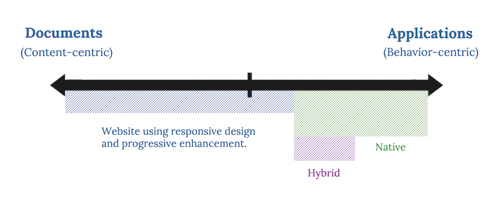
When a product falls closer to the documents side of the continuum, we can use progressive enhancement to layer features and interactions on top of the content-based core while keeping that core accessible to the largest number of people possible. These progressively enhanced features usually either layer advanced formatting or layout on these documents or add fanciful interactions for navigating within or between them. We can make the content adapt to different screen sizes and make the limited interactions that are used to navigate the content adapt to different input mechanisms. This isn’t an easy task, but nor is it impossible.
As products shift from the documents side of the spectrum to the applications side, however, implementing progressive enhancement gets harder. In fact, it might become entirely meaningless or impossible. How would you gracefully degrade an online image editor, for example? How would an image editor work on feature handsets without graphical displays? What content would you actually fall back to displaying?
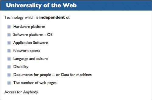
Applications are not content-based; they are behavior-based. Gracefully degrading to a simpler representation of whatever content an application might have does not always make sense. Applications are often made up entirely of behaviors that let users create content. Consider the image editor again: it doesn’t have any content itself, but it enables users to create content.
In order to create exemplary user experiences, we need to maintain focus. This focus has to be placed squarely on meeting the needs of our users in the best way possible. No product team on Earth has the resources to create applications that provide the best possible user experience for every user.
Given unlimited time and resources, we could optimize the user experience of our apps on every device and platform known to humankind. However, given limited time and budget we have to work with in the real world, we must be selective with our audience, problem domain, platforms and devices. We do this not to exclude people unnecessarily but because we realize that including everyone and giving everyone a great user experience is impractical.
Mobile Design Considerations for Document-Centric Products (Websites)
On the documents side of the continuum are websites. A website comprises content as well as the presentation of that content. The content may be text, images, audio, video, etc., that is marked up with HTML in order to add semantics and structure. The presentation includes both the visual layout and the interactive elements (such as navigation between pages or states) and is usually implemented using a combination of CSS and JavaScript.
If you have a website, the first thing you should do is test it out in mobile contexts to see how it displays and performs. I’ve encountered far too many companies that overlook the importance of making their websites mobile-friendly and jump straight into creating a native application. Be careful of making this mistake, especially if your website is an important revenue generator. For document-centric websites, use progressive enhancement whenever possible to make sure the content and core interactions for navigating and consuming that content remain accessible to as wide a base of your users as possible.
To do so, you can follow these broad steps:
- Make sure your content is accessible to everyone, and mark it up with proper semantics. Separating content from presentation is key.
- Progressively enhance your content to provide a more optimized experience for people viewing it at different screen sizes (this is the focus of responsive design currently).
- Progressively enhance your content to provide a more optimized experience for families of devices based on supported features and capabilities (for example, touch). In other words, make the website responsive in behavior, not just in layout. At this point, you are optimizing for features, not for specific devices (say, for all mobile phones that support touch, not just the iPhone).
- Progressively enhance your content to support the unique culture and capabilities of the various devices you want to support. At this point, optimizing for specific devices is all right. There’s nothing wrong with trying to make the user experience as beautiful as possible, even if it is for a specific subset of your users at a time.
#### Make sure to test your designs on actual devices A simulator or emulator is great for testing the effects of code changes while you’re developing, but they cannot recreate the unique ergonomics of the device itself. Context is also a key factor that affects the usability of mobile experiences, and a design that works perfectly well under the perfect lighting conditions of an office might not work as well in bright sunlight, for example. Also, remember that when you test with a simulator, it uses your computer’s powerful hardware to run the application. You might see slower performance—and even slightly different behavior—when running on an actual device.
Of course, each of these steps will take time and more resources, and you will need to plan and budget accordingly. But what if making your current website responsive does not meet your users’ needs in this particular instance? Perhaps you need to provide a more optimized and focused experience than progressive enhancement allows given your budget and schedule, or perhaps you need a level of device integration that is simply not possible through a browser currently? In this case, you might want to start thinking about whether to build an app, and if so, whether it will support multiple platforms and which technologies you should use to build it.
Cross-Platform or Single Platform?
Can you best meet your users’ needs with an application that runs on multiple platforms or — at least initially — on a single platform?
When answering this question, keep in mind that creating an application for a single platform does not mean that you cannot create a separate app for a different platform later on. It just means that you will be focusing your design and development efforts on a single platform (or perhaps even a single device) to start with.
It also does not, by itself, imply whether you will be creating an application that runs as a native binary or whether your application will use the native components of the device or devices that it runs on. (Using cross-platform authoring technologies to create an application that you have optimized for a single platform is perfectly possible.)
The answer to this question will, however, determine how much optimization you must do on different platforms. If you care about the user experience, you must optimize your app on each and every platform that you support. It will also affect how much testing you must do (because you will need to test on every platform that you support), the size of your support department (because you will need to troubleshoot user issues on every platform that you support), and how much time and budget you need to set aside for these various functions.
The Myth of Write Once, Run Anywhere
A common mistake I see many designers make is to assume that by using cross-platform authoring technologies they will be able to write once, run anywhere. This is a myth. And acting on the myth can lead to rather costly underestimations. Your application might run on multiple platforms, but this rarely—if ever—means that it will run well on multiple platforms.
The only way to get an application to run well on multiple platforms is to optimize it for each one of those platforms and devices. As mentioned earlier, every platform has its own culture, language and norms that users expect apps to conform to. And most users do not care how many other devices your application runs on — they care only about how well your application runs on their device.
Designers who do not take the unique cultures, customs, language and norms of their respective platforms into consideration risk making their applications look and sound out of place. The applications will appear noticeably foreign, unnecessarily loud and usually rather arrogant, simply because they are culturally insensitive.
Because we don’t want our applications to exhibit such obnoxious behavior, we must optimize them for every platform we support. Our aim is to create applications that are culturally sensitive to the language, norms and customs of the platforms they run on. Anything less and we would be showing varying degrees of disrespect to certain segments of our users.
Death by a Thousand Cuts
The worst thing you could do, of course, is disrespect all of your users by creating a lowest-common-denominator application that gives every user on every platform an unoptimized user experience. At that point, you would be at your most vulnerable. Even though your cross-platform application might have the potential to reach a large number of users because it runs on a large number of devices and platforms, it will be at a disadvantage in user experience on every one of those platforms. To put it bluntly, who cares if it runs on a certain platform if it runs badly?
More importantly, what happens when a competitor comes by on one of those platforms with a beautifully designed, precisely optimized, delightful user experience and blows your app out of the water?
Native applications, by contrast, have usually had clunky update mechanisms that interrupt the user’s flow. That, too, is changing with more and more native applications implementing seamless updates. When, for example, was the last time you noticed Google Chrome updating? Never. It does it silently.
Seamless Access to Data
The other huge advantage that users of Web applications have traditionally enjoyed is the ability to access their data from any device. You never have to worry about syncing email from your desktop to your mobile phone when using Gmail. It’s always there. Compare this to the nightmare that has traditionally plagued syncing on native platforms.
Native apps, however, are again catching up. With Apple’s iCloud, for instance, manual synchronization is becoming a thing of the past. Your data is simply, transparently and automatically available on your Apple devices and is kept constantly in sync without your having to worry about it. Although iCloud is primarily an Apple-centric continuous client solution, other cross-platform technologies, such as Dropbox, bring similar advantages to other platforms.
Just Another Client
Did you read the previous section thoroughly? Good. Then you may have noticed the common thread in all three areas where native applications are catching up to Web applications. They are all areas where the advantage in user experience is due to a characteristic of the Internet and not the Web. The Web is just a stack of technologies — namely, HTTP and URLs — on top of the Internet stack. So, native applications are catching up to the Web by taking advantage of the very same characteristics of the Internet that the Web does.
Furthermore, we are seeing the rise of a new type of user experience pattern, called the continuous client. A continuous client experience — as originally proposed by Joshua Topolsky[11] — lets a user seamlessly continue an experience across devices and contexts.
For example, if you are reading your Twitter stream on your computer and then grab your phone, you should be able to continue reading the stream from the same place. And when you get home, you should be able to continue from the same place again on your TV.
A good example of a continuous client in the wild is the Trillian instant-messaging application. It can store chats in the cloud, share chats between all of your devices in real time, keep track of and synchronize your read and unread messages, and even make use of “presence technology” to know on which device you’re currently active so that it can send current notifications only to that device.

If you think about it, in the age of continuous client experiences, the Web becomes JAC (just another client). It may be the best client to use in certain contexts, but users have the choice of switching to native clients without worrying about synchronizing data. Soon, continuous clients will be a core expectation instead of a novelty, especially as high-level technologies, e.g. iCloud, make it easier for developers to implement them.

The Future is Native
The Web today is just another native platform and one that, going forward, has to compete on its own unique merits and not on the advantages bestowed upon it by the Internet, because other native platforms are also implementing those same advantages.
The tricky question to answer when deciding whether to use the Web platform or other platforms for your next application is whether the advantage lies in exposing the user interface of your application as a native app or in exposing it via a URL and serving it via HTTP.
As Web applications catch up to native platforms with features like Local Storage and the ability to run while the device is offline, the line between Web and native applications blurs even further. This is taken to its logical extreme in OS’s like Palm’s WebOS and Google Chrome, where the native technologies are Web technologies.
We need to understand that a Web application running on such an OS is a native application. At that point, our decision is between different native OS’s and native frameworks. That choice will be greatly influenced by which native OS’s offer a superior user experience. Subsequently, our technology choices will be between different native authoring technologies — HTML, CSS and JavaScript for native Web applications, Objective-C and Cocoa Touch for native iOS apps, Java and Android SDK for Android apps, C# and .NET for Windows Phone apps, and so on and so forth.
Regardless of which platforms and technologies win out in the end, the future is clearly native and the Web is JAC. Now, the billion-dollar question is not “Do we go Web or native?” but rather “Which platform or platforms and which client technology or technologies should our new product support?”
To answer this, we need to understand the nature of our product and, specifically, where it falls on the documents-to-applications continuum.
The Documents-to-Applications Continuum
On the Web, one way to classify products is according to whether they are content-centric or behavior-centric. We call a content-centric collection of documents a website. A behavior-centric product is called an application (or “app”). Instead of falling entirely in one camp or the other, your product will probably lie somewhere between the two extremes on the documents-to-applications continuum.

When a product falls closer to the documents side of the continuum, we can use progressive enhancement to layer features and interactions on top of the content-based core while keeping that core accessible to the largest number of people possible. These progressively enhanced features usually either layer advanced formatting or layout on these documents or add fanciful interactions for navigating within or between them. We can make the content adapt to different screen sizes and make the limited interactions that are used to navigate the content adapt to different input mechanisms. This isn’t an easy task, but nor is it impossible.
As products shift from the documents side of the spectrum to the applications side, however, implementing progressive enhancement gets harder. In fact, it might become entirely meaningless or impossible. How would you gracefully degrade an online image editor, for example? How would an image editor work on feature handsets without graphical displays? What content would you actually fall back to displaying?

Applications are not content-based; they are behavior-based. Gracefully degrading to a simpler representation of whatever content an application might have does not always make sense. Applications are often made up entirely of behaviors that let users create content. Consider the image editor again: it doesn’t have any content itself, but it enables users to create content.
In order to create exemplary user experiences, we need to maintain focus. This focus has to be placed squarely on meeting the needs of our users in the best way possible. No product team on Earth has the resources to create applications that provide the best possible user experience for every user.
Given unlimited time and resources, we could optimize the user experience of our apps on every device and platform known to humankind. However, given limited time and budget we have to work with in the real world, we must be selective with our audience, problem domain, platforms and devices. We do this not to exclude people unnecessarily but because we realize that including everyone and giving everyone a great user experience is impractical.
Mobile Design Considerations for Document-Centric Products (Websites)
On the documents side of the continuum are websites. A website comprises content as well as the presentation of that content. The content may be text, images, audio, video, etc., that is marked up with HTML in order to add semantics and structure. The presentation includes both the visual layout and the interactive elements (such as navigation between pages or states) and is usually implemented using a combination of CSS and JavaScript.
If you have a website, the first thing you should do is test it out in mobile contexts to see how it displays and performs. I’ve encountered far too many companies that overlook the importance of making their websites mobile-friendly and jump straight into creating a native application. Be careful of making this mistake, especially if your website is an important revenue generator. For document-centric websites, use progressive enhancement whenever possible to make sure the content and core interactions for navigating and consuming that content remain accessible to as wide a base of your users as possible.
To do so, you can follow these broad steps:
- Make sure your content is accessible to everyone, and mark it up with proper semantics. Separating content from presentation is key.
- Progressively enhance your content to provide a more optimized experience for people viewing it at different screen sizes (this is the focus of responsive design currently).
- Progressively enhance your content to provide a more optimized experience for families of devices based on supported features and capabilities (for example, touch). In other words, make the website responsive in behavior, not just in layout. At this point, you are optimizing for features, not for specific devices (say, for all mobile phones that support touch, not just the iPhone).
- Progressively enhance your content to support the unique culture and capabilities of the various devices you want to support. At this point, optimizing for specific devices is all right. There’s nothing wrong with trying to make the user experience as beautiful as possible, even if it is for a specific subset of your users at a time.
#### Make sure to test your designs on actual devices A simulator or emulator is great for testing the effects of code changes while you’re developing, but they cannot recreate the unique ergonomics of the device itself. Context is also a key factor that affects the usability of mobile experiences, and a design that works perfectly well under the perfect lighting conditions of an office might not work as well in bright sunlight, for example. Also, remember that when you test with a simulator, it uses your computer’s powerful hardware to run the application. You might see slower performance—and even slightly different behavior—when running on an actual device.
Of course, each of these steps will take time and more resources, and you will need to plan and budget accordingly. But what if making your current website responsive does not meet your users’ needs in this particular instance? Perhaps you need to provide a more optimized and focused experience than progressive enhancement allows given your budget and schedule, or perhaps you need a level of device integration that is simply not possible through a browser currently? In this case, you might want to start thinking about whether to build an app, and if so, whether it will support multiple platforms and which technologies you should use to build it.
Cross-Platform or Single Platform?
Can you best meet your users’ needs with an application that runs on multiple platforms or — at least initially — on a single platform?
When answering this question, keep in mind that creating an application for a single platform does not mean that you cannot create a separate app for a different platform later on. It just means that you will be focusing your design and development efforts on a single platform (or perhaps even a single device) to start with.
It also does not, by itself, imply whether you will be creating an application that runs as a native binary or whether your application will use the native components of the device or devices that it runs on. (Using cross-platform authoring technologies to create an application that you have optimized for a single platform is perfectly possible.)
The answer to this question will, however, determine how much optimization you must do on different platforms. If you care about the user experience, you must optimize your app on each and every platform that you support. It will also affect how much testing you must do (because you will need to test on every platform that you support), the size of your support department (because you will need to troubleshoot user issues on every platform that you support), and how much time and budget you need to set aside for these various functions.
The Myth of Write Once, Run Anywhere
A common mistake I see many designers make is to assume that by using cross-platform authoring technologies they will be able to write once, run anywhere. This is a myth. And acting on the myth can lead to rather costly underestimations. Your application might run on multiple platforms, but this rarely—if ever—means that it will run well on multiple platforms.
The only way to get an application to run well on multiple platforms is to optimize it for each one of those platforms and devices. As mentioned earlier, every platform has its own culture, language and norms that users expect apps to conform to. And most users do not care how many other devices your application runs on — they care only about how well your application runs on their device.
Designers who do not take the unique cultures, customs, language and norms of their respective platforms into consideration risk making their applications look and sound out of place. The applications will appear noticeably foreign, unnecessarily loud and usually rather arrogant, simply because they are culturally insensitive.
Because we don’t want our applications to exhibit such obnoxious behavior, we must optimize them for every platform we support. Our aim is to create applications that are culturally sensitive to the language, norms and customs of the platforms they run on. Anything less and we would be showing varying degrees of disrespect to certain segments of our users.
Death by a Thousand Cuts
The worst thing you could do, of course, is disrespect all of your users by creating a lowest-common-denominator application that gives every user on every platform an unoptimized user experience. At that point, you would be at your most vulnerable. Even though your cross-platform application might have the potential to reach a large number of users because it runs on a large number of devices and platforms, it will be at a disadvantage in user experience on every one of those platforms. To put it bluntly, who cares if it runs on a certain platform if it runs badly?
More importantly, what happens when a competitor comes by on one of those platforms with a beautifully designed, precisely optimized, delightful user experience and blows your app out of the water?
And then again on a different platform by a different competitor?
This is death by a thousand cuts, whereby your application is abandoned one platform at a time for superior alternatives. Supporting multiple platforms is not a feature unless you can support them all well. You may have first-to-market advantage, but that will last only until you are outdone by your best-in-market competitor.
Write Once, Optimize Everywhere
So, write once, run anywhere is a dangerous myth. Cross-platform applications that compete successfully are write once, optimize everywhere. You must understand the implications this will have on your budget and schedule and plan for optimizing, testing and supporting your application on every platform you choose to support.
Please do not be taken in by the “create a cross-platform application in five minutes” demos by various tool vendors. They are rubbish, unless you are building the simplest of to-do list apps. The true test of a development technology is not how easily it enables you to create a five-minute demo or how quickly it gets you 70% of the way to your goal, but rather how easily it enables you to tackle the last 30% of your development, including the all-important user experience optimizations that could take up the last 10%. These details could end up taking up the bulk of your time and effort in developing the application.
Web and Other Cross-Platform Technologies
Broadly speaking, cross-platform technologies can be split into two groups: those that create native binaries and those that don’t. We can also further categorize them as those that use native frameworks and those that don’t. The combination gives us the binary-framework matrix shown below:
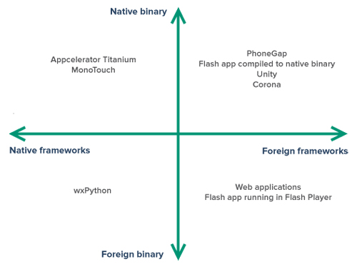
A native binary is an application bundle that can be run directly by the OS of a given device. It is what we think of commonly when we refer to a “native app.”
However, the far more important test of nativeness is whether the application makes use of native frameworks. These frameworks are what embody the culture, language, gestures, symbols and norms of a platform.
Foreign Apps Wrapped in Native Binaries (or Wolves in Sheep’s Clothing)
Creating a native binary for iPhone that does not use any of the native components in the Cocoa Touch framework for iOS is possible (and quite easy) by using a technology such as Adobe’s PhoneGap. PhoneGap wraps an existing Web application — that uses native Web components — and creates a native operating system application from it (in the example above, a native iOS application). While your app might look like a native app on the iPhone’s home screen and might launch like a native app, the UI of the app will be rendered using Web components.[12]
Your binary application is just a shell that contains a WebKit component. This WebKit component is what renders your Web application using Web components. Because Web components cannot meet native expectations, I would not recommend using PhoneGap to create non-immersive applications such as productivity apps.[13]
When building immersive applications such as eBooks and games, however, the lack of native framework support in similar technologies is not as big a problem. Adobe Flash and ActionScript, Unity and Ansca’s Corona are favorites among native game and eBook app makers, even though they do not use native frameworks or components. This is because immersive apps rarely, if ever, use native components. Instead, their designers aim to create a completely different world — perhaps a skeuomorphic one that looks and behaves like a real-world book — with its own rules, interactions and culture.
I do not recommend Adobe Flex (or applications that use components from the Flash framework) for the same reason that I do not recommend using PhoneGap to create non-immersive native applications: they do not conform to the culture of the native platform and will behave differently than native components on the system.
In summary, be careful when creating native binaries that simply wrap applications that do not use native components. These apps have a tendency to look like native applications, but they cannot behave like native applications because they do not use native components in native frameworks. A PhoneGap application that uses the jQTouch framework might display what looks like an iOS table view when running on an iPhone, but this is simply an HTML look alike brought to life by clever use of CSS and JavaScript. It pretends to be an iOS table view, but it cannot meet the behavioral characteristics of a real table view component from the Cocoa Touch framework, and thus it ends up creating expectations that it cannot meet.[14]
Creating unmet expectations is a major faux pas of usability. Avoid it like the plague.
Immersive vs. Non-Immersive Applications
Understanding the distinction between immersive and non-immersive applications is important because the nativeness of an application is considerably less of an issue for immersive applications.
Immersive applications usually take over the whole device and, by definition, create their own culture and language. A good example is games. A game could have its own control system for running, jumping and firing. Far from conforming to the culture of the platform, a good game transports the user to a world of its own creation. As such, immersive applications usually employ few, if any, of the platform’s conventions. As such, they are prime candidates for the use of non-native technologies.
This explains why Flash, while not native to the Web, is such a popular technology for delivering immersive experiences such as games on the Web; or why Unity, while not using the native components in Cocoa Touch, is used to make many of the top games on iOS and other platforms.
Non-immersive applications (such as productivity apps) usually make heavy use of standard user-interface elements like buttons and table views. They use platform-specific interactions like full-screen “master-detail” transitions on iOS, whereas they might use a tree-view control on a Windows or OS X application. It is thus very important that non-immersive applications speak the native language and conform to the native culture and norms of the platforms they run on.
All that being said, even for immersive applications, performance could still be an issue that influences your choice of whether to use native or non-native technologies. Certain games — such as first-person shooters — need to squeeze every bit of performance out of a system in order to shine. In these situations, some non-native technologies might not be performant enough for your needs. The early versions of Adobe AIR-based Flash apps on iPhone, for example, were notoriously slow. Adobe has improved performance in the latest versions of Adobe AIR on iOS, though.
Native Apps Translated From Non-Native Languages
If your goal is to provide an optimized user experience, a better cross-platform approach when creating non-immersive native applications would be to use native frameworks and components. This does not necessarily mean that you have to use the native programming language for a given platform to author your application.
Using Appcelerator’s Titanium Mobile SDK, for example, you could write JavaScript to instantiate and populate native components.[15] Thus, on iOS, when you create a table view in Titanium Mobile, a native Cocoa Touch table view component (a UI TableView instance) is created in your user interface. This not only looks like a native table view (as could also be the case in a PhoneGap application that mimics the native components) but actually is a native table view. Most importantly, it behaves as a table view should.
The use of a scripting language like JavaScript can make it easier to author applications and reuse your team’s existing Web development skills, while still affording you all of the advantages of using native components in your native applications.
Also, because Titanium Mobile is a cross-platform technology, it knows to instantiate native iOS components for your native iOS app and use native Android components instead when compiling your native Android app. The advantages are clear: you use a single scripting language (JavaScript) and have to maintain just one code base, instead of having to learn and use Objective-C on iOS and Java on Android and maintain two separate code bases.
The disadvantage is that you have yet another layer of abstraction to work with. Ultimately, the quality of your applications will depend on the quality of the code that Appcelerator writes in its abstraction frameworks. And you will be dependent on how quickly Appcelerator supports new features that are released to the native frameworks and SDKs. Although Appcelerator tries to make the differences between platforms as transparent as possible in Titanium, there are differences — not least of all cultural ones — that you will still need to address and optimize for (remember that our credo is write once, optimize everywhere).
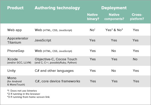
#### Native is not necessarily better, but it is native. The only way to create applications that conform to the norms — that is, the culture and language — of a given platform is to use native technologies. E.g., while creating Flash applications that are served on the Web platform is possible, they will not look or feel like native Web applications that use native Web authoring technologies like HTML, CSS and JavaScript. Similarly, while using these technologies to create applications for platforms like the iPhone is possible, the applications will not look or feel like native iPhone applications that are created using the components in the Cocoa Touch framework. That is not to say that Flash applications cannot perform better than HTML applications. In certain use cases — especially immersive apps like games — Flash applications might provide a better user experience. Machinarium, for instance, is a lovely game created in Flash that runs beautifully on iPad. Again, especially for immersive applications like games and eBooks, a cross-platform technology like Unity or Corona could reduce development time and make it easier to implement features that would be more difficult to create using native technologies (such as a 3-D environment or a physics engine).

This is not to say that you should fear cross-platform technologies, but rather that you should do your research, weigh the pros and cons and make an informed decision of whether to add another layer of abstraction to your development process. Each cross-platform technology has different advantages and disadvantages and use cases that make it a better fit for certain types of applications. While Corona might be the perfect choice for a 2-D physics-based game, Titanium Mobile might be better for building a cross-platform productivity application.
Of course, Titanium is not the only cross-platform technology that can create native binaries and use native frameworks. If your team has skills in C# and .NET development, you might also want to consider Mono (and specifically MonoTouch for iOS and Mono for Android). Mono works in much the same way as Titanium, but instead of using JavaScript, you use the C# programming language (… and, with caveats, other .NET programming languages) and .NET patterns and tools to create native apps.
Web Applications
If you are reading this book, you are probably either a Web designer or a Web developer (or both), or you are learning to become one. Your role as a Web designer might involve anything from designing collections of documents (in which case you would rely heavily on your graphic design skills) to designing behavior-rich applications (in which case you would be exercising your interaction design skills).
You also have a rich selection of materials to choose from when designing your products. Depending on the needs of your audience, you might choose to use native Web authoring technologies such as HTML, CSS and JavaScript to create native Web applications; alternatively, you might use non-native cross-platform application authoring technologies such as Adobe Flash or Unity to create non-native Web applications. As a third option, you might use a combination of both native and non-native authoring technologies to create hybrid Web applications — for example, a website built primarily with HTML, CSS and JavaScript but complemented with Flash to deliver a rich gaming experience.
Regardless of your choice of native or non-native Web technologies, what makes a Web application a Web application is that it is deployed to, and accessed from, the World Wide Web platform. This means, at its simplest, that your website or application has a URL[16] and is served via HTTP.
Single-Platform Native Applications
Having worked through the process above, you might decide that you would best serve the needs of your users by tackling a single platform or device for your application and investing your limited time and budget into optimizing the user experience for that platform.
If you do decide to support a single platform, you still have technology choices to make. If you’re making a game or other immersive application, you can choose a cross-platform technology that is specifically geared to making it easy to author such applications, such as Ansca’s Corona, Unity or Adobe Flash.
If you are building a non-immersive application, you still have the option of using a cross platform toolset like Titanium Mobile or Mono. The downside there is that your development process will involve one additional translation layer, and you will have less control over optimizing the performance of the application because you will be reliant to some degree on the native code that Titanium’s engineers have written. Even if you do use Titanium (or a similar framework like Mono), remember that you will still have to learn the native frameworks (or APIs) of the platform that you are developing for. Learning new frameworks is much harder than learning new programming languages. Whereas a seasoned programmer could pick up a programming language like Objective-C in a matter of days, it could take weeks (if not months or years) for a developer to fully grok and become comfortable with the patterns, culture and intricacies of a framework like Cocoa Touch.
Finally, you could use the native toolset of your platform of choice. For example, you can use Xcode with Objective-C and Cocoa Touch to build a native iOS application, or Eclipse with the Android SDK to build a native Android application, or Visual Studio with C# and the .NET framework to build a Windows Phone application.
This could involve learning a new programming language (Objective-C for iOS, Java for Android and C# for Windows Phone) or hiring team members who know the language and have experience with the native framework. As stated, picking up a new language is easy, but learning a new framework is much harder. Keep that in mind when deciding whether to go this route if you or your team do not already possess the required skills.
The advantages of building native applications using native technologies are numerous. For one thing, you have complete flexibility in optimizing the application and user experience. When you use native components and adhere to the human interface guidelines for your chosen platform, your application will conform to the culture, language and norms of that platform. It will be easier for users to learn and use. Also, since you are not reliant on a foreign abstraction or translation layer, you will always be working with the latest code and frameworks from the manufacturer, giving you additional flexibility to accommodate new features and updates as they are released for the platform. Most importantly, concentrating your efforts on a single platform means that you can put the time that you would otherwise have spent optimizing, testing and supporting other platforms into refining and optimizing the user experience of your application first, and if necessary add support to other platforms later on.
Designing for Humans
The platforms and technologies that you decide to use for your next product will have a fundamental impact on how the product is accessed, how it looks and feels, and whether it meets—and hopefully exceeds—the needs of your users. This is not a decision to be taken lightly or brushed over.
If your choice of platforms and technologies is based simply on your perceived short-term business needs or on the current competencies of your team, then you are making a decision that solves your own problems, not the user’s problems. This may have short-term advantages, but you will not be able to compete in the long term with those who solve the user’s problems first. Your choice of technologies and platforms should be based on how best you can meet the user’s needs, not on ideological bias or on obtaining short-term gain at the risk of long-term loss.
Remember that there are already too many things out there. We don’t need more things. We need things that work better. Make things that inform, empower and delight. And use the right tools and technologies for the job.
Footnotes
[1] To learn more about working this way, read up on agile methodologies and user-centered product development. The merging of these two worlds &mdash that is, adding sufficient design and user testing to every iteration in an agile process &mdash is what I called user-centered agile product development back in 2003: smashed.by/cfe
[2] These norms are usually expressed in interface guidelines for the platforms, such as the human interface guidelines that exist for the Mac, iPhone, iPad and Android platforms. (Android is the odd one out here since it is not really a single platform but has many flavors, each customized by device manufactures and mobile carriers. This is why it is very difficult for Google to exercise control over the user experience of the Android platform. Good user experience is a function of control — and Google has very little control over the user experience of phones based on the Android platform.
[6] See Tantek Çelik’s call for “Web Human Interface Guidelines” (smashed.by/wehuin) and read Joe Hewitt’s post calling for more focus and vision for Web technologies (smashed.by/owned).
[7] As Andrew Lewis states, “If you are not paying for it, you’re not the customer; you’re the product being sold.”, smashed.by/discont.
[8] Or, if you’re really savvy and use a Git repository, you could use a post-commit hook to automatically deploy your latest commit to the server.
[9] At least where the URL isn’t blocked by an autocratic regime.
[10] Read up on the “one version manifesto” and the versionless character of the Web in my opinion piece in .Net magazine titled “My Websites Will Only Support the Latest Browser Versions”: smashed.by/netsup
[11] Topolsky, Joshua. “A modest proposal: the Continuous Client,” smashed.by/client.
[12] PhoneGap does not dictate the use of any particular Web UI framework (for example, jQuery Mobile). All it does is let you wrap a Web application in a native application. However, regardless of which UI framework you use (or even if you decide not to use a Web UI framework at all), the rendered components will be Web UI components, not the native UI components of the platform that your app runs on.
[13] The same can be said for Web applications that are added to the home screens of phones. Again, the Web application in question looks like a native app, launches like a native app, but does not behave like a native app. A Web application running in the browser does not have these shortcomings because it does not create the expectations of a native OS app in the first place. A Web application running in the browser is a native Web application, and native Web applications — just like native apps on other platforms — have their own culture, conventions, language, norms and expectations (even though these might not be as strongly defined as on some other native platforms).
[14] The biggest usability faux pas you can commit is to style or skin non-native components to look like native components (as the jQTouch framework does). Whereas components in a native app that do not look like native components at least offer a visual clue that they will probably not behave like native components, non-native components that pretend to be native components will confuse users even more by appearing a certain way but behaving differently. The best thing to do, of course, is to use native components in your native apps. Failing that, at least make your components different enough visually so that you do not create behavioral expectations that you cannot meet.
[15] Don’t confuse Titanium Mobile with Titanium Desktop. The latter works just like PhoneGap. Appcelerator has recently open-sourced Titanium Desktop (now called Desktop) and is focusing its efforts on improving Titanium Mobile.
[16] More precisely known as a URI, although there are technical differences between the two that would make a W3C standards geek froth at the mouth if they were to see as cursory a dismissal of those differences as is being displayed here.
Download the full version of the chapter for free!
You can download this chapter in various formats:
- download the chapter in PDF (2.64 Mb),
- download the chapter in ePUB (1.59 Mb),
- download the chapter in Mobipocket (Kindle) (2.02 Mb) or
- download the chapter’s .zip with all formats (10.55 Mb).
We’d sincerely appreciate your support with an occasional tweet, Facebook post—or just spread the word to your friends and colleagues. You can also learn more about the Smashing Book #3 first. Again, thank you for all your support!
Cover image: Sami Hakkarainen. Thanks, Sami!


 Register Free Now
 Celebrating 10 million developers
 Try ProtoPie AI free →
 SurveyJS: White-Label Survey Solution for Your JS App

