Responsive Images With WordPress’ Featured Images
In this article, we’ll look at how to use WordPress’ built-in featured images capability to deliver different-sized image files to different devices. “Featured images,” sometimes referred to as thumbnails, is a feature of WordPress that has been vastly improved since version 3. It enables you to specify a featured image for each post and display it with the post’s content.
Further Reading on SmashingMag:
- Choosing A Responsive Image Solution
- Responsive Images Now Landed In WordPress Core
- Responsive Images In WordPress With Art Direction
- Introducing The Responsive Image Breakpoints Generator
The fact that the image is stored in the post’s meta data, rather than embedded in the post’s content, means we can use it more flexibly, as we shall see.
Why Worry About Image Size?
OK, so a lot of people do use their mobile devices to surf the Web while sitting on the sofa, hooked up to their Wi-Fi, one eye on the phone and one on the TV. And many browse for information sparked by a conversation with the people around them. This type of website visitor is becoming more and more common. You might even be reading this article in this way right now.
But there are and will always be people who use the Web from a mobile device while out and about, possibly using 3G in an area with a dodgy signal or on an expensive data plan. We Web designers and developers tend to invest in data plans with all the bells and whistles; but, believe it or not, plenty of people out there don’t use the Internet as much as we do and so choose a limited plan.
These people won’t thank you for using up their data by sending huge image files to their devices. They may well abandon your website before looking at it if the image downloads are slowing everything down. Moreover, mobile visitors might only check your website quickly in the middle of doing something else, and a slow website could harm your search engine rankings. Taking all this into account, surely reducing file sizes for mobile devices is a no-brainer.
Responsive Images: What’s It All About?
By now, you probably know what responsive design is: it uses a combination of a fluid layout and media queries to define breakpoints at which a website’s layout or content changes to fit a particular screen size. Most responsive websites use media queries to target phones; some target tablets such as iPads as well.
In the early days of responsive design, making your images responsive meant using CSS to ensure they stayed nicely inside their containing element, with this code:
img {
   max-width: 100%;
}
This technique makes the images look tidy, but all it really does is shrink the same large image to fit the layout. It does nothing to alter the actual size of the file, which could lead to huge image files sneaking onto your mobile design and seriously slowing down the website. Displaying large images that have been shrunk with CSS is discouraged by the W3C, and it uses processing power and data, so it’s a particularly bad idea on mobile devices.
When we do responsive design now, we generally include some way of making the image’s actual size smaller, using one of a variety of established techniques.
More Than One Way To Skin This Cat
If you’ve taken an interest in responsive design, you’ll have noticed that quite a few methods of delivering truly responsive images have emerged. Here are some of those methods:
- Replace images in the markup with background images, using images of different sizes depending on the device. This method has serious accessibility and SEO drawbacks because the images don’t have
alttags for screen readers to read or search engines to index. - Use a smaller image in the markup and a larger image as the background of the containing element in the desktop version of the website, and then use CSS to hide the smaller image on larger screens. This method, described in detail by Harry Roberts on CSS Wizardry, is better than the first one, but it does require that you manually create two images and then, in the style sheet, define the background image for every single image on the website. I don’t know about you, but I certainly don’t have the time or patience for that!
- Use a JavaScript-based solution that employs URL parameters or data attributes. This avoids the repetitive work above, but it involves more processing and can slow the website down—the opposite of what you intended.
- Use a solution such as Matt Wilcox’s Adaptive Images, which does the work for you. This is the smoothest option I’ve seen, but it requires that you separate the images that you want to be resized from those that you don’t—a potential problem when handing over a CMS-based website to a client or editor who isn’t technologically savvy.
The fact that Adaptive Images uses PHP got me thinking about how this could fit WordPress, which, after all, is written in PHP. Is there a way to use WordPress’ built-in functionality to deliver responsive images in a way that the client would not be able to break?
The answer is yes… with the addition of just one free plugin.
WordPress Responsive Images: Making It Work
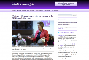
I’ll demonstrate this technique using a website that I recently developed for a client, What’s a Mayor For?. This website is responsive and gets a significant portion of visits from mobile devices. At the moment, it uses max-width to resize images, but it doesn’t send different image files to mobile devices.
This is what the website looks like in desktop and mobile browsers:


Click on the images for a large preview.
As you can see, the images scale to fit the layout. But what you can’t see is that the image’s actual size stays the same. We need to change that.
The solution we’ll follow here uses the following elements:
- A free plugin called Mobble, which detects devices and provides conditional PHP functions that you can use to deliver different content to different devices in your theme’s files;
- The
single.phpandpage.phpfiles, which we’ll edit to display the post or page’s featured image, but altering the image’s size according to the type of device; - The featured image functionality in WordPress’ dashboard, which we’ll use to define the image used for each post and page.
Let’s get started!
Download the Mobble Plugin
First, download the Mobble plugin. This will check the browser’s user-agent string to determine which device the user is on. These checks are wrapped in WordPress-style conditional functions, such as is_mobile(), which is the one we’ll be using. Purists will balk at this approach, but in my experience it’s very reliable, and the plugin does get a high rating in WordPress’ repository.
Download and activate the plugin.
Edit the single.php and page.php Files to Call the Post’s Thumbnail
Using a text editor or WordPress’ editor, open the single.php file. Find the following code or something like it:
<article id="post-<?php the_ID(); ?>" <?php post_class(); ?>>
<h1 class="entry-title"><?php the_title(); ?></h1>
<section class="entry-content">
In our example, the image needs to be displayed immediately after the heading and before the content, so our code needs to be inserted between the h1 and section tags. If your website’s theme doesn’t use HTML5, you may put a div there instead of section.
Here is the code that displays the featured image for a given post:
<?php the_post_thumbnail(); ?>The function has some parameters that we can use, the most relevant being image size. You can use any of the sizes defined by WordPress:
thumbnailThumbnail: by default, a maximum of 150 × 150 pixelsmediumMedium resolution: by default a maximum of 300 × 300 pixelslargeLarge resolution: by default, a maximum of 640 × 640 pixelsfullFull resolution: the original uploaded size
This is where our conditional function plays with the image’s size. Here is the full code we’ll need:
<?php
   if (is_mobile()) {
   the_post_thumbnail('medium');
   } else {
   the_post_thumbnail('large');
} ?>
This code does the following:
- Checks whether the website is being viewed on a mobile device:
if (is mobile()); - If so, outputs the medium resolution of the post’s thumbnail (or featured image):
{the_post_thumbnail('medium')}; - If not (i.e.
else), outputs the large resolution:{the_post_thumbnail(large)}.
Having set up the single.php file, let’s do the same for page.php. Then, we need to change any embedded images to featured images via the WordPress dashboard.
Use WordPress’ Featured Image Functionality to Display the Images Correctly
Adding featured images in WordPress has been very simple since the functionality was incorporated in the user interface in version 3.0. Just follow these three steps:
- In the WordPress dashboard, open the editing screen for each post and page.
- Delete the existing image (it will remain in the gallery for that post or page, which will be helpful in a moment).
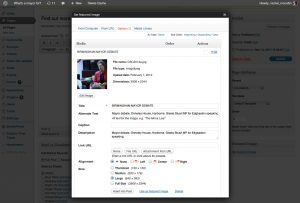
- Click “Set featured image” in the bottom right of the screen.
- In the “Set featured image” pop-up, click the “Gallery” tab. The image you just deleted will be displayed. All you need to do now is click “Use as featured image,” and then click the little cross in the top right of the window. Don’t insert the image into the post or else the image will be displayed twice.
 Large preview.
 - Finally, click the “Update” button to save the changes that you’ve made to the post, and test it.
Summary
As you can see, using WordPress’ featured images functionality to make responsive websites faster on mobile devices is a fairly simple process. All it takes is three steps:
- Install the Mobble plugin.
- Add conditional tags to the
single.phpandpage.phpfiles to call different versions of the image depending on the device. - Replace images in the body of the content with the featured images.
Of course, this method isn’t perfect for all situations. It only works if the image should appear above (or below) the rest of the content, and it does require that anyone who adds a post or page use the featured image functionality instead of just inserting an image in the body of the content. All you need to do now is educate the editors of your website to use featured images instead of images within the content. But how you do that is for another day!


 Celebrating 10 million developers
 SurveyJS: White-Label Survey Solution for Your JS App
 Try ProtoPie AI free →


