Social Media Is A Part Of The User Experience
The term “social media guru” has almost become a dirty word within the Web community. In fact, despite most of us being early adopters of social networks such as Facebook or Twitter, we consider social media the purview of marketeers.
It certainly isn’t our responsibility—we build websites, we don’t run marketing campaigns. But are we justified in this point of view? Is social media really somebody else’s responsibility?
Further Reading on SmashingMag:
- Using Social Media For User Research
- Social Influence: Incorporating Social Identity Theory Into Design
- How To Integrate Facebook, Twitter And Google+ In WordPress
- So You Want To Write A Digital Strategy?
In my opinion, social media is very much our concern. That is because social media is firmly a part of the user’s experience, and we are user experience designers. The user experience does not occur within a single channel (such as a website or Facebook page). Users move between multiple channels and so all of these channels need to be designed as one consistent user experience.
At the moment, we largely fail to integrate the various channels through which we communicate with our users. Although most social media channels are great at driving traffic to our websites, few websites return the favor to anything at that same level.
There is a reason why marketeers are increasingly including the Web address to their Facebook Page in ads rather than the website itself—it is because if they drive traffic to the website, it rarely makes it any further. This is because as Web designers our thinking about social media rarely moves beyond slapping a “share this” button on the bottom of each page.
Going Beyond “Share This”
I recently booked some travel insurance for an upcoming trip. While filling in the online form I came across a “share this page” link at the bottom. Why would anybody share a travel insurance form? Even if they did, would any of their friends look at it? Of course not!
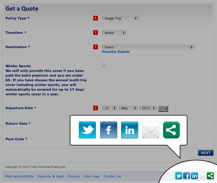
Would anybody really share a travel insurance form?
The problem here was that the “share this” option had been applied indiscriminately across the whole website. No thought had been put into its application. Admittedly, this was probably due to technical constraints. However, just because something is easier technically is no excuse for compromising the users experience.
Compare that to an environmental website I visited. While reading a blog post on their website I came across the following shocking fact:
“Only 1% of the 560 million city residents living in China are breathing air that would be considered safe according to EU guidelines.”
This was a piece of information worth sharing and the author knew it. Instead of the quote being buried in the copy, it was displayed in a magazine style pull-out. Directly under the quote was the option to share it with my friends on Facebook. This website got it right:
- It was specific. Instead of a blanket “share this page,” it identified specific content worth sharing.
- It made sharing easy. Inline with Steve Krug’s mantra of “Don’t make me think”, this website told the user what to share and made the process of sharing as easy as clicking a single button.
This is the level of thought we should all be putting into our “share this” links. However, it is not just these links that require attention, but also our “follow us” buttons.
Why Should I Follow You?
Otherwise well-designed websites seem to abandon the principles of user interface design when it comes to their “follow us” buttons.
Take for example an ecommerce website I visited. I was looking to buy a new DSLR camera, but upon arriving at the website, one of the first things I saw was a “follow us on Facebook” button. Because this button was styled with Facebook branding rather than that of the website, it stood out like a sore thumb.
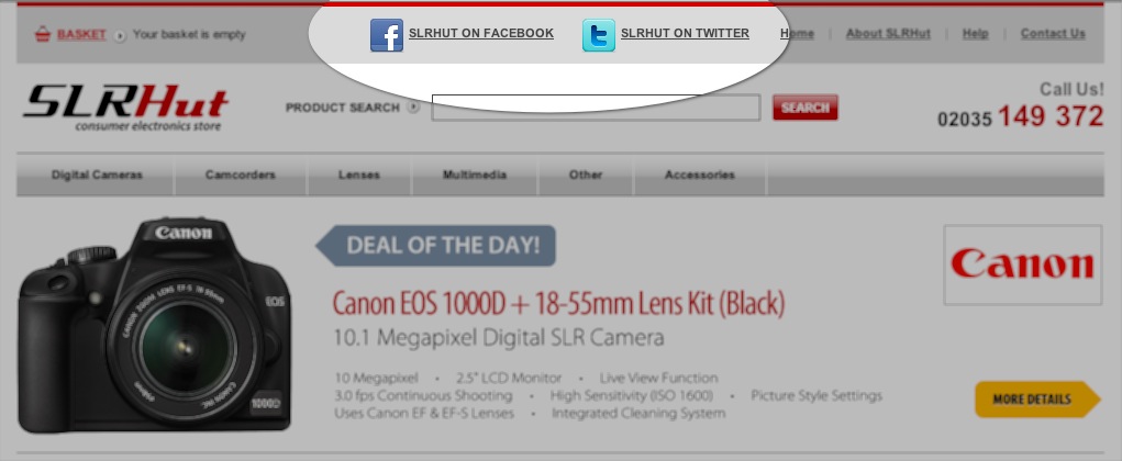
Sometimes follow us icons can be a distraction from the user’s primary task.
From my perspective this was a distraction. I had come to the website to buy a camera, not to follow the retailer on Facebook. This “call to action” was distracting me from my task and also from fulfilling the website’s business objective of taking my money.
I completed my purchase and ended up on the “thank you” page where I was presented with the inevitable option to “continue shopping”. Who clicks on this link anyway? Why would I continue shopping? I had just finished shopping, why would I start again?
Instead of this redundant link, now was the time to ask people to follow. I had completed my goal and fulfilled the website’s primary business objective. Therefore, now was the perfect time to go for a secondary call to action.
The “ask” would have been even more powerful if they gave me a reason to follow them. With so many brands, celebrities and others asking me to follow them, why should I follow this ecommerce website? What was in it for me?
If instead of asking me to simply “follow them” they added some copy, such as:
“Follow us on Facebook for useful advice on how to get the most from your new camera.”
I may have been more inclined to follow them.
There are no shortage of ways we can closely integrate our websites with social media beyond “follow us” and “share” options. Facebook, Twitter and LinkedIn all offer powerful APIs, but they also offer some easy-to-implement widgets too.
Going Beyond Share And Follow
Making greater use of social media on our websites doesn’t need to be technically challenging or expensive. All the major social networks are bending over backwards to make it easy.
For example, Twitter offers an @anywhere service that brings a range of functionality to your website with almost no technical ability required. Options include the ability to:
- Turn twitter usernames on your website into links automatically.
- Show hovercards that display users information on rollover.
- Tweet directly from your website.
- Embed tweets into your website the same you would embed a youtube video.
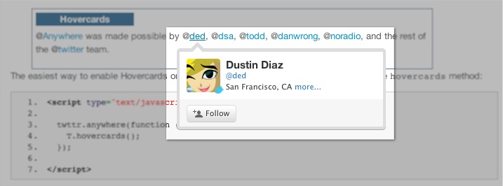
Twitter offers a range of ways to closely integrate with your website. One of my favorites is the Twitter Hovercard.
Facebook offers even more easy-to-implement social plugins. These include:
- An entire commenting system driven by Facebook.
- An activity feed that allows users to see what their friends have been doing on your website.
- A recommendation plugin that gives users personalized suggestions for pages on your website that they might like.
- A live stream that lets users share comments in real-time during a live event on your website.
- A registration plugin that allows users to easily signup to your website using their Facebook account.
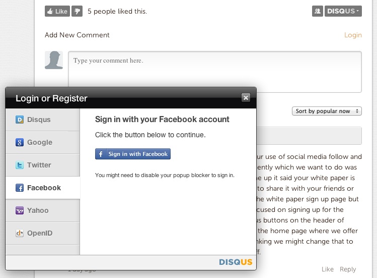
Tools such as Disqus commenting integrates not just with one social network, but with many.
With so many tools available to add social functionality, we have no reason not to. However, adding these basic tools to our websites is just the start. I believe that the real power of social media is only just beginning to be tapped.
Social By Design
At Facebook they have a phrase: “Social by design.” This refers to their commitment to put social at the heart of everything they do. For them, their network is not just about the content generated by users, but about the interaction between those users.
I believe that this principle extends beyond social networking and can be applied to many other websites as well. We are social animals. So much of our behavior and decision making is dictated by others. This is well understood in marketing and something we need to take seriously in Web design.
Whether we are considering what car to buy, where to eat out or what school to send our kids to, we like to ask our friends.
Online too, we are social creatures. When purchasing from Amazon, we tend to value the reviews more highly than the products official description. Equally we are more likely to complete a call to action when we see many others have done so before.
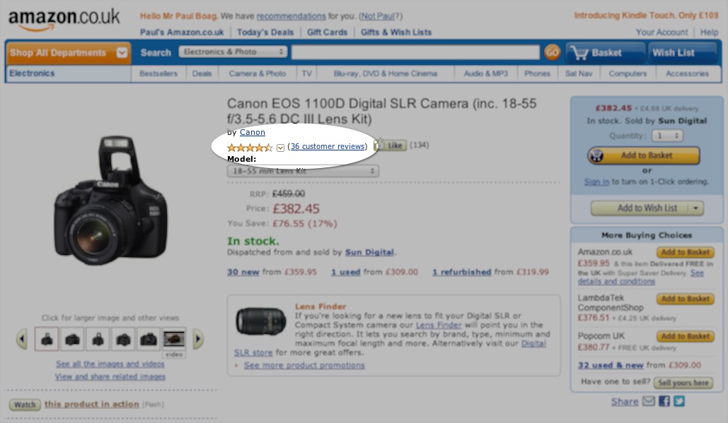
When it comes to purchasing, we put more weight on consumer reviews than marketing material.
The possibilities for harnessing this social component of our personalities are only just beginning to be explored. For example, although it is great that Amazon lets you read the reviews of other purchasers, it would be even better if the reviews of trusted friends (say, your Facebook friends) were floated to the top. A review from a stranger is one thing, but a review from a friend is quite something else.
Remember the environmental website I mentioned earlier? Allowing me to share that specific quote with my friends was great. However, I would be even more likely to share the link if below the share button it had told me that some of my friends had already shared that quote with their networks. I trust my judgement of my friends, so if they had shared that quote, then it must be worth sharing.
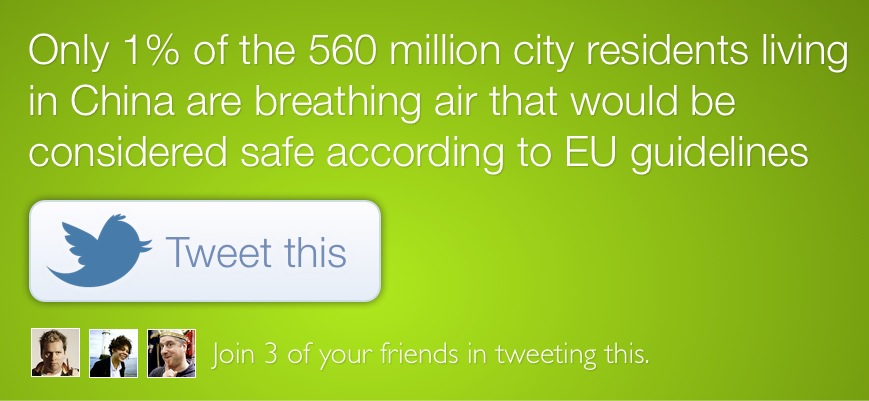
If I can see one of my friends has tweeted something, I am more likely to do the same myself.
Some websites are already beginning to harness our friendship networks. One example is Etsy, a company that sells handmade goods. You can login to Facebook via their website and it will suggest appropriate products for your friends based on their interests. Although the suggestions are not perfect, they are a lot more powerful than generic suggestions of “gifts for him” or “gifts for her”.
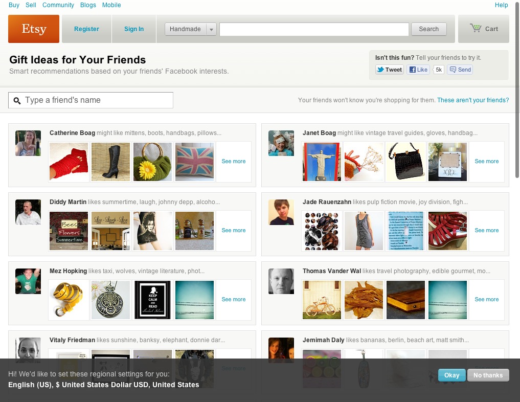
Etsy uses Facebook to suggest gifts for your friends.
Imagine for a moment if Etsy didn’t stop there. Imagine if they used that Facebook data to identify gaps in what they sold. This knowledge could be used not just to improve user experience, but suggest future products. Social by design has the potential to alter the direction of an entire business.
This doesn’t need to be limited to ecommerce websites. A website like Smashing Magazine could use tweets and comments on an article as an indication of popular topics that could be covered in more depth. You could even go so far as to asking users to directly suggest ideas for posts, product ideas or new services they wanted. Traditionally this kind of audience research and product development has been an expensive business. Social media offers the ability to get this kind of feedback for free.
As you can begin to see, social by design is not just about allowing us to draw on our friendship networks, but has the power to do much more. However, to achieve this we need to integrate social into the very fabric of our website rather than bolt it on as an afterthought.
The Problem With Bolt-On Social Media
Too many of our websites are social by happenstance rather than social by design. A new piece of social technology comes along and we bolt it onto our website without considering the bigger picture.
Take my own website. Like many, this website has evolved over a number of years and I’ve added more social functionality to it overtime. Because my community is so important, there are lots of ways to contribute, dependent on preference for social network. You can:
- Comment on a blog post.
- Contribute to a forum thread.
- Join the Facebook page.
- Talk to my via Twitter.
- Even comment on audio posts I release.
With so many options, nobody could accuse me of not having a social website. The problem is that the conversation is fragmented—those postings on Twitter will not see the contribution from those who post on Facebook. Equally, commenters on my blog will miss the in-depth discussion found in the forum.
This is because I have bolted on the technology, rather than integrating it to create a more complete community. Imagine instead that my website had been designed with social in mind from the start. When I release a new blog post this could create a thread on the forum. Comments posted to the blog post would appear on the forum and vice versa.
Equally, when the post is released it could also be posted to Twitter and Facebook. If somebody replied on either of those social networks the reply would be captured and folded into the comments on the website. Although not perfect (for example Twitter users still wouldn’t see comments made by Facebook users without visiting the website), it is a step forward. It makes the website the hub for your community, rather than having separate siloed discussions.
The Role Of The Website
That is the main point I want to leave you with. Your website should be the hub of social interaction, not sitting on the sidelines. It has the potential to draw together conversation across multiple networks and allow users to interact with friends, whether buying a camera or sharing an inspirational quote.
Image credits (front page): Opensourceway.
(jvb) (il)


 SurveyJS: White-Label Survey Solution for Your JS App
 Celebrating 10 million developers
 Try ProtoPie AI free →


