Are You Giving Your Users Positive Feedback?
We love to tell users that they have done something wrong. We have error messages for everything from poorly formatted telephone numbers to incorrect logins. But what about our user’s successes, do we celebrate them? Do we tell them they are doing something right?
It is as important to tell users that they are doing things right, as it is to inform them when they make a mistake. This kind of positive reinforcement is key to a pleasurable user experience. In this post, I want to explain why positive feedback matters, suggest when it is appropriate and how to integrate it into your website.
We begin by asking why positive reinforcement matters.
Further Reading on SmashingMag:
- Essential Visual Feedback Tools For Web Designers
- Meet “User Experience Revolution”, A New Smashing Book
- How Your Product Can Benefit From User Feedback
- How To Design Outstanding Feedback Loops
Why Positive Reinforcement Matters
Have you ever considered why a majority of us may dislike virtual keyboards? One of the primary reasons is that a virtual keyboard cannot provide the same level of feedback as a physical one.
Virtual keyboard manufacturers have worked hard to provide positive reinforcement using sound and the pop-up keys (such as the ones found on the iPad). However, these do not match the positive feedback one gets from using a physical keyboard. The sounds are annoyingly artificial and virtual keyboards are unable to replicate the tactile feedback of using a physical key.

We tend to dislike virtual keyboards because they cannot provide the same level of feedback as a physical one.
The example of a virtual keyboard illustrates how important it is to provide positive reinforcement for users of our websites. As with virtual keyboards, the lack of positive feedback leaves the user with a less pleasurable experience.
Many users lack confidence (either in their own abilities, or in the reliability of your website). They worry about whether they had done something wrong or whether the website has understood what it was that they wanted to achieve. In many cases this is because they don’t really understand how websites and computers work. The result is that they blame themselves when something goes wrong, presuming that their ignorance has led them to make a mistake.
By providing positive reinforcement we reduce these worries and give the user confidence that everything is going smoothly. This is particularly important for users who lack confidence in their own abilities (for example, the elderly). These users are often perfectly competent. However, because they lack confidence they second guess their decisions, which significantly undermines their experience.
Positive reinforcement does not just give the user confidence that they are doing something right, it also eliminates doubt about whether something has gone wrong. This can prevent a user from undoing something that they have done correctly.
A good example of this is an e-commerce transaction. Have you ever submitted an order to an e-commerce website and been left wondering whether the transaction is being processed because the page was taking longer to load than you expected?
A simple piece of positive reinforcement (such as an update telling the user that the order is still being processed) would resolve this problem, and prevents people from hitting the back button.
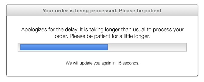
By keeping the user up-to-date you reduce their anxiety that something has gone wrong.
All of this doubt and confusion significantly slows the user down. They find themselves re-entering data, re-submitting forms and constantly using the back button. A small amount of positive reinforcement will significantly increase the speed with which they complete tasks.
With the benefits of positive feedback clear, when should we use it? When does the user need encouragement that they aren’t making mistakes and that the website is doing what they expect?
When Positive Reinforcement Is Required
The most obvious place to provide positive reinforcement is when a user is entering data. Whether registering, logging in, making a purchase, posting a comment, updating a status, or interacting with a Web application, data entry accounts for a large proportion of our interactions online.
It also represents the greatest likelihood of error, and users know this. As a result they often lack confidence in their data entry skills, and need some reassurance. This is especially true when entering data such as email addresses, passwords and postal codes.
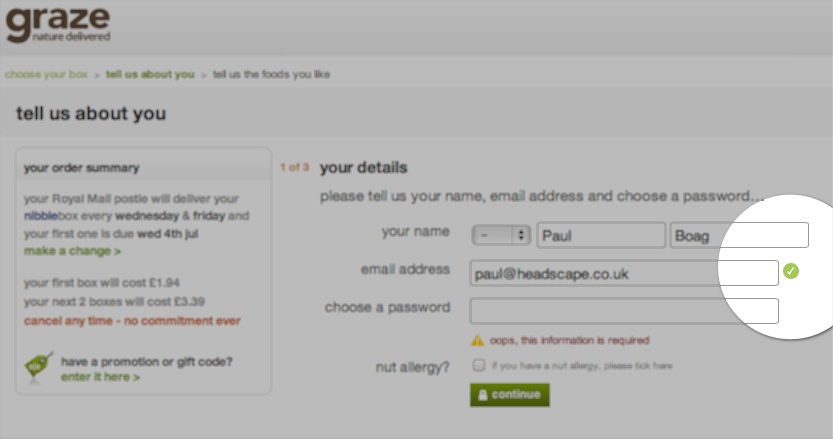
Graze speeds up the process of completing their signup form by showing a tick when you complete a field correctly.
Data entry is not the only (or even most common) form of user interaction—users interact with your website every time they click on a link. It surprises me how many websites fail to show the user that they have successfully clicked on a link, yet instead, rely on the browser to provide feedback.
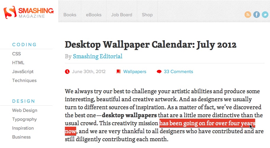
Smashing Magazine leaves the user with no doubt that a link has been successfully clicked (screenshot of Monthly Desktop Wallpapers).
Relying on the browser to provide positive feedback can be problematic as the user may miss it. This is because the browser shows that it is loading a page using the address bar, while the user’s attention is on the link that they have just clicked. This can lead to the user clicking on the same link again.

If the user is looking at a link, they may miss updates in the address bar.
The problem of feedback and attention being in two different places extends beyond links. There are many situations when a user’s interaction results in something changing elsewhere on the page. These kinds of changes are easily missed and some more obvious feedback is often required.
A common example of this would be adding an item to a shopping basket. Because the user’s focus is on the item they are adding, it can be easy for them to miss the basket updating. In such situations it is necessary to update the item itself to show it has been added.

When an item is being added into the basket on the Wiltshire Farm Foods’ website, the appearance of the product changes significantly.
Not that this is just an issue of distance between focus and the change on the page, it is also one of subtly. For example, a basket updating could be as subtle as a number incrementing from one item to two. This is easy to miss, even if the user’s attention is in the right place.
When a user’s interaction triggers a subtle page update, it is often necessary to provide some stronger feedback to reassure the user that their action has had the desired result.
How you provide that positive reinforcement will vary from website to website. There are a number of different approaches you may wish to consider…
Ways To Implement Positive Reinforcement
When a user makes a mistake, we normally inform them by displaying a textual error message. It is therefore unsurprising, that when we think of providing positive feedback, we also turn to textual messaging.
However, I believe we should be careful when providing positive feedback in a textual form. The problem with this approach is that text forces the user to shift their attention and read the message. This slows down the completion of their task rather than encouraging them to move forward.
That said, there are occasions when text can be effective for providing positive reinforcement. For example, if the user has just clicked an “add to basket” button, it may be appropriate to re-label the button to read “add another”. By changing the text you make it clear that one item has already been added, and encourages the user to move on to the next task. The other benefit to this approach is that the user is seeing a change where they are currently looking (the button that they have just clicked) rather than elsewhere on the screen (such as the basket, which they might miss).

Changing the labelling on an add to basket button can bring clarity to a user’s interaction.
Visual Feedback
If we are going to limit the use of text as a method of positive feedback, a better alternative is to use design signals. These could include changes in imagery, styling, color, or size.
Examples may include altering the color of a link when clicked, adding a tick after a field that has been correctly completed, or highlighting an updated portion of the page.
An important example of this kind of positive design feedback would be the cursor state. Users have come to expect the cursor to change into a hand when they rollover an interactive element (such as a link or a button). When it fails to do so, the absence of this positive feedback causes confusion. Yet, despite this well known behavior, too many interactive elements on websites do not demonstrate this behavior.
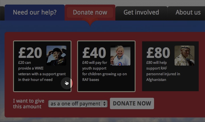
Without this cursor state, a user may be unsure whether they can click this box.
Feedback Using Animation
Another visual way to provide positive feedback is through animation. There are some great examples of how subtle animation can draw a user’s attention to an error (like the slight vibration you see if you enter the wrong log-in details for WordPress). These same principles can be applied to positive feedback, as well.
A common example of using animation to provide positive feedback would be when users click on an anchor link. By default this jumps the user down the page which can be a very disconcerting experience. However, a smooth scrolling animation combined with a highlighting of the destination can make it clear that what the user had expected has actually happened.
Animation can also be used on e-commerce websites to indicate an item has been added to a basket. Whether it is the basket expanding (to show the new item) or the product physically ‘flying’ towards the basket, these animations reassure the user that their intended action has been completed.
I believe animation is an under-utilized way of providing positive feedback and is something we should be exploring further on our websites. However, it is not the only method that is under-utilized—there is also the use of audio.
Audio Feedback
Do you wait for that “whoosh” noise when you send an email? That is an audible signal that the email has sent successfully. What about those little pings, beeps and twerps that notify you that something has happened on your computer or mobile device? Whether we realize it or not, most of us are reliant on this kind of audio feedback that reassures us that an action has happened.
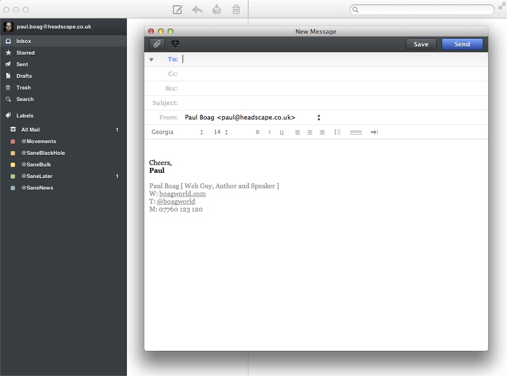
When sending an email we are very reliant on the audible feedback to ensure us that it has been sent.
Why then do we shy away from using audio on our websites? Audio is an excellent tool for providing positive feedback and yet few websites use it.
Maybe our reluctance is because audio can be annoying. The history of the Web is littered with examples of annoying audio loops or background music that you cannot mute. However, you could equally argue that the Web is littered with bad design and animation (but still, that doesn’t stop us from using these tools).
Others may argue that audio is not appropriate in a work environment. Although I would generally agree, the audio we are talking about using here is no different to the audio notifications used by a plethora of desktop applications that are common in an office environment.
An audible click is a great way to tell a user they have clicked on a link. A “cha-ching” would be the perfect way of letting a customer know they have added something to a shopping cart. Audio is a powerful tool that we are currently under-utilizing.
Much To Learn And Discuss
Whether you use audio, design, animation, or text, we should be providing users with more positive feedback for their actions. It gives a user confidence that in turn increases the speed in which they move through your website (and their level of satisfaction). We have still have much to learn about how to provide positive feedback for users, and we would be especially interested to hear your thoughts in the comments below.
- Is audio a good tool for feedback?
- What examples of positive feedback have inspired you?
- Do you perceive dangers in providing too much feedback to users?
Let us know your thoughts!
(jvb) (il)
Image used on front page is owned by opensourceway.


 Try ProtoPie AI free →
 Register Free Now
 SurveyJS: White-Label Survey Solution for Your JS App

 Celebrating 10 million developers


