Hands-On Experience: The Rehabilitation Of The Script
Serifs, sans serifs and… scripts. In theory not a bad typographic palette to play with, but when it comes to practice, the options are always far fewer.
One member of that stylistic trio could never quite punch its weight. But over the last few years we have seen something of a rebirth and revitalization of scripts, a category that once represented a care home for the typographically underemployed. But why has this come about, and why was one needed in the first place?
Further Reading on SmashingMag:
- The Art Of Calligraphy: Getting Started And Lessons Learned
- Type Design Is Not Only About Drawing Letters
- Reviving A Historic Typeface
- Massive Collection of Nature Inspired Typography
The problem with scripts was that although they were supposed to offer a freer, natural, handwritten style of lettering, when you tried to use them, most turned out to be more rigid and constricting than sans serifs and serifs. There was little room for any play with letterspacing, because the characters needed to connect. Uppercase letters could be equivocal, to put it mildly, in terms of legibility.
Although one of their traditional default applications was wedding invitations, even there you could run into problems. If the RSVP address included a postal code composed of capital letters and numbers the visual effect was clumsy at best, unreadable at worst. There was often a density of strokes in the x-height area that impeded legibility, an angle that always seemed to dog scripts; like handwriting itself, certain words could look ambiguous, or not readily identifiable.
If you pushed nagging doubts to one side and persevered in your decision to use a script on aesthetic grounds — just because it looked great or felt right — it would frequently be shot down by client or editor for lack of clarity.
For a typeface this is a considerable disadvantage; as designers we can sometimes be forgiving, but others can be brutally frank. Jan Tschichold, in his 1946 book An Illustrated History of Writing and Lettering, provides a possible explanation as to why this state of affairs came about, blaming eighteenth century “seductive engraved copy-books”, where a florid over-decorative style had emerged which owed little to genuine penmanship. What would be called the copperplate style, and commercial script, was a further distortion of this, using “regular alternation of fine and thick strokes [to disguise] the unnatural writing technique”.
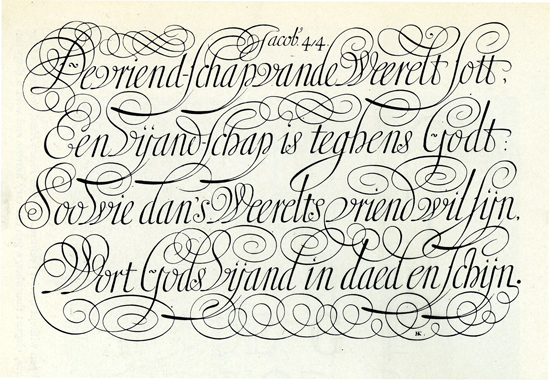
Where it went wrong, according to Tschichold, the abandonment of a natural writing style in favour of decoration.
There was also a stylistic handicap. R.S. Hutchings, in A Manual of Script Typefaces (1965) says: “Until well into the 1930s it was exceptional for even a well-stocked composing room to hold more than a single script series, and their use was restricted almost exclusively to the circumscribed field of professional and social stationery”. To test this out I took a look at my copy of the beautiful A Book of Typefaces produced by printers WS Cowell of Ipswich, England in 1952.
In their main display of faces is a solitary script, Marina, a 1936 design from Stephenson Blake, the standard copperplate style that would have been hauled out if someone came in and wanted some wedding invitations printed. It’s this kind of lifeless, off-the-peg sophistication to which designer Michael Bierut alludes in Gary Hustwit’s Helvetica film, when talking of corporate makeovers of the 1960s; clients would have “some letterhead that would say ‘Amalgamated Widget’ on the top and some goofy… maybe a script typeface … the nuptial script and the ivory paper.”
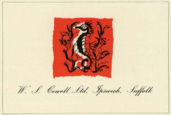
Marina in action; although Cowell’s catalogue features some attractive pages of type in action, this is probably the least confident example. The fault of the type?
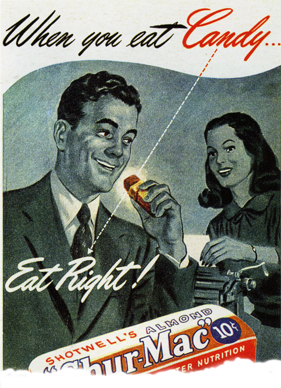
Scripts were almost a default headline style for American ads of the forties and fifties, a “visual bad habit that was endemic in those days,” says Michael Bierut. But some have since found them inspirational.
Later, more informal styles emerged, based on letters written with a brush, or contemporary handwriting. Several have become standards on computer operating systems; Brush Script, a 1940s American Type Founders advertising face by Robert E Smith, and the celebrated Mistral of Roger Excoffon, (1953) a handwriting-style script that belonged, says Julien Gineste in Roger Excoffon et la Fonderie Olive, “to the ‘civilization’ of the ballpoint pen”.
A more recent addition to the lineup has been Hermann Zapf’s magisterial Zapfino (1998). But these three all present problems. Think of the logo of world-conquering 1980s Australian soap Neighbours to get an aesthetic reading on Brush Script. Excoffon’s designs are wonderful, but outside of France, carry too much aesthetic baggage. They seem more like works of art than typographic workhorses. Zapfino is a cathedral; you want to fall to your knees before the power of its sweeping ascenders and descenders, but it feels like a script that no mortal hand could actually have written. Just how or where do you use it?

Everybody needs good ones — scripts that is. Brush Script was used for the logo of Kylie’s springboard.

Roger Excoffon overcame the physical limitations of metal type while moving diametrically away from the rising Swiss aesthetic.
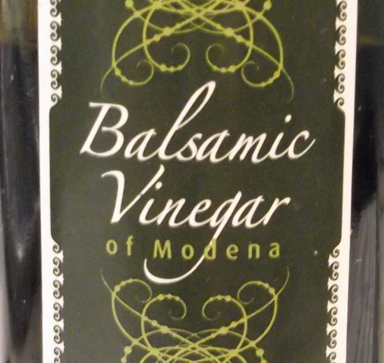
Cynical writer proved wrong; the designer of this label thought Zapfino was just the thing.
Fortunately the choice has broadened considerably. With it a lot of the old legibility issues seem to have disappeared, surely a result of faces being properly designed and considered for a purpose rather than being bastardized historical hand-me-downs. Nick Cooke has recently released Rollerscript, described in MyFonts” March 2012 Creative Characters newsletter as “the most realistic script face on the market”. Rollerscript is based on multiple versions of characters written in his own hand using a Pentel roller pen. I wondered if he thought there was a script renaissance, and what the reasons were:
“There has been a huge rise of script/handwriting fonts over the past couple of years and it’s definitely to do with more type designers exploring the features of OpenType and the complexities of programming. Designers are finally becoming aware of and are embracing OpenType technology and its possibilities for more expressive type usage, now that most programs are OT savvy, even the dreaded — by me — MS Word.”

Nick Cooke’s latest comes in Rough and Smooth versions, seen here. Described as a “modern sister” to his Olicana, it has over 100 ligatures.
Developments in software are clearly a factor then, but maybe another is that different people are moving into the field. Nick continues:
“I noticed that when I released an earlier script, Olicana, in 2007 there were many more purchases from the USA than in Britain. I think scripts have been popular over there a lot longer than here. Of course there are a lot of very poor fonts but there are also many more fantastic new ones available from the likes of Alejandro Paul at Sudtipos, Laura Worthington and Emily Lime. This seems to be an area which attracts more women designers, which is a good thing. Type design has for too long been pretty much a male preserve.”
You can probably see more connecting and brush scripts in one place at the site of Argentinian collective Sudtipos than anywhere else, or at any point in history. This struck me as possibly a cultural influence, and brought to mind the beautiful individualistic script lettering you can often see on shop fascias in Spain. But assumptions can be risky. In Creative Characters: the MyFonts interviews, volume 1, Alejandro Paul says that Argentinian graphics are broadly European modernist in flavour, outside of packaging, his own background.
Much of his inspiration comes from early twentieth century American scripts. Which brings us back to one of Nick Cooke’s observations. It’s a field in which Buffalo NY-based P22 are strong. They offer as one option fonts based on the handwriting of artists: Cézanne, Van Gogh, Michelangelo, Rodin, Monet and Gauguin.
Christina Torre’s Dearest is an elegant addition to this field, although using an anonymous nineteenth century century as its source. But that twentieth century advertising feel is strongly represented too: Rob Leuschke’s Corinthia and Michael Clark’s Sneaky are two examples. Richard Kegler’s Casual Script is a “free-flowing thin brush style evocative of vintage product advertisements and packaging lettering”.
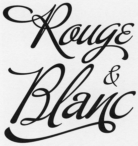
Alejandro Paul’s Buffet Script was based on the calligraphy of American signwriter Alf Becker. (image from Creative Characters: the MyFonts interviews, vol 1).

P22 Gauguin, based on the artist’s own handwriting.
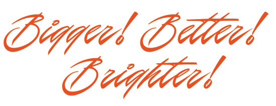
P22 Casual – look at the ad picture above, and the source of inspiration is fairly clear.
Nick also picks up on a significant wider trend, the desire for the handmade: “I think designers nowadays are looking for a personal touch and faux handwriting is just part of that ‘homemade aesthetic’ trend”. This is due partly to the turning of fashion’s wheel. During the 1990s the complete dominance of computer-generated design made other methods look obsolete. It was a period in which photography dominated, to the point that Rick Poynor could write in Eye in 1993 that “the effect of the continuing preference for photography… is to make most design based on illustration look decidedly old hat”.
Photography could be easily manipulated in Photoshop and — certainly in the UK — we saw the blanket dominance of the “fuzzy-photo” school of book cover design. Why spend money commissioning an illustration when you could use a stock photo, or even take one yourself? Crop in very close or take your subject at a great distance and then, crucially, blur to add mystery, obscure awkward details and cover up any technical shortcomings in the picture.
But eventually people tire of production line design that anyone can do, and turn again to the personal and the handcrafted. The latter also chimes with a post-global economic meltdown, do-it-yourself aesthetic that has also seen a rise in popularity of traditional homemaking crafts previously considered moribund, such as sewing and knitting.
But — and here I risk making myself very unpopular — I think there’s another contributing factor to the rise of the script. It may be sublimal, but significant — the ubiquity of Comic Sans. Although it is not a script in the sense that the letterforms connect, consider its source of inspiration. The lettering in the speech balloons of comic books are handdrawn, and often have a slight calligraphic incline to them. It is this characteristic that drew enough people to use it in its early years as a bundled font for Windows 95 for it to reach a tipping point of familiarity to over-familiarity.
As its creator Vincent Connare has said: “People like it because it isn’t the kind of font that they would use to type a serious letter.” Although you might complain that that is exactly what a lot of people have been doing with it for years, his point is an important one. Comic Sans has had an impact on our feel for type, whether we like it or not, and part of that effect has been a new wave of lively, fun, informal scripts, definitely not the kinds that you would use for your society wedding invites. Now I’m getting out of here before you start looking around for something to throw.


 Try ProtoPie AI free →

 SurveyJS: White-Label Survey Solution for Your JS App
 Register Free Now

