The Personality Layer
“Oh hai Smashing Magazine!” That’s one of the dozen ways that Flickr welcomes its users upon signing in every time. It’s an easily overlooked detail, one that the service would work without flawlessly. Yet this detail is a big part of Flickr’s particular design character that would be missed if it wasn’t there.
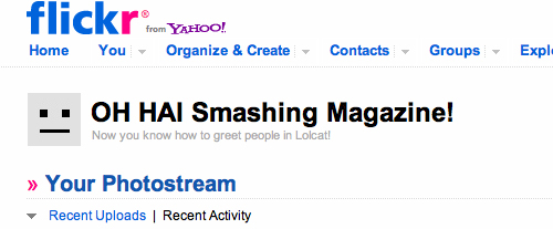
This is how Flickr greets its users, changing the language upon every sign-in.
These easily overlooked details are the ones that I’m particularly interested in because of the reaction they are capable of causing in users. These details trigger an emotional response, and if used purposefully and fittingly, they will help to form a personality that people will respond to positively when interacting with the product.
Further Reading on SmashingMag:
- Finding Your Tone Of Voice
- Redesigning With Personality
- Symptoms Of An Epidemic: Web Design Trends
- Creating A Living Style Guide: A Case Study
This positive attitude will often lead to people sharing and even advocating for your product with their peers. This technique of connecting with users on a personal level is also referred to as “emotional design.”
A Little Theory
The term “emotional design” was defined by (among others) Aarron Walter. In his book Designing for Emotion, he describes emotional design by building on Maslow’s famous hierarchy of human needs, which posits that humans need to achieve elementary states of being, such as health and safety, before they can start thinking about higher-level needs, such as self-actualization. People who are seriously ill or lack safety would find it difficult to think about self-actualization as expressed, for example, in morality, creativity and problem-solving.
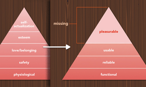
Maslow’s hierarchy of human needs (left) and the hierarchy of emotional design (right). (Image: Aarron Walter)
According to this theory, a product has to be functional, reliable and usable (in that order) before a layer of pleasure can be applied. Emotional design, then, is the pleasurable layer that you put on top of a functional, reliable and usable product.
An effective emotional design strategy has two aspects:
- You create something unique that transcends your own style and that evokes a positive response in users;
- You consistently use that style until it becomes a body of work, a personality layer.
In this article, we will look at some strategies you can follow, as well as some examples found in the wild, plus a few projects in which the consistent use of emotional design results in a great personality.
To learn more about the theory of emotion in design, you might be interested in the article “Not Just Pretty: Building Emotion Into Your Websites.”
The Elements Of Emotional Design
The goal is to connect with users and evoke positive emotions. Positive emotions instill positive memories and make users want to interact with your product in the future.
There’s an additional benefit, though. In pleasant, positive situations, people are much more likely to tolerate minor difficulties and irrelevance. While poor design is never excusable, when people are relaxed, the pleasant and pleasurable aspects of a design will make them more forgiving of problems within the interface.
Below is a non-exhaustive list (based on personal observation) of ways to induce these positive emotions. Of course, people will respond to things differently depending on their background, knowledge, etc., but these psychological factors should work in general:
- Positivity. See the article “What Are the Top 10 Positive Emotions.”
- Surprise. Do something unexpected and new.
- Uniqueness. Differ from other products in an interesting way.
- Attention. Offer incentives, or offer help even if you’re not obliged to.
- Attraction. We all like attractive people, so build an attractive product.
- Anticipation. Leak something ahead of the launch.
- Exclusivity. Offer something exclusive to a select group.
- Be responsive. Show a reaction to your audience, especially when they’re not expecting it.
Now, let’s see these principles applied to actual products.
Practical Examples Of Emotional Design
Below are some details of emotional design on the Web. We cannot always attribute a particular strategy to it, such as “surprise” or “anticipation.” Sometimes more factors are at play, and people will perceive some things differently.
Remember that just blindly copying these examples will not give your product the personality it needs. Rather, infusing emotional traits into the product thoughtfully will ensure that the personality sticks. Here’s a little test: browse Built With Bootstrap and see which ones you like best.
Mimicking Emotions
Smile
People who enjoy each other’s company tend to mimic each other’s behavior? When someone you like smiles, you generally smile back. This can work on websites, too. The emotional brain is affected by pictures, especially of people, and by stories. Let’s look at one design that tells a story and shows pictures of people.
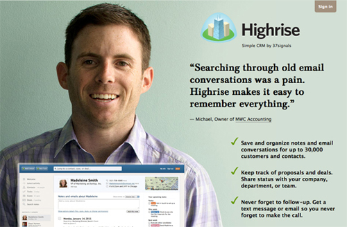
The Highrise landing page, with real customers.
Highrise shows happy people, along with stories of them using the product. The smiles and testimonials from existing customers are a powerful combination (for proof, read about the A/B testing done on Highrise.) Oh, and don’t forget to cultivate your own personality.
General happiness
Smiles seem to work in highly abstract form as well.
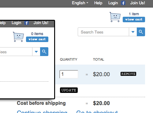
Threadless’ shopping cart shows emotions.
Threadless’ shopping cart is sad when it’s empty, but when you feed it, it becomes happy. This detail will probably make you smile; even if you don’t end up buying anything, you’ll remember it for making you look twice.
User retention
Attention
User retention is another area that requires a lot of attention.
A while ago, if you had tried to unsubscribe from Audible and stated that your device wasn’t compatible with its service, you would be given a code worth $100 to buy a compatible device on Amazon. That’s a powerful surprise that you’ll remember, even if you end up leaving.
Music
Etsy just plays “Every Time You Go Away” by Paul Young if you attempt to unsubscribe from its email newsletter. The song might not stop you from unsubscribing, but you will probably remember it the next time you come across a product on Etsy’s plattform. Or you might think of Etsy whenever you hear Paul Young.
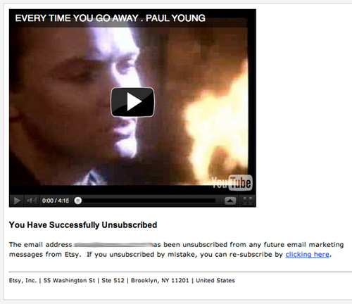
Etsy plays “Every Time You Go Away” by Paul Young when you leave.
Edgy humor
Groupon probably wouldn’t be able to change the mind of someone who is determined to leave its service, but its video definitely fits the playful tone of Groupon’s copy.
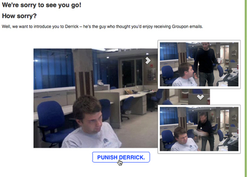
Groupon gets edgy.
Copy
Copy is the easiest way to introduce and play with personality. Your website probably has text everywhere, and words communicate a personality very well. Do you want your brand to be playful, stern, comical, hip? Copy can go a long way in defining who you are and who you appeal to.
Levity
In the Everyday app, if you haven’t put images in the library (which are needed in order to play a video), you will get this friendly reminder to take some pictures of your “beautiful” face — one word that completely changes the tone of the message.
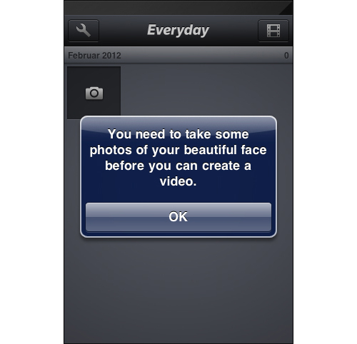
Everyday’s onboarding process
Contrast
The “Pssst!…” here says it really well — not only visually with all of the “s”-es and the contrasting color, but also aurally when read.
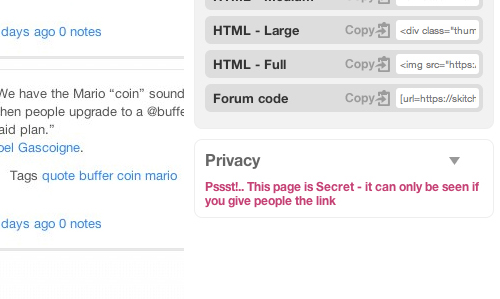
Skitch’s privacy copy
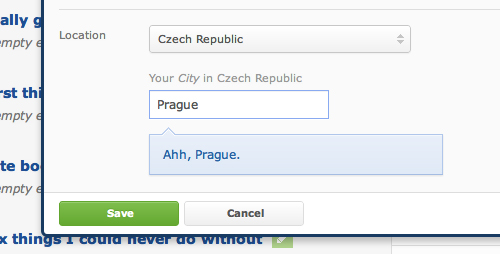
We find the same nice detail on OK Cupid’s website when you specify your location. “Ahh” could mean both “How wonderful” and “Yes, we understand now. Welcome.”
Microcopy
Hunch says something you are probably not used to reading. This difference alone could persuade you to go along with them. First, it communicates that the email will be of interest to the user; secondly, it recognizes that spam is evil.
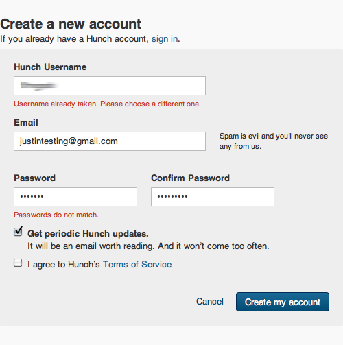
Hunch’s way of assuring prospective users of the safety of their data.
Microcopy 2
Milk’s detail here makes you much more open to subscribing to the newsletter. The approach is the same as the one above; assuring people that they will be contacted only when it really matters. (Note that Milk was recently acquired by Google and so has been shut down.)
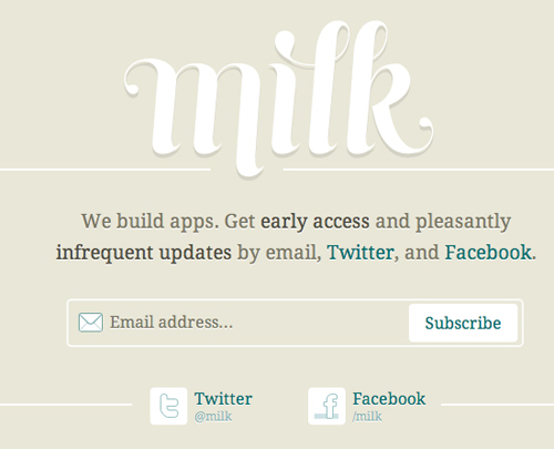
Milk promises infrequent emails and teases with early access.
Microcopy 3
Here is another approach from an as-yet-unreleased project of mine. The branding is lighthearted, so I’ve crafted this microcopy to accompany the invitation form. Hopefully, people will be more at ease submitting their address.
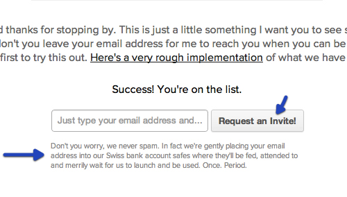
This says that your email address is secure with us.
Also, note how the button doesn’t just say “Submit,” but rather “Request an Invite.” This adds a touch of exclusivity to the sign-up form. If you’re interested in this sort of thing, read about Pinterest’s sign-up process.
Error Pages and Downtime
Not many situations are more annoying for a Web user than downtime. It can make users rather upset, especially if they depend on your product. Emotional design helps you steer clear of such offenses. Below are some examples.
Simple change in copy
Flickr says it’s having a massage. It’s not brilliant, but it’s better than an annoying error message.
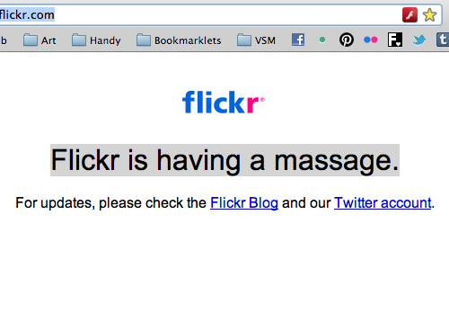
Flickr is having a massage (Image: Luke Beard)
Say sorry and offer a treat
Here’s a better approach from Flickr. When it experiences more serious problems, it puts up this splash page saying that its tubes are clogged and that it is sorry. But instead of leaving it at that, it set users to a task and offers the winning contestant a valuable pro account.
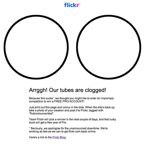
The competition when Flickr’s tubes are clogged.
Sorry but…
… there are more important things in life. When Tumblr went down recently, it told users that it was already hard at work on resolving the problem. In the next paragraph, it reminded users that there are bigger problems out there than a brief outage and that you could actually do something about them.
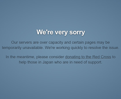
Tumblr supports people in need.
Annoyances
Other online annoyances include waiting for a screen to load. But some screens just need time to load. When your app is busy gathering information, consider doing something on the screen, such as displaying a tip.
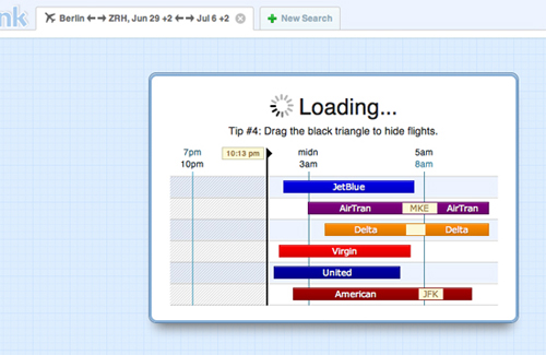
Hipmunk bridges screens with helpful information.
Humor
CAPTCHAs are a reality in many places today, but that doesn’t mean users have to like them. Heck, they’re an incredible annoyance. Stack Overflow at least explains with a funny graphic why it has to annoy visitors.
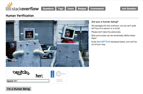
Stack Overflow explains why it has to annoy you with a CAPTCHA.
Personalization
Another emotional strategy is to respond to the user’s input. I love when something responds to me without my having to disclose personal details.
The landing page of the Thermo app detects your location and updates the graphics on the left, telling you the temperature of your location.
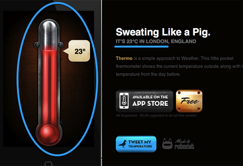
Thermo detects your location and turns it into something valuable.
You don’t even need that much information about visitors. 37signals demonstrates a simple way to be attentive to visitors, without any knowledge of them whatsoever.
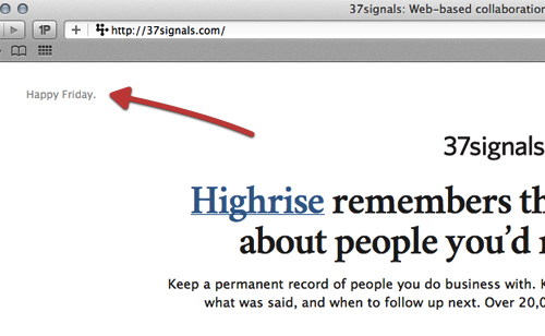
37signals wishes you a happy whatever-day-of-the-week-it-is.
Email Design
Newsletters can be a great tool, but most people want to cut down on noise and get only the most informative and well-produced ones. Newsletters can be worth subscribing to for various reasons: information, exclusive offers, humor, etc.
Telling a story
Zaarly highlights the most interesting “classifieds” in its newsletter. It’ll make you wonder what people come up with on the website and challenge you to use the service more often.
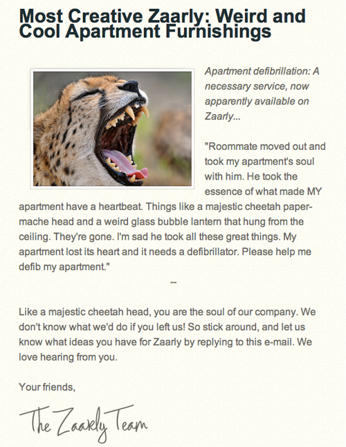
Zaarly highlights its favorite happenings on the website.
Personalization
Not that this is especially innovative, but Quora has enough data to show me stuff that I would enjoy reading. If you have the data, then do your users a service. Speaking of personalization, check out how adding the recipient’s name to an email’s subject line increases conversions.
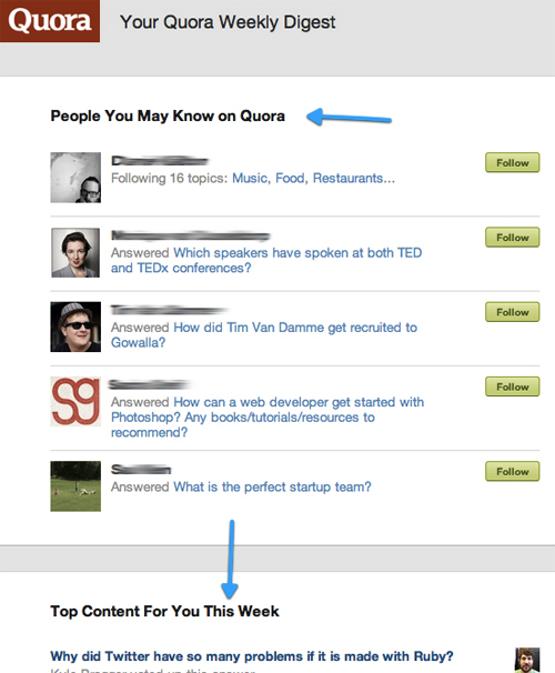
Quora extends your social graph and suggests reading tailored to you.
Surprise copy
Notification emails are usually all business. But when someone takes time to make something a bit more special, as the notification email below from CD Baby shows, people will go to great lengths to tell others about it. The string “private CD Baby jet” yields over 20,000 results on Google. That’s powerful word of mouth for just a tiny detail.
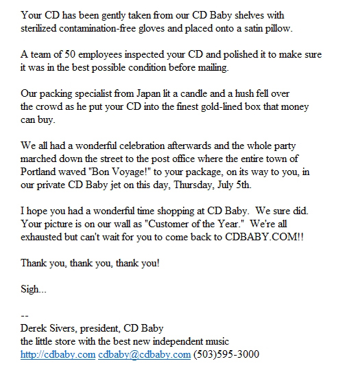
The copy for CD Baby’s notification email. (Image: The Shifted Librarian)
Storytelling
We all know that stories get people to listen. Some compelling examples are out there of product stories, one of which is Ben the Bodyguard. It’s an iPhone app that protects the personal data on your phone. The app is designed around the character of Ben. Way before it launched, the developer put up a website on which Ben walked the streets as you scrolled down, telling you that he’ll protect your data soon.
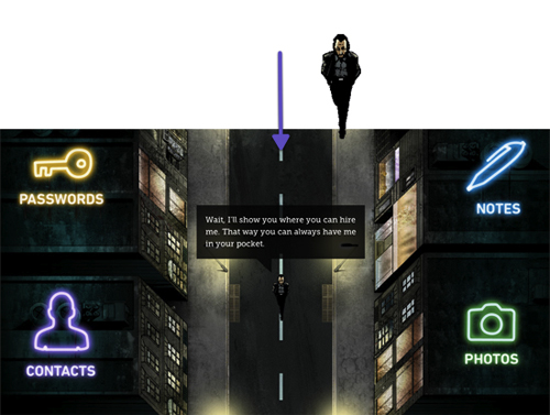
Ben the Bodyguard on the teaser page.
This character of Ben, the French bodyguard, is weaved into every bit of the application consistently. It’s almost as if you were entrusting your data to a personal bodyguard.
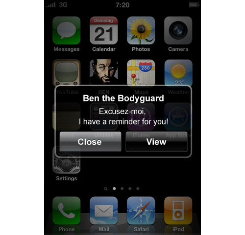
Notifications from Ben
Easter Eggs
Easter eggs in general are meant to delight users. Even Google, a relatively serious character among online personalities, adds an Easter egg or two to its search engine every now and then.
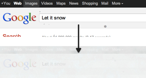
Google’s “Let it snow” Easter egg
Let it snow
A while back, Google made it snow on its home page. It also let users do a barrel roll.
Easter eggs are usually unrelated to the service. They exist merely to delight or surprise users, to give them a treat just to make them happy. And happy users share.
Mascots
MailChimp has a distinct personality that deserves all of the attention that it has attracted. A few details are worth pointing out.
The joking mascot
A distinctive part in MailChimp’s emotional design is its chimp, which goes by the name of Freddie. Freddie cheers you up when your profile page loads. And every time you reload, a random joke or link is shown.
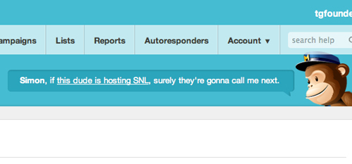
One of Freddie the Chimp’s random remarks. (Click on the image to see what he’s referring to.)
But note that emotional design like this can be done wrong. Remember the Microsoft Office paperclip helper that got in the way every time you tried to do something? Freddie the Chimp does not get involved; he stays out of your workflow.
Log-In Pages
Even log-in pages can be made interesting. MailChimp’s changes on special days, like Google’s doodle. Check out some of the designs in the dedicated Flickr pool.
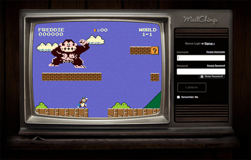
One of MailChimp’s custom log-in screens
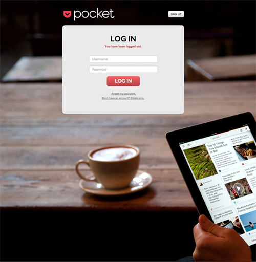
You don’t even have to do much to be special. Pocket greets you on the log-in screen with a huge background image instead of a dull color.
Attention to Detail and Surprise
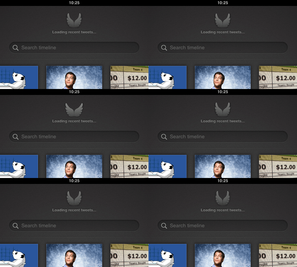
Many of the things covered above demonstrate some attention to detail, which is essentially what it all comes down to. The level of attention to detail shows how much you love the product and how much you respect your customers. Check out this spinner in Quip’s recently released app.
There is no need for the wings to flap, but I keep reloading just to see it. Remember, though, such details should never be at the expense of usability.
Surprises and attention to detail are everywhere. One big reason for Dropbox’s early buzz was its video, which it posted to Digg as “Google Drive killer coming from MIT startup.” It was carefully crafted for that audience, with a lot of things left to be discovered (including jokes that Diggers would understand and appreciate). More about that period in Dropbox’s growth can be heard in a talk by cofounder Drew Houston.
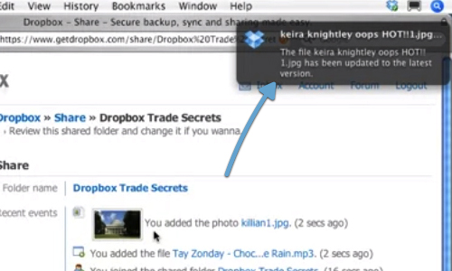
Keira is hot. An “accidental” status message during the Dropbox demo.
To get inspired with details, check out the great Tumblog Little Big Details.
Three Diverse Examples Of Personality
Up to now, we have looked at various aspects and examples of emotional design. Below are instances of emotional design in different areas: two from websites and one from the app economy.
Example 1: Gidsy (A Marketplace for the Public)
Gidsy is a marketplace for activities run by users. As such, its developers have to worry about broad appeal.
Gidsy’s main color palette is blue and white, a combination known to be liked and trusted. It is no coincidence that Facebook, Twitter, LinkedIn and countless other brands use some shade of blue. While you’re at it, have a look at BaseKit’s infographic about the psychology of color.
Gidsy’s personality is defined by a thoughtful use of vintage images, lighthearted copy and surprise elements.
Convey a feeling: Vintage images can be found all over the website. They are often used to make a point or emphasize an emotion.
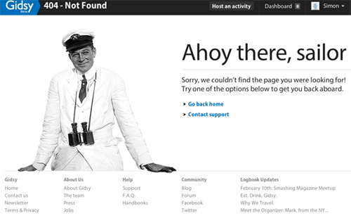 Its vintage-styled 404 page epitomizes Gidsy’s design personality.
Surprise: On reaching the footer, you’ll find a call to action, urging you to create a listing for free. Hovering over the wand will launch a rainbow, pointing you in the right direction and surprising you. Measuring how well that particular detail converts visitors into users would be interesting.
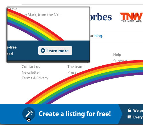 The rainbow playfully guides you to a “Learn more” button.
Copy: Simple copy with a bit of humor: “Well, hello gorgeous!” and “Booooom. Your photo was deleted.”
![]() The page on which users upload their avatar.
The page on which users upload their avatar.
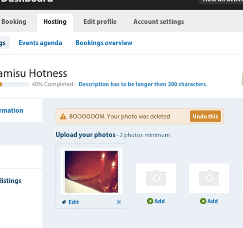 The page on which users delete images.
These details go a long way to giving a product a friendly personality. But you can also rethink large chunks of text, such as handbooks and manuals. Gidsy has done this in its handbooks section. Handbooks usually are a dull experience — but not this one. It has already generated a lot of buzz and links in the design community, so you might have already seen it. Notice the subtle nod to iA’s Writer app?
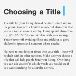 Gidsy’s handbook has made it around the Web.
Newsletter: We’ll finish off our look at Gidsy with its recent newsletter, which just hit my inbox as I was about to finish writing this article.
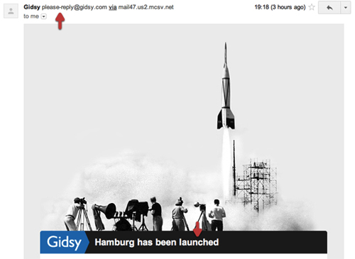 See the tiny “please-reply” email address?
Gidsy has used another vintage shot to emphasize its message. Also, notice the tiny detail of the sender’s email address, please-reply@gidsy.com, a friendly reminder that the company is listening and attends to the smallest of details. (I noticed that another Berlin-based startup started doing it first.)
Example 2: Automattic (General Web Hackery)
Automattic needs no introduction to this audience. It is a perfect example of how to integrate humor into a generally humorless environment: coding. It espouses Matt Mullenweg’s early mantra of “Code is poetry” anywhere it can. Let’s look at what it has done with its Web properties.
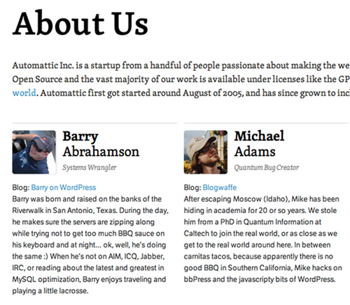
Automattic’s “About” page, packed with humor.
Humor: Automattic’s “About” page is a collection of good-natured bios. Mullenweg’s bio is this:
As the Chief BBQ Taste Tester of Automattic, Matt travels the world sampling cuisine and comparing it to the gold standard of Texas BBQ. Although he originally aspired to be a jazz saxophonist, Matt somehow wound up studying economics which took him to Washington D.C.[…]
Sounds like a fun place to work. Isn’t that exactly what most people reading the page would like?
Slogan: Automattic’s slogan is, “We’re much better at writing code than haiku.” This humorous line is what Automattic is all about, and it sets the tone for everything it does.
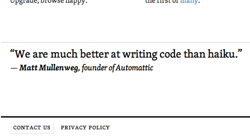
What Automattic is all about
Microcopy: People notice tiny details. For example, in the footer of WordPress’ home page is a signature that changes every time the page reloads. It says, alternately, that WordPress is “An Automattic [Production],” “An Automattic [Medly],” etc. This little change to the description shows the company’s love for its product.
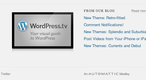
WordPress is “An Automattic Medley.”
Jetpack is “An Automattic Airline.”
Surprise: On Automattic’s Jetpack website, three jetpacks soar across the screen whenever the page loads, reinforcing the product’s name and exhibiting a love of detail.
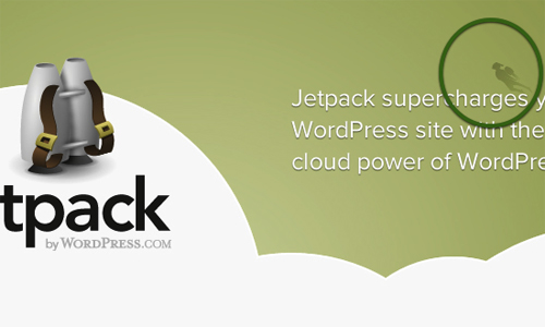
Small jetpacks shoot across the background.
Easter egg: One lovely detail is WordPress’ “self-comparison” Easter egg. Instead of removing the possibility of comparing a post’s version with itself, Automattic has built in a little mechanism that turns the page into a gray and white canvas, creating a Matrix-like effect.
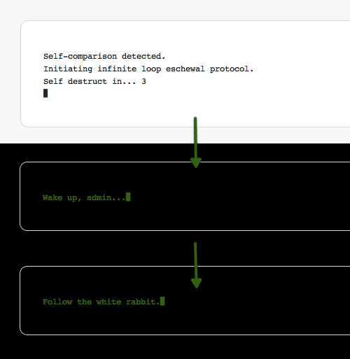
WordPress’s self-comparison solution.
So, when you hit that button, accidentally or not, the whole page turns gray and simulates self-destruction mode, Matrix-style. In the end, WordPress reminds you not to let that happen again.
TechFleece has a detailed description of how to find WordPress’ Matrix Easter egg.
Automattic is a great example of how to show personality in a hacker-heavy environment.
Example 3: Clear App (To-Do App for Design-Savvy Users)
Emotional design can turn users into evangelists who share their positive experience with others. People love sharing interesting stories; you just have to give them one.
Consider the recent success of Realmac Software’s to-do app for the iPhone, Clear. It sure isn’t the first to-do app out there, but it cleverly targets iPhone users and designers with a sleek, minimal interface and a few interaction and transition patterns that have not been done yet. It’s the kind of thing that we iOS geeks just drool over.
Anticipation: Realmac published a video before the launch that cleverly raises anticipation of the product. The video spread in some parts of the design community rather quickly.
People’s attention was captured not only by the design, but by some creative treats and surprises.
Playful: The app sets the tone for playing around and having fun.
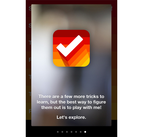
Setting the tone: “Let’s explore.”
Surprise: On opening the theme settings page, people who have installed the Tweetbot app are greeted with this message and are given an extra Clear theme. Chances are high that people who use Tweetbot love it and would find this to be a welcome surprise.
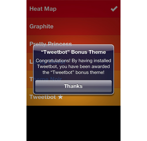
If you have installed the popular Tweetbot app, you’ll get a bonus theme.
Treat 2: If you follow the Twitter account of one of Clear’s developers, you’ll be awarded another theme for your social behavior. It was a cleverly engineered Easter egg hunt, resulting in an outburst of positive response by people on Twitter who shared their enthusiasm and compared which themes they had acquired and missed.
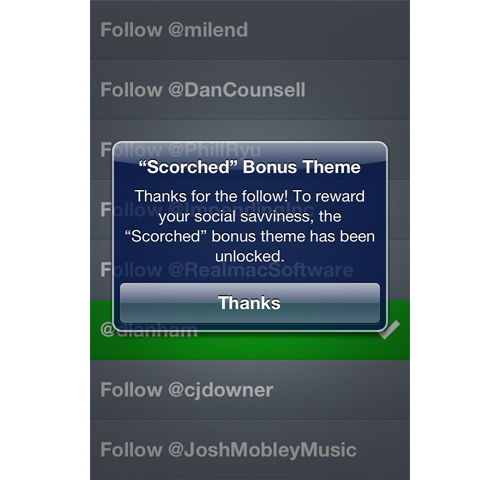
If you follow one of Clear’s creators, you are rewarded with a theme.
This is one of the best effects of emotional design. Not only will people enjoy using your product more, but they will share their excitement. And here is the proof on Twitter:
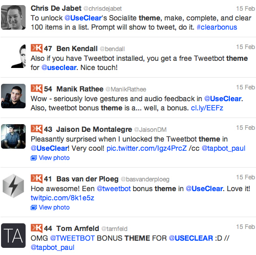
Some of the buzz that the bonus theme alone generated on Twitter.
Surprise detail: When your to-do list is empty, Clear offers a tip on how to fill it up.
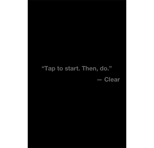
The second time, however, you are shown a motivational quote:
Final Words On Benefits And Risks
Emotional design is risky. Adopting a lighthearted tone when apologizing for something going wrong might not sit well with everyone. Don’t be afraid, though, to show your personality, as long as it’s geared to the right people. You can’t and don’t want to be everything to everyone.
We haven’t covered instances of emotional design gone bad, but here’s a word of advice: if you do attempt to be funny or quirky, the most important thing is to listen and monitor your users’ reactions. If something doesn’t work, you need to be proactive, apologize and improve. Showing that you’re listening and ready to learn exposes your humanity — putting you right back in emotional territory again.
MailChimp handles the risk of turning people off with an off switch, which it calls “party-pooper mode.”
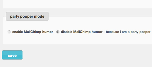
Switch on “party-pooper mode.”
So, if you really don’t like the chimp, you can disable him. Apparently, not many do.
Or you could do it the other way and make some quirky behavior the non-default state. Facebook has an Easter egg of its own, letting you change the UI’s language to pirate talk. It actually makes me enjoy Facebook a little more.
This is really what it’s all about: helping users to enjoy something more — so much that they’ll share with friends and strangers.
Share Your Thoughts
Have you shared something lately that you were excited about because it was different, lovely, surprising, attractive or appealing in some way? Have you built something like that? Let us know in the comments section below!
And if you’d like to learn even more about emotional design, here is a good list of further resources.
“Emotional Design” Featured On Smashing Magazine:
- “Optimizing Emotional Engagement in Web Design Through Metrics” Think about what keeps you coming back to your favorite store, your favorite person or even your favorite website. It’s not just a mindless buy-go, hug-go or click-go relationship. It is a complicated, emotional connection. It is what makes relationships with people and brands intoxicating. User engagement must have an equally complex emotional connection. It must affect the user in mind, body and spirit. Anything less is a 1990s brochure website. Read more.
- “A Craft Of Consequences: Reader, Writer And Emotional Design” Before the very first page of a book has been read, you’ve already analyzed it in countless ways without even noticing. The paper stock, the thickness of the binding, the aroma, the color of the type and even the texture of the cover; the very character of the book is being dissected by the hand and eye at every moment. Read more.
- “Not Just Pretty: Building Emotion Into Your Websites” Emotional design has become a powerful tool in creating exceptional user experiences for websites. However, emotions did not use to play such an important role on the Web. Actually, they did not use to play any role at all; rather, they were drowned by a flood of rational functionality and efficiency. Read more.
- “Give Your Website Soul With Emotionally Intelligent Interactions” What is it that makes us loyal fans of the websites and apps we love? When we sat down to answer this question for ourselves, we found that the websites and apps we truly love have one thing in common: soul. They’re humanized. They have emotional intelligence designed into the user experience. And this emotional intelligence is crafted through thoughtful interaction design and feedback mechanisms built into the website. Read more.
“Emotional Design” Around The Web:
- “Emotional Interface Design: The Gateway to Passionate Users” We’re changing. Our relationships online and in real life are shifting as we become more public with our private lives. Online social networks have helped our real world social networks transcend time and space making it easy (and seemingly essential) to share the triumphs, tragedies, and trite moments of life. No longer do you simply tell your best friend that you’ve broken up with your boyfriend. It feels natural to many people to tell hundreds of Twitter followers, and Facebook friends. Read more.
- “Personality in Design”Our lasting relationships center around the unique qualities and perspectives we all possess. We call it personality. Through our personalities, we express the entire gamut of human emotion. Personality is the mysterious force that attracts us to certain people and repels us from others. Because personality greatly influences our decision-making process, it can be a powerful tool in design. Read more.
- “Aaron Walter’s Emotional Design Reading List” There are a host of interesting books about psychology, design, emotion, and how our brains work that informed my book, Designing for Emotion. Here’s a list of essential books for the shelves of any user experience designer, web designer, or content strategist interested in the topic of emotional design.
- “Learning to Love Humans: Emotional Interface Design” Humans, though cute and cuddly, are not without their flaws, which makes it a challenge to design for them. By understanding how the wet, mushy processor works in these hairy little devils, you can design interfaces and web experiences that will have them hopelessly devoted to your brand. Aarron will introduce you to the emotional usability principle—a design axiom that identifies a strong connection between human emotion and perceived usability. Through real-world examples, you’ll learn practical interface design techniques that will make your sites and applications more engaging to the humans they serve. Read more.
- “WordPress, Blogging and Humour: Instances of Official WordPress Humour That You Should Not Miss” WordPress is not just an awesome blogging platform and an open source software that millions of blogs are happily using. The WordPress people have a great sense of humour. In fact blogging (and life) is almost meaningless without humour. The folks at WordPress understand this more than anyone else and you as a blogger and writer can take learn from the people at Automattic (the people who run WordPress and several other projects). WordPress is indeed the ‘blogging software with style.’ Read more.
- “Creative Cultures: MailChimp Grants Employees “Permission To Be Creative”” This is the first in a series on corporate culture. From business philosophy to talent acquisition and management, customer service and product development, we’ll examine the inner workings of successful companies and the ways they build cultures that promote and harness creativity. Here, email newsletter company MailChimp and the connection between coloring books and empowered employees. Read more.
- “Beyond Frustration: Three Levels of Happy Design” After watching Seligman’s talk about positive psychology, I was curious to learn more about the subject from other TED talks and other sources. I watched Don Norman talk about ways that design makes you happy, and Stuart Brown explaining the importance of play in cognition and creativity. Stefan Sagmeister drew parallels between the emotions people feel as they experience good design with the types of happiness and contentment people feel as they meditate. Read more.
- “The Psychologist’s View of UX Design” UX Mag The story of the elephant reminds me of the different view of design that people of different backgrounds, education, and experience have. A visual designer approaches UX design from one point of view, the interaction designer from another, and the programmer from yet another. It can be helpful to understand and even experience the part of the elephant that others are experiencing. Read more.
- “Organized Approach to Emotional Response Testing” Most user experience designers will have heard of the Product Reaction Cards (doc), a set of 118 words and phrases developed for Microsoft by Joey Benedek and Trish Miner in 2002 that can be deployed in a user testing workshop to help people articulate their emotional responses to a product. Read more.
- “Emotional Design,” Boxes & Arrows As UX professionals, we strive to design engaging experiences. These experiences help to forge relationships between the products we create and the people who use them. Whether you’re designing a website or a physical product, the formation of a relationship depends on how useful, usable and pleasurable the experience is. Ultimately, we form relationships with products and services for the same reasons we form relationships with people. Read more.
- “Resources,” Mental Notes A bookshelf of highly recommended reading.
- Little Big Details A great blog for your daily UI inspiration.


 Register Free Now
 SurveyJS: White-Label Survey Solution for Your JS App
 Try ProtoPie AI free →
 Celebrating 10 million developers
