Tips For A Finely Crafted Website
Good Web designers know what many others might not realize: that creating a truly beautiful website requires care, time and craft. And similar to how a craftsperson molds their creation by combining raw materials, skill and unwavering focus on the vision, a beautiful design is planned and executed with exceptional focus on what is to be achieved by the website.
It is important, however, not to confuse a beautifully crafted website with one that simply brushes over the content with attractive visuals. This article provides a small selection of tried and true methods that Web designers regularly employ to give a website that bespoke look and feel (think a tailor who carefully cinches a suit here and there to ensure a perfect fit).
Further Reading on SmashingMag:
- Beyond The Boring: The Hunt For The Web’s Lost Soul
- Web Design Is Dead. No, It Isn’t.
- The “Wow” Factor in Web Design
- Examining The Design Process: Clichés And Idea Generation
Make no mistake: these methods do take extra time, and they often result in improvements that the untrained eye might not consciously register. But the payoff is a better overall experience for the user. Users will leave with a smile and a lasting impression or relationship with your website, even if they can’t quite put their finger on why.
Start From Scratch, Every Time
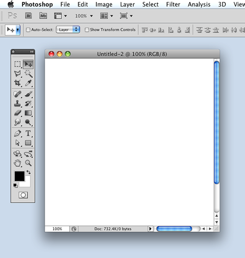
For a truly customized design, always start with a blank slate.
Whenever possible, avoid cobbling together work from old designs. Every website should be treated as unique, regardless of its type (e-commerce, author website, blog, etc.). The very best websites are designed to fulfill a defined purpose. Building your design from the ground up fosters clarity, focus and commitment to the design.
At every step in the design process, ensure that everything in the layout has a deliberate purpose; you should be able to explain your thought process behind every element on the page. If something has no reason to exist on the page, then consider removing it because it could simply distract visitors from more important content.
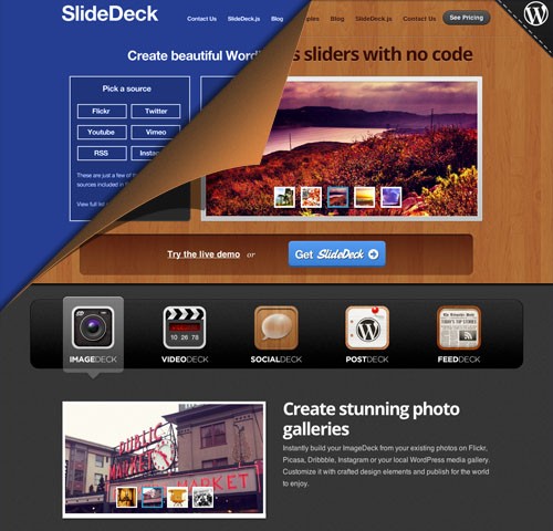
Every element on the page should have a reason for existing.
Simply copying and pasting elements from previous designs is a crutch that prevents you from experimenting, learning and growing as a Web designer. This isn’t to downplay the value of iterating on previous design elements, which can be a useful exercise and which can challenge you to get creative and experiment.
Invest In Custom Icons And Graphics

Spotify uses custom icons and graphics, rather than relying on stock images, to give their design soul and character.
Custom illustrations, imagery and iconography make for a unique experience on a website. While stock photography and vectors do save a ton of time, a photo of a smiling sales rep wearing a headset just feels phoney to visitors when they’ve seen the same image on five other websites.
Invest time in creating custom icons and graphics to preserve the look and feel of your website, as well as the authenticity of your message.
Spotify is a perfect example of this. Its lighthearted, “sketchy” illustration style sets its apart from all the other music services, and it leaves a lasting, positive impression on visitors.
Some other examples of great websites with custom icons and illustrations:
Remove Friction That Impedes Scrolling
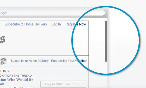
Encourage scrolling by removing obstacles.
As screen resolutions expand and touchscreens multiply at every turn, we’re encountering longer pages and smaller website footprints. And with good reason: a user who has to scroll down the page will encounter far less obstruction than someone who has to click a link and wait for the new page to load. Removing this obstruction will not only simplify the navigation, but help to tell a cohesive story, without the interruption of page loading.
As Paddy Donnelly’s excellent article “Life Below 600px” explains, the fear that users will ignore any content unlucky enough to fall below the fold afflicts designers much less today. And the proliferation of devices of different resolutions makes it almost impossible to determine where exactly the fold lies.
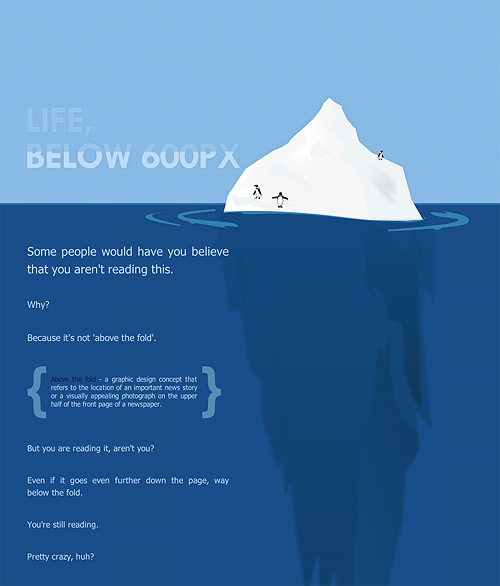
“Life Below 600px” is an excellent essay that dispels the myth of the fold.
Weave a cohesive story concept by getting creative with connecting individual page sections. This will promote a natural flow for the user, encouraging them to explore deeper into the page, building momentum in their experience and making it easier to get all the way through the page. You can even tie radically different styles of content together on the same page by adding small visual cues at the bottom of each section to indicate that more content awaits — much like how different rooms in a house can have entirely separate functions yet retain a common theme. If each section on the page comes to an abrupt end or looks like a footer, then users will be less likely to reach the end.
In fact, scrolling has become such a natural interaction on most Web-enabled devices that Apple did away with the scroll bar in OS X Lion.
The Dangers of Fracking and Slavery Footprint deserve hearty mentions. Both websites drive the user to scroll down with incredibly creative parallax effects and compelling stories.
More awesome examples of mega pages:
- Night Stand HD
- Diablo Media
- Courier
- Rdio
Make The Design Invisible Through Interactivity And Functionality
After more than 20 years of evolution, the paradigms of the print world still provide the fundamental building blocks of the way we present content online. Think about the terms we use to describe the Web: pages, headlines, columns, scrolling. These are band-aid metaphors that we’ve adopted to make the Web more understandable to the public. But the medium itself is capable of so much more. Static text and images are usually fine, but human beings by nature crave varied stimulation, and the Web is capable of feeding that craving with a much more interactive and richer experience.
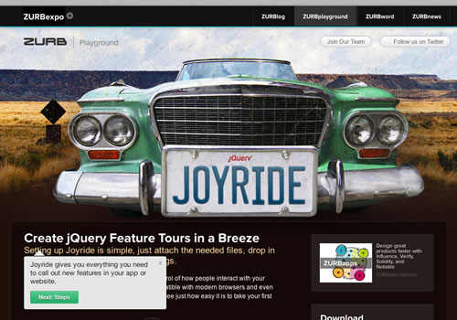
Joyride uses “Pit stops” of interactivity to keep the visitor engaged with the website.
Providing clear points on the page where users can interact with the design, rather than passively consume it, will help to relieve the burden of wading through long passages of copy. Visitors will experience the invisible part of a design; content sliders, tooltips, lightboxes, modal windows and other points of interaction give them something to do and can propel them further along in the story, much like how a good museum exhibit mixes methods of conveying information. Of course, swing too far to the extreme of too much interactivity and you’ll distract users, so be cautious of how much you build in. All interaction points should serve the overarching goal of the page.
Joyride is a great example of this approach. While the page has plenty of content, Joyride does a great job of guiding the user around the page and highlighting points of interest to come back to later. (And the little surprise at the end will leave you grinning.)
Great examples of engaging users with interaction on the page:
Pay Attention To Detail
Whether you’re going for clean minimalism or complex and illustrative, pay special attention to the details of every element on the page. Even slight inconsistencies will be picked up by users subconsciously, thus diminishing their experience or confusing them.
A few common pitfalls to watch out for:
- Typography gone wild. Each typographic treatment in the design should be consistent with its function. Headings in one part of the page should look the same as headings elsewhere on the page, and indeed throughout the rest of the website.
- Buttons, buttons everywhere. Be conscious of where a button style is called for, as opposed to plain text links. Overusing buttons diminishes their overall effectiveness.
- Changing gradients. If your design has gradients, use them consistently, with the same shades across like elements and with the same gradation.
- Mind the gaps. Consistent spacing and alignment between page elements will make the layout feel refined and high quality.
Thoughtfully questioning each element in the layout is key to achieving a highly polished design. The burden is on you to prove that an element has a reason to be there and is not superfluous to the experience. At the end of the day, don’t fall into the trap of thinking “No one will notice,” because the chances are high that someone will!
As Antoine de Saint-Exupéry once said:
Perfection is achieved not when there is nothing more to add, but when there is nothing left to take away.
Consider whether the elements on the page have the right amount of detail to fulfill their purpose. Does that button have the right texture and color treatment to serve its role? Does it need texture at all? Simplicity is key and is relative to the purpose of the element.
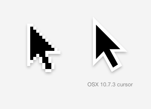
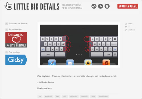
Polished designs can be found across the Web, if you look closely.
Polished touches lie all around the Web if you look. Little Big Details rounds up some details from the Web and other interfaces that many of us encounter every day but don’t notice.
To see a truly polished design, head over to PixelResort. To describe it in one word: sumptuous. No detail has been spared for each element. The entire experience has a weight and tangibility that stays with the user.
Some other excellent examples of polish on the Web:
Bringing It All Together
Creating a truly beautiful and memorable website ain’t easy. You’ll need to make a significant investment of time and effort, focused in key areas for maximum payoff:
- Design the entire layout specifically for the given website. Putting a new coat of paint on an old template won’t give you the most compelling design possible.
- Create your own graphics to give the design a unique personality.
- Motivate visitors to scroll by weaving a story across the page that compels them to finish.
- Engage visitors with variety. Adding “rest stops” of interactivity will keep them actively thinking about the experience that you’re leading them through.
- Finally, polish, polish, polish! Think about every detail in the design. Make sure nothing is missed.
There you have it: five solid techniques to ensure that your website is a beautiful and memorable experience. This roundup is by no means comprehensive, but the techniques will pay you back with returning visitors, high engagement and user satisfaction.
Do you have any tips on adding beauty to a design? Feel free to post them in the comments!
(al) (jc)


 SurveyJS: White-Label Survey Solution for Your JS App

 Try ProtoPie AI free →
 Register Free Now
 Celebrating 10 million developers
