Towards A Retina Web
With the recent announcement and release of the Retina Macbook Pro, Apple has brought double-density screens to all of the product categories in its current lineup, significantly paving the way for the next wave of display standards. While the fourth-generation iPhone gave us a taste of the “non-Retina” Web in 2010, we had to wait for the third-generation iPad to fully realize how fuzzy and outdated our Web graphics and content images are.
In the confines of Apple’s walled garden, popular native apps get updated with Retina graphics in a timely fashion, with the help of a solid SDK and a well-documented transition process. By contrast, the Web is a gargantuan mass whose very open nature makes the transition to higher-density displays slow and painful. In the absence of industry-wide standards to streamline the process, each Web designer and developer is left to ensure that their users are getting the best experience, regardless of the display they are using.
Before diving into the nitty gritty, let’s briefly cover some basic notions that are key to understanding the challenges and constraints of designing for multiple display densities.
Device Pixels

A device pixel (or physical pixel) is the tiniest physical unit in a display. Each and every pixel sets its own color and brightness as instructed by the operating system, while the imperceptible distance between these tiny dots takes care of tricking the eye into perceiving the full image.
Screen density refers to the number of device pixels on a physical surface. It is often measured in pixels per inch (PPI). Apple has coined the marketing term “Retina” for its double-density displays, claiming that the human eye can no longer distinguish individual pixels on the screen from a “natural” viewing distance.
CSS Pixels
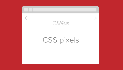
A CSS pixel is an abstract unit used by browsers to precisely and consistently draw content on Web pages. Generically, CSS pixels are referred to as device-independent pixels (DIPs). On standard-density displays, 1 CSS pixel corresponds to 1 device pixel.
<div height="200" width="300"></div>This would use 200 × 300 device pixels to be drawn on screen. On a Retina display, the same div would use 400 × 600 device pixels in order to keep the same physical size, resulting in four times more pixels, as shown in the figure below.
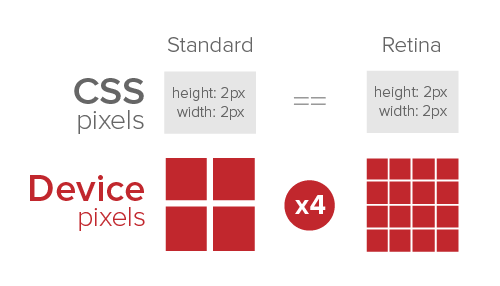
The ratio between device pixels and CSS pixels can be obtained using the following media query and its vendor-specific equivalents:
device-pixel-ratio,
     -o-device-pixel-ratio,
   -moz-device-pixel-ratio,
-webkit-device-pixel-ratio {
…
}
Or you can use their future-proof siblings:
device-pixel-ratio,
     -o-min-device-pixel-ratio,
   min--moz-device-pixel-ratio,
-webkit-min-device-pixel-ratio {
…
}
In Javascript, window.devicePixelRatio can be used to obtain the same ratio, although browser support is still relatively limited. Both of these techniques will be discussed in depth later in this article.
Bitmap Pixels
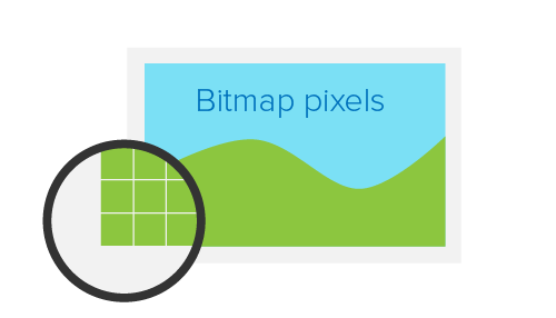
A bitmap pixel is the smallest unit of data in a raster image (PNG, JPG, GIF, etc). Each pixel contains information on how it is to be displayed, including its position in the image’s coordinate system and its color. Some image formats can store additional per-pixel data, such as opacity (which is the alpha channel).
Beside its raster resolution, an image on the Web has an abstract size, defined in CSS pixels. The browser squeezes or stretches the image based on its CSS height or width during the rendering process.
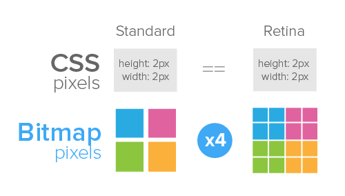
When a raster image is displayed at full size on a standard-density display, 1 bitmap pixel corresponds to 1 device pixel, resulting in a full-fidelity representation. Because a bitmap pixel can’t be further divided, it gets multiplied by four on Retina displays to preserve the same physical size of the image, losing detail along the way.
The Tool Chest
Even though we are still in the early stages of this major shift, several approaches to optimizing Web graphics for Retina displays have sprung up, and more are popping up as we speak. Each method makes some degree of compromise between performance, ease of implementation and cross-browser support. As such, choosing a tool should be done case by case, taking into account both quantitative and qualitative factors.
HTML And CSS Sizing
The most straightforward way to serve Retina-ready Web graphics is to halve the size of your raster assets using CSS or HTML, either manually or programatically. For instance, to serve a 200 × 300-pixel image (remember, those are CSS pixels), you would upload an image with a bitmap resolution of 400 × 600 pixels to your server, then shrink it by exactly 50% using CSS properties or HTML attributes. On a standard-resolution display, the result would be an image rendered with four times fewer pixels than its full bitmap size — a process commonly referred to as downsampling.

Because the same image would use four times as many physical pixels on a Retina screen, every physical pixel ends up matching exactly 1 bitmap pixel, allowing the image to render at full fidelity once again.
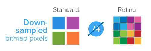
There are several ways to achieve this:
Using HTML
The easiest way to apply CSS sizing would be by using the width and height attributes of the img tag:
<img src="example@2x.png" width="200" height="300" />Please note that, even though specifying height is optional, it allows the browser to reserve the space required for the image before loading it. This prevents the page layout from changing as the image loads.
What to use it for? Single-page websites with few content images.
Using Javascript
The same result can also be obtained using Javascript by targeting all Retina-ready content images in the document and halving their sizes. With the help of jQuery, this would look like this:
$(window).load(function() {
  var images = $('img');
    images.each(function(i) {
      $(this).width($(this).width() / 2);
    });
});
What to use it for? Websites with few content images.
Using CSS (SCSS)
If you want to keep all of the presentation code in your CSS files, then the most common technique involves setting the image as the background of another HTML element, usually a div, then specifying its background-size property. You could either set explicit width and height values for the background image or use the contain value if the dimensions of the HTML element are already specified. It is worth noting that the background-size property is not supported in IE 7 or 8.
.image {
  background-image: url(example@2x.png);
  background-size: 200px 300px;
  /* Alternatively background-size: contain; */
  height: 300px;
  width: 200px;
}
You could also target a :before or :after pseudo-element instead:
.image-container:before {
  background-image: url(example@2x.png);
  background-size: 200px 300px;
  content:’;
  display: block;
  height: 300px;
  width: 200px;
}
This technique works just as well with CSS sprites, as long as the background-position is specified relatively to the CSS size (200 × 300 pixels in this case):
.icon {
  background-image: url(example@2x.png);
  background-size: 200px 300px;
  height: 25px;
  width: 25px;

  &.trash {
    background-position: 25px 0;
  }

  &.edit {
    background-position: 25px 25px;
  }
}
When using image sprites, consider any OS-specific limitations.
What to use it for? Websites that make limited use of the background-image property, such as those that rely on a single-image sprite.
HTML And CSS Sizing: Pros
- Easy to implement
- Cross-browser compatible
HTML And CSS Sizing: Cons
- Non-Retina devices have to download larger assets.
- Downsampled images might lose some of their sharpness on standard-density screens, depending on the algorithm used.
- The
background-sizeproperty is not supported in IE 7 or 8.
Querying Pixel Density

Perhaps the most popular way to serve Retina-ready graphics on the Web is by querying the device for its pixel density and then serving assets accordingly. This can be done using either CSS or JavaScript.
{% ad-panel-leaderboard %}}
Using CSS Media Queries
As of this writing, almost every major browser vendor has implemented a prefixed variant of device-pixel-ratio and its two siblings, min-device-pixel-ratio and max-device-pixel-ratio. These media queries can be used in conjunction with the background-image property to serve Retina-ready assets to high-density devices:
.icon {
  background-image: url(example.png);
  background-size: 200px 300px;
  height: 300px;
  width: 200px;
}

@media only screen and (-Webkit-min-device-pixel-ratio: 1.5),
only screen and (-moz-min-device-pixel-ratio: 1.5),
only screen and (-o-min-device-pixel-ratio: 3/2),
only screen and (min-device-pixel-ratio: 1.5) {
  .icon {
    background-image: url(example@2x.png);
  }
}
By using a ratio of 1.5 instead of 2, you can target other non-Apple devices with the same query.
What to use it for? Any website or app that uses the background-image property for graphic assets. Not suitable for content images.
CSS Querying: Pros
- Devices download only those assets that target them.
- Cross-browser compatible
- Pixel-precise control
CSS Querying: Cons
- Tedious to implement, especially on large websites.
- Displaying content images as backgrounds of other HTML elements is semantically incorrect.
Using Javascript
The pixel density of the screen can be queried in Javascript using window.devicePixelRatio, which reports the same value as its CSS counterpart. Once a higher-density screen is identified, you can replace every inline image with its Retina counterpart:
$(document).ready(function(){
  if (window.devicePixelRatio > 1) {
    var lowresImages = $('img');

    images.each(function(i) {
      var lowres = $(this).attr('src');
      var highres = lowres.replace(".", "@2x.");
      $(this).attr('src', highres);
    });
  }
});
Retina.js is a Javascript plugin that implements roughly the same technique as described above, with some additional features, such as skipping external images and skipping internal images with no @2x counterparts.
Lastly, it is worth noting that devicePixelRatio is not entirely cross-browser compatible.
What to use it for? Any website with content images, such as landing pages and blogs.
Javascript Querying: Pros
- Easy to implement
- Non-Retina devices do not download large assets.
- Pixel-precise control
Javascript Querying: Cons
- Retina devices have to download both standard- and high-resolution images.
- The image-swapping effect is visible on Retina devices.
- Does not work on some popular browsers (such as IE and Firefox).
Scalable Vector Graphics

Regardless of the method used, raster images remain inherently constrained by their bitmap resolution; they were never meant to be infinitely scalable. This is where vector graphics have the advantage, being a future-proof way to “Retinize” your Web graphics.
As of this writing, the vector XML-based SVG format has cross-browser support of more than 70% and can be used in several ways on the Web. SVG images can be easily created in and exported from a number of vector-graphic editors, such as Adobe Illustrator and free alternatives such as Inkscape.
As far as Web design goes, the most straightforward way to use SVG assets is with the HTML img tag or with the CSS background-image and content:url() properties.
<img src="example.svg" width="200" height="300" />In the example above, a single SVG image can be used as a universal asset, scaling infinitely up or down as required. This not only saves precious bandwidth (most SVG files tend to be smaller in size than standard-resolution PNGs), but also makes your graphic assets much easier to maintain. The same would apply if used in CSS:
/* Using background-image */

.image {
  background-image: url(example.svg);
  background-size: 200px 300px;
  height: 200px;
  width: 300px;
}

/* Using content:url() */

.image-container:before {
  content: url(example.svg);
  /* width and height do not work with content:url() */
}
If you have to support IE 7 or 8 or Android 2.x, then you will need a fallback solution that swaps SVG images with their PNG counterparts. This can be easily done with Modernizr:
.image {
  background-image: url(example.png);
  background-size: 200px 300px;
}

.svg {
  .image {
    background-image: url(example.svg);
  }
}
For best cross-browser results and to avoid some rasterization headaches in Firefox and Opera, make each SVG image at least the size of its parent HTML element.
In HTML, you can implement a similar fallback solution by adding a custom data attribute to your img tag:
<img src="example.svg" data-png-fallback="example.png" />Then, handle the rest with jQuery and Modernizr:
$(document).ready(function(){
  if(!Modernizr.svg) {
    var images = $('img[data-png-fallback]');
    images.each(function(i) {
      $(this).attr('src', $(this).data('png-fallback'));
    });
  }
});
This HTML and JavaScript route, however, would not prevent browsers with no SVG support from downloading the SVG assets.
What to use it for? Any website or app. Suitable for icons, logos and simple vector illustrations.
SVG: Pros
- One universal asset for all devices
- Easy to maintain
- Future-proof: infinitely scalable vector graphics
SVG: Cons
- No pixel precision due to anti-aliasing
- Unsuitable for complex graphics due to large file sizes
- No native support in IE 7 and 8 or early Android versions
Icon Fonts

Popularized by Twitter’s Bootstrap, the technique of using @font-face with icon-based fonts has garnered a following of its own as a resolution-independent alternative to bitmap icons. The technique consists of using a custom Web font that replaces the alphabet with monochrome glyphs, which can be styled using CSS, just like any other text on the website.
There is no shortage of comprehensive, good-quality icon fonts that would cover most of your needs. That being said, importing a large font in half a dozen formats only to use a small subset of the icons is a bad idea. Consider building your own custom font with free tools such as Fontello, Font Builder or even Inkscape.
The most common way to use icon fonts on websites is by assigning an .icon or .glyph class to a particular HTML element — most often a <span> or an <i> — and then using the letter corresponding to the desired icon as its content:
<span class="icon">a</span>After having imported your custom font using @font-face, you would declare it:
.icon {
  font-family: 'My Icon Font';
}
Another technique consists of using the :before pseudo-element and the content property, with a unique class for each icon:
<span class="glyph-heart"></span>[class^="glyph-"]:before {
font-family: 'My Icon Font';
}
.glyph-heart:before {
content: 'h';
}What to use it for? Websites or apps with a high number of icons, and for rapid prototyping.
Icon Fonts: Pros
- Future-proof: infinitely scalable glyphs
- Cross-browser compatible
- More flexible than graphic assets: can be used in placeholder text and other form elements, etc.
Icon Fonts: Cons
- No pixel precision due to subpixel anti-aliasing
- Hard to maintain: changing a single icon requires regenerating the whole font.
- Relies on semantically incorrect markup (unless used with
:beforeor:afterpseudo-elements).
Favicons
Favicons are getting their fair share of attention, being increasingly used outside of browser chrome as an iconic representation of our websites and apps. To make your favicons Retina-ready, export an .ico file in both 16- and 32-pixel versions. If you are using a Mac, you can create your own .ico files with Apple’s Icon Composer (included in the Graphic Tools in Xcode) or with Icon Slate, a paid third-party application.
A Glimpse Of The Future
Besides the techniques covered above, several other efforts are being made independently by organizations and individuals alike, not the least of which is Apple’s own -Webkit-image-set, introduced last spring. This proposal allows for multiple variants of the same image to be provided in one CSS declaration:
.image {
  background-image: -Webkit-image-set(url(example.png) 1x, url(example@2x.png) 2x);
  background-size: 200px 300px;
}
This technique does not, however, cover images inside img tags, and it is Webkit-only as of this writing.
Another notable effort is Scott Jehl’s Picturefill, an HTML and Javascript solution that makes heavy use of data attributes and media queries to serve different images in different media contexts.
<div data-picture>
     <div data-src="example.png"></div>
     <div data-src="example@2x.png" data-media="(min-device-pixel-ratio: 1.5)"></div>

  <!-- Fallback content for non-JS browsers -->
  <noscript>
    <img src="example.png" >
  </noscript>
</div>
Even if the markup puts you off, it is a good cross-browser solution to consider if you are dealing with few content images.
Last but not least, the ambitious picture element proposal aims to bring responsive images to the Web using a markup-only approach for multiple image sources, coupled with media queries that route each device to the right asset.
Closing Words
Like other major shifts the Web is currently undergoing, attaining resolution independence will be a long journey. As Web designers and developers, either we can sit down and wait passively for a convention to be standardized, or we can immediately start offering a pleasurable viewing experience to our users. Let’s get to work.
{% ad-panel-leaderboard %}}
Further Reading
- A Better Way To Design For Retina In Photoshop
- The Retina Asset Workflow You’ve Always Wanted For Photoshop
- Create Pixel-Perfect Assets For Multiple Scale Factors
- Free Photoshop Action For Slicing Graphics For HD Screens


 Try ProtoPie AI free →
 Register Free Now


 Celebrating 10 million developers
 SurveyJS: White-Label Survey Solution for Your JS App

