Typography Carved In Stone
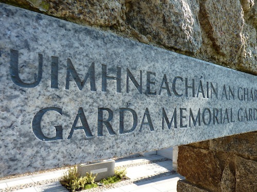
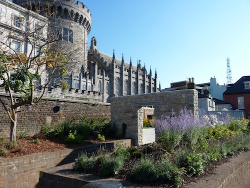
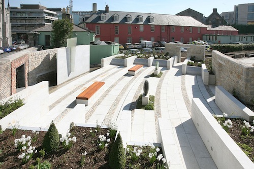
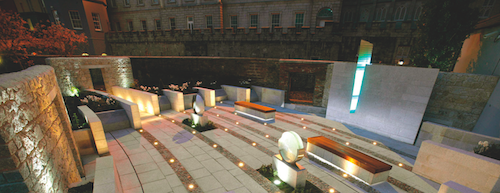
Every name here is a tragic story of loss and heartbreak. The Garda Memorial Garden, or Gairdín Cuimhneacháin an Gharda Síochána, is located in the heart of Dublin city. This memorial is a contemplative garden with large stone plinths and a lot of names and numbers. The list of names, this “roll of honor,” records individual police officers (gardaí) who have lost their lives violently and tragically in the line of duty since the formation of the Irish state in 1921.
This article offers insight into the creative thought processes I followed in designing a typographic solution for this memorial. I’ll discuss my choice of typeface, my detailed layout, the size of type, the materials, the process of engraving, and leaving open the possibility to add names in the future.
My objective was to keep a sense of visual harmony throughout the design, while aiming for a certain consistency in the future engraving of names, regardless of language.
Background
In the spring of 2009, Ana Dolan, senior architect in the Office of Public Works, asked me to think about the style of lettering that should be used in a project she was working on. Her job was to design a new memorial garden to honor all those who had died in the line of duty. The state had decided to carve the names of these 82 individuals into a new limestone memorial, and the need for a typographer on the team was recognized. It was great to be offered such an unusual and non-ephemeral project.
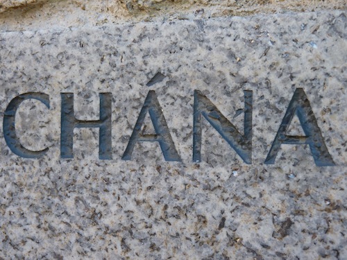
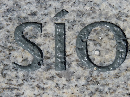
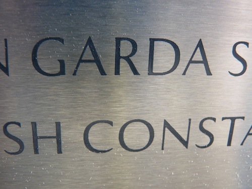
Ana explained to me that another memorial to honor all of these gardaí already existed somewhere else in the city. It had served as a place for their families to visit since the 1950s. All of the people’s names and unique regimental codes were carved in stone in a continuous block, each separated by a simple cross. The original lettering style (see below) was handmade and calligraphic in style; simple, elegant and carved deeply. Sadly, information about its architect and typographer has been lost over time. However, it might have been carved by the English typographer Michael Biggs, and the monument designed by the Irish architect Desmond Fitzgerald. More research is required on this. Any takers from the Smashing Magazine community?
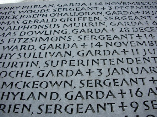
This older memorial was located in a high-security place that was difficult to visit without prior appointment or without undergoing strict screening. Over the years, the families of those people whose names were inscribed in this memorial felt that visiting the place was quite difficult. As a result, a decision was made to redesign the roll of honor and relocate it in the city center, on the grounds of Dublin Castle.
A New Memorial
The architect and I met in early 2009 to discuss the new memorial and to assess the advantages and disadvantages of the carved lettering in the old memorial. The lettering reflected the typographic sensibilities of the time (1950s); so, pondering the choice of lettering and layout was crucial to bringing some of those qualities into the new memorial garden’s typography. Initially, I was instructed to faithfully copy the original letters, but thankfully this specification changed as the project progressed.
The new architectural team had also gone some way towards developing a typographic approach and were favoring a ranged-left (i.e. ragged-right) style rendered in a PC-available face. Happily, I was invited to join the team at this stage, before too many decisions had been made about positive and negative spatial planning, choice of face, general layout and credentials of the stone carver (more on that last point later).
In an email conversation with my client, I explained that the ranged-left model that her team had designed and emailed to me (see below) had visual problems. For example, the white space between the left and middle blocks of names looked wider than the space between the middle and right blocks. This visual oddity happened because the length of the names in the middle block was longer than in the other two blocks, resulting in an uncomfortable spatial arrangement.
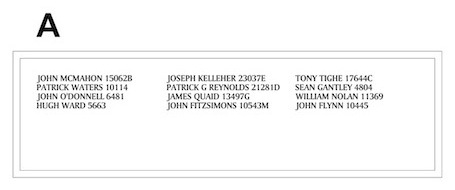
To my eye, the uneven white space between columns looked crude and clumsy. Harmony and regularity were demanded by the vertical and horizontal rhythm of the letterforms, the thicks and thins, the counters. It was important that the white space also have visual harmony. A lack of visual calm and harmony would detract from the overall coherence and stability — not a good vibe for a garden that needed all visual elements to be fully considered, that needed a thoughtful approach and that needed to be an oasis of visual order. These men and women died protecting Irish society from crime. Most died violently and in chaos. I didn’t want chaos in the typography. I wanted to create a calm and contemplative space. The typographic layout needed to be visually coherent, with a sense of structure and order. These people had made the ultimate sacrifice by giving their lives to protect others. The typographic design and layout needed to reflect the gardaí’s role of order and discipline in society, not the chaos that resulted in their deaths.
The task of laying out these names and numbers of different lengths in the allocated space in the limestone was complex. It presented the typographer with a visual riddle to be solved. I requested more time to explore these challenges on paper. Of course, allowing me more time came with a financial cost, but, happily, the architect understood the importance of typography and agreed with my arguments, giving me the green light.
Establishing A Layout


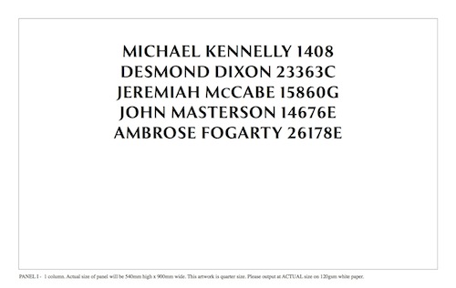
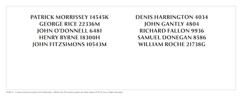
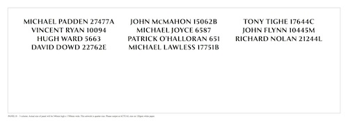
Finding an effective typographic layout for the gardaí’s names and numbers called for a number of considerations to be made, such as the number of names, their varying number of characters, and the dimensions of each stone plinth. Eighty-three names (and ID numbers) were to be carved across nine limestone plinths of varying widths, each of which would allow room for ten rows of names across one, two or three columns.
I decided to center all of the names vertically.
To get more consistent margins and better balance, I advised that long names not be put on the same row across the three blocks. Long names sat best in the center block, with two shorter names on the left and right. The reverse (i.e. a short name in the center and longer ones on the sides) would work equally well.
For obvious reasons, not leaving any plinths blank was important. So, the 83 names were arranged across each of them, with space left below for names to be added in future (as will be needed, tragically). There is capacity to carve another 117 names into the plinths.

Choosing A Typeface
There was general agreement that the shape of the letters and numerals in the 1950s memorial reflected a sense of “Irishness,” particularly in the letterforms, which were calligraphic in style and had a slightly uncial quality commonly seen in the letterforms of the Irish/Celtic manuscript tradition of the 8th century onwards. The Book of Durrow, the Book of Kells and the Book of Lismore all contain calligraphic letterforms whose shapes are influenced by the angle of the quill head and the angle of the scribe’s hand. However, I felt that a calligraphic typeface was not suitable for this project. I wanted a face that was almost invisible, so that, when reading the names of the fallen, one would think of them and not of the typeface. I wanted a typeface that was neither difficult to read nor so full of personality that it drew attention to itself, but rather one that reflected the hand-drawn character of calligraphy, a human quality. Yet it also needed the uniformity, strength and regularity of form found in a print typeface.
It was important that the new memorial have a typeface that could be set and carved in dual languages, namely English and Irish. However, for the long term, given the increase in gardaí with names that are non-Irish, non-English and non-European, the typeface needed to be versatile, be robust and include all glyphs and accented character sets.
I knew that the typeface would need to be easy to carve. I didn’t want one that had thin serifs, counters, stems or terminals that could be easily misinterpreted by a stone carver, resulting in a badly drawn version appearing in stone.
The hunt for a suitable typeface was on!
After some research online and using atlases of type, I found three possibilities for the project: Optima, Zapf Humanist 601 and Exemplar Pro. Each had a beautiful visual rhythm and lovely numerals. They were also all available for purchase in OpenType format and — more importantly for typesetting — available in digital form. The faces could all be slightly modified if needed with accented characters (commonly found in the Irish and central European languages), customized letters and individual number spacing.
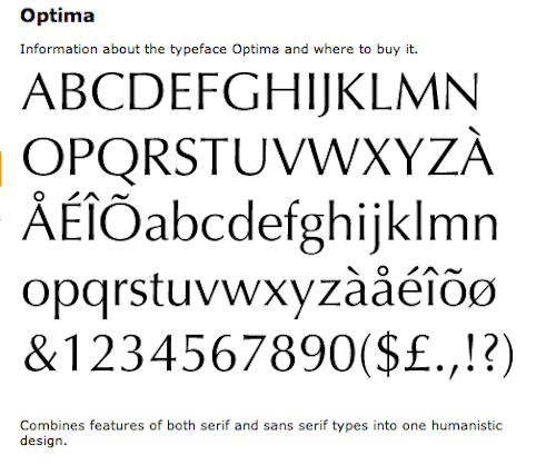
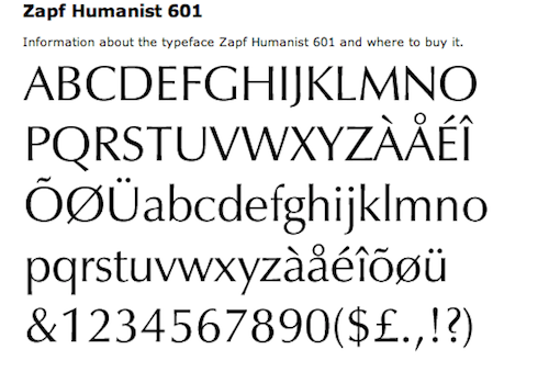
All three faces had visual traits that were similar to the original 1950s lettering. For example, in Optima, the uppercase “K” had the same calligraphic kick in the top and bottom diagonal strokes. The uppercase “O” had the same vertical stress, and the stem of the numeral “7” leaned back at the same angle. And as in the old memorial, the crossbar on Zapf Humanist’s uppercase “T” was not parallel but had a calligraphic bend in the middle that was very satisfying.
The Perfect Face
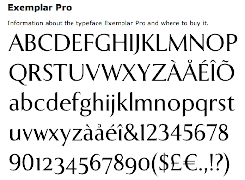
Exemplar Pro
After much deliberation, I settled on Exemplar Pro as the most robust and flexible typeface. Its weight and solidity of design were greater than those of Optima or Zapf Humanist; plus, it had a full range of accented characters, ideal for unusual names.
Comparing Exemplar Pro to the 1950s hand carving, I noticed that a lot of the capital letters (N, M, C, H) and numerals (7, 1, 6) were sympathetic in design. The letterforms in Exemplar Pro have a roundness and rhythm that I liked, as well as a slightly calligraphic or hand-drawn quality. I wanted to avoid typefaces that were coldly geometric or mechanical. I was dealing with the names of people who had died tragically. Their families would visit this memorial regularly. I didn’t want the relatives of fallen gardaí to feel that the memorial was cold, industrial or mass produced. I wanted the typeface to be sensitively drawn and a little quirky, the way people are sometimes quirky. When set in Exemplar Pro, the individual names and numbers had a friendliness and individuality that was appropriate to the project. Exemplar Pro also seemed to translate well into a carved face. The serifs were not too thin, and the shapes not too fine or difficult for a carver to redraw or laser-cut. I decided to set the type and provide size layouts, which the stonecarver carefully cut into stone.
It was interesting to research Exemplar Pro’s designer and his rationale for this face as I was critiquing the letterforms. I came across this online description written about the typographer, Göran Söderström:
“Söderström, born 1974, is a self-taught Swedish type designer and font developer based in Stockholm. Having just finished a little bit of calligraphic studies, he was twenty when he made the first sketches of Exemplar in 1994. In 2009 the full version became available, all glyphs were redrawn and improved. Diacritics were build for central European languages and small caps, different numerals and alternate letters were added. Finally, the typeface family was expanded to four weights with corresponding italics.”
Inspired by the beauty and perfection of several typefaces and the art of calligraphy, he wanted to create a typeface that was traditional yet unconventional, a balance that felt both old and new. It was the perfect typeface for my project. Thank you, Göran!
Final Layout
The limestone plinths had a uniform height of 540 millimeters, but their widths varied, ranging from 900 to 1800 millimeters. For the layout of the names, I looked closely at the scale and size of the type (with letters that were 17 to 25 millimeters in height), the weight of the letters (roman or bold), the number of lines of text (a minimum of 10 and maximum of 11) and the visual positioning of the text.
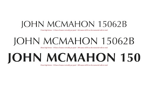
I created a series of sample design layouts for panels of varying widths (1800 and 1300 millimeters), including a visual reference of names at the actual size on an A3 landscape page, demonstrating the three possible heights of names (17, 20 or 25 millimeters, the last being preferred).
Regarding the number of names, letters that were 17 millimeters in height, in roman or bold, would fit 11 lines per panel, making for 264 names in total. Alternatively, letters that were 25 millimeters in height, in bold weight, at 10 lines per panel would fit 200 names in total. The latter was more legible, and it had a better visual scale and allowed for a larger carving area letter by letter.
My client and I were in total agreement on the final height of the letters, the general shapes of the letters, the number of lines, the layout and the overall number of names for the memorial. The result was 25-millimeter-tall capital letters (100 points) over 10 lines, providing a total capacity of 200 names. We could have increased the capacity by reducing the size of the type, but that would have compromised the aesthetics and the carver’s accuracy.
The full and final list of names finally arrived as a Microsoft Word file, set in the Courier typeface. I got to work and supplied all of the final size layouts on paper to the stone carver for execution. (More names have since arrived, each one being carved directly on site.)
Engraving Technique
We decided to ask the stonemason to do a test piece on the limestone in order to firefight any final problems before all of the names were carved. At that point, we also had to make the crucial decision of whether to carve the letterforms and numerals by hand or by machine. The decision would have a major impact on the visuals, budget and schedule. Limestone is actually quite porous and weathers fairly rapidly, and its color and texture when dry is distinct from when it’s wet.
I also provided the names of two proofreaders who were qualified to proofread the stone carver’s work at phased intervals on site in Dublin Castle. I suggested that the architects order one or two extra pieces of stone in case of spelling mistakes or a carving accident. I love contingency plans, especially on a project like this!
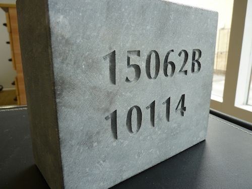
To our surprise, the handcut lettering was shallow and hard to read. In strong light (our rare Irish sunshine) and in overcast conditions (which was more normal), the hand-carved lettering was the same color as the surface of the stone, so one couldn’t read it properly. However, the machine-cut lettering was very deep; shadows were apparent, and the text was very easy to read. The letters looked darker than the surrounding stone, and the resulting contrast improved legibility hugely.
Unsurprisingly, we agreed to cut the letters by machine. This decision had several other positive outcomes. First, it ensured that the carving of future names would be consistent with the initial names; secondly, it ensured a deeper definition of form, given the sharper edge; and thirdly, it maximized legibility.
The stone carver used an interesting technique (three stone carvers have worked on this project so far). I supplied the full-sized artwork in black and white on a large sheet of thin grammage paper (120 GSM), one per plinth. The carver then glued this paper onto a “blanket,” or intermediary sheet of heavy blue material, which in turn was glued into position on each stone. The stone mason handcut the letterforms by scalpel, cutting through the paper and blanket layers.
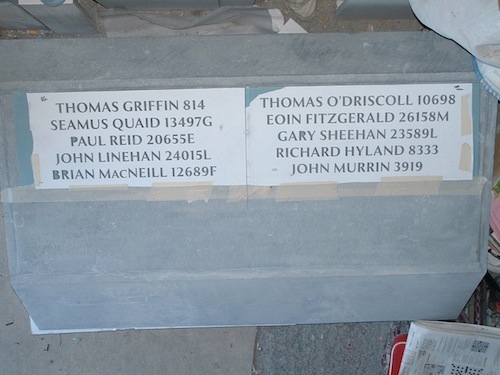
He then sandblasted and lasercut the cutout areas of paper and blanket to a standard depth of 2.5 millimeters. The edges of each letterform and their uniform depth had a very pleasing visual effect.
A decision was made to leave the lettering uncolored on the limestone. However, the granite, which contained a heavy background texture and pattern, needed greater legibility. So, a dark-gray infill was chosen for the granite plinths over each entrance.
Troubleshooting
The best laid plans sometimes don’t go as hoped! The original stonemason was chosen by the memorial’s architect. The builder who won the tender to build the memorial had included stone carving as part of their price. Four or five plinths were carved under this financial arrangement. Unfortunately, the main building contractor on this project was not so in tune with all of our typographic sensibilities and had hired a building subcontractor, who in turn had a different stonemason who in effect was working blind and hadn’t been vetted for quality. The result (illustrated below in the letter “G”) was disastrous. The letterforms were poorly cut and had no fidelity to the original typeface.
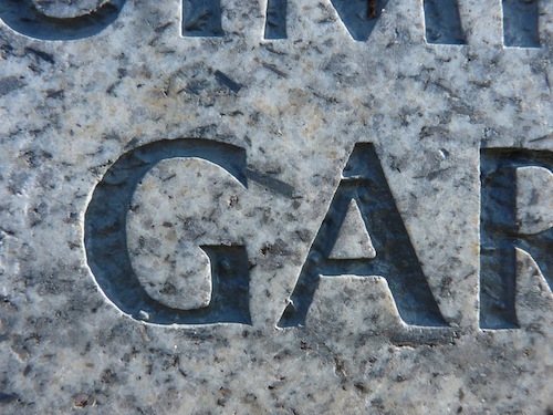
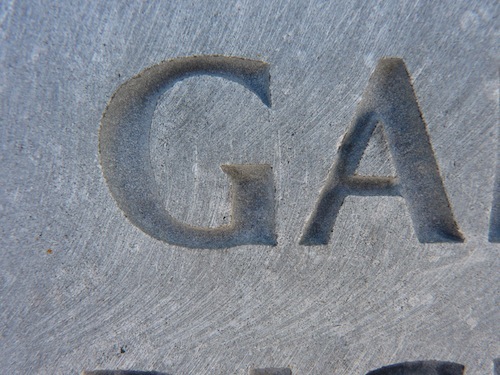
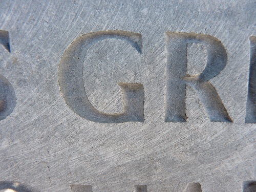
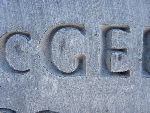
I spoke to the original stonemason some time later and learned that his switch in supplier was accidental. He had received all of this feedback through the “trade” grapevine. He also mentioned that a third stonemason was hired by the building subcontractor. The overall result is that the letterforms were not properly carved and, sadly, the standard of carving is very inconsistent throughout.
I contacted my client and mentioned my disappointment in the quality of the stone carving. The client happily took my comments to heart and has since gotten a new stone mason. New names are now beautifully carved. Happy days!
Conclusion
The names of the fallen will continue to be carved in random order, so having a sustainable design and manufacturing process that could potentially last the lifetime of the designer and stone carver and then get passed on to the next generation was important.
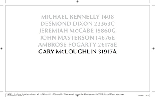
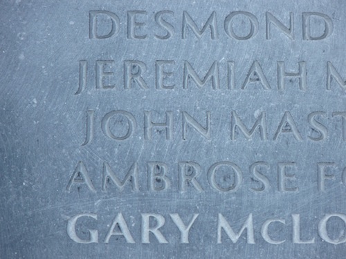
To assist this process, I created a set of detailed typographic guidelines for future reference, outlining the typeface, alignment and point size and offering advice on tackling white space and the general layout. These guidelines were created to help the next typographer take over the project from me. This project will probably run for another 100 years, with approximately one name being added each year — I don’t plan on being around to see the last name added!
Being asked to tackle this emotionally loaded typographic conundrum was a huge honor. I hope I have created a sense of visual coherence and restful harmony. Each letter shape was important. Each person memorialized here was someone’s son, daughter, father, brother, mother or friend. Each name is now set permanently in the heart of this island’s capital. Even if you didn’t know any of these people personally, hopefully you feel that this memorial is a fitting monument to their lives and service.
Of course, this being Ireland, we never like to leave on a low note. The next time you are in Dublin, if it’s not raining, please remember to visit the memorial; sitting in the garden and reflecting is a rewarding experience.
Further Reading
- Understanding The Difference Between Type And Lettering
- Writing Systems And Calligraphy Of The World
- 30 Brilliant Typefaces For Corporate Design
- How To Choose A Typeface — A Step-By-Step Guide!


 Celebrating 10 million developers
 Register Free Now


 SurveyJS: White-Label Survey Solution for Your JS App


