SVG Fallback, Vertical Rhythm, CSS Project Structure
Howdy, folks! Welcome to more Smashing Magazine CSS Q&A. It works like this: you send in questions you have about CSS, and at least once a month we’ll pick out the best questions and answer them so that everyone can benefit from the exchange. Your question could be about a very specific problem you’re having, or it could even be a question about a philosophical approach. We’ll take all kinds.
CSS Project Structure
Stephen Beiler asks:
“Could you please explain your strategy for building CSS? How do you start and what does the structure of your style sheet look like? Do you use something like tip/comment helpers (e.g. the color style guide) or perhaps the related markup, or anything else? How do you structure your code?”
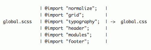
These days I’m using Sass for all my projects. Sass provides things that I’m sure you are all aware of — like variables and mixins, but it also provides a very simple and vital feature: includes. Just like you might use an include() function in PHP, or render a partial in Rails, you can @import another Sass file in Sass. Unlike the native CSS @import, which simply makes a request for that file, Sass goes and gets that file and includes the file’s content when compiling down to CSS.
I use this feature heavily while organizing and structuring CSS for a project. It allows me to break my styling into whatever files make sense for me, as the author. It allows me an ASCII drawing:

On my recent redesign of CSS-Tricks, I ended up with 28 .scss files, most of which were modular bits only ever @imported into bigger style sheets. This worked really well for me, matching how I naturally organize things, and not an organization scheme forced upon me, nor one built from artificial hacks (like enormous files with commented separators).
Regarding the color style guide, one of those .scss files is always one I call bits.scss, which is were I put all my re-usable “bits” that any of my other .scss files might need. Color variables, my own custom @mixins, etc. I’m a fan of setting up colors as variables right away in a project, so that you can reference them easily whenever needed. If you need variations on that color, you can use Sass functions like darken() and lighten() to adjust.
Slightly controversially, I like naming my colors based on their color, like $red, $blue, and $green, because then it takes me zero seconds to remember and actually use them. Whereas in the past, when I’ve tried to be super semantic about my colors and name them $brand, $secondaryHighlight, and $moduleBackground or things like that, I could never remember my own cleverness, and it slowed me down.
When To Use OOCSS
Michael Winczewski asks:
“Chris, what do you think of OOCSS? Do you use it in your code, and if so, how? When would you advise against using it? And when would you advise using it?”
I think it’s fantastic. It’s more of a way of thinking than a strict set of rules. I doubt that I understand OOCSS in the same way that Nicole Sullivan does, or that I understand SMACSS in the same way Jonathan Snook does. But I think I understand the spirit behind these movements and use them in ways that make sense to me.
What it boils down to for me is usually: write super semantic markup, but use a class name on just about every important “chunk”. Then style things largely based on those class names. It’s about identifying patterns and styling that pattern in a smart way. That way, this pattern can be re-used easily, efficiency is inherent, and no semantics are harmed. And this doesn’t mean going nuts with class names, it means using just the right amount.
Specifically to your question, I think these concepts work for every project. There isn’t anything I can think of that would warrant not doing it this way. It’s just a grown up way to approach CSS.
Selecting All Link Pseudo Classes
Ren Walker asks:
Is there a quick trick in either LESS, Sass, or with the tried and true CSS where you can select all the pseudo classes of an element? For example, instead of writing:
a, a:visited, a:active { }You could conceivably do:
a:* { }
Sure. If you’re using Sass, you could craft your own @mixin to your needs. For instance:
@mixin all-link-psuedos($col) {
  &:link     { color: darken($col, 10%); }
  &:visisted { color: darken($col, 20%); }
  &:hover    { color: darken($col, 30%); }
  &:active   { color: darken($col, 40%); }
}

$linkColor: red;
a {
  color: $linkColor;
  @include all-link-psuedos($linkColor);
}
There is a selector combiner type of thing in just CSS as well.
:-webkit-any(a:link, a:visited, a:hover, a:active) {
  color: red;
}
:-moz-any(a:link, a:visited, a:hover, a:active) {
  color: red;
}
But this isn’t really the intended use case for it, since you could just comma separate those selectors just as easily. Plus, the browser support isn’t great. Double plus, chances are you want different styling for those things instead of the same.
Fallbacks For SVG
Angelo D’Ambrosio asks:
“What’s the simplest and most efficient way to let the browser choose whether to load the SVG or the bitmap version of an img or a CSS background, according to browser support?”
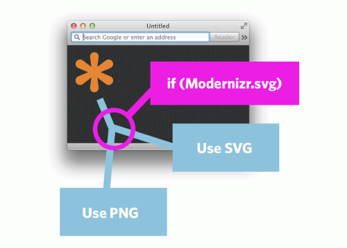
- Download a version of Modernizr that is trimmed down to just testing SVG (assuming that’s the only test you need).
- Run the test. If it passes, put in the SVG. If it fails, put in the bitmap.
Essentially:
if (!Modernizr.svg) {
  $("#logo").css("background-image", "url(fallback.png)");
}
Modernizr isn’t needed on every website in the world — it’s needed on websites where you need to very specifically fork style or behavior for browsers that do or don’t support a feature. For instance, if you have a geolocation feature on your website (but the feature works just fine by typing in an address manually), you may not need Modernizr to tell you about the lack of support, since you may not need to do anything anyway.
SVG is a perfect use case for Modernizr, because there is no simple native way to provide a fallback.

Just for the record: the only reason you would need a fallback for SVG these days if you have to support IE 8 and down, or older Android.
Maintaining Vertical Rhythm
David Casey asks:
“Chris, what’s your strategy for maintaining vertical rhythm for typography / design elements in responsive design?”
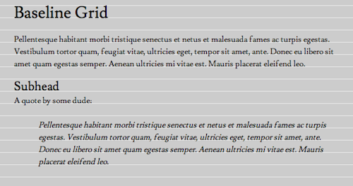
Looking at a page of pure typography — where someone has set up a background of lines where you can see the vertical rhythm matching up perfectly — is pretty cool. You can get a sense for why that makes for nice reading (with the lines removed of course):

But I think it’s a bit of a fool’s errand to enforce perfection on it up and down every page of a website. One image inside the content will most likely throw the whole thing out of whack. Yeah, we could crop it, but do we want to be making choices like that for the design de jour? We could resize it, but then perhaps it’s not lining up to our vertical grid lines like we want. In a world of flexible media, I don’t think it’s worth it.
If you do think it’s worth it, do note Dan Eden’s Baseline.js which does image resizing to combat the baseline grid issue. Molten leading may also be of interest.
Does it matter if the rhythm gets off? I don’t think so. Well set text will still look good. Remember: the type will still be in rhythm with the text right around it. So who cares if it’s off with text thousands of pixels away from it, and perhaps off screen? Making sure the type looks good in general is far more important than adhering to an invisible grid dogmatically.
Responsive + Retina Background-Image
Smarajit Dasgupta asks:
“How to tackle CSS background images for both responsive and retina display. If we use a background-size of 100% to make sure the image resizes on smaller devices, how do we set the same background-size in media query (-min-device-pixel-ratio: 1.5) to half of the @2x image?Also, to tackle images this way, should we set initial scale to one in meta viewport that we normally would for responsive websites? Would that be a problem as far as retina displays are concerned?”
This is a difficult question to answer because so much depends on the particular implementation and what your goals are. Presumably, your goals are:
- Make it look good all the time.
- Don’t waste bandwidth.
I can share with you how this works on a particular area of CSS-Tricks, in which I use a background-image that is both responsive (in that it works in a flexible width area) and retina (looks sharp on retina displays). The area is called The Lodge, and I used a snowy cabin graphic for the background.

That’s actually the “medium” breakpoint (I call it the “mama bear”) that many tablets see. There is a wider and narrower breakpoint as well. Like you, I want this website to look great on retina displays, but also worry about its bandwidth. Serving a background image that is big enough to look great on retina at the largest breakpoint to a non-retina display at the smallest breakpoint is not good.
What I do is put all the background-images in media queries.
/* Reverso Baby Bear */
@media (min-width: 320px) {
  .lodge-wrap {
     background: url(lodge-bg-small.jpg);
  }
}

/* Reverso Mama Bear */
@media (min-width: 800px) {
  .lodge-wrap {
     background: url(lodge-bg-medium.jpg);
  }
}

/* Reverso Papa Bear */
@media (min-width: 1400px) {
  .lodge-wrap {
     background: url(lodge-bg-large.jpg);
  }
}
Doing it this way means that only one of those will match and only one resource will be downloaded. There is also is no “default” (outside a media query) which runs the risk of starting to download before being overridden.
I also make each of those three different images larger than they need to be, and let them scale down with background-size: 100%;. That way they are retina ready all the time, whether or not the device is. A bit of a waste sometimes, but at least I’m smart enough not to supply the largest image all the time.
If you want to get extra fancy, you’d need two media queries for each breakpoint: one for retina and one for non-retina. In my case, I’d have six total media queries… they’d be pretty complex, but it’s do-able. Here’s the two for the smallest breakpoint:
@media only screen and (min-width: 320px) {

  /* Small screen, non-retina */

}

@media
only screen and (-webkit-min-device-pixel-ratio: 2)      and (min-width: 320px),
only screen and (   min--moz-device-pixel-ratio: 2)      and (min-width: 320px),
only screen and (     -o-min-device-pixel-ratio: 2/1)    and (min-width: 320px),
only screen and (        min-device-pixel-ratio: 2)      and (min-width: 320px),
only screen and (                min-resolution: 192dpi) and (min-width: 320px),
only screen and (                min-resolution: 2dppx)  and (min-width: 320px) {

  /* Small screen, retina, stuff to override above media query */

}
You’d repeat that for the next size breakpoint(s), overriding the background as you go down. Here’s more code and some more information on that.
Update: You might want to check Tim Kadlec’s media queries image analysis for background images.
Onward!
Keep up the great questions, folks! Got a good one? Send it in, and we’ll be picking the best ones for the next edition.
Further Reading
- Coding Q&A: CSS Performance, Debugging, Naming Conventions
- Coding Q&A: Responsive Sprites And Media Query Efficiency
- Coding Q&A With Chris Coyier: Code Smell And Type On A Grid


 Celebrating 10 million developers
 SurveyJS: White-Label Survey Solution for Your JS App
 Register Free Now


