How To Give Our Clients The Best Deal In Mobile
Are we cheating our clients when it comes to mobile? More precisely, are we allowing our desire for mobile work to get in the way of providing our clients with the best solution for their business needs? This is the uncomfortable question we asked ourselves recently when redesigning our agency’s website, and we want to discuss it with the broader Web community: You, dear reader.

We are not for a minute suggesting that either we or anyone else is intentionally taking advantage of the current excitement about mobile to “con” our clients. However, we do wonder whether our clients’ excitement and our own desires are hindering our ability to make rational business decisions — decisions that would lead to the best solution for our clients.
Jumping On The Band Wagon
By now, we all know that mobile is the next big thing. Not only do we realize it, but our clients know it, too. The growth in smartphone usage and the availability of fast mobile Internet connections are driving an explosion in mobile Web access. Organizations of all shapes and sizes need to start taking mobile seriously or else suffer in the near future.

For us, mobile is new and exciting and spells the future for our industry and careers. Unsurprisingly, we want to be a part of that. This scenario is not dissimilar to the one that many print designers found themselves in, all those years ago. When the Internet arrived and everybody was desperate to get their first website, the print design world skilled up and got building. Many websites were built in those early days that were never visited by an actual user. For many, the excitement got ahead of the demand.
Nothing is wrong with us as a community wanting to move into new areas. Nevertheless, we need to ensure that we do not push solutions onto our clients that they do not yet need, simply to boost our portfolio.
Do Our Clients Need To Think Mobile Yet?
Timing is everything. For businesses that are trying to turn a profit, their return on investment (ROI) matters.
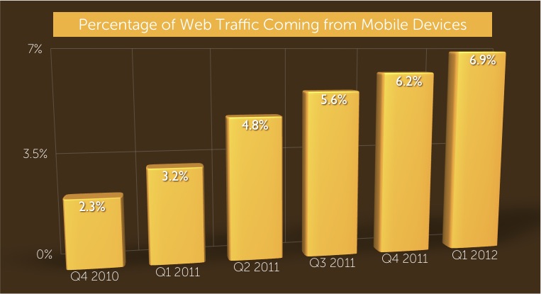
Although mobile is important, it still amounts to a very small percentage of the overall traffic for many organizations. So, quite often, optimization for mobile lands at the bottom of the design debt list — the list of issues that have to be addressed by the design team. Business considerations, particular features and technical issues in the shop often have a higher priority, especially if the client’s company is relatively small.
While investing in the future is, of course, important to the client, if they do so too early, they run the risk of investing their money in areas that don’t have an immediate result and that might become out of date just at the moment when the areas become relevant to the client. Helping them work through this timing issue is important for us, as service providers.
Wait a second! If we build our websites mobile-first, surely they won’t go out of date, right? I am not so convinced. Certainly, best practice in responsive design are not the same as they were a year ago. We are learning more all of the time, and best practices continue to evolve. Can you honestly claim that the code and design solutions you came up with a year ago are as good as the code you are writing today? Responsive design patterns emerge and change, CSS and JavaScript techniques evolve, and some solutions don’t stick around for a long time.

It’s difficult because many clients are just as excited as us about mobile. They want to build a mobile app or website because they love playing with their shiny new device. They know that mobile is the future and, so, convince themselves that now is the right time to invest. But it might not be right for their circumstances. Mobile might not yet be worth spending their budget on. Timing is everything when considering ROI.
The Cost Of Native
Among shiny things, native apps are the shiniest of all. Whatever arguments you may have against building native apps, if you put your bias aside (we all have bias), it is difficult to argue — at least to our clients — that native is not cool, slick and shiny.
In my experience, when most clients think mobile, they think apps. You don’t see TV advertisements promoting mobile websites, but a lot of ads promote app stores and native applications. Clients might not know the difference between native and hybrid — and our responsibility is to explain the difference to them — but when they think “apps,” they want “cool, shiny and in the app store.” They want a native app.
However, such apps are expensive. You need developers with a specialized skill set. It might sound obvious, but building apps is very different from building websites. Apps are software. Software projects need more rigorous planning and longer testing cycles, and so they take longer to complete.
And then you have to consider multiple platforms. If you go the native app route, then each time you roll out an app to a new platform (Windows, iOS, Android, BlackBerry), you have to do a lot of the work again. Usually little can be reused. Also, operating systems are updated a couple of times a year, and there will be at least one new device each year, too. These changes usually require apps to be updated as well. Of course, when dealing with Apple at least, there is no guarantee that your app will be approved and added to the store for customers to download.
You can reduce the costs involved by using hybrid app solutions and HTML5. The hybrid and native approach each has its pros and cons and its own place, but the bottom line is that app development is an expensive business.
The Hidden Costs Of Responsive Design
There may well come a time when we need to build bespoke versions of websites for mobile devices. As users replace laptops with tablets and many others access the Web only on their phones, such a move would be a worthwhile investment for some organizations. In the meantime, for everyone else, responsive design is a good solution. Because it applies a new style sheet to the client’s existing HTML implementation, it need not be costly to implement.
At least that is the theory. In reality, things are more complicated. We all claim that responsive design is a cheap solution, but that depends on how far we take it. At the most basic level, responsive design just requires some changes to the CSS. However, we all know in practice that that is not always the case. Making an existing website responsive can be incredibly time-consuming, especially if you have to deal with legacy HTML code that can’t be easily changed.
The Special Cases
Responsive design is not as simple as linearizing the content. Many elements need special attention. The most obvious is navigation, which often scales poorly across devices. However, it is not the only element. Maps, video, slideshows, graphics and tables all need special attention. Also, third-party “widgets” that embed content on a website aren’t always configured to be responsive.

The Cost Of Imagery
Then there is the biggest challenge of all: images. Many Web designers are rightly suggesting that delivering desktop-sized images to mobile devices is unadvisable due to bandwidth limitations. We also now need to consider devices with high-pixel-density displays, which require even larger images. However, optimizing images for different platforms and creating a mechanism to deliver these further increases the cost of responsive design. At some point, you have to consider client-side and/or server-side optimizations to address this and other issues, such as reducing the load of elements that won’t be displayed on mobile devices.
There is even talk now of the need to optimize typography so that it scales for different devices. Again, the idea has a lot of merit, but a price tag comes with it. The problem is that we as Web designers want to be seen by our peers as producing websites that use the absolute latest best practices. God forbid that we are seen coding with last year’s techniques!

Of course, our desires are not what matters. What matters is that we provide our clients with solutions that make sense for them. This often entails providing a solution that we consider to be inferior. Not every client needs a Rolls-Royce — some will be happy with a Skoda.
The question is how do you know which solution best fits a client.
Picking The Right Solution
As I have already suggested, ROI should be the primary criterion in determining the right approach. If a client has a large audience that is willing to pay good money for an app, then you can go to town and build a Rolls-Royce. But if the project is more speculative, then starting simple would be best.
But money should not be the only deciding factor. The choice between a native app and a responsive website, for example, is not really a budgetary one. After all, a responsive website could cost more than some native apps.
In some cases, the decision will come down to what the app will do. If the client’s primary requirement is to deliver content to the user, then a responsive website is probably more appropriate. In my experience, the kinds of native apps that users download and continue to use are task-oriented. If your client wants to enable users to complete certain tasks quickly, then a native app might be the answer. Otherwise, use the Web.
The only exception is when the client needs to access features on mobile devices that are inaccessible to the browser. Typical examples are things such as the camera and the accelerometer.
If you conclude that a Web-based solution is the right approach, then it becomes an issue of budget and timing. If the client is happy with their existing website and doesn’t wish to change it, then you could consider building a mobile website that targets particular devices. This might not be your preferred approach, but it could be the most cost-effective until the client undertakes a redesign.
If the client’s budget is tight, then you might choose to use media queries to target certain ranges of screen resolutions, rather than going fully responsive. This will make development slightly easier, thus keeping costs down. Similarly, you would have to leave image optimization to the carrier, rather than optimize images on the server.
The message here is simple. Whether talking about native apps, responsive websites or anything in between, we need to put aside our personal desires and even the desires of the client, focusing instead on what the client really needs: a mobile solution that generates the best return for their business.
(Image credits on the front page go to Information Architects.)
Further Reading
- Keeping Your Business And Clients Safe With Digital Policies
- Client Experience Design
- How To Encourage Better Client Participation In Responsive Design Projects
- Designing With Your Clients


 Celebrating 10 million developers
 Try ProtoPie AI free →


 Register Free Now

