Account Creation, Standalone Mobile Websites, And Dealing With Non-UX Designers
Editor’s note: Welcome to Smashing Magazine UX Design Q&A. It works like this: you send in questions you have about UX Design, and each month we’ll pick a handful of questions asked by our readers about best practices in designing smart and usable experiences. They will be answered by Christian Holst, a regular author here on Smashing Magazine and founder of the Baymard Institute. Prior to cofounding the Baymard Institute in 2009, he worked as a usability engineer in the hearing-aid, credit-card and consulting industries.
Location Of Registration Form During Checkout
Sheri asks:
"If an [e-commerce] site offers guest checkout, where is the optimal place to put the account creation fields (that is to say, the password and password hint fields)? During checkout (early or late), or on the order confirmation screen?"
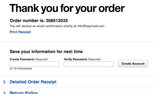
We generally recommend the latter option: making the password field optional and moving it to the order confirmation page (sometimes referred to as the “Thank you” page).

Crate & Barrel lets you create an account on its order confirmation page, removing significant friction and frustration from its checkout process. Ideally, it would also list a couple of the benefits of creating an account.
Moving account creation to the order confirmation page will remove a lot of friction during checkout because creating an account isn’t just a matter of filling out a password field. Rather, it is the beginning of a complex thought and decision-making process for the customer: “Which password should I choose?” “Do I trust this website?” “How will it store this info?” “Does it also store my card?” “Will it send me a lot of newsletters?” “Do I want an account here?” “How often will I shop here?”
The performance of optional registration forms at different positions in the checkout flow will vary from website to website, depending on how natural it is for a customer to hold an account with a particular type of website or business. For example, having an account could be a very integrated part of a software product; in such a case, placing the (still optional) registration form as a separate step in the checkout process might make more sense. But in general, take account creation out of the checkout process, and invite it after the sale has closed (on the order confirmation page).
Standalone Mobile Websites
Michael Meininger asks:
"What are your thoughts on a standalone mobile website with “browser sniffer” technology in place?"
In general, the more complex a website’s features, the more likely the mobile experience should be significantly different from the desktop experience. The bigger the difference between the two, the stronger the argument for having a standalone mobile website. Of course, maintaining two coexisting versions of the same website comes with many issues, especially in terms of maintenance (of content, code and design).
Therefore, a responsive design is a better solution in some cases, but it depends very much on the size and complexity of your website, as well as on your organization’s strengths and weaknesses. It’s a nuanced issue, with many gray areas and with good arguments both for and against having a standalone mobile website.
Let’s look at a concrete example. Our user research shows that for a mobile e-commerce store, animating carousels come with a whole slew of usability issues due to the lack of the hover state; therefore, never use them for website features, events, navigation and so on (use them only for products). However, on a full e-commerce website, a carousel on the home page might be an OK solution if implemented properly. And there are many more of such mobile-specific usability guidelines.

If you can achieve this by designing for mobile first, then a responsive design can be truly great — not just maintenance-wise, but also UX-wise. But merely making your existing full website scalable to different devices won’t be enough to offer a great mobile experience if you have a very complex website such as an e-commerce one.
And if messing with the full website’s existing structure and content isn’t an option, then you might be forced to create a standalone mobile website in order to provide a decent mobile experience — although maintaining content on the two different platforms in parallel could turn out to be both expensive and messy. So, if you have a simple blog, a portfolio or a small company website, then a responsive layout might be a better fit.
Ultimately, what’s important is that you pick the solution that enables you to create the optimal mobile experience within your unique set of constraints — your organization’s strengths and weaknesses, the website’s complexity, and the resources available to maintain the content, code and design.
Dealing With Developers Who Believe They Are UX Designers
DMC_ asks:
"What is a good way to deal with a development team that believes they are UXDs? #inmatesrunningtheasylum"
Giving specific advice without knowing your context is, of course, impossible; but take a moment to appreciate how great it is that your development team cares about UX. This is a good thing, because you won’t need to convince them that the user’s experience is important — you “just” need to show them how your solution will enhance it. Developers tend to respond well to rational arguments and solid logic backed by good research. Present a strong case, supported with real user data, and you should be able to persuade them.
If you don’t have any research to support your case, but are rather basing your arguments on a UX education or on years of experience, then the challenge is one of education. Teach them what you know. If they learn what you know (which requires good teaching) and they see the data you have (again, find research to support your case) and yet they still don’t find your case compelling, then your dispute is one not of training or information but of belief. If it has come this far and you’re still in disagreement, then start to question your own case.
After all, if your UX recommendation is ultimately rooted in your own belief and not a consequence of solid arguments and data, then it wouldn’t be immediately obvious that resources ought to be spent on implementing it. If you still feel strongly about your case and want to push it forward, then reframe your proposal: make it a case for experimentation. If you can’t prove the validity of your recommendation, but they can’t prove their case either, then insist on testing the two (either through A/B tests, qualitative usability tests or whatever makes the most sense for your project).
This will result in real user data showing which solution works better. If they are confident in the superiority of their proposal, then they shouldn’t be afraid to put it to a test. Obviously, you shouldn’t be afraid to test your proposal either. Whichever solution performs better in the test is the one that gets implemented.
Of course, this whole approach doesn’t just apply to development teams but can be used when dealing with managers and clients, too.
Client Requests That Compromise The UX
@NathanJY asks:
"What do you do when the client wants to compromise the UX with unnecessary and nice-to-have elements?"
You could try winning them over with the approach described in the previous answer. But more specifically, the very best advice I have is to include hours for performance metrics and analytics work in your contracts whenever possible. When performance analysis is a part of the assignment, then you will largely be judged on the actual impact of your solution. However, if it isn’t a part of the assignment, then the client can really only judge your deliverables in the format and context they are delivered in.
For example, if you deliver a set of designs done in Photoshop, then the client will look at them and give you feedback based on that. Adding context to your deliverables is a good idea, then, either by presenting them in a meeting or perhaps by creating a simple PDF document in which each design is annotated or described. This way, you can show your reasoning behind each design decision and support it with research and data where applicable. By articulating your decisions, you give the client a chance to see the design from your perspective and to understand your reasoning.
If feasible, run simple small-scale usability tests, recording the task success rate before and after the proposed changes have been made. Recording these test sessions is crucial because you can then show the client video clips of users despairing with one of the website elements that they wanted to add (or remove). This is a great way to evoke empathy in even the most stubborn clients.
In general, this could be a good way to get early buy-in from the client and convince them that they want (and need!) a simple and elegant UX. Educate them and present case studies, such as “Removing Company Name Field Saves Expedia $12 Million” and “The $300 Million Button,” and argue that getting the details right can have a significant impact on the bottom line.
Any Questions?
If you have any questions that you would like me to tackle for a future usability Q&A column here on Smashing Magazine, please ask them using this form.
Credits of image on start page: opensourceway.
Further Reading
- Form-Field Validation: The Errors-Only Approach
- Useful Ideas And Guidelines For Good Web Form Design
- Web Form Design: Showcases And Solutions
- Improve The User Experience By Tracking Errors


 Celebrating 10 million developers


 Register Free Now
 SurveyJS: White-Label Survey Solution for Your JS App

