Designing For A Multi-Device World
When I think about where we are with the Web in comparison to other media in history, pinpointing it is really hard. Is it like when the Gutenberg Press was just invented and we’re experimenting with movable type, or are we still embellishing pages and slavishly copying books by hand?
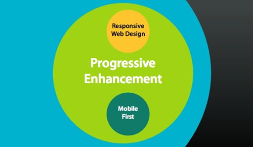
Our knowledge of building digital things changes rapidly, taking us from newborn to adult and back again every couple of years. It’s both exciting and frustrating, because just when you think you have it all figured out, it completely changes. But if you’re like me, learning something new keeps things interesting.
So, it seems pretty normal that our methods of designing and building websites are questioned every so often. The argument to ditch design apps (or to drastically minimize the time spent in them) and go straight to the browser has popped up a lot in the past few years and then quite recently. It’s obvious that our digital world and, by proxy, our design process are in a state of transition. And they should be: considering design in the context of your materials and goals is always important.
I tend to shy away from prescriptive approaches. Most decisions are framed by our experience, and, as humans, we’re continually drawn to and seek out what we already believe (known as “confirmation bias”), ignoring the rest. So, I strive to keep that in mind whenever listening to advice about how things should be done. We’re all navigating the same changing landscape here. What many designers recommend is the right answer for them and not necessarily the right answer for you, or your client. As Cameron Moll more eloquently states:
"You know your circumstances, your users, and your personal preferences best. And if that means responsive web design — or design methodology or todo app or office chair or whatever — isn’t the right choice for you, don’t be ashamed if you find yourself wanting more, or at least wanting something else."
That’s exactly how I feel right now. A lot of the explorations into Web design lately have been looking for the best ways to optimize an experience and to make it as flexible as possible across devices. These are important issues. But what about the design principles we’ve proven and iterated on through a variety of media? How can we apply what we’ve learned about design so that it can be utilized in an appropriate way to create websites in this multi-canvas world?
A New Medium With Old Roots
When we talk about designing a website today, we can’t help but mention the “What if?” challenges (or, if you’re a positive person, the opportunities) we face:
"What about embedded Web views?" "What if the user has limited bandwidth?" "What if JavaScript is turned off?" "What about this awkward break point?"
It’s as if we have suddenly discovered the first medium in history that comes with limitations. We’re definitely not on an island here: Every medium has faced limitations — and continues to face them.
In an interview with Elliot Jay Stocks, legendary typographer and designer Erik Spiekermann explains how he finds it funny that designers today complain about limitations in designing for mobile:
"The way to design is the same [between print and Web]. You give content form, and the medium is always different anyway… I remember designing the little forms for medication, the little things that go inside, and I have the same issue… Essentially, I’ve got to cram a lot of complex content into a given format, however small that may be."
He explains that when he designed for other media, the constraints were similar. You had to ask questions about the circumstances and about which information was the most important to the audience at that moment in time, and he asked things like, “Are they really sick and trying to read this medical information?” “Are they at an airport and need to know their gate?” Spiekermann goes on to say:
"So far, they [Web designers] have been bogged down by having to look at code all the time… So, now they can actually look at the problem. That’s why I said, in a few years time — however long it may take the individuals — they’ll design for the issue at hand and not for the medium."
We’ve seen print and Web design converging — websites with beautiful typography that are easier to read. But with all of these little connected devices, we’re in an awkward transition phase, figuring out our design process. Some methods fit this new frontier really well, while others just don’t feel right to me. Like Spiekermann, the designer in me feels like we’re still getting hung up on the medium and the limitations and letting that dictate things, rather than designing for the issue at hand.
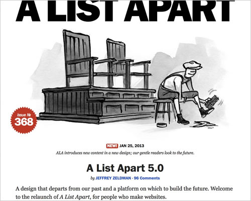
The new A List Apart is reminiscent of great print design.
For example, style tiles are a great new tool, but they are as the name indicates: styles. They can’t completely replace the layout because they do not indicate the content’s structure or balance or whether the navigation flow is right. Yet, I read about this kind of tool replacing the big-picture layout and design exploration all the time now.
Working on a design in small chunks feels like we’ve let the medium become the method. As a designer, you have to be able to see the forest and the trees. And the client needs to see what they are getting. We still need a holistic view of the canvas in order to solve design problems. It’s up to the designer to evaluate what form that should take.
In creating a more responsive Web, the process of how we design, implement and manage websites is evolving. We’re slowly convincing clients to go back to embracing the lifeblood of the Web, the content. We understand that rigid, unchanging canvases are not the way forward. However, embracing change doesn’t mean moving away from what works. The following quote from Stephanie Reiger about progressive enhancement speaks to how I feel about ignoring proven design principles in this transition:
"We have an opportunity to make the mobile web a million times more useful and relevant than the desktop web has been. The failure of the Obama site was not in the use of new techniques like responsive design, it was in forgetting that older principles and techniques still have an important role to play in building a better web. If anything, they are more important than ever before."
The rules of design and usability that we’ve learned and iterated on over many, many years still exist here and can’t be discounted so easily. Designing responsively doesn’t change the fundamentals. The principles of negative (i.e. white) space and balance still matter. Gestural interfaces don’t make Fitts’ Law irrelevant. Design is still a set of decisions and about solving a problem.
Knowing When To Jump
Photoshop and Sublime Text are currently a few of the popular tools being used to design websites. They were not originally intended to be used to design websites or apps, especially considering the words “Photo” and “Text” in their names. They evolved into these roles.
When we talk about designing in a browser, we’re not really in a browser, designing. We’re in a code or text editor of some kind, and previewing the work in the browser. Although it’s possible (and some Web designers find it more comfortable), I don’t think we could purely and effectively “design” in a text editor. There would be a disconnect in the flow. Right now, it might be good enough for some aspects, but designing in the browser still limits us.
I realize that one of the main reasons for going into the browser is so that the client can see how the website will really look and function. But if we shift too quickly into markup and code, then how do we push for the next iteration of HTML, CSS and JavaScript? We need to envision it first. We need to ask the design questions that push things and see whether we can deliver part of it in the markup’s current standards — or else show the makers of standards and browsers one hell of a hack that inspires them to make it possible.

Brett Victor shows us a more connected way to create with code.
Like anything, there’s a balance. Yes, the answer is, it depends. If you jump from sketching in your favorite bloated design app, then you’ll start thinking about layout and styling, rather than tasks, architecture and goals. If you jump from a design app to the browser (and text editor) too soon, you’ll start to get hung up on matters that have more to do with quality assurance and on fixing CSS issues at breakpoints.
Knowing when each stage of design peaks and loses value in the process is important and can be identified only through experience and by the type of project. The best design will happen when we get the jump points right. This could even mean working with a few tools at once, or going back to one tool before going forward again.
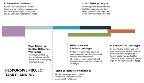
An example of responsive task planning, by Dennis Kardys, in Smashing Magazine’s Mobile Book.
Let me play a bit of the devil’s advocate. If we argue that the client isn’t getting a true representation of the product with a pixel-perfect comp (because they aren’t seeing it in the browser), then shouldn’t we design only in the browser or device most used by their audience? Shouldn’t we stop showing off what we’re doing in the latest Chrome or Safari browser and show the Web to the client through “normal” people’s eyes?
Showing the client what their users see by showing the website in a common browser or device could also improve the client’s perception. For example, if the client is desktop-focused, and you’ve seen that they get a good amount of tablet traffic, then show them what the website looks like on an iPad Mini. If they are using the latest and greatest devices and browsers but their users typically aren’t, then showing the design rendered in an older browser or phone would truly broaden their perspective.
Designing for the most ubiquitous browsers and devices is the most honest way I can imagine to represent the Web. In 2011, there were 6 billion phone activations, 80% of which were for feature phones. In case you aren’t following the news, the iPhone is not a feature phone. But we all know this scenario won’t happen. We live at the edge of the Web, and most Web designers and developers would rather imagine a Web with the latest browsers and smartphones — even if that’s far from the way most people experience it.

Design to degrade gracefully. (Slide from “Progressive Enhancement and Mobile,” by Aaron Gustafson)
I get what folks like Brad Frost are saying when they talk about designers spending too much time doing the wrong thing. It’s a great point. Refining a layout too much in your favorite photo-editing app is like trying to accelerate a car in neutral. The refining stage should be done in the browser, when you’re designing the website. And — sorry to say, visual designers — that means knowing your material. Time to learn some markup and get your hands dirty!
I think we need to separate the way we explore our designs from how we present them to others. Just as showing experimental CSS in the latest browser isn’t being true to the design when showing it to a client, the same goes for showing a beautiful layout with a pixel-perfect “painting.” We have to be honest about what we show clients and stop making design promises that we can’t deliver on.
Watching Movies On Your Hand
Other industries are going through changes, too. Consider the film industry. It used to have it made: movie theaters set up with a huge screen and THX sound system, the audience sitting in comfortable chairs, in near total darkness. The entire experience was perfectly controlled.
The filmmaker knew that they only had to deliver a compelling story or a Brangelina butt shot to get people in the door. Now that has all changed. I can’t imagine how a movie director feels when they see someone watching their movie in a loud airport on a screen the size of their hand… Well, maybe I can:
David Lynch’s iPhone rant. (Some profanity, so use headphones.)
Some filmmakers are dragging their feet, claiming that this is cannibalizing their per-seat theater profits. However, some have decided to embrace this new ecosystem and give audiences the option to watch movies how they want. Actor and indie filmmaker Ed Burns is one of them, saying:
"You know, I think you have to be a realist in the way that, no musician wants anyone to listen to their music on an MP3 file going through a small set of tinny headphones. They’d much prefer that we all listen to it on a big sound system on an LP. But, you know, that’s over. And I think a similar thing has happened with the movie business." My lawyer gave me a great argument, because I was even resistant to it. He goes, if we go theatrical on this film, you’re going to open up in New York and L.A. Think about what happens if we go out on Video On Demand (VOD) and iTunes. You’re going to be in over 50 million living rooms. And the minute I heard that, I knew, OK, this needs to be embraced."
Great (Unknown) Expectations
The best part about designing for an unknown future is that it allows us to ask clients what is really important. It forces clients to look critically at their content. It forces them to look for ways to simplify how they present themselves to customers. Simplicity isn’t simple, but it’s the path we must take in refining our own design process in order to help clients shift their mindset. A convoluted process will continue to yield undesirable results.
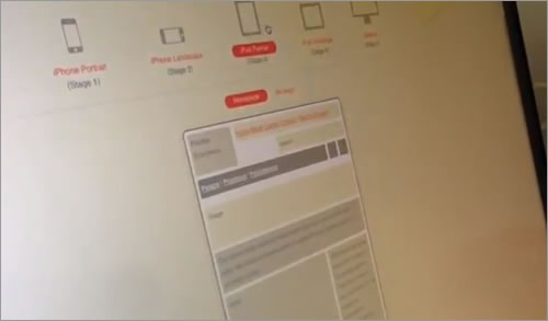
Ed Merritt and Paul Boag give us a glimpse into how we might wireframe a responsive canvas.
We will still need to work in a mixture of static canvases for certain kinds of projects, especially complex Web applications. There is no way we could properly examine a problem if we can’t explore it first. If we visualize a solution only in small pieces, we’d be ignoring the big picture. If we jump too soon into markup or delay looking at it in the browser or on a device, we’d be missing something.
If anything, building for all of these different devices shows us that we need to work better with developers and clients. Without these relationships and mutual respect, it all falls apart. It can’t be dictated or dominated by any of these roles.

The Artifact Conference focuses on helping designers adapt to a multi-device world.
Learning who the client is and which artifacts they will understand best is key. I’ve learned that educating clients with things such as responsive patterns really helps them grasp the scope of the challenge here. As Dan Mall says, it’s about building an expectation and delivering on that:
"A responsive design process is like a scandal. You’ve gotta preemptively control the conversation. If your client wants to have conversations like this, it likely means you didn’t do a good job of setting expectations."
Great communication up front has always been the way to make a project succeed. Now it’s more important than ever. The design process is shifting. For a designer, the best approach going forward is to find a way to put the problem first. Design from the content out, and find the best jump points to tools that fit the goal.
Until we get a real Web design application we’ll have to continue to determine these jump points as best we can. In the meantime, continue offering approaches and tools to the community, and embrace and improve on the ones presented to you. This will help us to continue designing a better Web.
Further Reading
- Smart Transitions In User Experience Design
- Why Transitions Are Important
- Using Motion For User Experience On Apps And Websites
- Designing For The Mind


 Celebrating 10 million developers
 Try ProtoPie AI free →
 SurveyJS: White-Label Survey Solution for Your JS App
 Register Free Now

