Removing Interface Elements: Should You Ask The User Or Their Browser?
The history of the Internet has been a steady march towards websites that are richer, bigger and more interactive. As websites have become more robust, we — as designers and developers — have often placed the burden on our users to make more decisions, each of which distracts them from their wants and needs.

Image source: Johan Larsson.
However, by using a combination of technical solutions and some careful decision-making on our part, we can often remove interface barriers for our users. It’s common for websites to automatically determine whether the user is on a mobile device (although responsive design has made this less relevant in many cases, and browser detection techniques are not without criticism).
More often than not, though, we’re still asking users to provide their localization information: their language, timezone and country. We can use a combination of techniques to minimize that burden on the user, too. Let’s dig into our bag of tricks and look at how we can handle localization without interrupting the user’s focus.
Language
The most common way of detecting the user’s language is with the Accept-Language HTTP header. There is also a JavaScript property, window.navigator.language, which serves a similar purpose, but may be less reliable — particularly cross-browser. Both methods rely on the user having their preferred language set in their operating system, so always provide an option for users to select an alternate language.
Country Or Region
A lot of attention has been paid to HTML5 geolocation recently, and it’s a great thing to have in our tool belt. It’s a generally reliable way to get the user’s current location — provided they are using a modern browser and opt in to providing it to you.
If you’re simply looking for what country a user is located in or what continent they’re on, IP-based geolocation services such as MaxMind and IpInfoDB (among many others) are a great bet. These solutions are implemented server-side, which may be preferable because the user isn’t required to load up a page and opt in to HTML5 geolocation only to be forwarded on to a new page.
Although IP-based geolocation still generally applies to mobile devices, HTML5 geolocation is widely available on these devices, and may be more reliable — particularly if the user is roaming.
Timezone
JavaScript provides us with Date.getTimezoneOffset(), which returns the difference between UTC and the user’s local time in minutes. However, there are some edge cases to handle (particularly around Daylight Savings Time), so I strongly recommend using a library such as jsTimezoneDetect for reliability and ease of use.
Should We Ask The User?
When deciding whether I need a user-facing interface element for a particular setting, I ask myself three questions:
- Can I make a confident determination using a technical solution?
- Can I decide on an intelligent default?
- What are the consequences of guessing wrong?
That last consideration is the most important. If we guess the wrong timezone for a user, is that worse than asking them up front for that information? It depends.
If you’re using the timezone to send a daily email digest, the consequences of being incorrect are probably minor, and it’s likely a worthwhile trade-off. What if we were using the timezone to set the period of time when a user could bid on an item? That’s a different story entirely; the implications of getting that wrong are far more dire, and we shouldn’t rely on behind-the-scenes magic.
Whenever you’re making any assumption on behalf of the user, consider whether it makes sense to provide a way for them to choose a different option than the one you’ve selected for them.
Case Study: UPS
How does this all work in practice? We’ll discuss one (very) common mistake, and one possible solution. If you buy or sell much online, you’re probably familiar with UPS. Let’s look at a huge opportunity for improvement, not only for UPS, but for thousands of other websites as well.
What It Does Wrong
Before you do anything on UPS’ website, you’re forced to pick your country and language from a big ugly drop-down list. This means that before finding a UPS Store location, tracking a package or scheduling a pickup, you’re faced with a question — without any explanation whatsoever of why UPS needs an answer.

Locale selection on UPS’ website
I don’t have any insider knowledge of UPS or its website, but common sense would suggest that it must be seeing at least some users drop off at that page. Blocking a user from viewing the website without selecting a locale isn’t consistent with either the user’s goal (tracking or shipping a package, in most cases) or the company’s goal (increasing revenue by shipping packages or promoting related services). So, what do we do instead?
How To Fix It
There are plenty of better ways to handle this situation. We could ask for the user’s country only when absolutely necessary (such as when calculating a shipping rate). But the locale (e.g. “United States – English”) also contains the language preference, so non-English-speaking visitors might have a difficult time navigating the website in that scenario. UPS could certainly do plenty to make the list more usable, but it might not need to do these things at all.
Let’s go back to the basics: our goal is to reliably determine the visitor’s country and language preference. Luckily, we can do both of these things without even prompting the user.
For the country, we can use IP-based geolocation. This technique is imprecise but generally accurate, which is fine for our purposes: we’re looking for a country, here, not a street address.
The language would often be determined by the country, particularly in the case of UPS (which offers only a single language for most countries). In case the user’s locale has multiple common languages, we could use the HTTP Accept-Language header to default the user to their preferred language. Voila!

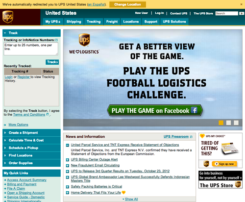
We’ve (hopefully) directed the user to the correct version of the website without distracting them from their original goal.
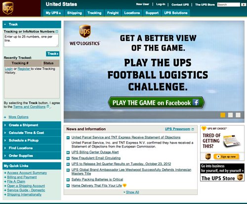
Now, rather than interjecting a distracting page, we’ll add a message to the top of the home page letting the user know that we’ve directed them to the appropriate website, and giving them an opportunity to change the language and country in the unlikely event that our determination was wrong for some reason or in case their preference is different from their current location.
Now, the vast majority of users will never have to think about their locale and can get right down to business, while any users who prefer a different locale would still be empowered to make that selection.
Proceed With Caution
So, we should all run out and start using these and similar techniques on all of our websites, right? Not necessarily.
As with anything else, there are trade-offs. Will guessing the country confuse users or feel like an invasion of privacy? Do your users frequently use your application while travelling?
No two websites are the same, and the most important thing you can do is to get into the mindset of your users through research, analytics and interviews. As designers, we’re used to being conscientious while we’re adding interface elements; we need to be even more careful when removing them.
Wrapping Up
Adding more checkboxes, drop-down menus and radio buttons to a website is the easiest thing in the world. The technical implementation is straightforward, and the UX trade-offs are well defined.
Putting in the extra work to remove interface elements is sometimes thankless. But creating experiences in which users are only asked relevant information at relevant times makes for happy users, and happy users lead to happy designers.
More Reading
- “Accept-Language” specification, “Hypertext Transfer Protocol — HTTP/1.1,” W3C
- “Accept-Language Used for Locale Setting,” W3C Internationalization
- “window.navigator.language,” Gecko DOM Reference, Mozilla
- You Are Here (And So Is Everybody Else),” Dive Into HTML5
- FreeGeoIP.net Web Service
Further Reading
- A Closer Look At Personas: What They Are And How They Work
- A 5-Step Process For Conducting User Research
- User Interface Design in Modern Web Applications
- Effectively Planning UX Design Projects


 SurveyJS: White-Label Survey Solution for Your JS App


 Register Free Now
 Celebrating 10 million developers

