How To Get Started With jQuery Mobile
There is no longer any debate about whether we need to address the design needs of mobile website users. While mobile browsers and platforms are creating new challenges for us, jQuery Mobile, an open-source multiplatform UI framework, can help us succeed with our mobile apps.
jQuery Mobile can help in the following circumstances:
- Different screen sizes, pixel densities (DPI) and orientations;
- Different compatibility in terms of HTML5 and CSS3;
- New platforms appearing every couple of months (if you don’t believe me, Windows 8, Firefox OS and BlackBerry 10 will reach the market in the next couple of months);
- Dozens of hacks that we need to implement for each platform and to update almost every couple of months when a new browser appears.
jQuery Mobile was released to help designers and developers create mobile Web experiences that are easy to build, multiplatform, customizable and unobtrusive in code.
In this article, we’ll discuss what we need in order to use jQuery Mobile, as well as its basic architecture, and how to deal with a typical app’s features, such as theme, fixed toolbar, page navigation, buttons, lists and forms. You’ll get a practical idea of how to create a jQuery Mobile app and how to extend it with advanced features.
What Is jQuery Mobile?
If you are new to jQuery Mobile, let’s shed some common misconceptions about what it is and is not. And let me be clear: jQuery Mobile is not the mobile version of jQuery. “What?” you say? Again, jQuery Mobile is not the mobile version of jQuery. I’ll explain the concept.
jQuery Mobile is not:
- a jQuery alternative for mobile browsers;
- an SDK for packaging native Web apps;
- a framework for JavaScript lovers (“Huh?” Just wait a paragraph);
- the right solution for all mobile applications and websites.
To be honest, I believe its name has led to some confusion. As a friend of mine told me, jQuery Mobile could join JavaScript and C# in the Badly Named Technologies’ Hall of Fame.
Let me explain with two anecdotes. I’m the author of the book jQuery Mobile: Up and Running, published by O’Reilly Media. Amazon.com has some not-so-good reviews of my book, saying that it “does not explain the normal jQuery topics,” and one of the official translations of the book had mistranslated the title as jQuery for Mobile Devices (fortunately, I detected it in time). So, why doesn’t my book (and this article) talk about normal jQuery topics? Why is jQuery Mobile not just “the mobile version of jQuery”?
Just A UI Framework
jQuery Mobile is just a user interface framework — nothing less, nothing more. It uses jQuery’s core framework as a requirement, but definitely doesn’t replace it. It’s a UI layer on top of it. Can we store databases with jQuery Mobile? No, that’s not its concern. Can we use Node.js or PHP with this framework? No, that’s not its concern. Do you need to know jQuery in order to use jQuery Mobile? Nope.
jQuery Mobile is a framework that delivers Web app experiences to mobile and tablet devices, mainly ones with touch interfaces; it is effort-less and multiplatform, and it uses only HTML5 standard code. That last bit is important: to define our user interface, we use only semantic HTML5 code — no JavaScript code, no jQuery code.
Don’t get me wrong. I’m not saying you will never use JavaScript or jQuery in a mobile Web app. But you are not forced to unless you want to create typical JavaScript behaviors, such as event handling and dynamic content loading.
Compatibility
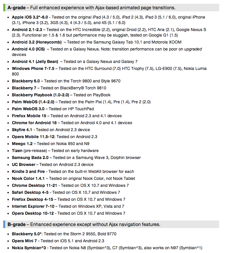
Compared to jQuery Mobile, other UI frameworks (such as Sencha Touch) have compatibility issues that are far more complex. Every tablet and smartphone in the world today is supported by jQuery Mobile, including browsers such as iOS, Android, Chrome, Firefox, BlackBerry and Symbian and native platforms such as Apache Cordova (PhoneGap).
Main Features
- Open-source and free for all kind of usages
- Cross-platform, cross-device and cross-browser compatible
- The UI is optimized for touch devices.
- The design is themable and customizable.
- Only non-intrusive semantic HTML5 code is used, without the need for any knowledge of JavaScript, CSS or API.
- AJAX calls are made automatically to load dynamic content.
- It’s built on the well-known and well-supported jQuery core.
- Lightweight in size — 12 KB compressed
- Progressive enhancement is used. Even if the framework can’t load properly, your Web app will work without any enhancements.
- Accessibility support
Show Me The Code!
OK, let’s stop chatting and see a basic “Hello, World” template using jQuery Mobile. Oh, and we don’t need to download any files to make it work. Just create a new text file, paste the following code, and save it as an HTML file.
<!DOCTYPE html>
<html>
<head>
<meta charset="utf-8">
<title>My first jQuery Mobile code</title>
<link rel="stylesheet" href="https://code.jquery.com/mobile/1.2.0/jquery.mobile-1.2.0.min.css">
<script src="https://code.jquery.com/jquery-1.8.2.min.js"></script>
<script src="https://code.jquery.com/mobile/1.2.0/jquery.mobile-1.2.0.min.js"></script>
<meta name="viewport" content="width=device-width, initial-scale=1">
</head>
<body>
<div data-role="page" data-theme="a">
<div data-role="header">
<h1>jQuery Mobile</h1>
</div>
<div data-role="content">
<ul data-role="listview" data-inset="true" data-dividertheme="b">
<li data-role="list-divider">Options</li>
<li><a href="option1.html">Option 1</a></li>
<li><a href="option2.html">Option 2</a></li>
<li><a href="option3.html">Option 3</a></li>
<li><a href="option4.html">Option 4</a></li>
</ul>
</div>
<div data-role="footer">
<h4>© 2012 Smashing Magazine</h4>
</div>
</div>
</body>
</html>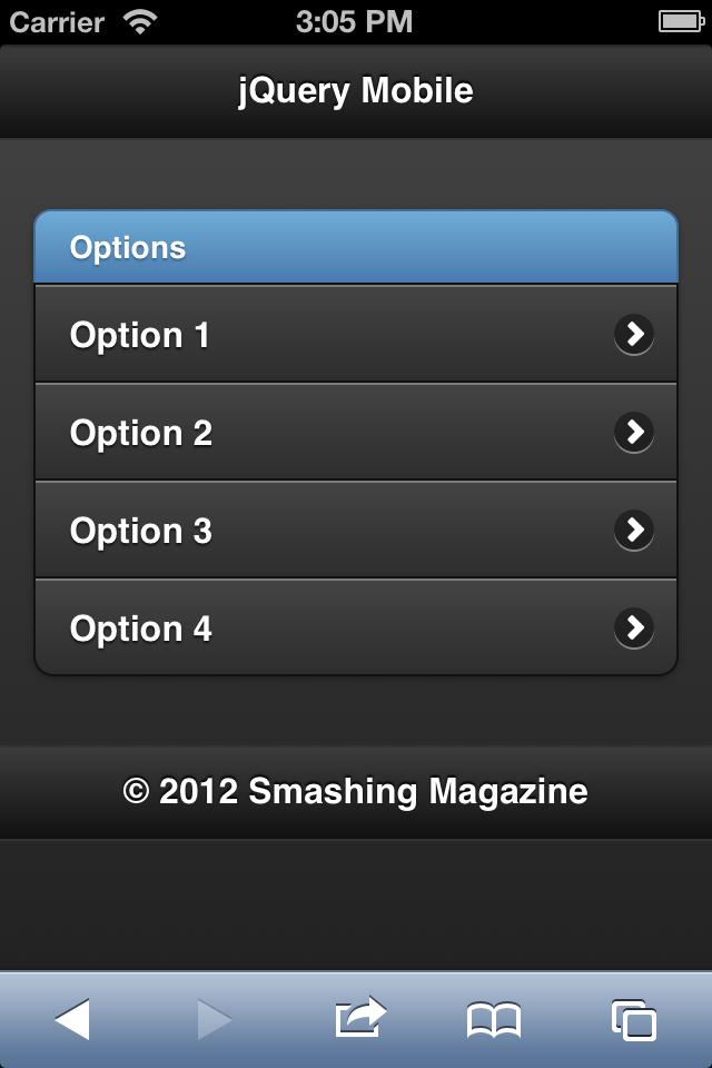
As you can see, there is no JavaScript code (OK, just definitions for the two external files); it’s just HTML5 code with some strange new attributes, such as data-role, and then it gets transformed into the screenshot above automatically.
Now it’s time to figure out what’s happening here, starting with the basic concepts and followed by the typical UI controls that we would use in an average mobile Web app.
Requirements
Download the latest version of the framework, or use the download builder, which will give you a build customized to your needs.
Before coding, our first decision is where to host our resources. There are two approaches:
- You could host all of the files in your project yourself. You can download every file or the full ZIP package from the official repository. The jQuery core framework is available from another website.
- We could use a content delivery network (CDN), as in the example we saw earlier. With this solution, we don’t need to download any files to get started with jQuery Mobile.
How To Use It
Our HTML5 document needs to include the following (either from the CDN or from our downloaded files):
- The jQuery core JavaScript file;
- The jQuery Mobile core JavaScript file;
- The jQuery Mobile core CSS file;
- The jQuery Mobile CSS theme file (optional, if you are overriding the default theme).
jQuery Mobile also uses a series of image files for some of the UI, but we don’t need to explicitly link to them; the CSS file does that.
The Basics
To code a jQuery Mobile app, we need to understand some basic architectural concepts. In this section, we will cover how the framework detects roles in the HTML document and how to manage pages, toolbars, theming and navigation between pages.
Custom Attributes
You’ll have noticed the data-<something> and data-* attributes in some HTML tags. These are HTML5 features called custom data attributes. They are defined in the W3C specification and enable us to define whatever attribute that we want to add to a tag, while keeping the document HTML-valid. It’s useful for adding custom meta data to tags without invalidating the markup.
jQuery Mobile uses a lot this to define custom attributes for the framework. But don’t get confused: data-role is not a new HTML5 attribute. Its usage is a kind of implicit agreement between the framework and us.
Roles
jQuery Mobile uses standard HTML markup, such as the div element. To define what the framework should do with a div, we define a role. A role in the framework is defined using the attribute data-role; for example, <div data-role="page">.
The possible roles that we can use will usually define the type of components or rich widgets that we can render with jQuery Mobile.
The page
The page is the main unit in jQuery Mobile. A typical page will be divided into three parts: header, content and footer. The only mandatory section is the content. Every part is declared using a div element with the corresponding role:
<div data-role="page">
   <div data-role="header">
   </div>

   <div data-role="content">
   </div>
<div data-role="footer">
</div>
</div>If you are wondering why jQuery Mobile has “div-itis” (that is, using divs for everything) and why it doesn’t use the new semantic HTML elements, such as header and footer, it’s to maintain the framework’s compatibility with some older non-HTML5 browsers. If you are confident enough that your users will be using HTML5 browsers, then you can use any block element you like.
Color swatches
Every part — including the page, header, footer and content — can have its own swatch color in the current theme. Therefore, a theme (the default one or our own customized theme) can have different color swatches, which we define using data-theme attribute. Every swatch color is defined using a letter, from a to z. However, not every theme would include so many color swatches, and the default one goes up to e
Headers and footers
Let’s do a quick exercise. Let’s add a link in the header and an h1, like so:
<div data-role="header">
   <a href="#">Link</a>
   <h1>Title</h1>
</div>
In the next image, you’ll see jQuery Mobile enhance the h1 and a elements automatically, without the need for any data-role. A header may contain up to two links, and the footer has no limit.
Headers and footers are inline by default; so, if there is enough content, bars may not be visible when scrolling.
We can affix our toolbars to the edges using data-position=“fixed”, like so: <div data-role="footer" data-position="fixed">. In compatible mobile browsers, it will use fixed-position elements; in other browsers, it will polyfill to a floating bar.
Navigation
A jQuery Mobile document (i.e. our HTML file) can have multiple pages, and we can link between them using the pages’ IDs and the hash anchors. Let’s see a simple example:
<div data-role="page">
   <div data-role="header">
      <h1>Page 1</h1>
   </div>
   <div data-role="content">
      <a href="#page2">Go to Page 2</a>
   </div>
</div>

<div data-role="page" id="page2">
   <div data-role="header">
      <h1>Page 2</h1>
   </div>
   <div data-role="content">
      <p>Welcome to Page 2</p>
   </div>
</div>
jQuery Mobile will take care of the following:
- Create a transition between the pages using CSS3;
- Manage the browsing history, so that the user can hit the “Back” button or key in their mobile browser and be taken to the previous page;
- Create a deep-linking mechanism, so that if the user marks an internal page as their favorite, it will work properly;
- Add a header button to go back if we use
data-add-back-btn="true"on the page.
I know what you’re thinking: should we have a mega HTML document containing all of the pages in our Web app? Well, the decision is up to you. We can also have external jQuery Mobile documents to load pages automatically.
External files
To load an external file, we just link to it. If it’s on the same domain as the current document, it gets loaded using AJAX and a nice automatic transition.
<a href="external.html">Go to external page</a>With this link, jQuery Mobile will suspend the default linking behavior and replace it with a “behind the scenes” AJAX call to retrieve external.html’s contents, inject it into the current document and transition to it, as with internal pages. In the meantime, the framework will show a nice loading animation over the page.
Transitions
We can change the default transition and use one of the many options available, as well as design our own transitions using CSS3 animations. Transitions must be defined using data-transition on the a element and one of the following values:
fadeslideslideupslidedownslidefadepopfadeflipflowturn
For example, we can link to an external jQuery Mobile document using a flip transition with this: <a href="external.html" data-transition="flip">.
Working With Components
jQuery Mobile has a collection of rich components and a lot of attributes for each of them. Check the official documentation (created with jQuery Mobile, by the way) to browse all of the components and options. In this section, we will cover the most useful components that a mobile Web app would need, including buttons, collapsible panels, lists and form controls.
Buttons
We’ve already seen that we can use any link element to link between pages or to link to external content. However, a typical <a> element is rendered on touch devices in a way that is not easily usable. The element is typically inline, and the clickable area is only the text. That is not a good experience for touch users. That is why jQuery Mobile has buttons.
A button is a UI component that feels like… well, a button — that is, a larger clickable area with text and, optionally, an icon.
A button can be created in different ways:
- Using the
buttonelement; - Using an
inputelement that would typically render a button, includingtype="button",type="submit",type="reset"andtype="image"; - Using any
aelement withdata-role="button"; - Using any
aelement in a header or footer (no need for a role).
jQuery Mobile’s button is typically rendered with a centered label, rounded corners and shadows, depending on the browser’s compatibility with CSS3.
Buttons can have several possible attributes, as you can see in the following snippets:
<a href="#" data-role="button" data-corners="false">No rounded corners</a>
<a href="#" data-role="button" data-inline="true">Inline button</a>
<a href="#" data-role="button" data-icon="refresh">Text with icon</a>
<a href="#" data-role="button" data-icon="refresh" data-iconpos="notext">Only icon</a>
You can even wrap buttons in a controlgroup role to get a nice UI of grouped buttons:
<div data-role="controlgroup" data-direction="horizontal">
   <a href="#" data-role="button">Button 1</a>
   <a href="#" data-role="button">Button 1</a>
   <a href="#" data-role="button">Button 1</a>
</div>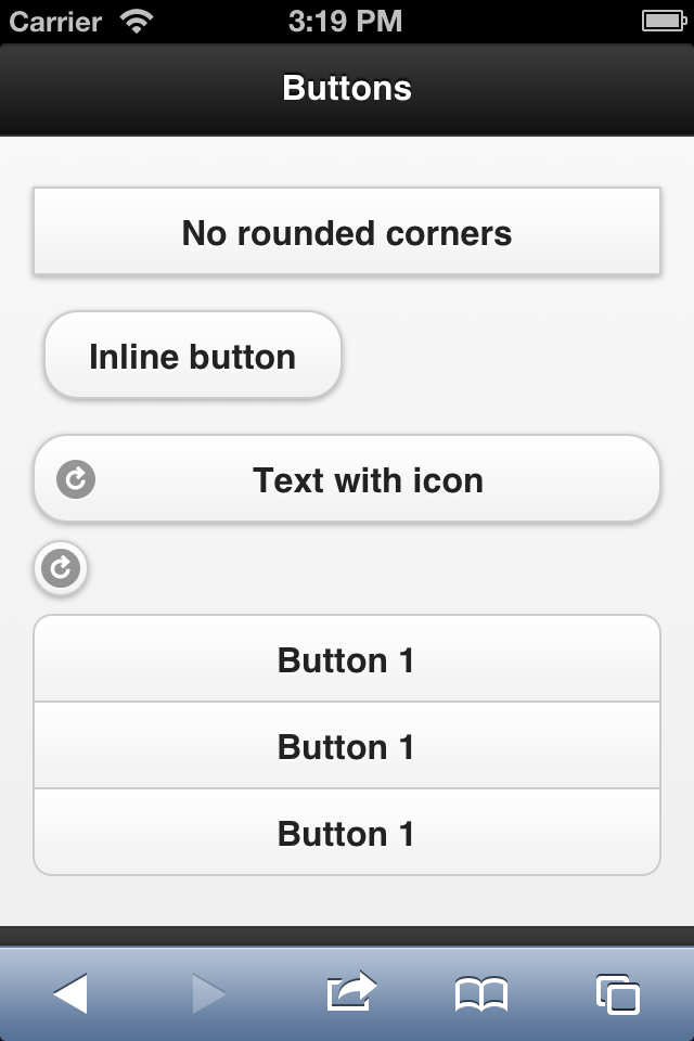
Navigation Bars
A navigation bar is a group of buttons that are aligned horizontally in a header or footer. The syntax is this:
<div data-role="navbar">
   <ul>
      <li><a href="#">Option 1</a></li>
      <li><a href="#">Option 2</a></li>
      <li><a href="#">Option 3</a></li>
   </ul>
</div>
Collapsible
On mobile devices, space is very limited. That is why a good UI pattern, such as collapsible content, is so beneficial. This is content that can be hidden and then shown via a JavaScript behavior once the user touches a heading or button.
jQuery Mobile automatically supports this UI pattern, without our needing to add any JavaScript of our own. To create collapsible content, just define a container with data-role=“collapsible”. This container will need to have an h~ element that acts as both the heading and the open/close button. The collapsible content would be any HTML code inside the container other than the title.
<div data-role="collapsible">
   <h2>Heading</h2>
   <p>Content for the collapsible area</p>
</div>
List Views
You already know what a list is. In jQuery Mobile, a list view is just an ordered or unordered list on a page with at least one list item and with the role defined as listview, using the HTML5 syntax data-role=“listview”.
jQuery Mobile renders lists that are optimized for touch usage, as you can see in the default height of rows rendered by the framework. Every list item automatically fits the whole width of the page, which is a typical UI pattern for touch mobile devices. List views may contain the following:
- Item separators;
- Nested lists;
- Interactive rows;
- Double action rows;
- Rows with icons and thumbnails;
- Rows with aside text, count bubbles and detail-related content;
- A filter mechanism.
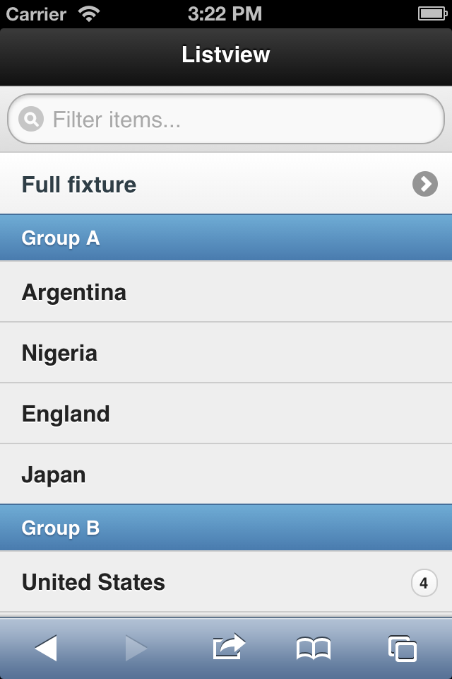
Let’s see a simple example with some options applied:
<ul data-role="listview" data-filter="true">
   <li><a href="fixture.html">Full fixture</a>
   <li data-role="list-divider">Group A
   <li>Argentina
   <li>Nigeria
   <li>England
   <li>Japan
   <li data-role="list-divider">Group B
   <li>United States
       <span class="ui-li-count">4</span>
   <li>Mexico
   <li>Korea
   <li>Greece
   <li data-role="list-divider">Group C
   <li>Germany
   <li>Finland
   <li>Chile
   <li>South Africa
</ul>
Form Controls
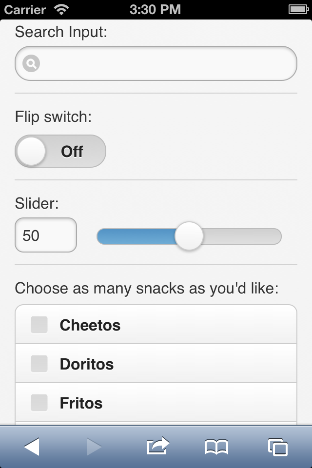
jQuery Mobile supports standard Web form controls and the new rich controls in the same form. The framework has a feature called “auto-initialization” that replaces every Web form control with a touch-friendly rich control.
The framework also takes new HTML5 input types to a new level, supporting them even in browsers with no official support. And by default, jQuery Mobile will send the form using AJAX, while providing a transition to the results page.
Here are the elements that will be rendered as rich controls:
- Buttons, using
buttonandinputelements; - Text inputs, using
inputandtextareaelements; - Check boxes and radio buttons, using
inputelements; - Menus, using
selectandoptionelements; - Sliders, using the new
input type="range"control; - Slider switches, using
selectandoptionelements with a new role.
If you don’t want jQuery Mobile to render a form control as a rich UI component, you can force it to use data-role=“none” in every form element.
Every form element will take up one line and will not share a row with any other form control. This is the best solution for the user’s experience with mobile forms. We can always force columns, but it’s not recommended with mobile forms.
The next example shows how jQuery Mobile renders a form.
What Else Can We Do?
jQuery Mobile is a powerful framework. There are a lot of things we have not covered here, such as:
- Dialogs and pop-ups;
- Advanced attributes for each component;
- CSS grids;
- Creating your own theme;
- Setting up default values for components and pages;
- JavaScript API for refreshing widgets and creating widgets on the fly (e.g. using AJAX-based data to construct pages);
- Using jQuery Mobile in Apache Cordova or PhoneGap applications;
- Event model for pages and widgets;
- Using jQuery Mobile plugins;
- Creating your own jQuery Mobile plugins.
Wrapping Up
If you want to create a mobile application with HTML5, jQuery Mobile will help with the user interface, including basic styling, fixed toolbars, the navigation controller, navigation transitions and multiplatform support. We’ve covered the basics: how to set up a jQuery Mobile document and all of the basic controls available in the framework.
Just remember: jQuery Mobile is not a jQuery alternative, and it only works for and affects the UI layer of your Web app. Also remember that you can mix jQuery Mobile with any JavaScript, HTML5 or CSS code of your own. If you’d like to go deeper into the framework, the advanced topics will keep you entertained. Just browse the official documentation and have fun!
Further Reading
- Essential jQuery Plugin Patterns
- Spicing Up Your Website With jQuery Goodness
- How To Make Your Websites Faster On Mobile Devices


 Try ProtoPie AI free →
 Register Free Now

 SurveyJS: White-Label Survey Solution for Your JS App
 Celebrating 10 million developers