Infinite Scroll: Let’s Get To The Bottom Of This
Human nature demands hierarchy and structures that are easy to navigate. But infinite scrolling sometimes leaves users feeling disoriented as they travel down a page that never ends.
Infinite Scrolling, Pagination Or “Load More” Buttons?
What is the best UX pattern to display products on an e-commerce website? We tested three different design patterns for loading products. Read a related article →

The Good
Long lists are not new, but the way in which we scroll these lists has fundamentally changed since the arrival of mobile interfaces. Due to the narrowness of mobile screens, list items are arranged vertically, requiring frequent scrolling.
Infinite scrolling is highly trending as an interaction behavior on pages and lists. The basic functionality is that, as the user scrolls through content, more content is loaded automatically. With the popularity of social media, massive amounts of data are being consumed; infinite scrolling offers an efficient way to browse that ocean of information, without having to wait for pages to preload. Rather, the user enjoys a truly responsive experience, whatever device they’re using.
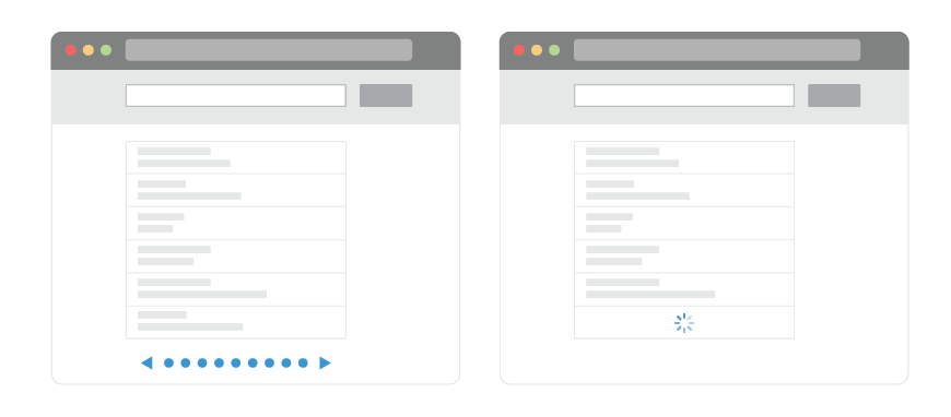
Websites with lots of user-generated content today are using infinite scrolling to handle content that is being generated every second. By unspoken agreement, users are aware that they won’t get to see everything on these websites, because the content is updated too frequently. With infinite scrolling, social websites are doing their best to expose as much information as possible to the user.
Twitter integrates infinite scrolling effectively. Its feed fits the criteria: a large amount of data (tweets) and a real-time platform. From the perspective of the user, all tweets are equally relevant, meaning that they have the same potential to be interesting or uninteresting; so, users will often scroll through all of the tweets in their feed. Being a real-time platform, Twitter is constantly being updated, even if the user leaves their feed unattended. Infinite scrolling seems to have been created especially for websites like Twitter, which successfully employs the technology.
Infinite scrolling appears to have found its niche on the Web. However, there are also drawbacks that must be considered before assessing its value.
The Bad And The Ugly
With so much data to browse, users must stay focused on the information they are searching for. (Remember about being goal-oriented?) Do users always want a never-ending stream of data? Analytics show that when users search for information on Google, only 6% advance to the second page. So, 94% of users are satisfied with receiving only 10 results, which suggests that users find Google’s ranking of results to be relevant.
To Click Or Not to Click
Google has implemented infinite scrolling for image search results but has yet to implement it for its general results. Doing so would eliminate the need for users to click to reach the second page. Google will probably maintain pagination because this pattern is quite symbolic for its brand. If it does switch to infinite scrolling, when would users typically stop scrolling? After 20 results? 50? When does an easy browsing experience become more complicated?
Looking for the best search result could take a second or an hour, depending on your research. But when you decide to stop searching in Google’s current format, you know the exact number of search results. You can make an informed decision about where to stop or how many results to peruse because you know where the end is. According to studies conducted in the field of human-computer interaction, reaching an end point provides a sense of control; you know that you have received all relevant results, and you know whether the one you are looking for is there or not. Knowing the number of results available provides a sense of control and helps the user make a more informed decision, rather than be left to scour an infinitely scrolling list.

When items are distributed across Web pages, they are framed and indexed and have a start and end point. The information is presented clearly and orderly. If we select an item from a paginated list and are taken from that page, we know that clicking “Back” will return us to that page (probably to the same scroll position). Our Web search will continue right where it left off.
If you scroll the same list of results with infinite scrolling, you are left without that sense of control because you are scrolling through a list that is conceptually infinite. Let’s say you count yourself among the 94% who stop reading after the first page (i.e. 10 results) of a Google search. When the list scrolls infinitely, there is essentially no end to the first page. Rather than look for the end of the page, which doesn’t exist anyway, you decide to stop scrolling at the 10th item. This poses a problem with infinite scrolling, because the 11th item is directly in sight. With a paginated list, on which you wouldn’t see the 11th result, deciding not to continue browsing is easier. However, when the next results are already there, you’d probably just keep on scrolling and scrolling.
As Dmitry Fadeyev points out:
"People will want to go back to the list of search results to check out the items they’ve just seen, comparing them to what else they’ve discovered somewhere else down the list. Having a paginated interface lets the user keep a mental location of the item. They may not necessarily know the exact page number, but they will remember roughly what it was, and the paginated links will let them get there easier. Not only does the infinite scroll break this dynamic, it also makes it difficult to move up and down the list, especially when you return to the page at another time and find yourself back at the top, being forced to scroll down the list once again and wait for the results to load. In this way the infinite scroll interface is actually slower than the paginated one." — Dmitry Fadeyev, When Infinite Scroll Doesn't Work
When Infinite Scrolling Fails
The best companies are constantly testing and studying new interactions with their users. Increasing numbers of these studies are showing that infinite scrolling does not resonate with users if it does not support their goal on the website.
Temptation
When you’re looking for that perfect search result and are tempted to continue scrolling into a wasteland of irrelevant results, time is wasted. Chances are that the best result will appear in the first 10 items. Therefore, infinite scrolling merely tempts you to continue reading, wasting time and decreasing productivity in the process.
Optimism
Even more annoying is that scroll bars do not reflect the actual amount of data available. You’ll scroll down happily assuming you are close to the bottom, which by itself tempts you to scroll that little bit more, only to find that the results have just doubled by the time you get there.
Exhaustion
Infinite scrolling overwhelms users with stimuli. Like playing a game that you can never win, no matter how far you scroll, you feel like you’ll never get to the end. The combination of temptation and optimism play a big role in exhausting the user.
Pogosticking
Infinite scrolling often causes your position on the page to get lost. “Pogosticking” happens when you click away from an infinitely scrolling list and, when you return by clicking “Back,” are brought to the top of the previous page, instead of to the point where you left off. This happens because the scroll position is lost when you navigate away from an infinitely scrolling page, forcing you to scroll back down each time.
Loss of Control
Infinite scrolling leaves you with the feeling that you might be missing out on information. You continue scrolling because the results are right there, but you feel overwhelmed because you’re losing control over the amount of data being shown. There is something nice about defined pages on which the amount of content is quantified, where you can comfortably choose whether to click to view more or to stop. With infinite scrolling, you don’t have control over the amount of data on the page, which becomes overwhelming.
Distracting
Etsy, an e-commerce marketplace, implemented infinite scrolling, only to find that it led to fewer clicks from its users. Infinite scrolling was unsuccessful because users felt lost in the data and had difficulty sorting between relevant and irrelevant information. While infinite scrolling provided faster and more results, users were less willing to click on them, defeating its very purpose.

Unreachable
Have you tried reaching the footer of Facebook lately? The footer block exists below the news feed, but because the feed scrolls infinitely, more data gets loaded as soon as you reach the bottom, pushing the footer out of view every time. Footers exist for a reason: they contain content that the user sometimes needs. In Facebook’s case, the user can’t reach it. The links are repeated elsewhere but are harder to find. Infinite scrolling impedes the user by making important information inaccessible.

Footers serve as a last resort. If users can’t find something or they have questions or want more information or explanation, they often go there. If they don’t find it there, they might leave the website altogether. Companies that implement infinite scrolling should either make the footer accessible by making it sticky or relocate the links to a sidebar.
Not Exclusive
Pinterest does not have a footer at all, which makes sense given the problem we just saw with Facebook. Through infinite scrolling, Pinterest emphasizes its profusion of data, an endless sea of inspiration taken from all over the Web.

Images are faster and easier to scroll than text, so Pinterest and Google Images succeed with infinite scrolling to an extent. However, billions of images are on the Web, and users would prefer to see only the best of them. There is something to be said for exclusivity, which seems to be lacking in Pinterest’s layout.
Limiting the number of images on Pinterest’s home page, with an “Editor’s picks” or “Most popular” list, might make the website more appealing. How exclusive can a pin be when a ton of other similar pins are next to it?
Pinterest’s tactic of using infinite scrolling for its plethora of data suffers because it overwhelms users. The collection looks bottomless, but its immensity is somewhat daunting, and browsing it might seem a waste of time. Ultimately, Pinterest is trying to expose users to infinite inspiration, but that actually undermines the human need for control. The amount of data becomes intimidating, and users are left with mixed feelings.
When Usability Wins
As mentioned earlier, Twitter integrates infinite scrolling effectively. The user sees an infinitely growing list of tweets and can comfortably click on a tweet to expand it in place, preventing the page from refreshing and, as a result, maintaining their scroll position.
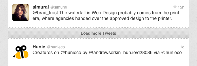
On its mobile version, Twitter even adds a “torn paper” marker, indicating to the user where to resume reading. This subtle and simple solution enables the user to scroll up and down the list, while having a recognizable point to return to. Psychologically, that marker reassures the reader by dividing read and unread content. Such markers give the user a sense of control and a better perception of the content’s depth and how far they’ve gotten into it.
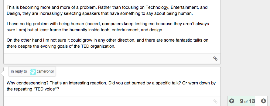
Twitter is not the only one. Discourse, an emerging discussion platform, also has infinite scrolling that empowers the user. The company considered the importance of infinite scrolling to its user experience and implemented an intriguing and unique progress indicator. The indicator appears when needed and remains in view (without interfering) while the user reads the content. The indicator numbers the item currently being viewed out of the total number of items. This is a great way to make the user feel in control, even with a lot of data.
Go Hybrid
A hybrid of infinite scrolling and pagination is also a good option in many cases. With this solution, you would show a “load more” button at the end of a preloaded list, which, when clicked, loads another batch of items onto the list. The same behavior that infinite scroll does automatically, this button does on demand. The interface gains some of the advantages of infinite scrolling, without some of its drawbacks.
Because infinite scrolling requires the website to fetch so much content, the hybrid solution is used at times to control the data load. In Facebook’s news feed and Google’s image search, the infinite scrolling is automatic at first but becomes on-demand once a certain number of items have loaded. This maintains the interface while limiting the load on the server.

Infinite Pages
Infinite pages take the concept of infinite scrolling to a new level. Websites that employ this concept are “one-pagers.” To remove the barrier of clicking to the next page, the designer turns the entire website into one long scrollable page. Examples are Unfold and Lost World’s Fairs.
On these one-page websites, the sections are spread vertically, one after another. This makes the whole website less comprehensible — hence, less accessible. These websites might not have infinite scrolling, but the user might still have that feeling of a never-ending page.
On infinite pages, the height of each section will vary according to its contents. Although the approach can make for some creative interactions, it can leave users disoriented and unsure where to scroll for the next piece of information. The scroll bar is hidden on many such pages, leaving users feeling lost as they unconsciously look for the scroll position to track their progress. Hidden scroll bars deprive users of that chance for rescue. Users shouldn’t be left helpless; the interface should clearly show them how to navigate the page.
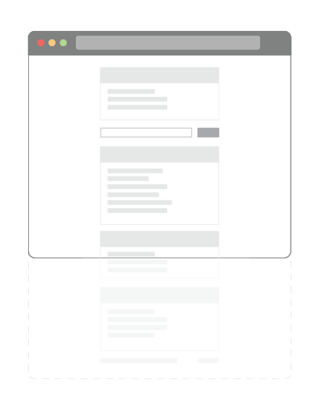
Not knowing where they stand can leave the users disoriented.
UX engineers need to take extra care when designing infinite pages. They must take into account accessibility; tell users where they stand by showing the length of the page and how much they’ve viewed. Solutions could include a fixed menu, a map of the page or a scroll progress bar.
Another trick is the parallax effect, whereby different layers on the page move at different speeds according to the user’s scrolling, creating the illusion of depth (as seen on Andrew McCarthy’s website). While it can help to create beautiful and innovative experiences, it is sometimes heavily overused, and users can get confused by how much they need to scroll for more content. When the parallax effect is combined with animation, the user can get confused about whether the page is being scrolled by their movement or is moving autonomously. It’s wise to use the technique to enhance content, not as the content itself.
Let’s Get To The Bottom Of This
Infinite scrolling can be an innovative feature that greatly improves an interface by exposing content and making performance more efficient. But it needs to be used correctly.
Avoid the following sinkholes to achieve a strong infinite scrolling experience:
- Users want immediate access to exclusive data. Users don’t want to be left to explore all of a website’s data on their own. When implementing infinite scrolling, identify what data is exclusive to your website and elevate it to the top of the page, and filter less relevant information.
- Users want to feel in control. Infinite scrolling sabotages that feeling of control. Add a smart progress indicator, a fixed menu or a map.
- Users often look for landmarks when scrolling. When scrolling through long lists, users expect to be able to easily distinguish between new and viewed data. Add landmarks along the interface to keep users oriented.
- Consider conventional pagination or a hybrid solution. Good old pagination is always an alternative to infinite scrolling. And if that doesn’t fit the context, then a hybrid solution, using a “load more” button, could greatly enhance the interface.
- Provide interesting content without an ambiguous interface. Having to traverse a never-ending list is logical only if the user leaves feeling that it was worthwhile.
- Users often expect a footer. If footer-type information is functional to the interface, then it should appear at the bottom of the page. A fixed footer is usually the way to go with infinite scrolling.
- An infinite list is still a list. Infinite scrolling still needs to meet common interface standards. Whether users take their eyes off the screen for a moment or click a link and then click “Back,” they expect to return to the exact point where they left off. Whatever your interface, make sure it meets users’ expectations.
- Effects are nice to have but not a must. Many infinitely scrolling interfaces have various effects to show more data (whether by sliding in new content or another method). Be mindful not to focus more on effects than on presenting data in the most effective way possible.
Use It Correctly
Users are goal-oriented and find satisfaction in reaching the end of their exploration. To be effective, infinite scrolling has to account for this. Nothing is really infinite, not even these infinitely scrolling lists we’ve looked at. Users should always know where they stand, even when the content has not finished loading. They should know what the total amount of data is and be able to easily navigate the list. Infinite scrolling has to be implemented in the best possible way so that users can always find their way.
Further Reading
- How To Enable Collaboration In A Multiparty Setting
- Web Design Trends 2021: The Report
- Overcoming The Challenges Of Content Creation For Informational Websites
- Designing Sticky Menus: UX Guidelines


 Try ProtoPie AI free →

 SurveyJS: White-Label Survey Solution for Your JS App
 Celebrating 10 million developers

