5 Ways To Prevent Bad Microcopy
You’ve just created the best user experience ever. You had the idea. You sketched it out. You started to build it. Except you’re already in trouble, because you’ve forgotten something: the copy. Specifically, the microcopy.
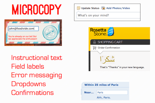
Microcopy is the text we don’t talk about very often. It’s the label on a form field, a tiny piece of instructional text, or the words on a button. It’s the little text that can make or break your user experience.
If you think you’ve built the best user experience but didn’t make sure the microcopy was spot on, then you haven’t built the best user experience.
With the adoption of agile development and lean UX, we’re often concerned about racing through iterations and getting our products in front of customers. But we can’t forget that design is still about words.
Everyone frets about marketing copy — and they should — but communication doesn’t stop once you’ve sold the user. In some ways, you could argue that words become more important once the marketing experience is done. With most products, users have to be sold to only once — or once in a while — and then they’ll use the core product all the time.
If your microcopy isn’t getting the job done, you’ll lose users — and all the marketing in the world might not get you a second chance.
With that in mind, here are five ways to make sure your website’s microcopy doesn’t end up sinking your UX.
1. Get Out Of Your Own Head And Get To Know The User.
I’m willing to bet that your experience is plastered with internal terminology, especially your labels and navigation. Every company has its own language, which often sneaks onto the website when we’re not careful.
Don’t let it happen. Never assume that what works for you will work for the user.
Here’s a simple way to check whether your microcopy is too internal — or confusing, for that matter.
Let’s assume that you’re running some form of usability testing. (If you’re not, there’s only about a thousand articles out there that will convince you you’re making a mistake, so you don’t need me for that.)
When you’re testing, you probably get caught up in watching how the user interacts with your website and their facial expressions. But instead of simply watching, make a point to really listen to — and take notes on — the actual words the user says during testing. Listen closely to the phrases they utter when describing their actions. After all, you’ve told them to think out loud.
Listen to the inflection in their voice as they read microcopy: Did they say that label or term with a question in their voice? Don’t hesitate to have your moderator follow up on copy. Have them go back and ask the user whether they’ve understood that label.
Take it a step further: Listen to what users say from the moment they walk in the building. Listen to their banter with the moderator, the jokes they make and the words they use to express their frustration or enjoyment.
You’d be surprised by what you can learn about a user and their language set from a comment they make about a cup of coffee. Everything someone says tells you something about them and can inform your copywriting process.
2. The User Is A Person. Talk To Them Like One.
Because brevity is essential on the Web, most of us tend to truncate everything — particularly labels. Labels are great for design. They organize and keep tidy essential parts of a UI, such as navigation and forms.
Unfortunately, labels have an inherent problem: They’re easily subject to a user’s personal context because they don’t provide explanation. They’re on an island in the user’s mind.
Not too long ago, we encountered this problem with a label at TheLadders.
TheLadders is a job-matching service. Like any matching service, we required information to match a user with the right job.
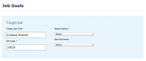
We thought this form was very clear. “Job Goals” is the label we’ve used for our matching criteria for almost 10 years. It’s brief, which helped to keep the navigation neat. But in a recent redesign, we noticed that users kept stumbling when first arriving on the page.
Turns out that people who don’t work in the job-search industry think of job goals as accomplishments they hope to achieve at their job, not as the details of their next job.
(We also fell into the trap covered in the first point: internal terminology = bad.)
So, we made it more conversational: “What job do you want?” Instantly, we could see that users no longer hesitated. Why? Because taking this new line of copy out of context was impossible.
Instead of forcing a label on a form or field for the sake of the UI, use natural language. The experience should be a conversation with the user, not a filing cabinet for them to drudge through.
Most of all, the labels in the navigation shouldn’t be more important than the user’s interaction with the pages that the labels represent.
3. Use Copy As A Guide, Not A Crutch.
"We can fix that with copy."
I’ve heard this too many times when the UX falls short, and I hate it. If there’s a problem with the design, then fix the design. The best experiences have minimal copy because they’re intuitive. When designing the UX and you find yourself writing a sentence or two to help the user take an action, step back.
Tests have been conducted on readability and on the optimum length of content for understandability since the 1880s. With the rise of the Internet, this story became about line length. Most sources net out between 45 to 75 characters as the ideal line length.
To me, line length is moot, especially with responsive and mobile design. Besides, character counts seem tedious and not very lean.
Instead, I subscribe to the original readability tables of Rudolf Flesch (pictured below), in which sentences with eight words or fewer are regarded as “very easy” to read.
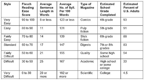
The readability tables of Rudolf Flesch.
It may be an old standard, but it still may be the best measuring stick we have, and it’s the easiest for lean teams to follow. On the Web, we’re shooting for “very easy to read” every time, and we want to be able to communicate with as many people (93%) as possible.
If you can’t explain what a user needs to do in eight words or fewer, then reconsider the design.
Once the user has gotten past the marketing portion of the experience, use copy as a guide to usher them through the product. The best copy on basic UI features, such as a form, will get read but not really noticed. The user absorbs the words and takes the desired action without a hiccup.
4. Treat Every Moment Like A Branding Moment, Even When It’s Not.
There are multiple definitions of a “branding moment.” When we talk about copy in a UX, I define it as a moment when you purposefully inject your brand’s tone and voice into what would normally be a straightforward user interaction.
For example, Foursquare has a lot of great branding moments within its badging system. I unlocked the one below not too long ago. It’s fun and a bit edgy, on point with Foursquare’s brand.

A good job of a branding moment with Foursquare’s brand.
But getting carried away is easy. Think hard before using fun or quirky — or whatever your brand’s voice is — copy in a situation that the user wants and expects to be straightforward.
Your brand’s tone and voice are essential to consider when writing all of your copy, but it should not get in the way of a user who is trying to take action.
Avoid over-branding copy on:
- navigation,
- forms and field labels,
- instructional text,
- selection text (drop-downs, radio buttons),
- buttons.
Consider incorporating your brand’s voice in:
- confirmation messaging,
- rewards (badges, points),
- 404 pages,
- server errors,
- error messaging.
The difference between these lists is simple. In the first list, the user is attempting to take action; the second list is the results of actions.
In the first list, you don’t want to risk confusing users as they try to accomplish something and cause them to abandon. Clarity is essential.
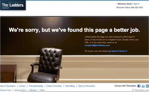
In the second list, you have an opportunity to embrace the user’s success (Foursquare’s “You’re on fire!”) or mitigate a failure (TheLadders 404 page, below) by injecting your brand. You don’t need anything from the user at these points.
This isn’t to say that you can’t brand that first list. But if you’re going to do it, test it first. With branding moments, execution is paramount. If you’re unsure, don’t risk it.
By choosing not to brand parts of the experience to keep it simple and easy for the user, you’ll provide an enjoyable experience, which will make your brand stronger. So, every moment is a branding moment. Even when it’s not.
5. If Content Is King, Then Treat Context Like A Queen.
The hot saying right now is “Content is king.” Native advertising, or the integration of relevant content into a natural experience for the purpose of acquisition, is becoming a core offering of many agencies and has spawned a few popular startups.
But without context, content is useless. (And if you’re big on Game of Thrones, then you’ll know that queens have all the real power!)
Whether you’re labeling a form or writing a blog post, you have to either understand the user’s existing context or provide context for them.
A user’s context will define how they interpret the copy on the page. That context could come from anywhere: an email they’ve just read, or something that happened to them when they were eight.
When a user doesn’t have proper context, they get confused. When a user gets confused, they abandon.
If you’re agile and iterative, accounting for a holistic experience adds an additional layer of complexity, in the form of consistency. A simple change to copy on one page could affect 10 other pages. One minute you’re calling something “Job Goals,” and the next you’re changing it to “What job do you want?” Well, where else have you used “Job Goals”?
To better understand the user’s context — and to check for consistency — sit down at least once per iteration and experience your “contextual flow” as the user sees it.
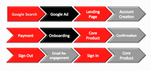
For example, if you have a subscription service, the flow might be something like this:
That’s at least 10 distinct steps in which a user’s context could be created, confirmed or altered.
Sit down, take a breath and wipe your mind of what you know is there. Then start with Google or your home page or wherever the first touch usually happens.
Does your onboarding experience deliver the same promise as your Google ad? Have you described a feature using the same language throughout? Are your labels so subjective that the context gets lost? These are questions to answer as you go through the flow.
Whatever Happens, Don’t Ignore Your Microcopy.
Microcopy often falls victim to personal bias, internal terminology, poor branding, broken contextual flows, time crunches and other factors. Any of these can undermine even the most well-designed UX and the copy within.
Here’s the thing about mistakes with microcopy: They’re so easy to make yet so hard to identify after you’ve made them.
You have a much better chance of stopping the mistakes in advance than of identifying them after the fact. When you’re testing, how often do you think, “Hey, maybe we should change the label on the third field of this form?” You’re wrapped up in other UX mistakes that you know you’ve made. Unfortunately, a repeated pattern of noticeable failure is usually needed in order for microcopy to get updated or even tested.
So, the next time you’re creating or improving an experience, I hope you employ some of the tactics provided here so that you avoid these “easy” mistakes and do right by your microcopy — and by your user.
Further Reading
- 5 Copywriting Errors That Can Ruin A Company’s Website
- Quick Course On Effective Website Copywriting
- 50 Free Resources That Will Improve Your Writing Skills
- Designing The Words: Why Copy Is A Design Issue


 Try ProtoPie AI free →
 Celebrating 10 million developers
 Register Free Now

 SurveyJS: White-Label Survey Solution for Your JS App