The Joy Of Illustrated Maps In The Era Of Google Earth
Update (01.08.2013) Please note that this article has been updated and now references to OpenStreetMap.
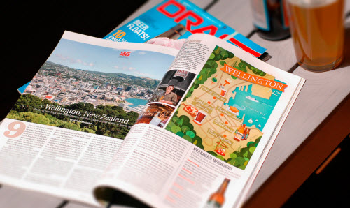
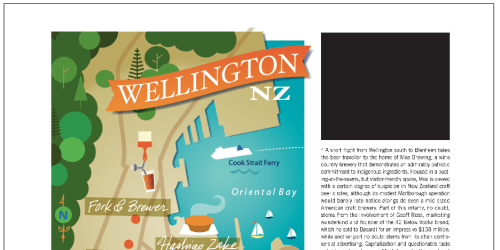
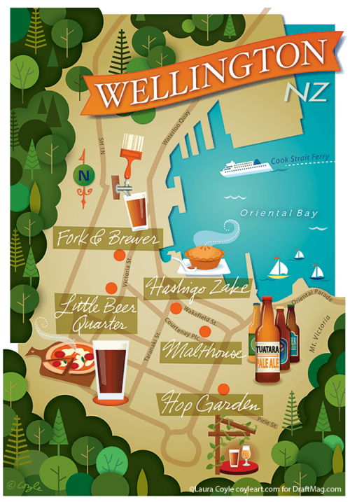
In my career as a freelance illustrator, map-making has become a favorite specialty of mine. With each map assignment, I virtually travel across the globe, visiting places I’ve never been. Most recent was a “trip” to New Zealand for a sampling of local Wellington beer for Draft Magazine. My maps are designed to appear next to magazine stories about trips to faraway places, or about the best restaurants in a nearby neighborhood.
I create them in Adobe Illustrator, and I relish the research process as much as working on the drawings themselves.
There was a time when map assignments arrived from clients in a FedEx envelope, full of research, including Xerox’ed maps taped together and marked up with a highlighter. Back then, I could search online for photo references, but it certainly wasn’t the 3-D experience of flight that it is now. With Google Earth, I can get the lay of the land and see the heights of buildings and the way green spaces meet city blocks. These details give me a sense of place that fires my imagination.
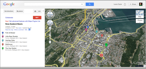
I received the brief for Draft Magazine’s project from art director Kevin Robie, with a list of publications to highlight, a preliminary layout and a few reference maps. My starting ritual is to create a Google “My Places” map, with a marker for each landmark, shop or restaurant highlighted in the story.
Here are the steps I took:
- Log into Google, and click on “Maps.” Click on the “My Places” button and then the “Create Maps” button.
- Name the map. Choose to make it “Public” or “Unlisted.” Hit “Done.”
- Search for a location using the search box, and then click “Save to My Maps.” From here, I can choose which map to save it to and view the map.
- Once I have saved locations on my map, click the “Edit” button, and then click on the location that I want to edit in the list. A callout box will appear on the map, allowing me to change the location’s title and description and even the color and style of the pin.
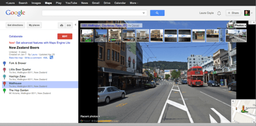
- With the map set up and Google Earth installed, I can choose to look at locations in “Satellite” mode or “Street View,” and then try the “Earth” view right from my browser to fly in and get a feel for the heights of buildings and the topography of the city.
- Download a KML file of my map by clicking the KML link or the Google Earth icon under the title of the map. Double-click the file to launch Google Earth on my system with my map preloaded.
Whether you explore your map in the browser or from the Google Earth app, you can fly around, visit street level and see the Panoramio photos taken in the neighborhood you’re visiting. If you’re lucky, the location you’re researching will have a panoramic virtual tour of the interior space. Street-view images can get out of date, so I always visit the websites of any businesses or restaurants that are being highlighted. I find that the Google Earth and satellite views give me a sense of a city or neighborhood that helps me to envision the overall look of the map.
Google has recently released the Google Maps Engine (currently in beta), which offers further customization, such as the ability to draw lines to create a virtual walking tour. If 3-D aerial views of buildings are what you’re after, Bing has a nice Bird’s Eye view that can supplement your research.
While Google and Bing can provide the 3-D vistas that allow you to travel virtually to the city you’re illustrating, you’ll also need a street map to compose the illustration. For this, go to OpenStreetMap.org, the Wiki of world maps. Open Street Map describes their service as “free geographic data for the world.” Although maps contain factual information, most online map services copyright their maps. The license on Open Street Maps, allows for artistic use of their information with certain requirements and conditions.
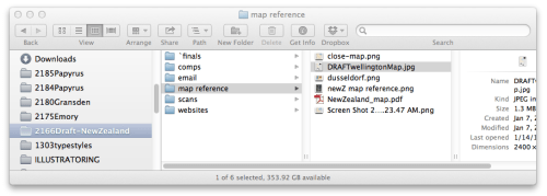
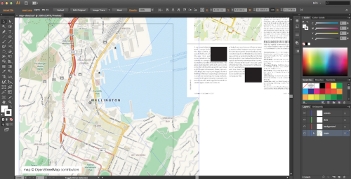
I take screen shots and keep my reference images organized in the job folder on my system. In Illustrator, I create a CMYK document at the page size of the magazine. I take reference provided by the client along with screenshots of the Open Street Map view and File → Place’d them in the document.
Place-linking images (as opposed to embedding them or pasting them from the clipboard) in Illustrator keeps the document’s size small — but it’s important to have a strategy for keeping up with the images on your system. If you move an image to a different location, the next time you open the document, Illustrator will ask you to find and relink the image that you moved.
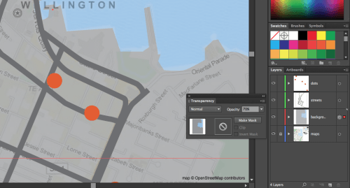
I created a few more layers above my locked reference layer for the map’s background and the streets, and one for the dots that mark the locations I was highlighting.
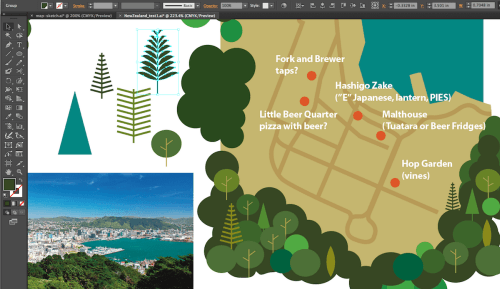
The first stage of creating the map was to figure out the composition. In this instance, art director Kevin Robie provided his page layout with the map indicated. Once I’d drawn the location dots and some simple shapes indicating the background of the map, I could begin to see the shape and scale of the map and the space available for illustration.
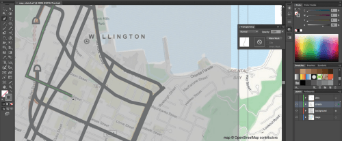
Maps © OpenStreetMap.org Contributors
At this early stage I work in grayscale and I trace the street layout with the Pen Tool. I may not be including all the streets I draw in the final map. Sometimes the pattern of streets can provide a grid texture I can work with later. I strive to strike a balance between a basically accurate map that also functions as an illustration. I take liberties to make the information more legible as an illustration and the art more attractive on the page.
With my background shapes isolated on their own layer, I clicked the Target icon in the layers panel and lowered the opacity of the background shapes layer to see the map reference below. With the basic map area laid out, I began searching for photo references to help me decide on a color palette and imagery for the different locations.
Each location I was highlighting needed an icon illustration that’s emblematic of the place. Food bloggers, such as foodiegemsofwellie, are a lifesaver to me because, although I can read about the specialty pies on Hashigo Zake, that website has no images to help me visualize the size and presentation of the dish that this bar is famous for.
One of the great advantages of working in Illustrator is that I have my own spot illustration elements, which I’ve collected from previous projects. I have glasses, bottles of beer, pizza and foliage that I can scale, recolor and rework to suit any project — a major time-saver.
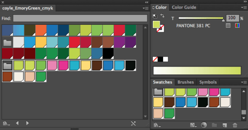
I also collect color palettes from previous projects, which I save in the Swatches Panel libraries (click Swatch Libraries → Save Swatches…, and then access them under User Defined). Over the years, I’ve learned not to assume that a color on screen will print accurately, so I’ll always check it against a physical sample.
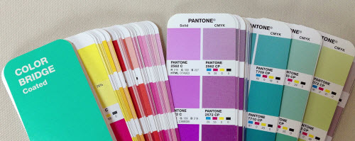
I used the Pantone Plus Color Bridge guide fan book to help me choose CMYK colors from the right-hand CMYK column (I ignored the spot colors on the left because this was a CMYK job). The bridge guide also shows the equivalent spot colors, hex codes and RGB values for each color. Illustrator’s swatch libraries for Pantone books can be found in the Swatch Libraries menu, under “Color Books.” Once I find a color I like in the fan book, I add it to my swatches panel.
With colors loaded on my swatches panel and photo references gathered, I was ready to start building the illustration. I did most of my work from beginning to end in Illustrator. With other types of illustration, I may start with pencil sketches, but maps really lend themselves to being “built” from solid shapes and lines in Illustrator.
After flying around Wellington in Google Maps, I knew I’d be surrounding the map with a border of green trees, so I started drawing circles in shades of green and trying out different tree shapes for the border. I typed notes about an icon’s subject matter directly on the map to save my ideas for later.
Keeping the tree decoration on its own layer allowed me to use a layer clipping mask in Illustrator to quickly crop the edges of the trees to fit the map. Later, I got rid of the layer mask and used individual clipping masks on separate groups of trees so that I could vary their placement. (See the resources at the end of this article for masking tutorials.)
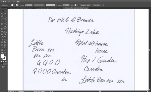
I turned off the layer with notes and printed out a preliminary map in grayscale, at a slightly larger than final size. I laid the printout on my light box and drew letters in ink multiple times to find some that I could combine to make labels for the different locations. I’d later make a 300-DPI TIFF scan of the lettering in Image Capture.
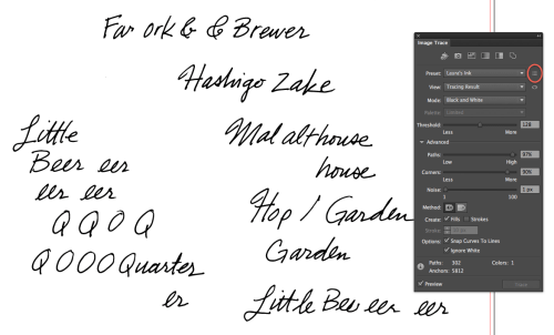
Next, I opened the TIFF in Illustrator and “Image Trace”’d it in black and white, with “Ignore White” turned on. I’ve saved a custom Image Trace preset in Illustrator that I use specifically for my handwriting, to retain as much of the original line character as possible. All of the detail settings are very high, and noise is at the lowest setting:
- Mode: Black and White
- Threshold: 128 (default)
- Paths: 97%
- Corners: 90%
- Noise: 1 px
- Check: “Create Fills,” “Snap Curves to Lines” and “Ignore White”
To save these settings as a custom preset for future use, click the “Manage Presets” button (circled above) on the Image Trace panel, and choose “Save as New Preset.”
After ungrouping the expanded trace, I started assembling the letters into place names and grouping them. Then, I copied and pasted the names onto a separate layer in my map file.
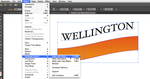
The title was created from a line of type and a rectangle, using Object → Envelope Distort → Make With Warp → Rise. I kept a copy of the “live” envelope objects off to the side, so that I could always adjust the amount of distortion. Then, I chose Object → Expand… to convert the warped type to paths, so that I could change colors and edit further.
I sent my Illustrator sketch positioned in the layout to the art director. At this stage, I showed him the composition and color palette, with a few details to show where I was going with it. In Illustrator, changing the colors or shuffling the composition elements is easy, so I always let the client know that this work is preliminary, even though it looks solid and not “sketchy.” The icons were plain shapes, which allowed me to get my ideas across without investing time in details that might need to be changed later.
Sometimes, I’ll include pencil sketches of the icons, placed on the Illustrator map; in this case, I’d worked with Kevin enough that I could use Illustrator shorthand, and he would know the level of detail to expect from my finished work.
I saved separate AI files for the sketch, comp and final version, so I could always go back and grab something I’d gotten rid of if I decided later that I needed it. Illustrator files are small enough to make this possible without eating up much storage space.
Once I’d finished detailing the final illustration, I got rid of any unused colors on my color palette (Panel Options → Select All Unused, and delete). Then, I saved the color palette for future use (Swatch Libraries Menu → Save Swatches). I can always access it from the same menu under “User Defined” later. Then, I went to “Select All” and chose Edit → Edit Colors → Convert to CMYK. Now, if I clicked on a color in my artwork, I could see the CMYK formula in the color panel.
Finally, I exported a high-resolution CMYK TIFF of the artwork. I could bring this into Photoshop if I needed to make any final adjustments or convert it to RGB for the website. I sent the final TIFF, rather than the Illustrator file, to my client. The final AI file is complex and made up of so many tiny parts that it would be safer for me to do any necessary edits myself. I learned that lesson after receiving a printed cover on which I found my main character’s ear unintentionally floating away!
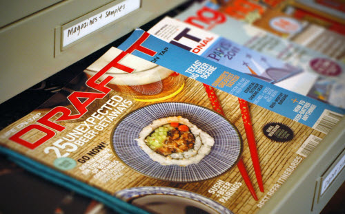
After a project, I’m always excited to see the final work in print. I filed the magazine away in the hope of getting to see New Zealand some day. In that case, I’ll be tearing out the page.
Other Resources
- Layer Clipping Mask Illustrator Tutorial
- Clipping Mask Illustrator Tutorial
- Laura’s Illustrator tips & tutorials blog
Further Reading
- Entering The Wonderful World of Geo Location
- Maps In Modern Web Design: Showcase and Examples
- A Guide To Building SVG Maps From Natural Earth Data
- Legal Guidelines For The Use Of Location Data On The Web


 Celebrating 10 million developers
 Register Free Now
 SurveyJS: White-Label Survey Solution for Your JS App