75 Instructive Design Case Studies
Not only are case studies a great way to explain the design process of an agency, but they also help designers and developers to learn from each other. Seeing how designers work, create, build and play is great, and furthermore, you can learn how to write a great case study yourself and how to use one to spice up your portfolio.
In this overview of useful case studies, we’ve featured studies that have recounted decisions made about particular design elements, as well as studies of full overhauls and their accompanying technical challenges. Most of them provide interesting insights into failures and successes, stories, workflows and design decisions made and rejected.
We must admit that this post is quite a long one, so we’ve decided to divide it into two parts to make it easier for you to navigate. Now you should be well prepared for a couple of late reading sessions over the next weekends!
Illustration, Graphics And Logo Design
“Illustrator Full Spectrum Spirograph,” Veerle Pieters Pieters talks about her experimentation process with spirographs, inspired by the work of Andy Gilmore.

“The Design Process of my Infographic About Women Cycling for Grinta!,” Veerle Pieters Pieters shares her experience of the design process behind the infographic on women’s cycling that she produced for Grinta magazine.
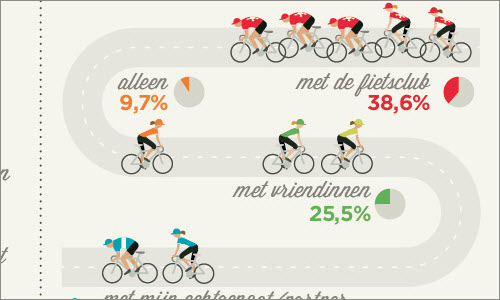
“A Systematic Approach to Logo Design,” Adham Dannaway Icon design can be time-consuming. Dannaway shows how to systematically approach a new logo design.
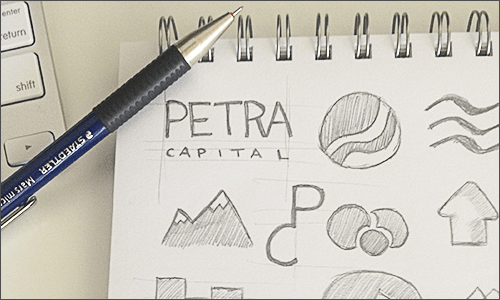
“(Re)building a Simplified Firefox Logo,” Sean Martell Learn how Firefox’s logo was simplified to better fit its extended usage beyond a desktop web browser.
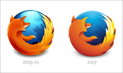
“Five Details,” Jon Hicks Jon Hicks shares the design process behind the Five Details Logo, including the design and choice of typography.

“Iconfinder Logo,” SoftFacade SoftFacade completely reimagined Iconfinder’s existing identity and came up with a shiny and modern robot character. View the detailed design process.

“The Great Gatsby” Like Minded Studio collaborated on the branding of “The Great Gatsby“. The aim was to develop a bespoke Deco styled logo reflective of the roaring 20s and Fitzgerald’s masterpiece. They also created a display typeface to acompany the main branding. Additionally read more about it following this link.

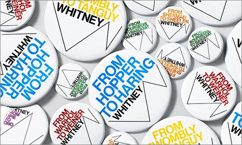
“Whitney Graphic Identity,” Experimental Jetset In this case study of the Whitney Museum of Art’s logo, Experimental Jetset discusses the impact that a responsive logo can have on branding.
“My ‘Tour de France’ posters,” Veerle Pieters Pieters created posters for the 100th edition of the Tour of France. She mainly used the French landscape which she had used for the ‘Tour de France Infographic’ as a starting point.
Typography
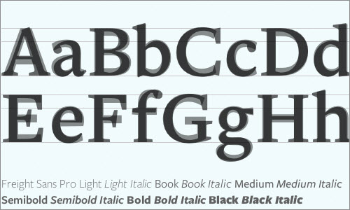
“Designing Type Systems,” Peter Bil’ak To create truly useful designs, typographers need to examine not only how characters relate to each other within a style, but also how different styles relate to each other within a family. Peter Bil’ak discusses how to achieve this.
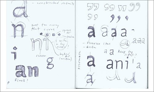
“Novel Constructions: The Making of a Typeface,” Christopher Dunst Dunst shares the process behind the creation of the “Novel” typeface.

“The Development of the Signage Typeface Wayfinding Sans Pro,” Ralf Herrmann Herrmann describes the development of the Wayfinding Sans Pro, a signage typeface that can be read from a long distance.

“The Making of FF Tundra,” Ludwig Übele Übele shares the process behing making the FF Tundra typeface, which was highly inspired by nature.

“The Making of Magasin,” Laura Meseguer Meseguer writes how she created Magasin, a typefaces inspired by fluid handwriting.

“Type Study” series, Adobe Typekit Typekit features a whole series of case studies of typography:
- “Hi-DPI Web Typography,” David Demaree
- “Typographic Hierarchy,” Frank Chimero
- “Pairing Typefaces,” Aura Seltzer
- “Sizing the Legible Letter,” Ethan Marcotte
- “Stereo-Typography,” Dan Mall
- “Choosing Fallback Fonts,” Josh Brewer
- “Techniques for Using Novelty Fonts,” Meagan Fisher
Usability
“Social Login Buttons Aren’t Worth It,” MailChimp Social login buttons are used by many apps today. MailChimp shares its own experience and considerations in using social login buttons.

“Usability in Icons,” Peter Steen Høgenhaug Icons are used to illustrate a particular function, anything from information to actions. This article explains what needs to be considered when designing them.
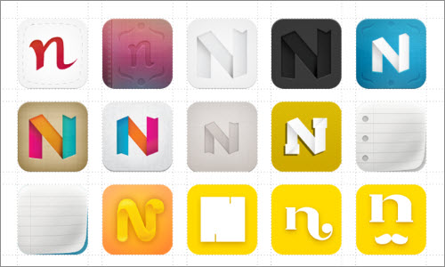
“iOS Icon Design: A Designer’s Exploration,” iOS icon design is not only difficult, but requires a lot of experimentation. David Killoy shares his experience of designing the icon for his note-taking app Notorious.
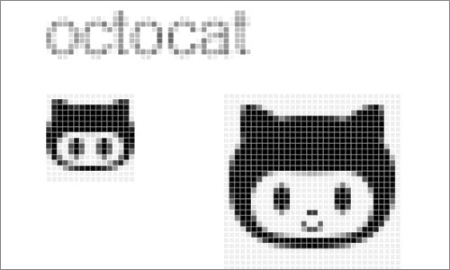
“The Making of Octicons,” GitHub Octicons is a icon font made by GitHub. Five designers collaborated on the project, and they share how they built Octicons and what they learned along the way.
“Designing Facebook Home,” Julie Zhuo On May 8th, the designers behind Facebook Home (Justin Stahl, Francis Luu, Joey Flynn and Mac Tyler) presented a behind-the-scenes look at their work at the Bluxome Street Winery for a small crowd.

Advertising, Promotion And E-Commerce
“How to Make Your Own App Promo Cards,” Mike Swanson Swanson was inspired by Starbuck’s promo cards for giving away free apps and decided to make his own for an upcoming event. Learn how you can do one, too!
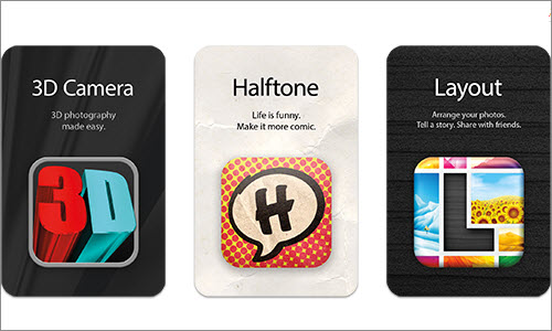
“The Art of Launching an App,” John Casey You’ve made your first app! Now what? This study covers some tactics and lessons learned during one process of launching an app.

“How to Launch Anything,” Nathan Barry Barry has launched five products in fewer than nine months. Read about the strategy that helped him generate over $200,000 in revenue from online products, starting from scratch.
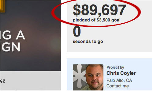
“Selling My E-Book on Amazon,” Jonathan Snook Several people predicted that 2013 would be the year of self-publishing. Snook shares insight into his eBook sales on Amazon.
“Increase Online Sales on Your Ecommerce Website,” Headscape increased sales on Wiltshire Farmfoods’ e-commerce website by over 10,000% in only five years. What makes it even more special, the target audience is over 50 years old. Paul Boag shares his experience.
“Twitter Promoted Tweets,” MailChimp MailChimp has made use of Twitter’s promoted tweets and shares insight into this experience.
Redesigning Elements And Features
“Visual Exploration Behind Signal vs. Noise,” Mig Reyes 37signals share the process behind making its blog special. This study is about how the company visualized noise and styled its blog categories in a unique way.
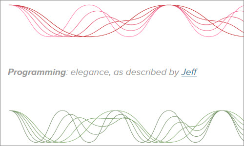
“Reinventing Our Default Profile Pictures ,” Jamie Jamie talks about the process of finding the right default profile pictures for the 37signals website. It’s a great new approach to a very basic element.

“Login Screen Design: Behind the Scenes,” Simon Tabor Good UX is not just about the main content, but also about little details such as log-in (and error) pages. GoSquared shares how it made its log-in experience exceptional.

“Save for Later,” Brian Groudan All browsers support two functions: searching and revisiting. Groudan worked closely with Mozilla’s user experience researchers and designers to rethink how Firefox could better offer “saving for later” functionality in the browser.

“A Closer Look at Zoom,” FiftyThree FiftyThree shares the design process behind the new zoom feature in its Paper app.

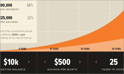
“Reinventing the Investment Calculator,” Alex Bendiken Drawing from the book Money for Something, Alex Bendiken built a tool that lets users experiment and create a unique investment plan. It’s a UX study in turning a boring financial calculator into something you’d actually want to use.
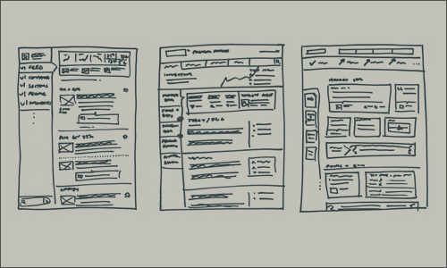
“Getting Down to Business,” Teenhan+Lax The Globe and Mail is Canada’s national newspaper of record. It serves millions of readers everyday with in-depth journalism and informed comment. Learn how Teenhan+Lax helped refresh and enrich the way users experience and engage with the news today.
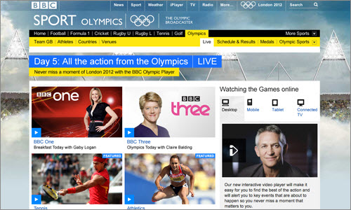
“Olympics: User Experience and Design,” Nick Haley Nick Haley shares the BBC’s design process of delivering the Olympics across desktop, tablet, mobile and connected TV.
“How We Built the Responsive Olympics Site,” Matt Clark Matt Clark writes about MSN UK’s approach to delivering the Olympics digitally, from the brief to the finished design.

“The Anatomy Of A Successful Logo Redesign,” Belinda Lanks Lanks summarizes how Jessica Hische had freshened up the new logo for MailChimp with a slight facelift. The new logo now looks new and fresh — more refined but just as playful.
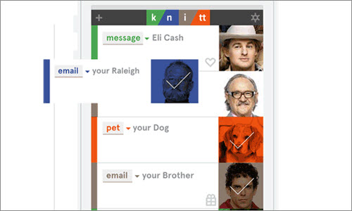
“What I Want Out of Facebook,” Keenan Cummings Cummings explains why Facebook fails him and what he wants to get out of it that would make it useful for his personal life.
“In Praise of Lost Time,” Dan Hill Dan Hill talks about Facebook’s Timeline as an exemplary bit of interaction design that does little to advance the timeline formally. Yet it might alter the nature of human memory itself.

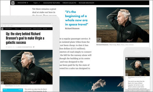
“Designing the new, fully responsive Wired.co.uk article pages,” Javier Ghaemi This article is about redesigning the Wired.co.uk article website to provide a more content-first and immersive experience.
Complete (Re)branding And (Re)design
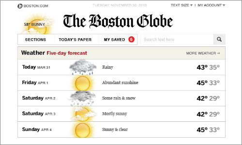
“How to Approach a Responsive Design,” Tito Bottitta This article shows the design process behind The Boston Globe’s website, one of the most famous examples of responsive designs. Read about how Upstatement approached its first responsive design.
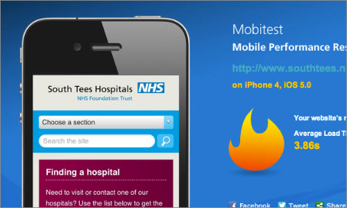
“Responsive Design Case Study,” Matt Berridge This case study outlines the entire process of constructing the South Tees Hospitals’ website, a large responsive design containing over a thousand pages.
“Rebuilding a University Homepage to Be Responsive. Twice. In Less Than a Year,” Erik Runyon This slideshow discusses how and why Notre Dame University’s home page was rebuilt twice in less than a year. You will find a recording of the talk below the slides.

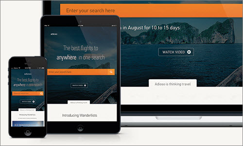
“Yes, You Really Can Make Complex Web Apps Responsive,” Daniel Wearne Wearne shares his experience in creating Adioso’s web app, a complex yet accessible project. He covers the framework, responsive mixins, tables and future challenges.
“Designing a New Playground Brand,” Ryan Bannon This case study shows the design process of Playground’s new brand. It covers the logo, overall website and vector animation process, as well as the core values and personality of the company. The extensive study comes in three parts.
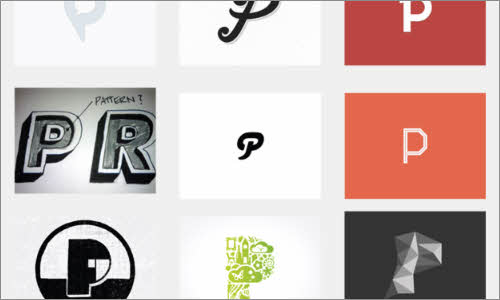
“How House Parties Helped Us Design Potluck,” Cemre Güngör The team at Potluck describes how it took inspiration from reality to design a “house party on the Internet.”

“Colorado Identity,” Berger & Föhr Imagine someone hiring you to define your own identity. Berger & Föhr was hired to help create the new identity and visual brand of Colorado, the place they call home. Have a look at the work and logo they came up with.

“Building the New Financial Times Web App,” Wilson Page Page talks about building the Financial Times’ new app, a challenge that many on his team believed to be impossible. He covers device support, fixed-height layouts, truncation, modularization, reusable components, Retina support, native-like scrolling, offline support and the topic of ever-evolving apps.

“Google Treasure Maps,” Alex Griendling Griendling writes about the design process behind Google Maps’ treasure mode.
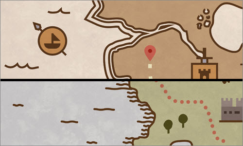
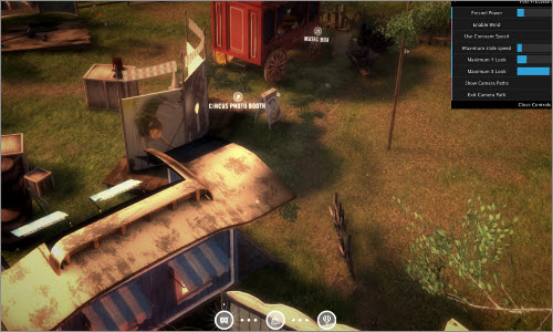
“Find Your Way to Oz,” HTML5 Rocks This very detailed case study looks at the “Find Your Way to Oz” demo, a Google Chrome experiment by Disney. It covers sprite sheets, Retina support, 3-D content and more.
“The Making of the Moscow Metro Map 2.0,” Art Lebedev Studio This study is about the design process behind the Moscow Metro map, a complex project that needed to meet the requirements of both Web and print.

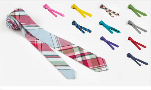
“Skinny Ties and Responsive eCommerce,” Brendan Falkowski Read and learn how GravDept redesigned Skinny Ties’ creative and technical direction to propel shopping on every device.
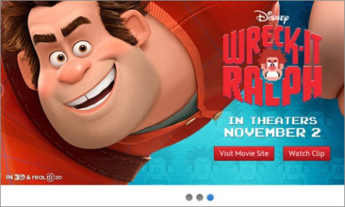
“The Design Thinking Behind the New Disney.com,” Bobby Solomon Solomon shares the process of creating a Disney website that is flexible enough to showcase the widest range of offerings imaginable — in other words, a website that can do everything.
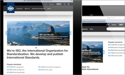
“Say Hello to the New ISO,” Andy Clarke Clarke and David Roessli redesigned the website of the ISO (International Organization for Standardization) and share their experience.
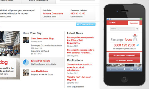
“A Responsive Design Case Study,” David Bushell The redesign of Passenger Focus takes advantage of the Web as an unique medium.
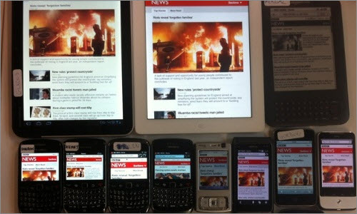
“BBC News: Responsive Web Design and Mustard,” Kaelig Deloumeau-Prigent These slides address the core principles and the “cutting the mustard” technique behind the BBC News’ responsive website.
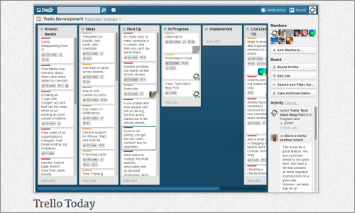
“The Trello Tech Stack,” Brett Kiefer Read the process behind the Trello app, from initial mockup to a solid server and maintainable client.
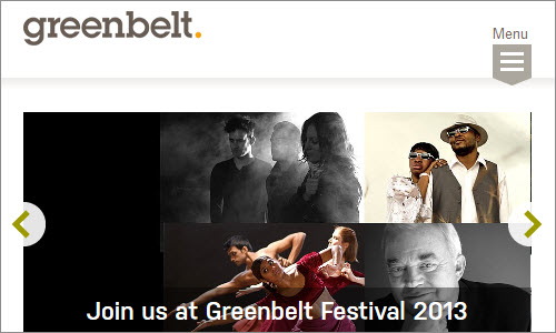
“Responsibly Responsive: Developing the Greenbelt Website,” Rachel Andrew Andrew writes about her front-end design decisions in rebuilding the Greenbelt Festival’s website.
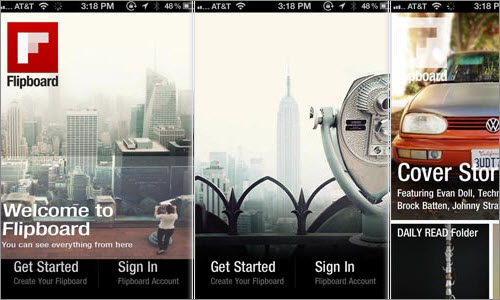
“The Digital-Physical: On Building Flipboard for iPhone and Finding the Edges of Our Digital Narratives,” Craig Mod Mod walks through the process of building the Flipboard app for iPhone and of finding the edges of its digital narratives.
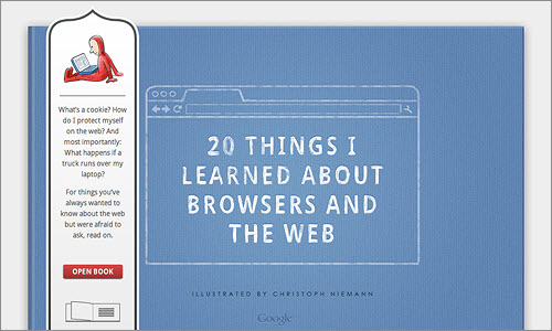
“Page-Flip Effect From 20 Things I Learned,” Hakim El Hattab This study shows how this team found the best way to achieve the feeling of a real-world book, while leveraging the benefits of the digital realm in areas such as navigation.
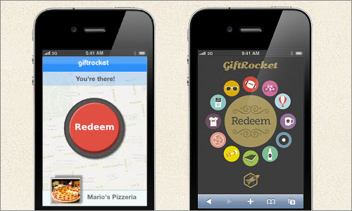
“Six Key Lessons From a Design Legend,” Kapil Kale The GiftRocket team eventually recruited Mike Kus as a designer. This article shows why that decision took their website to the next level.
“Breaking The Rules: A UX Case Study,” Laura Klein Klein shows how she broke all rules to create the great UX for Outright.

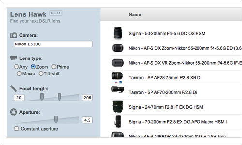
“7 UX Considerations When Designing Lens Hawk,” Christian Holst Lens Hawk is a massive DSLR lens database. This article shares seven UX considerations that were made in its design process.
“The Story of the New Microsoft.com,” Nishant Kothary Kothary shares his insight into making Microsoft’s new website. Also, check out Trent Walton’s perspective on the redesign.

“Behind the Scenes of the New Kippt,” Gannon Burgett This interview about the work behind the new Kippt app covers the redesign process, the design principles and problems that the team faced, insights into the new era of web app design, and where Kippt will head in the future.
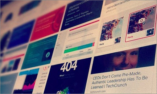
“Crayola: Free the ‘What If’,” Daniel Mall Dan Mall has put together a case study of the creation of the new Crayola application for kids.

“Campus Quad iPhone App,” Soft Facade Soft Facade covers every aspects of the design process behind its Campus Quad app.

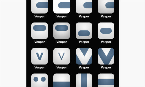
“How to Make a Vesper: Design,” Vesper Learn how the Vesper app was designed and made.
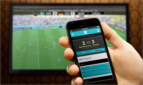
“Betting on a Fully Responsive Web Application,” 14islands Read about how 14islands took the web app for Kambi, a sports-betting service, to the next level.
“AMMO Rack App Design Critique,” Alexander Komarov An interesting study of the feedback process that improved the AMMO Rack app.

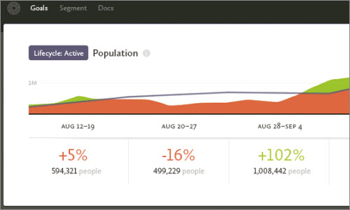
“Walking Through the Design Process,” Ian Storm Taylor Taylor walks you through the design process of Segment.io, including the progression of mockups in Photoshop.
“Music Video ‘Lights’: The Latest WebGL Sensation,” Carlos Ulloa Interactive studio HelloEnjoy built a mind-blowing 3-D music video for Ellie Goulding’s song “Lights.” Creative director Carlos Ulloa explains why the team chose WebGL and how it created various immersive graphic effects.

“Designing for Designers,” Kyle Meyer Designing for other designers is different than working for regular clients. Kyle Meyer shares his experience.
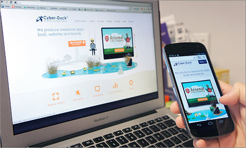
“Adapting to a Responsive Design,” Matt Gibson Cyber-Duck abandoned its separate mobile website and created a new responsive design.
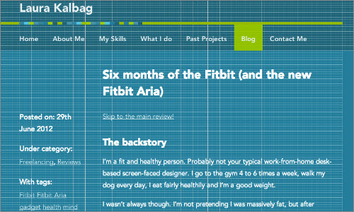
“Grids, Flexibility and Responsiveness,” Laura Kalbag Kalbag shares her thoughts on the redesign of her own website, including her choice of typefaces.
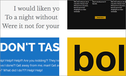
“Making of Typespiration,” Rafal Tomal Rafal Tomal built Typespiration as a side project. Learn about the process from initial idea to finished WordPress website.
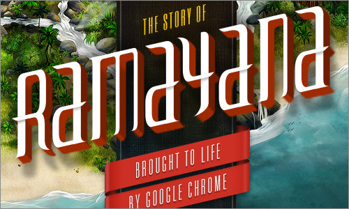
“Case Studies,” Fi Design firm Fi has integrated case studies into its portfolio. The studies are very interactive and beautifully designed. Here are four of them:
- “Is This The Future of The Airline Website?”
- “The Story of Ramayana: Brought to Life by Google Chrome”
- “Sony: Connected World”
- “USAToday.com: Redesigning One of America’s Most Popular News Sites”
Content And Storytelling
“Step-By-Step Landing Page Copywriting,” Nathan Barry The process of writing great copy for a landing page is covered step by step.
“The Art Of Storytelling Around An App,” John Casey This case study is about the art of storytelling in the app “The House That Went on Strike.”

“Rethinking the Case Study,” Christopher Butler Butler explains what case studies are for and what a great one looks like, and he lays out a practical plan for writing one.

“Retiring The Portfolio Screenshot,” James Young You’ve probably noticed that portfolios nowadays are packed with detailed analysis, rather than screenshots. Take yours to the next level and learn how to create an amazing portfolio (such as the ones featured in this post).
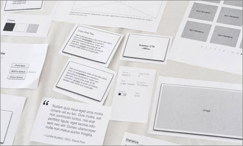
“Responsibly Leveraging Advanced Web Features,” Ryan Heap Heap tells us about his full responsive redesign of Travois, a consulting firm focused on housing and economic development. The study includes topics such as progressive enhancement, responsive and responsible Web design, SVG, and the HTML5 History API.
“My Notes on Writing an E-Book,” Jonathan Snook Several people have suggested that 2013 is the year of self-publishing. Jonathan Snook shares his process of writing and digital publishing.
Technical Challenges And Solutions
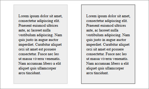
“Beating Borders: The Bane of Responsive Layout,” Joshua Johnson Responsive design often requires setting widths in percentages. This is easy enough, until borders are thrown into the mix.
“How We Improved Page Speed by Cleaning CSS, HTML and Images,” Lara Swanson Page-loading time is a big part of the user experience. Dyn shows how it improved it simply by cleaning up the CSS, HTML and images.

“Mein Honig – Brand Identity,” Thomas Lichtblau “My Honey makes people and bees happy. And if they are happy, nature is happy too.” This simple yet beautiful statement belongs to Mein Honig (My Honey), a personal project of Thomas Lichtblau from Austria. Thomas shares fascinating insights about a production, banding and packaging process in which he only used colorless, organic and traditional tools and materials.

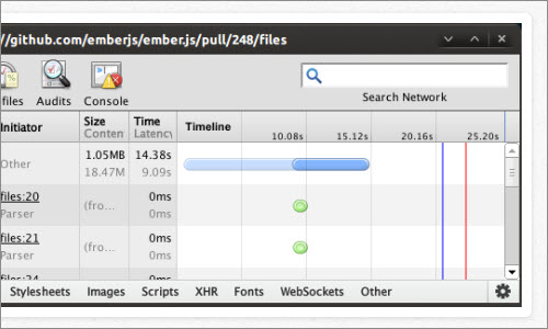
“Front-End Performance Case Study: GitHub,” JP Castro Castro analyzes the front-end performance of GitHub and shares his findings.
“iPad to Windows Store App,” Bart Claeys and Qixing Zheng This case study helps designers and developers who are familiar with iOS to reimagine their apps using design principles for Windows Store apps. Translate common UI and UX patterns found in iPad apps to Windows 8 apps.
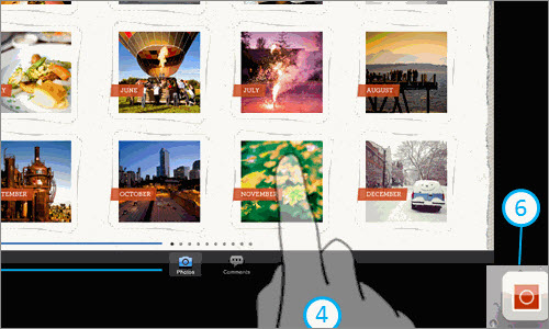
“Behind the Scenes of Mad Manimation,” Anthony Calzadilla Here is the process behing the Mad Manimation, an HTML- and CSS-based animation of the introduction to the Mad Men TV show.
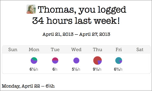
“Embedding Canvas and SVG Charts in Emails,” Thomas Fuchs Learn how to use embedded canvas and SVG charts in email.
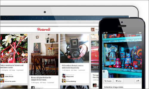
“Scaling Pinterest From 0 to 10s of Billions of Page Views a Month in Two Years,” Todd Hoff This case study traces the evolution of Pinterest’s architecture, which was scaling fast, with a lot of incorrect choices made along the way
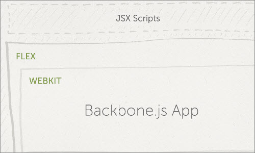
“How We Built a Photoshop Extension With HTML, CSS and JS,” Brian Reavis Creative Market’s extension is a Backbone.js Web app that lives inside of Photoshop. The team can update it without the user having to install an update. How does that work? Read up on it!
“Batch Processing Millions and Millions of Images,” Mike Brittain Etsy wanted to redesign a few of its major sections and had to rescale over 135 million images in order to do it.

“Making 100,000 Stars,” Michael Chang Chang writes about 100,000 Stars, an experience for Chrome that was built with Three.js and CSS3D.

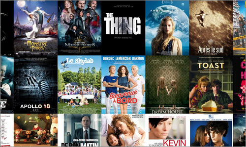
“Mastering the Application Cache Manifest for Offline Web Apps and Performance,” Julien Nicault Nicault, who work on Cinémur, a new social film app, describes how to use AppCache to improve performance and enable offline usage of Web apps
“Harvey: A Second Face for Your JavaScript,” Joschka Kintscher Responsive design often requires drastic UI changes. This study shows how to execute parts of your JavaScript depending on the device’s type and screen size.
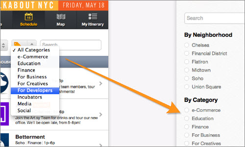
“Our First Node.js App: Backbone on the Client and Server,” Spike Brehm The team at Airbnb has been curious about Node.js for a long time, but used it only for odds and ends. See how they used it on a production-scale project.
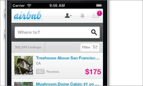
“Making a 60fps Mobile App,” Paul Lewis Paul Lewis shows you how to make a mobile app that has 60fps at all times, does one thing really well, has offline support and a flat UI.

“The Making of the Interactive Treehouse Ad,” Chris Coyier Treehouse is the primary sponsor of CSS-Tricks, and this case study looks at its interactive ad using jQuery.
“Improve Mobile Support With Server-Side-Enhanced Responsive Design,” Jon Arne Sæterås This is an analysis of the process of finding the right mix between server-side and client-side logic for adaptive Web design.
“Designing an Instant Interface,” Luke Wroblewski Wroblewski shows how to design the instant interface used for the real-time views, real-time notifications and real-time comments on Bagcheck’s website.
“Lessons in Website Security Anti-Patterns by Tesco,” Troy Hunt Hunt looks closely at the many simple security errors Tesco makes, analyzing how he would apply basic security principles to remedy them.
“Refactoring >14,000 Lines of CSS Into Sass,” Eugene Fedorenko Beanstalk is a mature product whose CSS grew accordingly to 5 files, 14,211 lines and 290 KB of code. Learn how the team rebuilt its style sheets into something cleaner and easier to maintain.
“Refinder: Test-Driven Development,” Maciej Pasternacki These slides show how test-driven development enabled Gnowsis to reimplement Refinder’s basic data model.
“Managing JavaScript on Responsive Websites,” Jeremy Fields Jeremy Fields of Viget talks about how to manage JavaScript on a website whose interface and functionality changes at different breakpoints.
“Trimming the Fat,” Paul Robert Lloyd Lloyd walks through the performance optimizations he made for his website, trimming the page load from 383 to 100 KB. He also shows graphs.
Workflow And Optimization
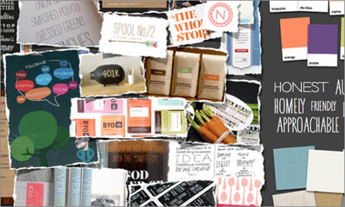
“Visual Design Explorations,” Paul Lloyd Lloyd of Clearleft talks about how to maintain knowledge-sharing and collaboration on a growing team.
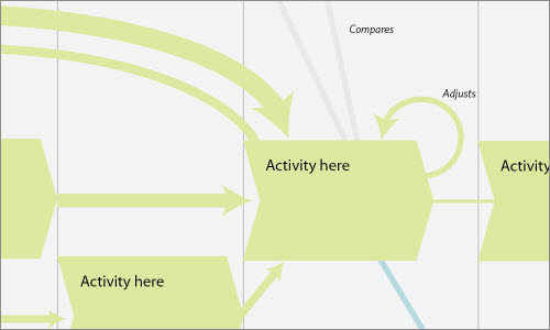
“The Anatomy of an Experience Map,” Chris Risdon Experience maps are becoming increasingly useful for gaining insight in order to orchestrate service touch points over time and space. This study explains what they are and how to create them.
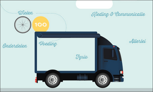
“The design process of my infographic for the ‘Tour of France’ for Grinta!,” Veerle Pieters Pieters designed an infographic about the Tour of France, and focused mainly on the question, “What does a pro cycling team take with them to the Tour of France?”
“Turning Small Projects Into Big Profit,” Jon Savage and Simon Birky Hartmann Ace of Spade discusses how it overhauled its operations and started making a living off of small projects.

“What We’ve Learned About Responsive Design,” Christopher Butler Butler shares what his agency has learned about responsive design, which is to overcome initial fears and focus on what is important.
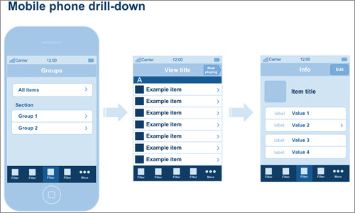
“The Modular Canvas: A Pragmatic Workflow for Designing Applications,” by Gabriel O’Flaherty-Chan There are some gaps in the way we work; the bigger the project, the more glaring the gaps become. O’Flaherty-Chan looks at a better workflow for designing apps.
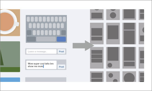
“How We Reduced Our Cancellation Rate by 87.5%,” Kareem Mayan Kareem Mayan tackles the issue of user cancellations by using a cohort analysis. Learn how he did it.
“How I Run a Membership Site,” Justin Tadlock This study looks at how Theme Hybrid handles memberships after registration and payment.
“Post-Implementation, Pre-Launch: A Crucial Checkpoint,” Mindy Wagner Wagner of Viget discusses how to approach the time of post-implementation and pre-launch, a crucial checkpoint that can create a lot of stress for a team.
“A New Make Mantra: A Statement of Design Intent ,” Mark Boulton Mark Boulton used the CERN redesign project as an occasion to define a new “make” mantra that would help him tackle projects. This single, actionable sentence would guide him through projects.
“100 Conversion Optimization Case Studies,” KISSmetrics Lots of techniques and tactics to optimize your website for better conversions shared by marketers.
Responsive Design
“Responsive Design and ROI: Observations From the Coalface,” Chris Berridge Working on the frontline, Berridge share his insights on responsive design and returns on investment.
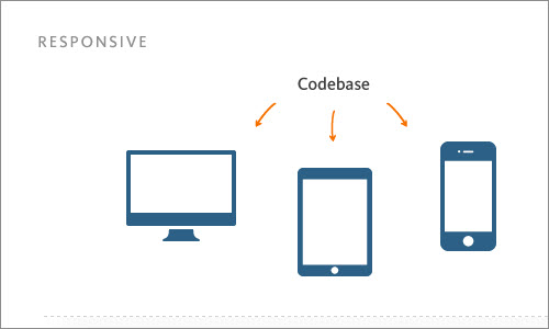
“Making Your Site Responsive: Mastering Real-World Constraints,” Alex Fedorov Listen to how agency Fresh Tilled Soil addressed real-world constraints, such as resources, time and budget, in its responsive design process.
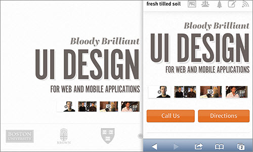
“Goals, Constraints, and Concept in a Redesign,” Steven Bradley Some thoughts on the redesign of Vanseo Design.

“How a Simple Redesign Increased Customer Feedback by 65%,” James Santilli Customer feedback is the backbone of many Web services. Campaign Monitor analyzed the process behind a simple redesign that increased customer feedback by 65%.
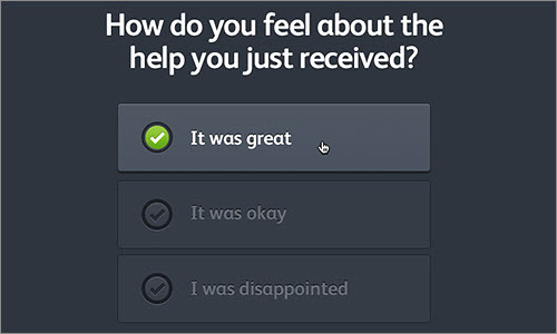
“More on Apples: Mobile Optimization in Ecommerce,” Electric Pulp This study analyzes how both mobile and non-mobile conversions went up when Electric Pulp redesigned a website to be responsive.
“How I’m Implementing Responsive Web Design,” Jeff Croft Croft is finally at the point where responsive design feels worth the extra effort. Read about how he got there.
Last Click
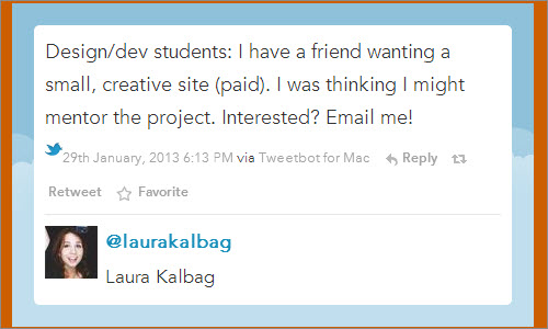
“Mentoring: The Evaluation,” Laura Kalbag Freelancers are often offered projects whose budget is below their rate. Laura Kalbag had a fantastic idea on how to transform these kind of projects into a win-win: She decided to mentor a group of students. Such a project would give the students an opportunity to gain valuable experience and help them transition into freelancing, and the client would get good quality work, despite the modest budget. This series of posts describes her experience, from initial idea to launched project.
Further Reading
- Showcase of Case Studies in Design Portfolios
- 15 Impressive Case Studies from Behance
- Improving Smashing Magazine’s Performance: A Case Study
- Powerful Workflow Tips, Tools And Tricks For Web Designers


 Celebrating 10 million developers
 SurveyJS: White-Label Survey Solution for Your JS App


 Register Free Now

