Designing For Emotion With Hover Effects
Of the many factors that must be considered in Web design, emotional interaction is an important, but frequently neglected, component. In the real world, we experience the sensual interaction of design all the time. Reflect for a moment on the emotional engagement of slipping behind the wheel of a powerful luxury car: the welcoming embrace of the driving seat, the tactile experience of running your hands over the leather on the steering wheel, the subtle gleam reflected in the controls.
There is no technical requirement for any of these finely crafted details: The vehicle would perform equally well without them. Yet this singular focus on sensual and emotional engagement is what separates luxury goods from all others and what inspires deep loyalty from customers.
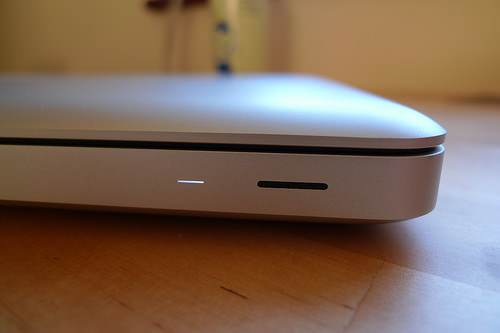
This drive for emotional design can be discovered in the most surprising places. Take the power light on the next to last-generation Apple MacBook. The company deserves credit for helping thousands of users avoid entanglements with power cords though the MagSafe connector, but the deeper emotional intimacy is held in the tiniest of details: the power status light on the front of the laptop. When in sleep mode, the light pulses, and not randomly: It does so 10 times a minute, the breathing rate of a resting human being.

The blink rate of Apple’s MacBook in sleep mode falls within the average breathing rate of a resting adult. (Image source: Michael Stillwell)
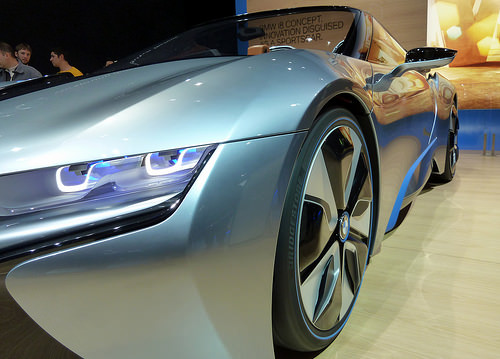
To take another example: The front of a car is not two headlights and a grill. It is a face, one with its own character and communication. Look at cars and vans marketed to suburban mothers, on which lines tend to be round, curved, welcoming and friendly.
The front of the vehicle often demonstrates the neotenic effect: We regard “eyes” (headlights) that are larger than the body as being cute, safe, loveable. Compare this to the visual communication of vehicles marketed to men, particularly sports cars: Those lines are angular and aggressive, right down to the slitted eyes.

Note how a sports car’s front interacts with you on an emotional level. (Image source: GabboT)
Designing For Emotion
We can strive to achieve the same emotional engagement on websites — a promise to delight, surprise and affect users without resorting to manipulation or being too saccharine. While the digital realm lacks many sensual cues, it is possible to impart an emotional experience through a careful selection of color, stroke and typography.
CSS transitions help us to make interactions more human: Rather than flicking from one state to another, we can ease the motion of an element over a few hundred milliseconds to make a website feel more inviting. Paradoxically, the same techniques can also make a website feel faster, especially if we use the opportunity to preload content.
In creating such experiences, we must avoid the mistakes of the past: The engagement should encourage the visitor to explore the website, but should never hide important components such as navigation. Rewards for exploration should be a treated as a bonus, rather than a required interaction. Any information shared should also be accessible to those who don’t have the time or ability to use the interface.
Surprise In Boxes
(Please see the demo at “Hover Effect on Images From Different Directions Using Pure CSS,” on CodePen.)
One way to design for emotional surprise and stimulation might be to present different panes of information according to the way the user hovers over a responsive image. For this example, I’ll use a photo of the spiral galaxy NGC 1309, added to an HTML5 page:
<img src="ngc-1309.jpg" alt="">
(Note that I’ve intentionally left the alt value of the image blank. We’ll return to that attribute shortly.)
The information panels are created from four span elements, with the entire group wrapped in a div tag that includes a class:
<div class="multi-hover">
    <span>Spiral Galaxy NGC 1309</span>
    <span>Approximately 120 million light years from Earth</span>
    <span>Home to several Cephid variable stars</span>
    <span>Member of the Eridanus galactic cloud</span>
    <img src="ngc-1309.jpg" alt="">
</div>
We’ll write the CSS transition code sans vendor prefixes: Internet Explorer 10 does not use prefixes for animation, Firefox no longer requires them, Chrome is not far behind, and a piece of JavaScript magic such as Lea Verou’s -prefix-free will take care of those browsers that still do.
.multi-hover {
    position: relative;
    font-family: Orbitron, sans-serif;
    max-width: 500px;
    line-height: 0;
}

.multi-hover img {
    max-width: 100%;
}

.multi-hover span {
    position: absolute;
    width: 100%;
    height: 100%;
    line-height: 1.5;
    font-weight: 100;
    text-align: center;
    box-sizing: border-box;
    font-size: 3em;
    transition: .3s linear;
    color: white;
    padding: 15%;
    opacity: 0;
}
The CSS takes advantage of the rule that absolutely positioned elements inside relative containers will be transformed relative to their parent. Because the image determines the height and width of the div, the span elements will always be exactly the same size, protected from growing further by the use of box-sizing, max-width and line-height: 0. In this example, I’m using Orbitron by The League of Moveable Type as an appropriate typeface.
Next, locate the span elements, so that each lies just over the inner edge of the image. We’ll do so by writing offsets from the containing div in percentages, to keep everything responsive:
.multi-hover span:nth-child(1) {
    top: 0;
    left: 90%;
    background: hsla(0,70%,50%,0.6);  } /* right panel */

.multi-hover span:nth-child(2) {
    top: -90%;
    left: 0;
    background: hsla(90,70%,50%,0.6); } /* top panel */

.multi-hover span:nth-child(3) {
    top: 0;
    left: -90%;
    background: hsla(180,70%,50%,0.6); } /* left panel */

.multi-hover span:nth-child(4) {
    top: 90%;
    left: 0;
    background: hsla(270,70%,50%,0.6); } /* bottom panel */
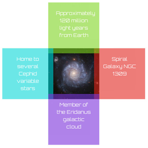
As you’ll see in a moment, the order of the panel declarations matters. The result looks something like this:

Positioned span elements with text. (Large view)
To clip the outside edges of the panels, use overflow: hidden on the containing div:
.multi-hover {
    position: relative;
        overflow: hidden;
    font-family: Orbitron, sans-serif;
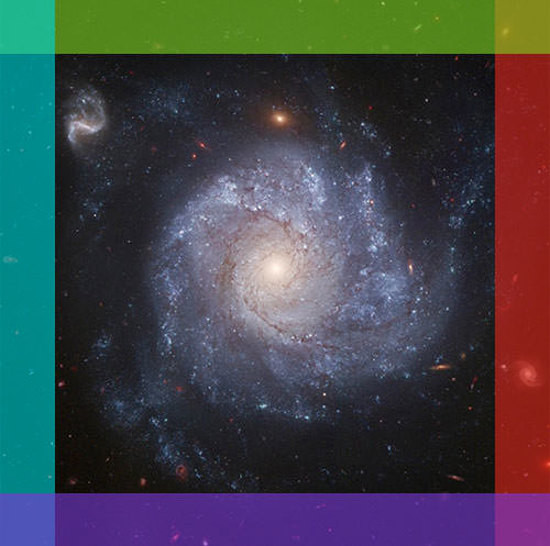
Now, the result appears like this:
The colored sections we can see for now will function as the “hit areas” of our panels. Increasing the size of these areas will increase the panel’s ability to respond to quicker and broader mouse movements, but will also increase the overlap between them, making it more likely that a different panel will be activated than the one expected.
Finally, we’ll hide the panels entirely by setting their opacity to 0 and moving them on hover, taking advantage of the fact that transparent elements still respond to mouse events.
.multi-hover span {
    position: absolute;
    width: 100%;
    height: 100%;
    line-height: 1.5;
    font-weight: 100;
        z-index: 2;
    text-align: center;
    box-sizing: border-box;
    font-size: 3em;
    transition: .3s linear;
    color: white;
    padding: 15%;
    opacity: 0;
}

.multi-hover span:hover {
    opacity: 1;
}

.multi-hover span:nth-child(odd):hover {
    left: 0;
        z-index: 3;
}

.multi-hover span:nth-child(even):hover {
    top: 0;
        z-index: 3;
}
The odd and even declarations set each panel to the opposite side of the box, positioning them entirely over the image and completing the design. Note that this interface pattern requires exploratory mouse movement from the outside of the box inwards to activate each panel; alternately, a completely “in box” exploration model could be created by lowering the z-index of the :hover states to 1.
Accessibility Testing
Making the panels invisible brings up the issue of accessibility. Partially sighted users might be able to see and interact with the panels, but blind users obviously will not.
Screen readers treat such content as being truly “invisible” (leaving them, therefore, unread), depending on the context; content that is set to display: none is usually left unread, for example. However, opacity does not trigger this behavior. On a Mac, you can easily test this by activating VoiceOver and having it read the page we’ve created in the browser:
Command + F5to start VoiceOver,Control + Option + Ato read Web page content,Command + F5to stop VoiceOver.
You’ll hear the span content being read in the order that it appears on the page; all that’s missing is a description of the image at the end:
<div class="multi-hover">
<span>Spiral Galaxy NGC 1309</span>
<span>Approximately 120 million light years from Earth</span>
<span>Home to several Cephid variable stars</span>
<span>Member of the Eridanus galactic cloud</span>
<img src="ngc-1309.jpg" alt="Photograph of NGC 1309">
</div>
Note that this only treats the visual aspects of accessibility. There are other important areas (cognitive, motor and language) that I will leave unaddressed in this example for the sake of space but that have been detailed by other Smashing Magazine authors.
Adding Touch Support
The majority of mobile devices that depend on touch interfaces do not support a pure “hover” state: An element is either “in touch” or not. With rare exceptions, there is no registration of a fingertip being just above the screen of a mobile device. A brief touch might be interpreted as a hover event by mobile browsers, but this behavior is not perfectly predictable. As such, our interface will not work on most tablets or phones, at least as it currently exists.
To solve this issue, we’ll add a little JavaScript (by way of jQuery) to the page:
<script src="//ajax.googleapis.com/ajax/libs/jquery/1.9.1/jquery.min.js">
</script>
<script>
function is_touch_device() {
  return !!('ontouchstart' in window)
      || !!('onmsgesturechange' in window);
};

$(document).ready(function() {
  if (is_touch_device()) {
    $('span').unbind('mousenter mouseleave touchend touchstart');
    $('span').bind('touchstart', function() {
      $('span').removeClass('hover');
      $(this).addClass('hover');
    });
  }
});
</script>
The JavaScript applies a class of hover to any span element that is touched. So, we just need to alter our CSS declarations to make this class equivalent to the :hover event:
.multi-hover span:hover { opacity: 1; }
.multi-hover span:nth-child(odd):hover { left: 0; z-index: 3; }
.multi-hover span:nth-child(odd).hover { left: 0; z-index: 1; }
.multi-hover span:nth-child(even):hover { top: 0; z-index: 3; }
.multi-hover span:nth-child(even).hover { top: 0; z-index: 1; }
}
Note that in the mobile version, the extended panel goes “under” the level of those that are retracted, allowing them to be tapped.
Disengaging the copy controls on handheld devices might also be wise. This is not some futile pursuit of DRM, but a practical response to the fact that longer touch times on mobile devices can bring up copy prompts that could get in the way of the user interface:
.multi-hover span {
  -ms-touch-action: none;
  -webkit-touch-callout: none;
  -webkit-user-select: none;
}
This user interface pattern of exploration on a mobile device may now be described as “tap on edge.” This could be further enhanced by increasing the overlap of the original position of the span elements in an @media query to provide larger hotspots, making the panels easier to activate, along with further improvements for smartphones. This code is not the only way to achieve this effect either: Ana Tudor has written an alternative technique using CSS transforms and SASS.
Conclusion
Crafting an element of surprise on Web pages can raise visitor engagement without obfuscating important content, sidelining mobile visitors or disadvantaging users who require accessibility features. Naturally, this must always be balanced with the need to guide users through the website: Visitors will only be surprised by the effects described here if they explore the page for themselves, or are led to it. How much users should be led and how much opportunity they should be given to discover a delight on their own initiative is a central question of user experience design.
Further Reading
- The Definitive Guide To Styling Web Links
- Not Just Pretty: Building Emotion Into Your Websites
- An Ultimate Guide To CSS Pseudo-Classes And Pseudo-Elements
- Give Your Website Soul With Emotionally Intelligent Interactions


 Celebrating 10 million developers
 Register Free Now
 Try ProtoPie AI free →


