Responsive Navigation On Complex Websites
Central to a solid user experience is a well-structured, simple navigation system. Over the past few months, I’ve been involved in launching two large institutional websites with complex navigation systems. Maintaining simplicity on such large websites becomes increasingly difficult as content requirements grow and tiers of navigation are added, not to mention the extra complexity added by small screens.
To illustrate the techniques involved in implementing responsive navigation on a large website, I’ll refer to two actual clients of mine. I’ll start with the process and how to get through it with research and mockups, then later get into some of the actual code that was used.
Middlesex-London Health Unit
The Process
The key to success in every project, particularly a large website, is to work closely with the client, keeping them involved in as many aspects of the design process as possible. Before we get into code and how to build a website technically, we need to learn more about the project. At ResIM, we start with audience research, before progressing through information architecture, wireframing and wireframe usability testing.
In our latest project for a public health organization, the Middlesex-London Health Unit (MLHU), we started with audience research to find out the kinds of information that public users look for on health-related websites. Considering that MLHU’s website had over 1300 pages to be overhauled, we needed to make sure that priority content gets the focus it deserves.
As a design studio, we’ve tried different forms of audience research. One of our go-to methods is to bring in users to walk through a wireframe website, seeing how long it takes them to perform various tasks and to find various sections of the website, while video recording them. This style of testing doesn’t always yield perfect results because many inexperienced users will have problems understanding a website without graphics, colors, etc. But it still provides valuable insight into how easy or difficult content is to find.
This method works well when the structure and site map are defined, but we weren’t quite at that stage and needed to step back. MLHU has various committees and groups that had to be represented on the website, and we needed to make sure that everyone’s voice is heard.
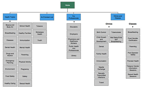
We started by meeting with all of the committee members who were appointed to work on the website, to determine which parts of the website were most important. After hearing each group state its case as to why its information needed to be prominent on the website, we started to build a proper hierarchy. We realized there were a lot of different sections and areas, and we needed a way to group them into fewer parent items in order for the user to be able to interpret and navigate more quickly. We decided to piece together a lot of similar categories, and we named each of these groups; these would become our four main navigation items.
This was a great accomplishment, but we quickly realized that we needed to call attention to other important pages that weren’t necessarily grouped into those four sections. We created a supporting menu to accommodate and provide access to some of these non-health-related topics. Once we had built this streamlined navigation and worked it into our wireframes, we ran them through a testing period, in which we had users walk through areas of the website, performing tasks and finding information.
Watching people use this streamlined navigation, we noticed that each of them was able to quickly find the section of the website they were looking for and then effortlessly find the particular page and information they were after. These results from real-world users reinforced the decisions we had made in the information architecture.

MLHU’s site map. (Larger view | Source)
From here, we were able to move into the interface design phase, which included mocking up the responsive mobile view. Many clients struggle with the concept that a responsive mobile website is, in fact, the same website they see on their desktop, and not a whole new skin for mobile. Showing these clients a little less in the mockup phase is sometimes valuable.
For this reason, we typically leave tablet views out of this step, to enable us to control how the website transitions from the big “desktop” view down to the small “mobile” view. In the case of MLHU, I realized with the older ages of some of our target users, we couldn’t rely on typical top-right hamburger-style navigation.
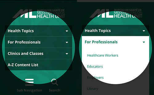
Feeling that this solution would have been more difficult for certain users, I opted instead for vertical text-based navigation. This gave the second level of navigation a better layout, by allowing users to view all menu options before making a selection.

MLHU’s website on mobile. (Larger view | Source)
Implementation
Our initial concern in the MLHU project was whether we could keep the mobile navigation structure congruent with the desktop version. Typically, one can hide navigation under a hamburger-style button, a common design pattern. However, our target audience included a wide age range, and we felt that displaying the full text of the navigation would be more user-friendly.
If we were to keep the navigation the same and then make some CSS adjustments to wrap the navigation in a box and stack the navigation vertically instead of horizontally, we could achieve the solution we were looking for.
@media only screen and (max-width: 600px) {
    nav li {
        width: 100%;
        box-sizing: border-box;
    }

    nav a {
        background: rgba(0,0,0,0.5);
        padding: 10px 12px;
        text-align: left;
        margin: 0;
        box-sizing: border-box;
    }
}

MLHU’s mobile navigation. (Source)
A JavaScript-based solution for our desktop navigation interaction was in place, using the hoverIntent plugin, but we needed to adjust it to work properly on mobile. Our solution was to add a condition to check the screen’s size and, if small, to switch to a toggle slide instead of a hover fade in/out. A toggle slide gives a more native feel to the website, making it fit in and feel quicker on a mobile device, whereas a fade can feel slow and unresponsive when interacted with on a touchscreen.
function navIn() {
    [...]
    } else if($(window).width() < 600) {  /* Here's where we check for the screen size and do a slide instead. */
        $(this).children('ul').slideDown();
        $(this).addClass('hovering');
    }
    [...]
}
Seneca College
The Process
A second instance of our process was the design and UX overhaul of Seneca College’s public website. We couldn’t reduce the main navigation as we did with MLHU because of different content requirements and organizational constraints. We didn’t need to work through an information architecture phase because the navigation was already set for us by the client; so, we moved right into wireframing and interface concepts. Similar to MLHU, we also mocked up a responsive mobile view and explored ways to display the navigation in an effective format.
Recognizing that this target audience is much younger, I felt strongly about using a streamlined navigation that is revealed via a hamburger-style vertical side menu. The hamburger icon has become popular through its use in many mobile applications, and it frees up space in the website’s header for the logo and search icon. A lot of sublevel pages needed to be displayed on Seneca College’s website, and showing them all at once in the header navigation would have been a bit too much.
My solution was to display sectional navigation at the top of every inner page. This secondary navigation would allow the user to quickly move through sections of the website without having to scroll through a long menu. With the complexity of a large website, making it navigable before showing the main content on the inner pages is sometimes necessary.
If you’re unsure of which route to take, try doing some extra audience research using mobile wireframes, and get a feel for how real-world users respond to the solutions.

Seneca’s website on mobile. (Larger view | Source)
Implementation
Seneca’s navigation system is more complex and its mobile and desktop versions more different from each other than MLHU’s. We needed to find a way to replace the main navigation with a hamburger icon once the screen reaches a certain size. We started with a div for the mobile navigation that sits inside the header, but we didn’t want it to show up in the desktop view, so we hid it with CSS.
<div id="mobileNav">
    <a id="searchIcon" href="#"><img src="https://www.smashingmagazine.com/images/searchIcon.png" width="24px" height="24px" alt="" /></a>
    <a id="mobileNavIcon" href="#"><img src="https://www.smashingmagazine.com/images/mobileNav.png" width="38px" height="20px" alt="" /></a>
</div>

Seneca’s div for mobile navigation. (Source)
#mobileNav {
    display: none;
}
For screens that are big enough, we display the aforementioned hidden div using media queries.
@media only screen and (max-width: 600px) {
    #mobileNav {
        display:block;
    }
}
At the same time, we restyled the navigation and hid it. Feel free to get creative with restyling the navigation for mobile. I wanted full-width navigation that slides down, pushing the rest of the content, but you could instead absolutely position the menu to overlap the main content, or achieve an off-screen push effect using something like PageSlide. Many different techniques are possible; experiment with what you like and what feels best for the website.
@media only screen and (max-width: 600px) {
    nav {
        display: none;
        width: 100%;
        background: #000;
        margin-left: -20px;
        padding-right: 40px;
    }

    nav li {
        display: block;
        margin: 20px 0 20px 20px;
        width: 100%;
    }

    nav a {
        color: #FFF;
        margin: 0;
        width: 100%;
    }
}
Lastly, completing our toggle is simply a matter of adding some JavaScript, similar to the example above.
$('#mobileNavIcon').click(function () {
    $('nav').slideToggle();
    return false;
});

Seneca’s mobile navigation opened. (Source)
It’s imperative to make design decisions that enhance the user experience by considering the results of usability testing, the perceived skill level of all user sets, and the general characteristics of the audience. As demonstrated in the cases above, even though a hamburger-style menu icon has become the industry standard, it might not be the best approach given the age or competency of the target audience.
Other Techniques
I’m always looking for new solutions to the problem of complex navigation. Below are a few examples that could be really useful, depending on the requirements of the project.
PageSlide
I like that PageSlide follows the current mobile app trend with a pull-out side menu. Users are getting more comfortable with these menus and how they work. The benefit is a much taller scrollable menu that doesn’t push content too far down.
Responsive Multi-Level Menu
Responsive Multi-Level Menu is great for a few reasons. It mimics normal drop-down navigation, which is usually triggered by mouse hovering, and implements it effectively for touchscreens. It also makes it easy for users to jump down a few levels without forcing new pages to load.
Conclusion
Making design decisions based on your users should be paramount. If you aren’t involved in the initial design phase, then at least try to get involved in the responsive portion of the project. You need to help make sure that the direction taken is in the best interest of users, based on their comprehension of the systems you plan on using and their ability to access content.
Next, determine what code is needed to make a smooth transition from desktop to mobile. Does it require some JavaScript to animate nicely? Does its orientation need to change from horizontal to vertical? What can you do with the initial CSS to allow for an even smoother transition that requires fewer adjustments to media queries?
Lastly, don’t let a complex navigation system or information architecture intimidate you. There’s always a way to simplify it to its core and to provide those layers to the user in a way that is non-threatening and easy to understand. Take on the challenge and have fun with it!
Other Resources
You may be interested in the following articles and related resources:
- PageSlide This jQuery plugin slides a Web page over to reveal an interactive pane.
- Responsive Multi-Level Menu This space-saving drop-down menu includes subtle effects.
- “Convert a Menu to a Dropdown for Small Screens,” CSS-Tricks
- “Responsive Navigation Patterns,” Brad Frost
Further Reading
- Progressive And Responsive Navigation
- Navigation For Mega-Sites
- Implementing Off-Canvas Navigation For A Responsive Website
- Responsive Menus: Enhancing Navigation On Mobile Websites


 Try ProtoPie AI free →
 Register Free Now
 SurveyJS: White-Label Survey Solution for Your JS App
 Celebrating 10 million developers


