Type Makes A Difference: An Exploration Of Type-Focused Websites
In this article, we’ll take you on a thought-provoking journey through carefully selected Web designs. Certainly, these websites have some captivating interactivity; however, the selection of type and the typographic styling and spacing are the reasons why we chose them for this piece. In the context of typography, considering composition and grid structure is also important.
Why Grid Structure And Composition Are Crucial To Typography
Composition and grid structure are vital factors in effective communication with type. In Thinking with Type, Ellen Lupton comprehensively explains the benefits of working with a grid. She addresses the flexibility of grids, what grids offer in integrating type and image, and how they can organize a complex hierarchy.
There is an inextricable link between typeface, type size and measure (i.e. line length). While a design’s appearance can vary from screen to screen, good designers are experts at creating enticing, digestable amounts of information, carefully composed to hold our interest. However, losing the connection with the audience is all too easy. For example, text set small on long lines can make for daunting reading, and text set large on short lines is equally problematic, though for different reasons.
In the latter case, the line breaks could overwhelm the punctuation, demanding the reader to refocus their attention every few words. In both situations, the extra long or extra short lines could lose the reader’s interest all on their own.
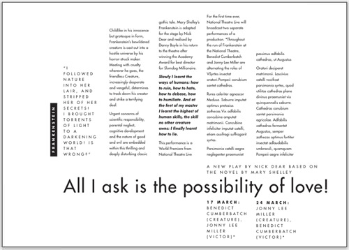
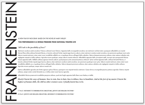
These two examples demonstrate well the challenges of fitting relatively small text into either a very wide or very narrow measure. Neither is easy to read and both are unappealing. (Design by Bright Pink) (Larger views: Image 1, Image 2)
Sections with different levels of importance require different levels of prominence to guide the user through the website and hold their attention. A consistent measure in sections of relatively equal importance is a helpful and reassuring guide. Inconsistency is confusing.
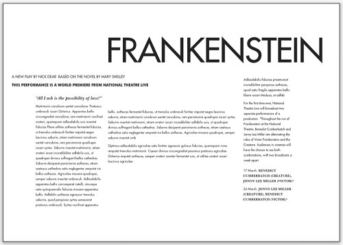
When text of the same priority extends across multiple columns, a sudden change in measure for no apparent reason would be confusing. (Design by Bright Pink) (Larger view)
Grid Structure
In this section, the websites we’ve highlighted show how a grid can affect typography, creating appeal, accessibility and structure and supporting the hierarchy.
SilkTricky
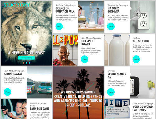
The grid structure of SilkTricky has six columns to break down information into enticing segments. The consistent typographic system for headings contrasts the lighter tones of Bookman Light Italic (for category descriptions) with the very different visual rhythm of Futura Condensed Bold.
These typefaces complement each other well, creating a dramatic change in scale, case, texture and weight. The contrast tempts you to look further, drawing you to each segment’s few lines of descriptive sans-serif text.
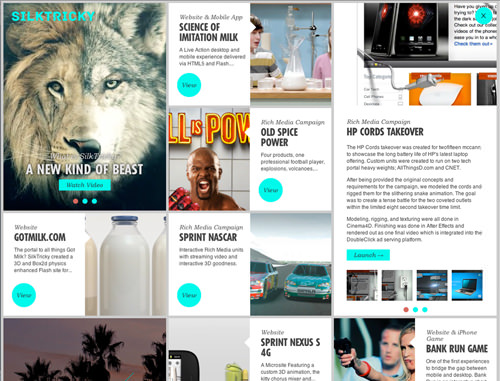
At the click of a button, the copy smoothly expands to a few paragraphs and across two columns, just enough to get you hooked while still adhering to the grid. This longer descriptive copy creates another level of typographic texture and tone that contrasts effectively with the headings, providing a welcome change of pace and visual rhythm.
Percussion Lab
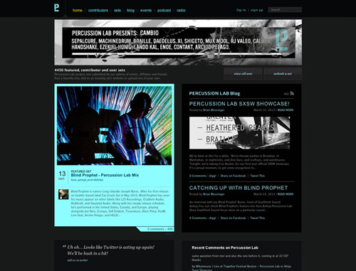
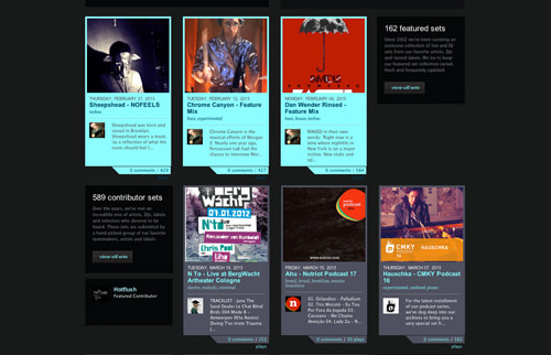
Percussion Lab also makes effective use of the grid, flexibly using four columns to feature a detailed mix of sets from contributing artists. Each featured item fits into the column structure and overall hierarchy, including details on the date, artist, set name and genre. The highlights expand to fill two columns and feature a track listing and helpful details.
The fonts, a blend of serif and sans serif, feature changes in weight, case, orientation and spacing to reinforce the hierarchy. Typographic detail and the grid structure also establish and maintain interest and trust.
The New Art Gallery Walsall
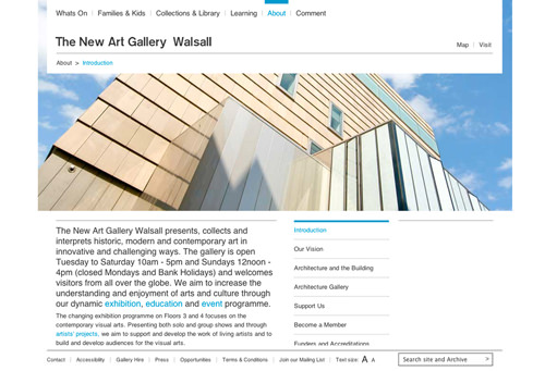
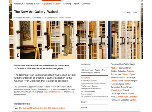
The website for The New Art Gallery Walsall in the UK uses sans-serif letterforms clearly and appealingly, but the changes in scale and the pleasing grid are what make this website truly memorable. The main body of text extends down the left side, with other aspects, such as links and highlighted details taking up columns to the right.
The open uncluttered typography and generous space reflect the gallery’s own architecture, its important collections and its commitment to making art both accessible and enjoyable.
Type That Attracts Users
Is the substance of the text what matters most? Undoubtedly, this can be true, especially if the language is stimulating or addresses the user’s personal interest. Text that makes us laugh or that is risqué or controversial can be a great draw, too.
However, there is more to drawing interest: the type’s style, texture and tone, general appearance and layout play a great part in whether users take an interest. Type can also enhance the subject matter of an article, reinforcing the emotional weight, the aesthetic, or the exclusivity of the product.
Crockett & Jones
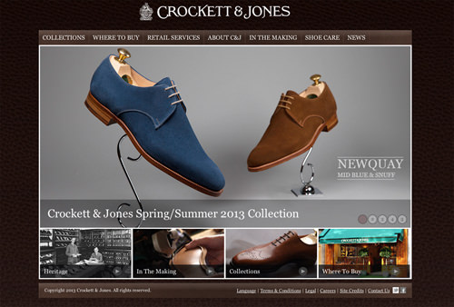
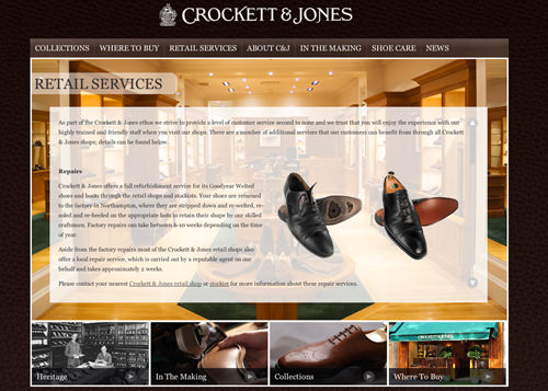
The website of Crockett and Jones is one such example. The English company has been handcrafting fine shoes since 1876, and its website undoubtedly reflects this wonderful heritage through both its imagery and type. The name style appears on each page, and the individual letterforms echo the decorative style of Victorian design. Microsoft Georgia is used sensitively for body text to complement the name style and to reinforce the sense of heritage, quality, style and attention to detail.
In writing this piece, I found myself thinking of Beatrice Warde’s well-known article from 1932 on printing and type, “The Crystal Goblet,” in which she argues that “printing should be invisible.” She specifically addresses type, using the metaphor of wine in a glass to explain that the printed word shouldn’t in any way hinder the meaning of text. Warde reasons that type should complement and enhance meaning and increase our understanding and appreciation.
This connects well with what Marko Dugonjic says in “Designing for the Reading Experience”: “Seamlessly digesting written matter is possible only when the typography is well thought out and legibility is facilitated by a considered reading experience.” Obviously Warde’s article predates the Web, but the principles it espouses are relevant today.
Combinations Of Typefaces
Selecting and combining typefaces to reinforce a theme is always a challenge. It demands patience to try out alternatives and visual acuity to assess effectiveness. The websites in this section mix pleasing and well-chosen faces and type styles to emphasize subject matter, to boost appeal and sometimes to surprise.
Four Seasons
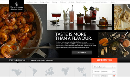
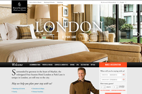
Dramatic contrast in texture and tone is achieved with type on Four Seasons’ website, which brings together different styles and weights of Garamond with some of the many variations of Helvetica. The visual rhythms of uppercase and lowercase Garamond Italic sit side by side with the strong vertical strokes and very different pace and texture of uppercase Helvetica Condensed.
Delve into the website to experience this dramatic contrast reinforcing the hierarchy and the style, quality and reputation of the Four Seasons brand. Both Garamond and Helvetica are available in numerous weights and styles, making them both very useful for complex hierarchies.
Nowness
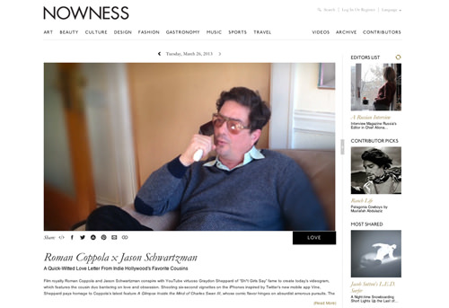
With the headings on Nowness, CreateThe Group has elegantly mixed uppercase and lowercase Garamond Italic with uppercase P22 Underground Titling. This combination exudes class; the graceful strokes of Garamond Italic have a pleasing textural contrast with the sophisticated lines of P22.
CreateThe Group has paid careful attention to intercharacter spacing and changes in scale, carefully controlling the tone and hierarchy and reinforcing the stylish subject matter of the website.
Barcamp Omaha
Barcamp Omaha’s website, designed by Grain and Mortar, promotes what is described as an “unconference,” an informal occasion to listen to and meet others and network. With a considerable amount of illustration, the website brings together three well-chosen, contrasting fonts, two of which have obviously been selected for their potential as heading fonts.
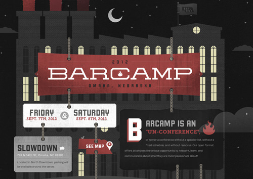
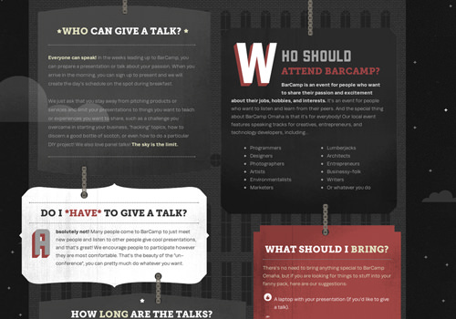
These two — one a bold, slightly condensed uppercase sans serif, and the other a companion all-cap slab serif — have a slightly retro feel that is often associated with an American college aesthetic. The text is enclosed within multiple small panels; however, the change in font and the variation in weight and color are the things here that prioritize detail and reinforce hierarchy.
Warhol Initiative
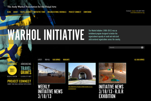
The website for the Warhol Initiative, by Toky, shows typographic audacity. Condensed typefaces can be a challenge to read; strong vertical strokes of letterforms combined with compact characters can, on occasion, hinder legibility. Here, Toky brings together a serif font with a dramatically contrasting condensed face, showing great skill and bravery.
The careful intercharacter spacing and measured type sizing help to ensure ease of reading. The pace and texture of type are well supported by the condensed font, speeding the user through the condensed headings to the details that follow. This condensed typeface has been well selected to complement Warhol’s style and era.
Combadi
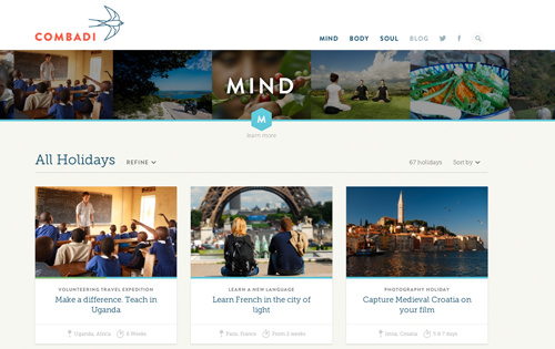
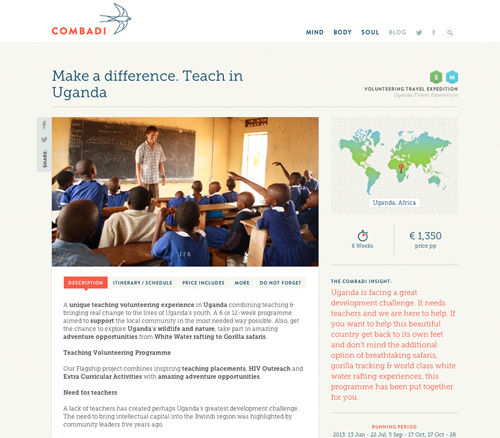
Combadi, designed by Radial, could easily appear in a number of the sections in this article. Its grid structure is based on 12 columns and can be seen in various configurations as you progress through the pages. However, the combination of typefaces is the really arresting aspect of this design. Brandon Grotesque and Museo Slab combine with great sensitivity and finesse to reinforce the hierarchy.
Museo Slab is used for the body text, and the generous x-height, short ascenders and descenders and wide letter spacing make for easy reading. Changes in color are also applied to instances of Museo Slab, adding emphasis and reinforcing Combadi’s brand and color palette. Brandon Grotesque is complementary and contrasting, mostly restricted here to secondary headings, navigation and Combadi’s name style.
Aria
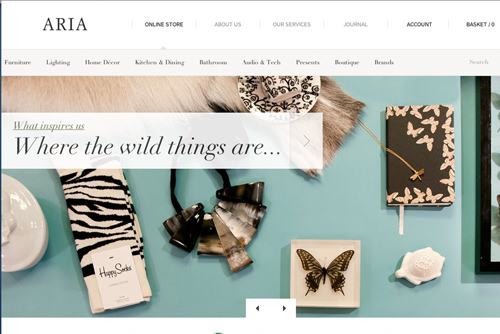
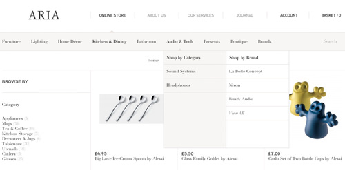
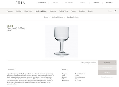
Designed by Un.titled, Aria’s online shop has elegant high-contrast serif letterforms. Headings in italic feature particularly unusual forms of lowercase v’s and w’s, reinforcing the exclusivity of Aria’s designs. Contributing to the distinctive typographic character are the limited tonal changes within the text. To adequately capture hierarchical differences with considerable subtlety, Aria has varied the scale and adopted italic type.
Spacing, Leading And Intercharacter Spacing
Spacing within and around type is crucial to making the text appealing and legible. Even if you’ve selected the ideal typefaces, the design’s ultimate success could fall by the wayside if spacing is not satisfactorily addressed. On the websites in this section, spacing around and between letterforms has been carefully considered, not only making the designs more appealing, but helping the user to read the copy comfortably.
STL DesignWeek
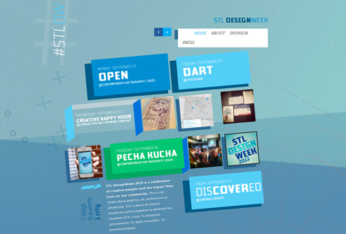
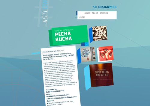
The design for STL DesignWeek is unusually angled and highlights what can be achieved by subtle line and letter spacing. The sans-serif face has been selected for its proportionally large, open, rounded x-height and slightly wide letter spacing. Line spacing is broad, too, reinforcing the airy feel and guiding the reader from line to line, making for a pleasant experience.
The Beetle
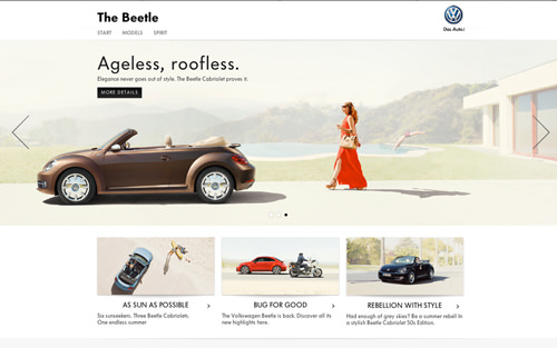
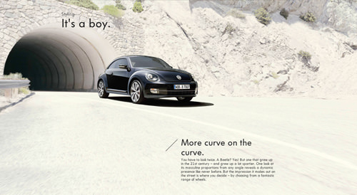
DDB Tribal designed The Beetle’s website, which focuses on the spirit and heritage of the Volkswagen Beetle. The character of the car — a reliable, hardworking vehicle for all — is admirably captured in the type. Typographically, the website is simple, with letterforms limited to two weights of Futura.
The clarity of the type is evident, with careful letter and line spacing that reinforce the simplicity of the Beetle’s story. Headings are given extra letter spacing, as if to slightly enhance its tonal difference from the rest of the copy and to reinforce the character of this iconic brand. Generous, broad leading draws the user comfortably along each line of text, making the Beetle’s story an enjoyable read.
I Love Typography
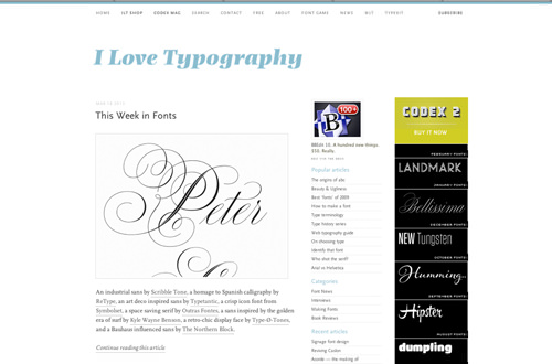
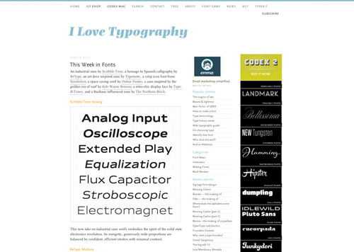
If you are not familiar with I Love Typography, do take a look; anyone with a passion for type will find so much of interest. Some beautiful selections of typefaces appear throughout the website, and as you progress from article to article, you are helpfully told the names of the fonts used, which include FF Basic Gothic Web Pro, Le Monde Journal STD and Le Monde Sans STD.
The typefaces and combinations are elegant, but the leading and intercharacter spacing also reinforce the sophisticated and refined feel. The title for each article is set in a lightweight, relatively large-scale uppercase and lowercase sans serif, with intercharacter and word spacing that also show a delicate touch. The link between the space within the counterforms of the letters and the letterforms themselves is pleasing. This delicate touch complements well the type that follows.
I Love Typography takes a careful approach to the spacing in the opening text for articles. It strikes the right balance between just enough space to draw the eye along each line, guiding it to the next, and leaving just enough space for links, with their generously spaced, dotted underlines. The underlines are frequent and are centered below the base line and above the x-height; they have been positioned to avoid any clash with ascenders or descenders. The space throughout all levels of text creates a contrast that reinforces hierarchy, aids reading and helps to captivate.
Changes In Scale
Changes in the scale of type are frequently done to indicate prioritization and hierarchy. One of the most common approaches is to set headings in large bold type and body text in smaller, lighter type. The examples in this section show much more ambition.
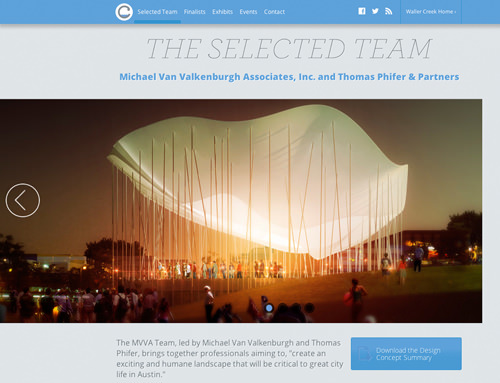
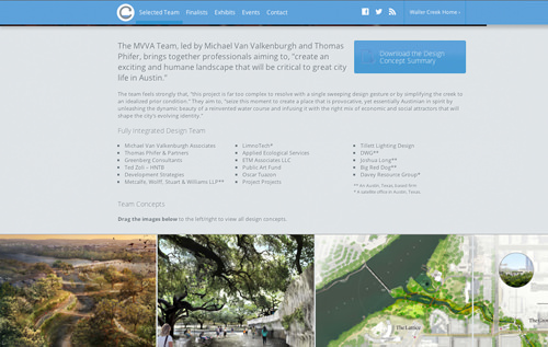
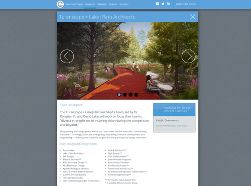
Design Waller Creek: The Final Four
Changes in scale are an excellent way to create structure and assign priority, and they can be one of the few solutions available if the selected font has few weights and styles. The “Final Four” section of Design Waller Creek’s competition page changes scale to reinforce hierarchy. Four lines of the largest type form an introductory statement, followed by a section of considerably smaller copy set in the same face. For the heading that follows, the text returns to the size of the introductory copy, possibly in a slightly lighter weight, before reverting to the smaller size for the bullet points.
The tone here is noteworthy, too; copy is predominantly set in gray, but the much larger, lightweight slab-serif headings that serve as section indicators are tonally very similar to the smaller text on the website. This comes down to the hairline weight of the slab-serif font, which echoes the weight of the smaller letterforms.
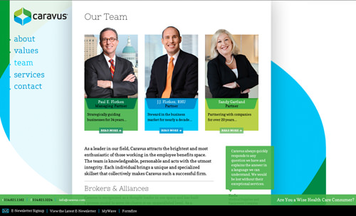
Caravus
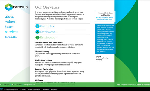
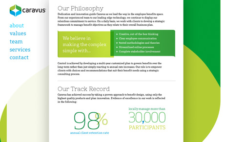
There are many pleasing aspects to the typography in Caravus, by Toky, but the changes in scale merit particular attention here. The text has a varied hierarchy, setting the stage for changes in weight and dramatic changes in scale. Large lightweight slab-serif letterforms are used for headings, contrasting with the much smaller, darker body copy.
This is a departure from a typical hierarchy, with large bold type for headings and smaller lighter type for the body. Throughout the website, quotes, statistics and other high-impact information are accentuated by changes in scale, often in combination with bright color. You could describe this as “type as image,” playfully attracting attention, while reinforcing the hierarchy in a memorable way.
As in most cases, visual judgement is key, and the hierarchy here is well supported by the textural and tonal contrast arising from the changes in scale and color.
Conclusion
All of the designers we’ve showcased use type sensitively, making careful typographic choices that reinforce their message and brand values. The design decisions establish hierarchy and stimulate appeal, and the combination of images, color and typography make for highly memorable visuals.
We’ve focused on typography and on how engaging it can be; hopefully, it has broadened your view and drawn your attention to some of the minutiae involved in effective typography. Perhaps this piece will move you to continue on your own thought-provoking journey through the typographic details of other websites. Since the time of Beatrice Warde, new technologies have enabled us to more easily experiment with typographic alternatives and new letterforms to speedily communicate content while maintaining appeal.
Useful Links
Articles
- “The Creative Way to Maximize Design Ideas With Type,” Carolyn Knight and Jessica Glaser
- “The Crystal Goblet (Or Print Should Be Invisible),” Beatrice Ward, 1932
- “Designing for the Reading Experience,” Marko Dugonjic
Website Designs
- Crockett & Jones
- SilkTricky
- Black Estate
- Four Seasons
- Nowness, designed by CreateThe GROUP
- Barcamp Omaha, designed by Grain & Mortar
- Warhol Initiative, designed by Toky
- Combadi, designed by Radial
- Aria Shop, designed by Un.titled
- STL DesignWeek
- The Beetle, designed by DDB Tribal
- I Love Typography
- Design Waller Creek: The Final Four
- Caravus, designed by Toky
Further Reading
- 40+ Excellent Freefonts For Professional Design
- Typographic Design Patterns And Best Practices
- Industrial-Strength Types
- When Typography Speaks Louder Than Words


 Celebrating 10 million developers
 SurveyJS: White-Label Survey Solution for Your JS App
 Register Free Now

