Killer Responsive Layouts With CSS Regions
As Web designers, we are largely constrained by the layout features available to us. Content placed inside a container will often naturally extend the container vertically, wrapping the content. If a design requires elements to remain a certain height, then our options are limited. In these cases, we can only add a scroll bar or hide the overflow. The CSS Regions specification provides a new option.
Support
Regions are a new part of the CSS specification, so not all browsers have implemented them, and in some cases you might have to enable a flag to use them. They have recently gained support in iOS7 and Safari 7, as well as Safari 6.1+. Adobe maintains a list of supported browsers and instructions on enabling regions and other features. However, support for regions is constantly growing. For a robust list of which browsers have implemented regions and the various features available, see Adobe’s “CSS Regions Support” page.
Regions 101
CSS regions enable us to disperse content across multiple containing elements. They provide a flow, which consists of content that may appear within multiple elements, and a region chain, which is the collection of elements the flow is spread across. Once these elements have been defined, the flow dynamically fills the elements in the region chain. We can then size our containers vertically without worrying about the content getting cut off, because it simply overflows into next element in the chain. This creates new opportunities for layout with responsive design.
To use regions, start by creating a named flow; simply add the CSS property flow-into to your content element, with the value of your flow’s name. Then, for each region through which you want the content to flow, apply the CSS property flow-from with the same flow name value. The content element will then flow through the region elements. Current implementations in browsers require the property to be prefixed, but we are using the unprefixed version here.
#myContent {
    flow-into: myNamedFlow;
}

.myRegion {
    flow-from: myNamedFlow;
}
Your HTML would contain a content element and the scaffolding of all of the regions that this content will flow through. When you use regions, the content element will not be visible in its original location and any HTML already in your region elements will disappear, replaced by the content being flowed into them. Because of this, we can have placeholder or fallback content within our region elements.
<div class="myRegion"></div>
<div class="myRegion"></div>
<div class="myRegion"></div>

<div id="myContent">...</div>
When using regions, the content being flowed is not a child of the region elements. You are only changing where the content is displayed. According to the DOM, everything remains the same, so the content does not inherit styles from the region in which it lives. Instead, the specification defines a CSS pseudo-selector, ::region(), which allows you to style the content within a region. Apply the pseudo-element to the region’s selector and then pass a selector as an argument, specifying the elements that will be styled within a particular region.
.myRegion::region(p){
    /*styles for all the paragraphs flowing inside our regions*/
}
Responsive Design With Regions
Responsive design is the technique of creating malleable layouts that stretch and change according to the given context. Frequently, designers will make elements flexible with percentages and media queries to adapt a layout to different screen sizes. Responsive design adapts content to every screen without requiring the designer to completely overhaul the design or code.
Regions facilitate responsive design in several ways. First, you no longer have to rely on height: auto for every element to ensure content fits. Instead, you can allow the content to flow into different elements within the layout. This means that the content does not dictate the layout, but rather adapts to the intended design. You can still use height: auto on the last region in the chain to ensure that it extends to display all remaining content. You can see this technique in the CodePen example below.
See the Pen Region Auto Height by CJ Gammon (@cjgammon) on CodePen.
Regions And Events
You can use JavaScript events with regions to manage your layout and to ensure that content is displayed properly. The regions specification defines events that you can use to respond to certain conditions. The regionoversetchange event is dispatched when the regionOverset property changes for any region. This can occur when a user resizes the page, stretching out the container element so that the content no longer flows into certain regions. The value of regionOverset is either fit, overset or empty. A value of empty specifies no content inside the region. The regionOverset property is set to overset when the last region in the chain is unable to display all of the remaining content, making some of the content unreadable.
The fit value sets content to fit within the region properly, either completely (if earlier in the chain) or partially (if it is the last region in the chain). How you respond to these events will depend on the design, content and other aspects of your layout. These events could be used to dynamically add or remove regions or to apply a class that changes the layout. You can see an example of the former technique in the CodePen below.
Note: Some implementations call the event regionlayoutupdate, instead of regionoversetchange, based on an earlier version of the specification.
See the Pen okmGu by CJ Gammon (@cjgammon) on CodePen.
Regions And Media Queries
Regions are defined entirely in CSS, making them easy to use in combination with media queries. In addition to resizing and positioning elements, you can completely change which elements are defined as regions. You can also set a region to display: none, which will cause it to be skipped entirely in the region chain. This capability makes it easy to remove particular regions from a layout without worrying about the continuity of the content. You can also use this technique to display whole new templates with completely different layouts, without ever changing the content.
Regions And Break Properties
Regions also extend break properties from the multi-column layout specification, which you can use to define how content breaks within your regions. You can apply these properties to elements within the flow either to always break or to avoid breaking a region relative to the element. Using the value region for break-before or break-after will always force a region to break before or after the element, respectively. The value avoid-region can be used for break-before, break-after or break-inside to prevent regions from breaking before, after or inside the element.
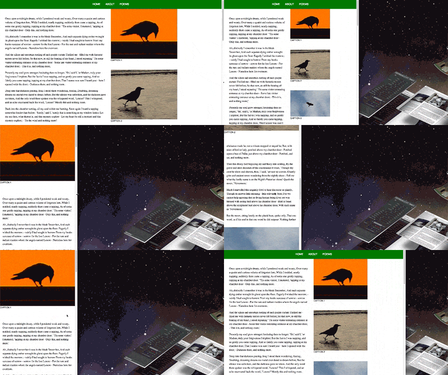
This technique is useful for keeping related elements grouped together and for preventing important elements from being split. The demo below shows images along the right column and long descriptive text flowing along the left. If you reduce the width of your browser, then media queries will change the layout, causing the images to redistribute over the narrower single-column structure. Applying break-after: region to the image containers ensures that a new region break will occur after each image in the image flow.
Note: Some implementations use non-standard regions-specific break properties with a region prefix; for example, region-break-before or, with a vendor prefix, -webkit-region-break-before.

break-after property is applied to regions with media queries.Regions And Viewport Units
Viewport units enable you to use the window (or viewport) as the basis for sizing elements, which creates a consistent aspect ratio and harmony in the layout. You can simulate pages or blocks that break up the content cohesively. A potential pitfall of this approach is that, if you use the aspect ratio of the device to size containers, defining both the width and the height, then your content might no longer fit inside the containers.
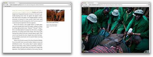
You could, however, use regions to break up the content while respecting the variable-sized elements across different screen sizes. You can see this technique being applied in the “Demo for National Geographic Orphan Elephants.” On this website, images and text are alternated to maintain the height of the viewport. We use regions to flow the content through all of the text sections, and we adjust them when the user shrinks the screen.

The typical navigation paradigm for magazines and books on a tablet is pagination — i.e. enabling the user to swipe or tap to page through the content. As a designer, you want these pages to respond to a variety of screen sizes. Regions are particularly useful for this kind of layout, because you can size columns using viewport units and create a variety of different layouts that enable content to flow across the columns. An example of this done in HTML is shown in the video below:
The Kindle Cloud Reader website has a similar two-page spread but uses JavaScript to manage the layout. Implementing this kind of layout in JavaScript requires significant development overhead, and manipulating the DOM so heavily will usually incur a performance penalty. You can use regions to bring these capabilities natively to the browser, increasing the website’s performance while reducing development time.
Debugging
When working with regions, it’s helpful to have tools to easily manage and debug various features. In Chrome Developer Tools, you can enable debugging features specific to regions. Detailed instructions on enabling these tools can be found in Christian Cantrell’s post “Web Inspector Support for CSS Regions.” With these features, you can find all of the named flows in a document, find the content and region chain associated with each named flow, and get visual cues for whether content fits in a region based on the regionOverset property.
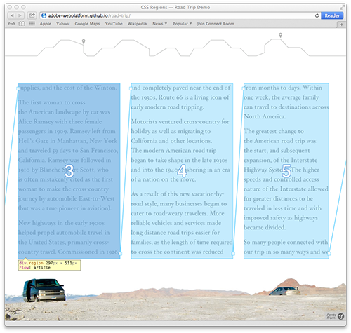
Webkit Nightly also has some helpful visual cues. When you open the Web Inspector and inspect a region’s container, you will see a region number and links between the region containers showing the flow of the content.

Other Resources
Regions open up many new opportunities for designing responsively and ensuring that content looks great at any size. One responsive website whose unique layout was created with regions is Adobe’s demo for a bike company, created with Edge Reflow. Follow @adobeweb for the latest updates on regions and other new Web features. Also, be sure to check out Adobe’s CodePen collection, which shows regions in use; you may want to fork one or more of the examples to explore different ways to use regions.
For more on regions, visit Adobe’s Web Platform Team Blog, which often provides updates about the specification and implementations. Full details can be found in the CSS Regions specification, which outlines all of the topics covered here and more. You can also find more information and examples in the “Regions” section of Adobe & HTML.
Further Reading
- Responsive Web Design: What It Is And How To Use It
- Responsible Considerations For Responsive Web Design
- Responsive Shapes With Clip-Path
- Truly Fluid Typography With vh And vw Units
Front page image credits: Adobe & HTML


 Celebrating 10 million developers
 SurveyJS: White-Label Survey Solution for Your JS App
 Register Free Now


