How To Apply Transformations To Responsive Web Design
To most Web developers, it sounds controversial until you hear the punchline: Last summer, the developers in charge of Google’s Chrome browser floated a proposal that went virtually unnoticed by the technology press, which was to remove support for an established W3C standard that every other browser vendor still supports. The standard in question? Extensible Stylesheet Language Transformations, otherwise known as XSLT.
In reaction to this news, most Web developers would likely shrug and say “So what?” That’s unfortunate.
Transformations are a simple yet powerful technique for separating content and presentation in Web applications. Yet, outside of enterprise and data-processing circles, transformations have failed to gain popularity through XSLT. As a result, Web developers are liable to think that transformations “don’t apply to me,” even though they work with HTML, a structured format ripe for transformation. Thankfully, new transformation frameworks are on the horizon, including work by the inventor of Sass, that hold the promise of a revival.
In this article, we will reintroduce transformations and explore their applications to mobile and responsive design. We will not only teach the old dog new tricks, but show that transformations are relevant to everyone who deals with HTML.
Separating Content And Presentation
A transformation is simply a system that transforms its input into an output according to a set of predefined rules.

The data flow of a transformation. (Large view)
The key thing about transformations isn’t the action they perform but the capability they enable. Transformations create an abstraction that decouples content and functionality from presentation. This separation is a design goal of many frameworks, but transformations facilitate it in powerful and unique ways.

The transformation data flow recast as a separation of concerns. (Large view)
A powerful example of this decoupling occurs in Enlive, a transformation and templating system written in Clojure. Most templating engines use a customized markup language to mix HTML with programming constructs such as loops and variables. Take PHP, for example:
<ul>
  <?php foreach ($task_list as $task) { ?>
    <li> <?php echo $task ?> </li>
  <?php } ?>
</ul>
By contrast, Enlive templates use the same plain old HTML that you would get from your designer or PSD slicer. For example, a simple hello-world.html Enlive template might look like this:
<html>
    <body>
        <h1 id="output">Lorem Ipsum</h1>
    </body>
</html>
Instead of embedding logic in the markup, Clojure code that is associated with the HTML transforms it into output:
  (deftemplate helloworld
    "hello-world.html"
    []
    [:h1#output]
    (content "Hello World!"))
Completely understanding the code above is not important, but you’ll probably recognize the h1#output argument as a CSS selector. In this example, a template named helloworld is being defined, in which the h1#output element’s content is replaced by “Hello World!” When executed, this template would output the following:
<html>
    <body>
        <h1 id="output">Hello World</h1>
    </body>
</html>
For more on Enlive, I recommend David Nolen’s excellent tutorial. But the key point is that content and presentation have been decoupled. Website changes, A/B tests and even a redesign could be as easy as getting new HTML from your designer and dropping it in. In addition, the designer doesn’t need to know anything about the templating language and may use HTML classes and IDs, concepts that they already know.
While you don’t need to build a website in this way, the situation is analogous to building a Web page without a style sheet. True, you could design a page purely with inline styles (that is, using only the style attribute), and novice developers often code this way out of expediency. But experienced developers know that a style sheet improves workflow and productivity at scale.
Similarly, by separating content and presentation, you will unlock more productivity and agility for your team. In effect, transformations truly separate the front end from the back end and create a new workspace for the visual design team to operate independently of the rest of the system. In an industry where even simple things like the color of a button can affect conversion rates, enabling your visual design team to iterate more quickly and continually could deliver tremendous value to the bottom line.
Responsive Retrofitting
Transformations are not just useful in a templating system. This decoupling of content and presentation can also be applied to an existing website, enabling developers to apply a new presentation regardless of how the original website was built. This combination of separating content and presentation and its applicability to existing websites is what makes transformations so powerful and useful to a broader audience than currently use them. I’ll illustrate this by responsively retrofitting an existing website using a transformation technology that’s in every browser today (at least for now), XSLT.
XSLT was introduced in the late 1990s as a language for transforming XML and XHTML documents. During the ascendency of XML, XSLT was seen as a solution for separating content and presentation in Web applications built on XML data formats. The W3C recommended XSLT as a standard, and almost every major browser incorporated support for some form of the language.
Now that Google’s Chrome and Blink team has proposed dropping support for XSLT, some might be concerned about using it long term. However, at the time of writing, XSLT is supported in all major browsers, including Chrome and the latest versions of the iPhone and Android browsers. In addition, XSLT may be used both server- and client-side. Server-side implementation works regardless of browser support, and open-source and commercial XSLT engines are available. Finally, JavaScript implementations of XSLT, such as Saxon-CE, could also fill the gap client-side if Google does indeed decide to drop support for XSLT.
Responsive retrofitting is the process of grafting responsive Web design techniques onto an existing website that was not built to be responsive. Although a lot of resources and tutorials on building a responsive website from scratch are out there, retrofitting has curiously received far less attention, despite its enormous value. A lot more old websites exist than new ones, and significant capital and effort have been invested in them.
A long responsive rebuild might not meet the budget or time-to-market requirements for many of these websites. Transformations provide an effective way to make a website responsive without the expense of rebuilding it.
The natural first step would be to retrofit the website purely in CSS. Ben Callahan’s bookmarklet for example, inserts a custom CSS file to make a given website more responsive. However, adding CSS gets you only so far. Eventually, the layout, nesting and order of elements in the original HTML will restrict your design options. John Shirrel describes this as an inherent flaw of CSS:
"You have discovered the weakness of using CSS… CSS does not allow you to transform your document. Elements must remain in the order they appear… There is no real decision-making power in CSS."
Fundamentally, this process breaks down because CSS and HTML do not purely separate presentation and content. Whenever you’ve found yourself needing to wrap an element in an extra div or span to make the design work, you’ve encountered that breakdown. This is where transformations come in, restoring the abstraction (surprisingly) by enabling us to manipulate the document.
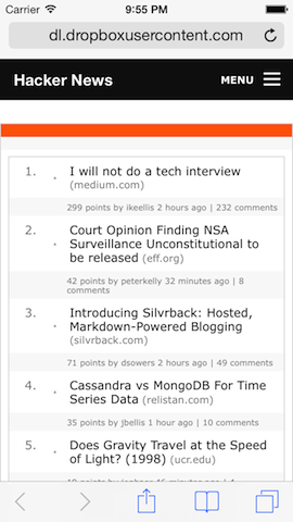
To demonstrate the technique, I’ve created an sample retrofit of Hacker News’ home page, by making the top navigation responsive, using ZURB’s Foundation framework. Naturally, additional design changes beyond these would be required, but it should serve to illustrate the process. Why Hacker News? First, using code from a real website helps to demonstrate the power of the technique. Secondly, the HTML on this website is Goldilocks-sized: not so small that it’s a toy, but not so big as to make our example complicated.

Hacker News’ HTML, with Foundation’s responsive top bar added by transformations.
The most relevant file in this retrofit is the XSL style sheet transformer.xsl, which you can download directly. In the paragraphs below, we’ll highlight some key points about the code in transformer.xsl. While a full explanation of XSLT is beyond the scope of this article, a quick crash course should make these explanations more understandable:
- Syntax. The XSLT programming language is written in a form of XML. For example, an
ifstatement in XSLT would be<xsl:if></xsl:if>element. - Parameters. Parameters to statements like
<xsl:if>are specified in the attributes and child nodes of the element. - Matching elements. A common parameter is the
matchattribute, which selects a collection of nodes. For example, the template specified by the<xsl:template match="body/center">rule would be applied when the XSLT engine encounters the<center>element that is the child of the<body>. - Embedding HTML. Finally, you can embed bare HTML in a style sheet.
The first thing we need to do is tell the browser to use the rules in transformer.xsl. To do this, we change the document’s Content-Type to text/xml (alternatively, in some browsers, you can simply change the file’s extension from .html to .xml) and add an <?xml-stylesheet> tag like the following to the top of the document:
<?xml-stylesheet type="text/xsl" href="transformer.xsl"?>
When the browser encounters this tag, it will transform the document according the XSLT rules specified in the style sheet before rendering it. This will execute the transformation in the browser (i.e. client-side). But transformations can also be performed server-side. Doing transformations server-side could result in better performance, but we’re doing transformations client-side to make our example accessible to anyone with a browser. For those interested in using this technique client-side, optimization techniques and tools are available for writing performant XSLT.
Another issue is how XSLT handles unspecified elements. By default, XSLT strips out any elements not specified in the transformation rules. This is a design decision that makes sense for XML documents, which typically represent data. However, when transforming a fully formed Web page, you will usually want to change only a relatively small part of the document, and specifying every single element we need to be preserved would be laborious. Thankfully, we can add a construct called the identity transform to the transformer.xsl style sheet:
<!-- XSLT identity transform allows most of the input to pass through to the output. -->
<xsl:template match="@* | node()">
  <xsl:copy>
    <xsl:apply-templates select="@* | node()"/>
  </xsl:copy>
</xsl:template>
The code above might appear cryptic, but in essence it tells the XSLT engine to copy (i.e. <xsl:copy>) every element node and attribute in the input to the output. Adding this to our style sheet will effectively change the default behavior from stripping out elements to passing them through.
The next step is to add Foundation to the document. For example, the following code would add Foundation’s CSS (foundation.css) and its dependencies (normalize.css and Modernizr) to the top of the <head>:
<!-- Install and initialize Foundation -->
<!-- Note the match attribute targeting the document's head element -->
<xsl:template match="head">
  <link rel="stylesheet" href="normalize.css" />
  <link rel="stylesheet" href="foundation.css" />
  <script src="custom.modernizr.js"></script>
  <xsl:apply-templates select="@* | *"/>
</xsl:template>
Likewise, to add Foundation to the bottom of the <body> element, you would write this:
<xsl:template match="body">
  <xsl:apply-templates select="@* | *"/>
  <script src="zepto.js"></script>
  <script src="foundation.min.js"></script>
  <script>$(document).foundation();</script>
</xsl:template>
The chief difference between the two code samples above are the match attribute values (head versus body, indicating the element being targeted) and the placement of the <xsl:apply-templates> tag (which controls whether our new content will appear before or after the existing content).
Finally, to add the responsive header, we inline new HTML that matches the structure of Foundation’s top bar, and we use the for-each and copy-of commands to populate it with the relevant links from the existing header.
<!-- Add our Foundation top bar -->
   <xsl:template match="body/center">
     <nav class="top-bar">

    <!-- Boilerplate removed for clarity -->

        <section class="top-bar-section">
          <ul class="right">

            <!-- Pull the menu links from the old header into our new Foundation header -->
            <xsl:for-each select="//span[@class='pagetop']/a">
              <li><xsl:copy-of select="." /></li>
            </xsl:for-each>

          </ul>
        </section>
     </nav>
     <xsl:apply-templates select="@* | *"/>
   </xsl:template>
There are some caveats to this approach the reader should be aware of. First, in this retrofitting example the transformations were performed by the browser but executing the transformations server-side has a couple of advantages. Server-side transformation reduces the burden on mobile devices, which have less processing, power, and memory capabilities than the server.
The server is also the appropriate place to segment your content to avoid sending unnecessary data over the network and to improve performance. Lastly, you can update the server transformation engine and keep it consistent, instead of dealing with potentially different quirks and levels of XSLT support among browsers. (For example, while XSLT 1.0 is supported in most browsers, XSLT 2.0 is not supported in any, although Saxon-CE is one attempt to add it via JavaScript.)
Second, XSLT’s roots in functional programming make it inaccessible to the average Web developer. It isn’t simply a matter of learning a new syntax. The recursive processing model of XSLT requires a new way of thinking that is unfamiliar to developers of imperative languages, especially developers from a design background who do not have formal training in computer science.
Finally, a larger challenge is that this technique works only for Web pages that are in XHTML (a flavor of HTML that is XML-compliant), because XSLT can transform only XML, not HTML. According to W3Techs, 55% of websites are in XHTML. While this is a majority, it still leaves out a large number of websites. In fact, for this retrofitting example, I worked around this limitation by running Hacker News’ HTML code through an HTML to XHTML converter.
In the next section, we’ll explore how the Tritium transformation language was built to address these issues.
Responsive Delivery
In the example above, we’ve used transformations in the browser to create a responsive experience for an existing website, but conceptually the two approaches overlap. Because responsive Web design is itself about changing presentation across multiple screen sizes, transformations can help in that process as well. Instead of simply pairing different CSS styles to the same fixed HTML as in typical responsive design, we can leverage transformations to change the HTML across devices.
As we explored earlier, the ability to manipulate the HTML (which is missing from CSS alone) not only creates flexibility but actually improves the separation between presentation and content. As a result, maintainability becomes easier because the content is more semantic and less tied to layout. In essence, think of this as moving the breakpoints in responsive design to the transformation layer.
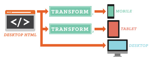
At Moovweb, we’ve leveraged these insights about transformations to implement a technique called responsive delivery, which draws inspiration from responsive Web design, RESS and adaptive design. With responsive delivery, transformations are used to adapt an existing website to different touch points, such as smartphones and tablets.

The data flow in this responsive delivery configuration transforms desktop HTML for mobile and tablet end points. (Large view)
Because the transformed website inherits directly from the desktop, responsive delivery provides the unified content and functionality across touch points that you get with responsive Web design, while the majority of the processing is done server-side. And because transformations can be used to manipulate the HTML, we get the benefits that we saw earlier: independent and precise control over the look and feel for each touch point, thanks to an abstraction that separates content from layout.
In some sense, we can think of responsive delivery as part of a larger trend of weaving adaptive design techniques into responsive design and moving more processing to the server, as in RESS.
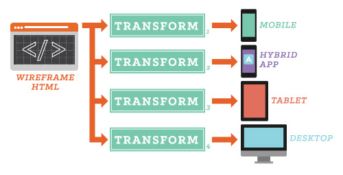
Also worth noting is that responsive delivery can power desktop websites. In the ideal scenario, the back end would produce semantic but unstyled HTML (affectionately called “wireframe HTML”), and the responsive delivery layer would transform the output for all user touch points.

The data flow in this responsive delivery configuration uses wireframe HTML as the source data for transformations that output to mobile, tablet, app and desktop end points. (Large view)
Especially in large organizations, this makes for a powerful decoupling of teams. Back-end engineers can focus purely on functionality (i.e. producing the “wireframe HTML”), and front-end designers can focus on the experience (i.e. transforming the wireframe HTML into a styled Web page). Because the channel between both teams is simply HTML, both teams understand it, and passing through implementation details that are inherited by the front end (such as styles and JavaScript) becomes easy.
Consider a simple autocomplete widget. With a responsive delivery approach, the back-end engineer would write the server code to support an autocomplete API and embed the corresponding JavaScript that powers the widget in the wireframe HTML. The designer could then style the widget using CSS and transformations and, if necessary, add JavaScript beyond the stub provided by the back-end engineer. The key point is that HTML is used as a flexible carrier of both content and functionality, as opposed to XML or JSON, which represent only data.

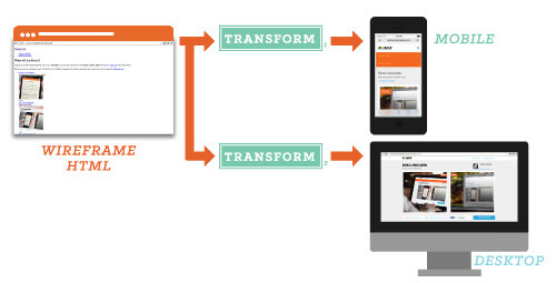
Shown here are the wireframe HTML and the transformed mobile and desktop output used to power Remix Moovweb. (Large view)
One way of applying this approach is to use a software-as-a-service platform to process transformations in the cloud. This is the service that we built at Moovweb to power mobile websites and apps for Macy’s and 1-800-Flowers, among others, using our own open-source transformation language, called Tritium. Tritium was designed by Hampton Catlin, inventor of the CSS preprocessor Sass. He used his experience to create a transformation language that’s accessible to Web designers and developers. Some features that we felt would be important to the language are the following:
- Familiar syntax. The syntax should be similar to CSS and jQuery so that it’s more familiar and readable than XSLT’s XML syntax.
- Imperative style. We wanted to use an imperative programming style, instead of the function and recursive processing model of XSLT.
- Input transparency. The input is passed directly to the output, so there is no need for a construct like the identity transformation (as is the case with XSLT). Stated differently, the identity transformation is an empty document.
- HTML-compatible. Tritium was designed to process regular HTML, so it can be used on any website, not just XHTML websites (as with XSLT).
For a simple “Hello world” example, the following Tritium script will select all of the HTML table elements with an ID of foo and change their width attributes to 100%:
# Select all HTML nodes that are table elements with ID of foo.

# The $$() function takes a regular CSS selector
$$("table#foo") {
        # change the width attributes to "100%""
        attribute("width", "100%")
}
The Tritium language has its own official website, and Moovweb has scheduled to open-source the language in 2014. Developers interested in contributing are encouraged to check out the public GitHub repository for the core Tritium parser library.
To compare an example, the analogous Tritium code for adding Foundation to an HTML document, as we did earlier with XSLT, would be this:
  # Install Foundation in the document
  $$("head") {
    inject_top('<link rel="stylesheet" href="normalize.css" />
                <link rel="stylesheet" href="foundation.css" />
                <script src="custom.modernizr.js"></script>')
  }
  $$("body") {
    inject_bottom('<script src="zepto.js"></script>
                   <script src="foundation.min.js"></script>
                   <script>$(document).foundation();</script>')
  }
Recall that, in the case of XSLT, the relative placement of new content in the document relies on the judicious placement of the <xsl:apply-templates> tag. However, in the Tritium code just above, the straightforwardly named functions inject_top and inject_bottom are used to insert the boilerplate HTML that installs Foundation.
In practice, the Moovweb SDK offers a Foundation scaffold that installs the Foundation boilerplate for you. The scaffold also offers convenience functions to use other components in the Foundation framework. For example, we would use the following functions to create the responsive top bar for Hacker News:
foundation.tbar() {
  foundation.tbar_title("Hacker News", "", "menu-icon")
  foundation.tbar_section("right") {
    move_here("//span[@class='pagetop']//a"){
      wrap("li")
    }
  }
}
As in the XSLT example, the XPath selector ”//span[@class=‘pagetop’]//a” is used to select the links for the menu, but the foundation.tbar*() convenience functions make it easier and spare us from having to know the details of the top bar’s HTML format.
As a final example, a full project implementing the responsive retrofit of Hacker News with Tritium is available on GitHub for you to run and play with using the Moovweb SDK. Unlike the XSLT version, which uses HTML downloaded from Hacker News (due to the need to run it through an XHTML converter), you can run this project with the live version of the website.
Transform Your Thinking
Closures once sat obscurely in functional languages until languages such as JavaScript and Ruby brought them into the mainstream. Likewise, transformations have been buried in frameworks that are alien to the average developer, and the popularity of the transformation approach has been married to the fate of XSLT.
This is unfortunate because transformations are more about a new way of thinking than about any particular technology. They enable a powerful separation of content and logic from presentation, and the usefulness of this separation is important in a number of ways. As we move into the post-PC era, transformations provide one part of the answer to serving websites across a wide array of form factors.
Furthermore, the separation enabled by transformations enhances productivity and accelerates the iteration cycle for visual design teams. Meanwhile, for developers who rearrange DOM objects via JavaScript or jQuery, transformations are a new lens on their current workflow, and they open up new doors to optimizing tasks, such as server-side transformation.
In an industry that has no shortage of new ideas, sometimes the most useful thing is to connect new concepts with old ones to make them more digestible. That is what this article has tried to do with transformations. Hopefully, we’ve demonstrated the power of thinking in transformations, showing its relevance to anyone who works with HTML.
Further Reading
- Responsive Web Design: What It Is And How To Use It
- Responsible Considerations For Responsive Web Design
- Design Process In The Responsive Age
- A Pure CSS3 Cycling Slideshow


 Celebrating 10 million developers


 SurveyJS: White-Label Survey Solution for Your JS App
 Register Free Now


