How To Create Responsive Prototypes With Adaptive Views In Axure RP 7
Responsive Web design has vexed people who build prototypes since the techniques came into use several years ago. While responsive design is an extremely elegant way to handle coding for multiple device types when executed with HTML and CSS, the prototyping tools available to UX professionals have not delivered testable or demonstrable experiences of the same quality. That changed recently with the adaptive views feature that is part of the new Axure RP 7.
Axure RP 7’s Adaptive Views
Creating responsive prototypes without writing code is now possible with Axure RP 7’s new adaptive views feature. The feature enables you to create one page in Axure RP with several “views.” The view displayed on a given device is determined by the width of the device’s screen.
The freedom from needing to know or even think about HTML during the prototyping process is a real benefit to UX designers. When you have to take technical aspects into account in the prototyping process, you could easily start filtering your design thinking. At some point, usually pretty early in most projects, technical capabilities and constraints will become a necessary part of the design process. But during the very early prototyping phases, you might benefit from more freedom to think about what interfaces, screen flows and interactions would solve problems best for users, and these exercises can even uncover questions about technical limitations that you might not have considered.
How Adaptive Views Work
Adaptive views are executed by first creating what Axure refers to as the “base view.” This is the view from which other views may, but don’t necessarily have to, derive. In a mobile-first design, your base view would be for a smartphone in portrait orientation. From this starting point, you would create views for progressively wider screens, such as smartphones in landscape orientation, tablets and desktops. I tend to prefer this approach when using adaptive views.
You could also take a desktop-first approach, starting with a wider screen and progressively working your way down to handheld devices. The benefit is that you would know all of the elements available to the largest screens in order to decide whether to remove or redesign them for progressively smaller screens. The approach you take will depend on the project you are working on and on the known or expected device usage patterns.
A Mobile-First Approach
For our sample website, a fictitious bike shop’s, we’ll use the mobile-first approach. When we’re done, we’ll have one home page with individual views for smartphones and tablets in both portrait and landscape orientations.
The first thing to do is create a new Axure RP file with a single page, which we have named “Bike Shop.” For smartphone views, we’ll target the iPhone 5’s screen, but the techniques shown can be applied to any device, regardless of screen size or operating system. I also like to add page guides to mark the boundaries of the screen and add internal margins. The page guides for the screen are placed at 320 pixels on the x axis and 568 on the y axis.
We’ll also add page guides at 10 pixels and 310 pixels on the x axis for margins, so that the page content doesn’t bump up against the left or right edge of the screen (where it would be obscured by some smartphone cases). For iOS Retina displays, the screen widths used in this article will automatically scale to the higher resolutions. The smaller sizes simply make our Axure RP files smaller and are often easier to work with when building a prototype.
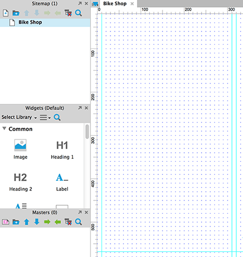
A single page is created with page guides to mark the edges of the screen and the left and right page margins. (Large preview)
We are now ready to design the page that will become the base view. The first thing we’ll do is create a simple header, consisting of a colored bar with some text for the bike shop’s name. Once the header is created, right-click it and select “Convert to Master” from the context menu. Once you’ve named and saved the header, it will be added to the Masters panel at the bottom of the left column in the workspace. In Axure RP, a master is a component that is designed in one place but can reused on every page of the prototype.
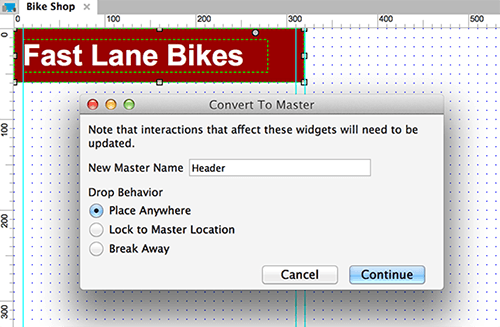
Using the “Convert to Master” dialog, you can name the master and specify the behavior to occur when it is dropped on any page in the project. (Large preview)
Add some more interface elements to the page and you’ll have designed a basic page for a smartphone in portrait orientation. Now we’ll create the different views that give this feature its power.
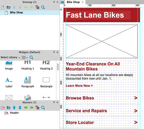
The base view of our project is now complete. (Large preview)
Creating A New View
To create views, open the “Adaptive Views” dialog by clicking the button to the left of the tabs for our Axure RP pages (outlined in red in the screenshot below).

The button to open the Adaptive Views dialog. (Large preview)
Using adaptive views is fairly straightforward:
- Click the green “+” icon in the top left of the dialog (shown below) to add a new view.
- Name the view — “Phone Landscape” in this example.
- From the two available, select a condition to trigger the new view to be displayed: “is greater than or equals” or “is less than or equals” a set width.
- Finally, add the numeric value for the screen width that will trigger the view.
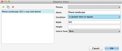
The completed Adaptive Views dialog for the first child view. (Large preview)
With that done, a second view, named “Phone Landscape,” will be triggered to appear anytime the screen is greater than or equal to 321 pixels. Because we are targeting the iPhone 5 for our handheld views, this view will appear if the person tilts their phone to landscape orientation. Otherwise, the base view will appear (and the base view will appear on Retina iPhones in portrait orientation, even though the actual width of the device’s screen is 640 pixels). Our new view also will appear for tablets and desktops until we add views specifically for them.
By default, any new view inherits from the previous view — in this case, from the base view (the only other one available). As we add more views to a page, we can have them inherit from any other view that we want to use as a starting point.
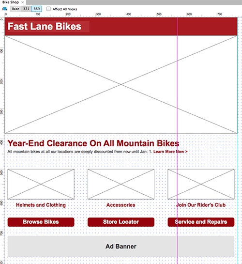
The screenshot below shows our two views, base and 321. Axure RP automatically sets the name of the view according to the width that you specified when creating it. The 321 tab is blue because it is the active view. The purple guide on the right is at 321 pixels on the x axis to indicate the breakpoint.
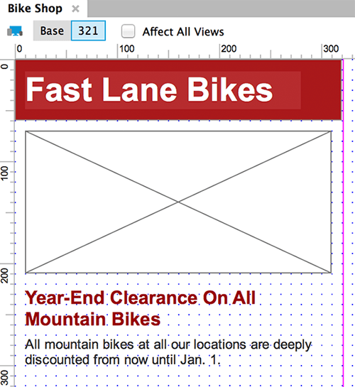
The content and layout of the new view are the same as their parent at first. This will change as the project progresses. (Large preview)
Inheritance
The concept of inheritance is key to understanding how to effectively use adaptive views. Here are some key concepts to know:
- A new view is an exact copy of its parent. This frees us from having to recreate widgets to appear in more than one view.
- If we were to change the text in the main headline in the base view, it would be updated on any direct or indirect child screens all the way down the inheritance chain.
- Inheritance passes only from parent to child, not the other way. So, changes made in a child view are not passed back up to parent views.
- Widgets in adaptive views inherit location, size and style from the location, size and style of the parent view. If we increased the size of text in a child view, it would not affect the parent view. But if we go back to the base view after making this change and make the text size of the main headline smaller, that wouldn’t affect the changed child view because the new text size in the child view would already be overriding it.
Before you modify the design for phones in landscape orientation, place new page guides for the edges of the screen. The page guides for the phone landscape view are at 568 pixels on the x axis and 320 on the y axis.
Adaptive Masters
We’ll start designing for phones in landscape orientation by updating the header master for the wider screen. Masters in Axure RP 7 are adaptive, just like pages, and they automatically inherit the breakpoints from regular pages.
In the screenshot below, you can see that we’ve added a page guide and extended the length of the header background to 568 pixels.

Masters inherit the same breakpoints for different views from regular Axure pages. (Large preview)
Now, we can update the design of the phone landscape view. In the screenshot below, we’ve moved a set of standard list items from where they were at the bottom of the page in portrait orientation up to the right of the page’s hero image. The promotional headline has been made larger, and the text beneath it has been run across the full width of the screen. More of the page’s content will now appear on the screen (depending on whether the page is viewed in full-screen mode or with the browser chrome and iPhone status bar showing).
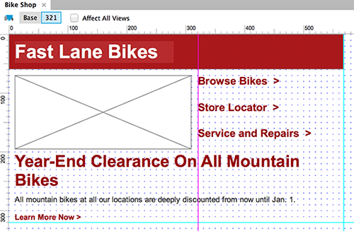
The page has been redesigned to make better use of the phone’s screen in landscape orientation. (Large preview)
Tablet Views
Now that the views for the two phone orientations are complete, let’s start on the tablet views. We’ll use the iPad for these views, but again, the techniques may be used for any screen width or operating system. The mechanics of creating the tablet views are the same as for the phone landscape view.
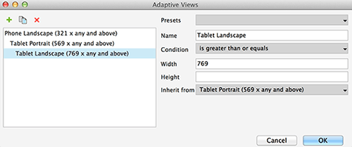
We’ll start with the tablet in portrait orientation because that is the next widest screen. We’ve set up this view to appear when the screen is 569 pixels or wider. This leaves our phone landscape view constrained to screens between 321 and 568 pixels wide, with this third view handling the wider tablets. As you can see in the screenshot below, we may choose to have the tablet portrait view inherit from phone landscape view. Because of the way that inheritance works, any changes made to the base view or the phone landscape view will be inherited by the tablet portrait view.
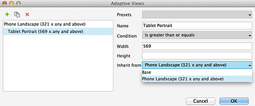
The Adaptive Views dialog for creating a tablet view in portrait orientation. (Large preview)
And just as with the phone landscape view, the tablet portrait view starts as an exact copy of the view it inherits. In the screenshot below, I’ve added a page guide at 768 pixels on the x axis and 1024 on the y axis, which is the size of non-Retina iPads in portrait orientation. The tab for it is labeled “569” to reflect the breakpoint that triggers this view.
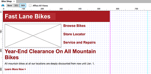
The tablet portrait view starts as an exact copy of the view of its immediate parent. (Large preview)
With a large canvas to work with, we can completely change the layout and add new content elements.
The view for tablets in portrait orientation allows for much more content than the smartphone views. (Large preview)
The final view we’ll create is for tablets in landscape orientation. Because this view will be set to appear when the screen is 769 pixels or wider, it will also appear for desktops and laptops unless more views are added. Because this new view will be for tablets, let’s have it inherit from the tablet portrait view to include the content added for those devices.
This view will be used for tablets in landscape orientation, as well as for desktops unless additional views are created. (Large preview)
With this final view, we have space for more design elements on the right side of the screen.
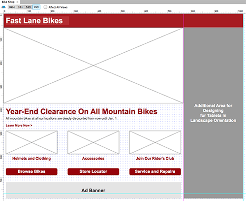
For the tablet landscape view, we could simply add elements onto the portrait orientation view or completely rethink the design, depending on the needs of the project and the content available. (Large preview)
With this final addition, the project now has different views for phones and tablets in portrait and landscape orientation. If you have an iPhone or iPad, you can see the two views created for each device by opening your browser, navigating to our example prototype (hosted by AxShare), and rotating your device.
Limitations
Adaptive views have some limitations. First, the code generated by Axure RP is not usable as a starting point for development. But unless you write the HTML and CSS using the templates or framework that you use on the production website, then this is probably true of your current prototyping tool.
Because of this limitation, adaptive views cannot be used to create proof of concepts for front-end coding solutions. But that’s not the purpose of Axure RP or of the UX prototyping process, so it’s not so much a limitation as it is just something to be aware of.
One other limitation affects teams working with Axure RP’s shared projects feature. Because all views are designed for one page in a project, when someone is working on one page in a shared project, other designers may not edit any of the views. This differs from previous versions of Axure RP, in which mobile and desktop prototypes would be created from separate pages, meaning that one designer could work on the desktop version while another worked on the smartphone version. This would only be a limitation if different people are working on the mobile and desktop designs, rather than one individual executing everything.
Conclusion
If you’re building a prototype to demonstrate or test the usability of a website that will be accessed on a smartphone or tablet, then you’ll want it to be responsive. To get this kind of prototype in the past, we’ve had to use HTML and CSS with media queries and breakpoints.
Now, Axure RP 7’s adaptive views get UX designers who don’t code much further along the path of prototyping and testing responsive designs than a lot of other tools have in the past. With this new feature, a UX designer can create a multi-device prototype in a few hours. As we all get further along in designing for our multi-device world, Axure RP’s adaptive views are a great tool to have in your arsenal.
Further Reading
- Mobile Prototyping With Axure RP
- A Deep Dive Into Axure 8: A Comprehensive Review
- The 10 Commandments Of Efficient Design In Axure
- Choosing The Right Prototyping Tool


 Try ProtoPie AI free →


 Celebrating 10 million developers
 Register Free Now

