Stop Wasting Users’ Time
Our users are precious about their time and we must stop wasting it. On each project ask two questions: “Am I saving myself time at the expense of the user?” and “How can I save the user time here?” What is the single most precious commodity in Western society? Money? Status? I would argue it is time.
We are protective of our time, and with good reason. There are so many demands on it. We have so much to do. So much pressure. People hate to have their time wasted, especially online. We spend so much of our time online these days, and every interaction demands a slice of our time. One minor inconvenience on a website might not be much, but, accumulated, it is death by a thousand cuts.
Steve Jobs claimed that improving the boot time on the Macintosh would save lives. A 10-second improvement added up to many lifetimes over the millions of users booting their computers multiple times a day.

Steve Jobs was obsessed with saving the user time, and we should be, too. (Large preview)
Millions of people might not use your website, but millions do use the Web as a whole. Together, we are stealing people’s lives through badly designed interactions. When I work on a website, one question is front and center in my mind:
“Am I saving myself time at the expense of the user?”
That is the heart of the problem. In our desire to meet deadlines and stay on budget, we often save ourselves time by taking shortcuts via our users’ time. Let’s explore some examples of what I mean.
Taking Time To Improve Performance
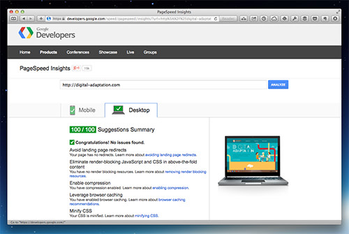
The most obvious example of wasting users’ time is website performance. This is what Jobs was getting at with boot times. If our websites are slow, then we’ll waste our users’ valuable time and start to irritate them. One more cut, so to speak.
The problem is that improving performance is hard. We became lazy as broadband became widespread. We cut corners in image optimization, HTTP requests and JavaScript libraries. Now, users pay the price when they try to access our websites on slow mobile devices over cellular networks.

Optimizing your website for performance not only saves your users time, but improves your search engine rankings. (Large preview)
Making our websites faster takes time and effort, but why should users suffer for our problems? On the subject of making our problems the users’ problem, let’s take a moment to talk about CAPTCHA.
CAPTCHA: The Ultimate Time-Waster
CAPTCHA is the ultimate example of unloading our problems onto users. How many millions of hours have users wasted filling in CAPTCHA forms? Hours wasted because we haven’t addressed the problem of bots.

CAPTCHA forces the user to deal with something that is really our problem.
Just to be clear, I am not just talking about traditional CAPTCHA either. I am talking about any system that forces the user to prove they are human. Why should they have to prove anything? Once again, another inconvenience, another drain on their precious time.
We could solve this problem if we put the time into it. The honeytrap technique helps. There are also server-side solutions for filtering out automated requests. The problem is that throwing a CAPTCHA on a website is easier.
Not that CAPTCHA is the only way that we waste the user’s time when completing forms.
Don’t Make Users Correct “Their” Mistakes In Forms
Sometimes we even waste the user’s time when we are trying to help them. Take postal-code lookup. I have been on websites that try to save me time by asking me to enter my postal code so that it can auto-populate my address. A great idea to save me some time — great if it works, that is.
The problem is that some lookup scripts require the postal code to have no spaces. Instead of the developer configuring the script to remove any spaces, they just return an error, and the user has to correct “their” mistake. Why should the user have to enter the data in a particular way? Why waste their time by requiring them to re-enter their postal code? This doesn’t just apply to postal codes either. Telephone numbers and email addresses come with similar problems.
We also need to better help mobile users interact with forms. Forms are particularly painful on touchscreens, so we need to explore alternative form controls, such as sliders and the credit-card input system in Square’s mobile app.
Then, there are passwords.
Why Are Passwords So Complicated?
Why do we waste so much of the users’ time with creating passwords? Every website I visit these days seems to have ever more complex requirements for my password. Security is important, but can’t we come up with a better solution than an arcane mix of uppercase, numbers and symbols?
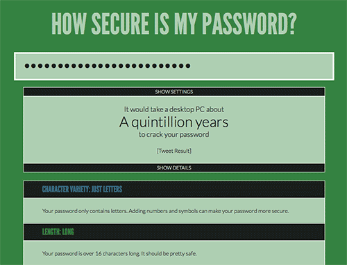
Why couldn’t we ask users to type in a long phrase instead of a single word? Why can’t my password be, “This is my password and I defy anyone to guess it”? The length would make it secure, and remembering and typing it would be much easier. If your system doesn’t like the spaces, strip them out. You could even provide an option for people to see what they’re typing.

A long password phrase is as secure as a short password with numbers and symbols yet easier to remember. (Large preview)
If you can’t do that, at least provide instructions when the user tries to log in. Remind them of whether your website wants uppercase or a certain number of characters. That would at least help them remember their password for your website.
The important thing is to recognize that people have to log in all the time. The task demands extra attention so that it is as painless as possible.
Pay Special Attention To Repetitive Tasks
We should ask ourselves not only whether we are unloading our problems onto users, but also how we can save our users time.
Take those common tasks that users do on our websites time and again. How can we shave a quarter of a second off of those tasks? What about search? If the user enters a search term on your website, will hitting the “Return” key submit the query? They shouldn’t have to click the “Search” button.
Drop-down menus are another good example. Navigating country-pickers can be painful. Could we display countries differently, or make the most common countries faster to access? In fact, so much could be done to improve country-pickers if we just take the time.

Something as simple as a country-picker can waste a surprising amount of time, especially if you are British! (Large preview)
For that matter, a more robust solution to “Remember me” functionality would be nice, so that users are, in fact, remembered!
I am aware that this post might sound like a rant against developers. It is not. It is a problem faced by all Web professionals. Designers need to pay close attention to the details of their designs. Web managers need to ensure that the budget exists to refine their user interfaces. And content creators need to optimize their content for fast consumption.
Help Users Process Our Content Faster
We waste so much of our users’ time with verbose, poorly written and dense copy, making it hard for them to find the piece of information they need. The real shame is that we could do so much to help. For a start, we could give the user a sense of approximately how long a page will take to read. I offer this functionality on my personal blog, and it is the feature most commented on. Users love knowing how much of their time a post will take up.
We can also make our content a lot more scannable, with better use of headings, pullout quotes and lists. Finally, we can take a leaf out of Jakob Nielsen’s website. At the beginning of each post, he provides a quick summary of the page.
The Tip Of The Iceberg
We could do so much more in all aspects of Web design to save users’ time. From information architecture to website analytics, we waste too much of it. Sometimes we even know we are doing it! We need to be forever vigilant and always ask ourselves:
“How can I save the user time in this situation?”
What are your thoughts on this topic? Please share your experiences and opinions with us, and join in the discussion in the comments section below.
Further Reading
- How To Spark A UX Revolution
- How Functional Animation Helps Improve User Experience
- Are We Thinking About Digital All Wrong?
- The Elements Of The Mobile User Experience


 Try ProtoPie AI free →
 SurveyJS: White-Label Survey Solution for Your JS App
 Register Free Now


