Streamlining Mobile Interactions
The mobile web is a harsh environment: mobile processors are slower than their desktop counterparts; network connectivity is flaky; bandwidth is low; latency is high; and touchscreen keyboards are slow. The best mobile web applications are the ones that excel at handling these challenges.
In this article, we’ll look at how to identify the tasks your users want to accomplish on a mobile device, memorize as much as you can about your users’ situation, presume that your users’ actions will succeed (and get them to their next task) and also how to predict your users’ next actions, and prepare accordingly.
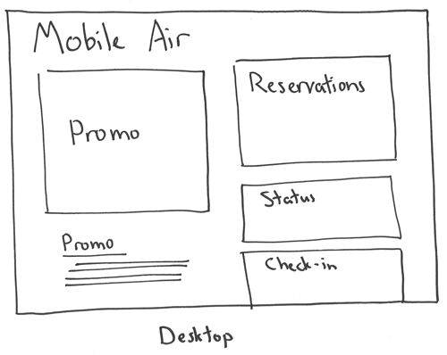
For desktop users, we’ll focus on interactions that take a longer amount of time and effort.
In this article, we’ll look at four core ways to streamline mobile interactions:
- Identify the tasks your users want to accomplish on a mobile device.
- Memorize as much as you can about your users’ situation.
- Presume that your users’ actions will succeed, and get them to their next task.
- Predict your users’ next actions, and prepare accordingly.
Recommended reading: Streamlining Mobile Interactions)
Task-Oriented Design
First things first: Why are your users here?
Desktop users keep a lot of web applications open for long periods of time so that all of the information they need is right at their fingertips. But a mobile device is used sporadically, when a task needs to be accomplished. The user may be checking Twitter because they’re bored and want to read an article that a friend has posted. Maybe they’re checking into a flight, sending dinner plans to a friend or looking up a bus schedule. They have a task that they’re trying to accomplish, and when they’re done, their phone will go back in their pocket.
Let’s say you’re in charge of Mobile Air’s mobile experience. On the desktop, Mobile Air’s home page is all about sales. Fare discount advertisements, enticing destinations and a trip planner are at the forefront. Off in the corner are options for checking into your flight, seeing your flight’s status and checking your rewards program.
For desktop users, we’ll focus on interactions that take a longer amount of time and effort (booking a flight) because desktop users are willing to spend more time on pages and are less likely to leave compared to mobile users, whereas a mobile user is looking to accomplish a shorter task and they won’t have a lot of patience. Also, since checking flight status on a phone while at an airport is such a common use case we’ll bring that to the forefront. 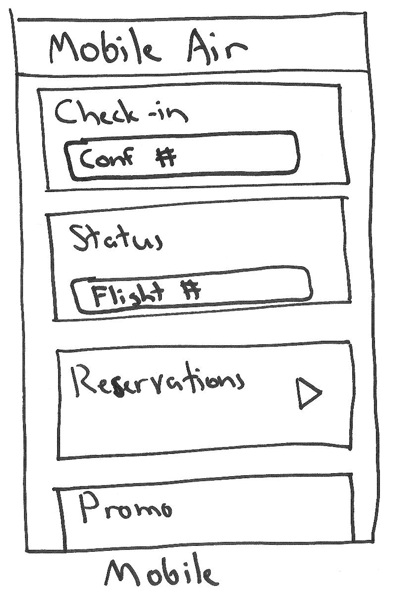
Visitors to Mobile Air’s mobile website are away from home. The most prominent and accessible tasks should be flight status and check-in.
If you’re at home and want to visit Mobile Air, you’re not going to take the phone out of your pocket to do it if a perfectly good laptop is sitting on the coffee table. Visitors to Mobile Air’s mobile website are away from home. Odds are, they’re traveling right now. The most prominent and accessible tasks should be flight status and check-in. Reservations should be possible, but they aren’t as high a priority. Already, we’ve flipped the entire experience on its head because we know more about why our users come.
Memory
Once a user has visited our website and checked into a flight, we’ll know a lot more about them. We know that they have a flight coming up, for starters. Also, we know who they are, and we may have more information in our database, such as past and future flights. Using this information, let’s customize the home page for them by anticipating their actions.
Let’s say we know that Ann has checked into her flight that leaves tomorrow from New York City (NYC) to San Francisco (SFO). We also know she’s returning from SFO to NYC a few days later; and two weeks after that, she’s taking a trip to the Bahamas. Here’s how we could display her home page:
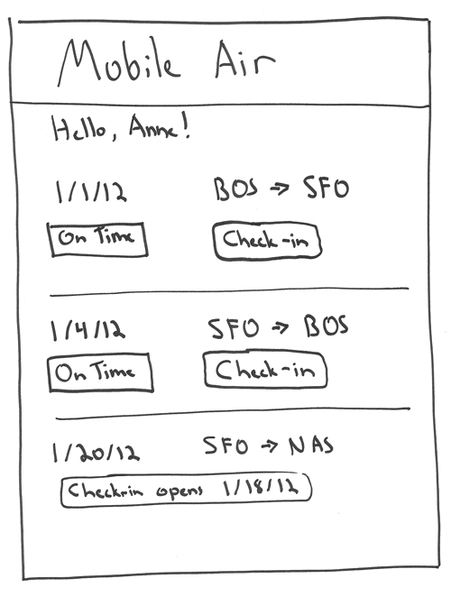
We know that the client is returning from SFO to NYC and taking a trip to the Bahamas. Here’s how we could display her home page.
So, how should we store this data? We could store it on the server in a database, and then use a cookie on the client. That’s the usual way to store this kind of thing. However, this is really a mobile-only interface, and it’s going to be short-lived; once the user has completed their flights, they won’t need this interface anymore. Additionally, storing the data on the server means that it won’t be available if Wi-Fi is lost (say, when Ann is on board and her phone is in airplane mode). Here’s an implementation of a flight-information cache using HTML5 localStorage:
// After we fetch from the server, store it:
localStorage.setItem("flights", JSON.stringify([
  { from: "NYC", to: "SFO", at: "Sun Jan 1 2012 07:45:00" },
  { from: "SFO", to: "NYC", at: "Tue Jan 3 2012 16:00:00" }
]));

// When we first open the page but before fetching from server, retrieve the data:
flights = localStorage.getItem("flights")
if (flights) {
  flights = JSON.parse(flights);
  restoreFlights(flights);
}
This will store flight information on the phone, but Ann still would not be able to open the application without Wi-Fi. That’s what HTML5 application cache manifests are for. A cache manifest tells the phone what files to download and use offline. When the phone regains Internet access, it will update these files. Below is a simple cache for our application.
First, add the manifest to the html tag:
<html manifest="/application.manifest">
Next, add the manifest:
CACHE MANIFEST
  # 2013-02-14
  # v1

  # Primary assets
  /favicon.ico
  index.html
  application.css
  application.js
  images/mobile-air.jpg

  NETWORK:
  /api
This manifest tells the browser to cache our core application assets but to require the network for all of our API methods. That way, our API data won’t be cached. Note that at the top we have a timestamp and version number. Any change to the manifest will trigger a cache update; so, whenever you ship a new version, just update the timestamp and/or version accordingly, and the next time the user is online, they’ll get a fresh version.
At this point, you may be wondering about browser support for these new features. With all of the constraints on mobile devices, HTML5 support is a welcome relief. HTML5 localStorage and offline support is available on Android 2.1+ and iOS 3.2+. iOS 3.2+ accounts for about 97% of Apple mobile devices, and Android 2.1+ accounts for about 99% of Android devices. Adding a check for localStorage would be responsible so that our application doesn’t crash when it’s not available; but we don’t have to add a manifest check because we’re not using any JavaScript to access that feature — the browser automatically picks it up.
Routing
At this point, we have a fast application that can work offline, but we haven’t tackled how it behaves when refreshed or when the user quits and reopens the browser. Suppose Ann is checking her flight’s status and is refreshing constantly. We could provide a button to do this, but what if she sleeps her phone and later pulls it out of her pocket? Browsers will destroy a page’s state after a while (or after switching apps), so your application needs to be able to resume. That’s where routes come in.
Any page that stands alone should have its own route, and it should be able to be loaded purely by opening that route — meaning that we must be able to reconstruct our application’s state without forcing Ann to start at the main page and then navigate back to where she was. To do this, we will need a router. You could build one yourself, but many great JavaScript routers are available for different frameworks. Here’s a router in Backbone.js:
// Define the router
var MobileAirRouter = Backbone.Router.extend({
  routes: {
    "": "dashboard",
    "flights/:id": "flight"
  },
  dashboard: function() {
    // Display the main dashboard
  },
  flight: function(id) {
    // Fetch flight with ID: id
    // Display flight info
  }
});

// Instantiate it
var router = new MobileAirRouter();

// Start Backbone's history tracking
Backbone.history.start()
// That will trigger whichever route matches the current url
Combine a router with a localStorage-backed cache system, and you’ll have an application that can resume very quickly, even without Wi-Fi access.
Perceived Speed
The hard truth of the mobile world is that delivering content at desktop speeds is incredibly difficult. Most mobile data providers see ping times on the order of hundreds of milliseconds. This means that, assuming your application takes 0 milliseconds to process a request and the phone takes 0 milliseconds to handle and render it (yeah right!), you’ll still have a 300 to 500 millisecond delay waiting for the signal to travel across the network. The only option left is to cheat.
Instagram is praised for its user experience, and one of its core tactics is to perform actions optimistically. This means that when a user says, “Post this status update,” the system immediately says, “Done!” and moves the user back to their timeline, adding the new photo. Never mind that the data hasn’t even left the phone yet. In reality, your photo was on Instagram’s servers before you hit OK, and it was on your timeline before the server confirmed it. A double shot of perceived speed!
Let’s apply this concept to our mobile reservation system. We’re going to have five pages:
- submit airports and dates,
- pick the first leg,
- pick the second leg,
- pay,
- get confirmation.
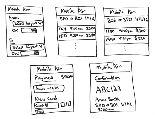
Our mobile reservation system on five pages.
Once Ann has picked her airports and dates — but before she has hit the “Find Flights” button — we will fetch the info for the first leg. This way, if she were to change those values a few times, we might incur an extra data cost, but the next page will appear almost immediately. Here’s how we can prefetch a page:
// Function to fetch flight legs
var fetchFlightLegs = function() {
  // Inside a closure, we keep some internal variables
  var key, deferred;

  // Return the actual fetchFlightLegs function
  return function(from, to, on, until) {
    // Make a key from the arguments, so that different
    // invocations restart the process
    var newKey = [arguments].join("-");

    // If request is not redundant, make a new request
    if (newKey !== key) {
      // Set the key
      key = newKey
      // And set the deferred to the new request
      deferred = $.get("/legs", {
        from: from,
        to: to,
        on: on,
        until: until
      });
    }
    // Return the deferred
    return deferred;
  }
}();

// Now, every time they change a field, we run:
fetchFlightLegs(from, to, on, until);

// Then, when they hit "next", we run it again
// But this time we use the results to render the page
fetchFlightLegs(from, to, on, until).done(function() {
  // render the legs page
});

// If the fields haven't changed, we piggyback on the current request,
// which has been in progress since they updated the fields
In order not to rack up huge data costs, we might want to wrap our calls in something like _.debounce from Underscore.js, which will delay a function call up to a specified number of milliseconds, and renew the delay if the function is called again. Basically, it lets the application “settle down” before performing the fetch.
In our design, the first and second leg are selected on different screens, but that doesn’t mean they have to be separate requests. We can modify our fetchFlightLegs function to lump the first and second legs into one request. Thus, the transition from the first to the second will be instantaneous. The submission of payment information requires no fetching.
When the payment is POST’ed to the server, we will do it synchronously with a loading screen. We don’t want to assume success at this step. Plus, an unusually quick response could actually make Ann feel uneasy! Here’s what our request chain looks like with and without data prefetched:
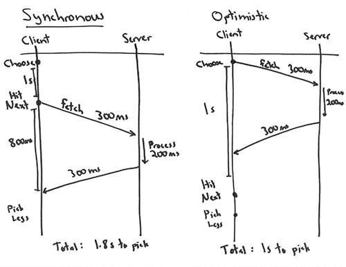
Our request chain with and without data prefetched.
As you can see, we’ve parallelized the application and the user’s actions. The user can do what they need to do (pick dates, pick flights, etc.), while the application predictively loads the next page’s information. This takes a lot of waiting out of the equation.
Focus On What Matters
Mobile interaction is a different world, with different constrains and different expectations. Simply adding a responsive style sheet does not address your user’s changing demands based on the context of their use. Keep the following steps in mind when building a mobile web application:
- Identify the tasks your users want to accomplish on a mobile device.
- Memorize as much as you can about their situation.
- Presume that your users’ actions will succeed, and get them to their next task.
- Predict your users’ next actions, and prepare accordingly.
The mobile web is a harsh environment, but by simply focusing on what matters, you will find that these new constraints provide a clear path to a superior experience.
Further Reading
- Mobile First Is Just Not Good Enough
- The Wow Factor in Web Design
- The Thumb Zone: Designing For Mobile Users
- How To Poison The Mobile User


 Celebrating 10 million developers
 SurveyJS: White-Label Survey Solution for Your JS App
 Register Free Now

