Team Collaboration And Closing Efficiency Gaps In Responsive Design
Responsive design ushers in complexities that require a more involved design and implementation process. Because of this, the effort has piled up on the front end. Working in silos, where you talk to each other only occasionally or during scheduled meetings, has too many unknowns. Let’s look at how these new challenges create opportunities to work together better.
We have to kill the mentality that there is an assembly line of workers waiting for it to be their turn, and instead embrace more focused collaboration across the project’s entire team.
Getting Teams To Buy-In
Four or five years ago, before responsive design was a “thing,” I was asked to make a comprehensive checklist that our team could follow when building any website. Inevitably, an unexpected task or two would come up, along with a tightrope of a deadline, and we never looked at that checklist during the build. These days, the thought of making a step-by-step checklist for a responsive design build sounds like a cruel joke.

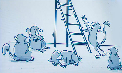
Collaboration is not something you can force on the team. (Credits: Jeffery Zeldman )
I’ve been on a small team building a large media website over the last year. It did not take long after the project kicked off to realize that our design team’s best work is done in tandem. We’d solve small problems, create momentum and then solve bigger problems.
It is crucial for all roles to be looped in and to have meaningful access to each other, not only for decision-making, but for brainstorming and healthy debate. Empower the team and cultivate an environment of encouraged collaboration and skilled problem-solving.
Make The Process More Transparent With Lightweight Deliverables
Sharing the decisions being made with the project’s entire team as the design evolves is a great first step. Keeping deliverables lightweight (i.e. sketches or style prototypes that demonstrate strategy instead of pure visual design) will take the pressure off the big reveal. This, first, keeps you from going too far down the rabbit hole without getting feedback and, secondly, creates trust through transparency — when the whole team gets to see the process, it is more likely to make informed decisions.

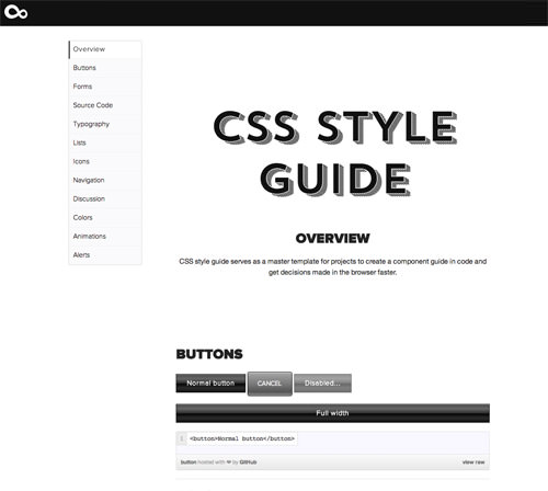
An example of our team’s baseline CSS style guide for each new project. (Large preview)
When working on something new, prototype ideas and then create interactive concepts in the browser, thus reducing the likelihood of miscommunication about what will change when pieces are made interactive.
The Web is continuing to distance itself from the outdated “page” metaphor, and more and more design systems are emerging. These design systems are often concretely established by the creation of a CSS style guide. As the guide becomes more robust, gaps get filled during development.
Demoing Interaction In Its Simplest Form
Showing a demo that has the desired functionality in a tool like Codepen or Dabblet is an added efficiency, and the functionality can then be reused as the website is planned across devices. There is no need to even upload anything to show it to others.

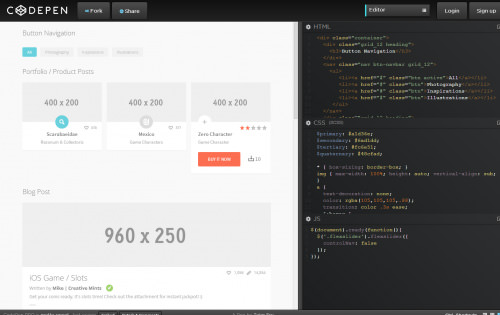
Codepen demo image. (Image source: Tyler Fry)
Instead, fire up a new Pen, load your dependencies (for example, if you are working with Zurb Foundation, you can add that external CSS and JavaScript through a content delivery network), and get a working example in front of the rest of the team. Show how that off-canvas navigation looks in its simplest form to get feedback before layering it in a content management system or introducing another complexity.
Live By The Browser, Die By The Browser
Look at reflowing content on different devices. A static example cannot be visualized when content reflows from portrait to landscape. Interaction will trump documentation. To show how a responsive design works, nothing tells the story as effectively as opening a browser and squishing and expanding the viewport in front of someone. Plus, getting the design in code brings added efficiencies, such as showing off CSS animations and showing active, focus and hover states.
How To Think Collectively As A Team
Right now, there is an outdated habit of delegating chunks of work to individuals. Problems need to be solved with momentum; otherwise, spinning your wheels until the next checkpoint becomes too easy. Reach out for feedback with non-disruptive methods of communication, such as Basecamp, Slack and Skype, which are good ways to get unstuck without dismantling productivity through time-intensive meetings or phone calls.
The goal is to get this communication loop right, not only with the internal team, but with the client and any other decision-makers. You are not just depositing information, but rather thinking collectively.
War Rooms
A war room is a dedicated space for a team to communicate about a project in a focused setting, without interruption. This sends a message to the rest of the organization that everyone in the war room is off limits in terms of availability. More importantly, it cinches these feedback loops by way of proximity. Going “heads down” is an effective way to get designers and developers on the same page during crunch time (testing, milestones, launches, etc.).
A Shift In Mindset
Decision-makers need to be involved in the design process. A good rule of thumb is that, whenever a decision introduces a layer of complexity that will change the overall project, check that it doesn’t affect other areas of the project. Separate the act of unveiling the design from the process by sharing assets constantly during the design process.
Balancing And Powering Through Efficiency Gaps
An efficiency gap is created whenever a team’s execution breaks down due to a lack of communication or lack of knowledge about the design or functionality. When you are working on a design that scales proportionally, those miscues multiply quickly, which makes the discovery phase that much more important.
Ask questions. On the front end, missing design details is easy. Pull in the designer to make sure you are not bastardizing their thinking. Reviewing code helps to keep team members accountable for their work. Explain your decision-making process to each other to make sure you’re making thoughtful choices.
Making a website responsive is not a one-person task. Designers can work on comps to present ideas more concretely, without making any hasty assumptions about how exactly the design will look at each breakpoint. Rather than trying to create multiple pixel-perfect examples, we find it best to rely on the website’s existing foundation and get the work into the browser quickly to test it with our existing grid.
Think “Teamwork” Instead Of “Assembly Line”
The responsive design process requires both communication and practice if the team is to make any headway towards a finished product. Making sure your team is working with lightweight deliverables, demonstrating interactions in their simplest form, thinking collectively as a team and striking a balance are all meaningful steps towards making sure the result matches the vision.
Communicate Often. Work In Tandem. Trust The Team.
The focus on efficiency and a better workflow will reinforce the overarching goal of making great websites. Continued collaboration across the project’s team and a thoughtful approach in each area of the process will enable you to refocus and accomplish more with iterations, rather than with reworking.
Let’s work together better and embrace a unified approach on all fronts to design for all devices and experiences.
Further Reading
- Why You Should Include Your Developer In The Design Process
- Designers And Developers Playing Nice
- Developers “Own” The Code, Designers “Own” The Experience?
- How To Build Digital Capacity And Attracting Talent
- How To Effectively Communicate With Developers


 Try ProtoPie AI free →
 Celebrating 10 million developers


 SurveyJS: White-Label Survey Solution for Your JS App

