Maintaining Momentum Through Efficient Mobile Design
When interacting with mobile devices, users have little patience for confusing interfaces or unnecessary steps that impede their progress. As designers, we must understand the role of momentum in effective user interface design and create experiences that keep our users moving forward.
Think about the act of checking email on a mobile device. This is probably one of our most efficient interactions with our phones; we do it while crossing the street, between conversations and even (for the dangerous few!) while driving. Every distracting bit of user interface (UI) that could get in the way of checking our email has been stripped from the design, making it a streamlined process that we love doing.
Consumers’ insatiable need for efficient UIs will surely intensify as technology matures. But not every mobile interaction requires the speed and efficiency of checking email. There will be times when speed must be sacrificed to help the user understand what to do, to slow them down and focus them on the task at hand. In these instances, friction is necessary.
How do you know when your design has enough friction to be understood but is not overly complicated? How do you preserve the user’s momentum at a pace that is appropriate to the context you are designing for?
This article considers different design scenarios and how to manage the user’s momentum by speeding up or slowing down their flow according to the situation. We will use our 10,000ft’s mobile time-tracking app as a case study for maintaining the user’s momentum by adding deliberate friction and strategically innovating on the UI controls. We will also discuss a framework for thinking about friction in your next design and when to be strategically innovative in order to maintain momentum.
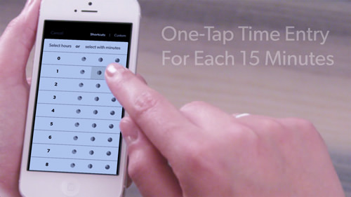
We rethought the time-entry grid, reconsidering an obvious solution to mobile time entry to maintain the user’s momentum. (View large version)
Two Types Of Design
On a very simplified level, there are two types of design: design for frequent tasks and design for infrequent tasks. Infrequent tasks are activities that you do once or so seldom in life that remembering how to complete the task without help is unlikely.
Take the ticket kiosk at the train station. The UI is typically very instructional and includes familiar components and individual task-focused screens that guide the user along each step of the process of purchasing a ticket. This UI is “walk up and use” — without having done it before, anyone can figure out what to do.
Frequent tasks are those activities that you revisit often; so, the chance of forgetting how to achieve the goal is low. We’ve talked about the efficiency of checking email — that interaction is designed with high efficiency in mind because it is a frequent task, one that we are sure to remember how to do.
When designing for efficiency, sacrificing some of the walk-up-and-use aspects that are necessary with infrequent tasks is common. On a first interaction, a user might stumble trying to figure out what is going on, but once they figure it out, they’ll be flying along.
In both instances, momentum carries the user through the UI. The amount of momentum will vary according to the context, but as long as there is progress at each step, the momentum will be preserved and the interaction will be enjoyable.
Case Study: Designing For Frequent And Infrequent Use
Sometimes you might need to consider frequent and infrequent use in a single UI. This is the design challenge that we faced with our mobile time-tracking app.
The app was supposed to be a project- and resource-management application that relies on employee time-entry data to populate progress and budget reports. The act of tracking time is done either a couple times a day or through many entries all at once. Use of our app could range from dozens of interactions in a single week to a single instance on a Friday afternoon.
When designing our app, we had to rethink how users would input information to account for their disparate interaction preferences.
Additionally, we knew that our target users were creative professionals with little patience for bureaucratic procedures. The app needed to demonstrate an efficient method of time entry for the people who would use it multiple times a day, but also maintain enough of the walk-up-and-use elements that our infrequent users would always know what to do.
Creating Friction In Mobile Design
Throughout the process, we were consciously aware of introducing friction into the design. A common view is that friction should be eliminated from a UI as much as possible. But you might find that friction is necessary in your situation to help the user better understand what to do.
In this case, try to create deliberate friction in your design to slow down the user and increase their understanding. Deliberate friction manages the user’s flow and momentum, but use it judiciously. As designers, we need to add enough friction to help them understand what is going on but not so much that we impede their progress.
For this to be effective in a mobile context, the user’s effort and time spent with your UI must be proportional to the task at hand (“effort” here referring to the number of taps and the strain on their cognitive load). Typically with frequent tasks, the time and effort spent (i.e. the friction) should be low. For less frequent tasks, friction is more acceptable because it often helps the user understand how to interact with the UI.
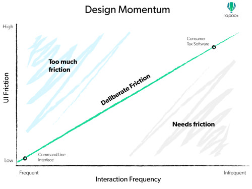
Design momentum graph: The amount of friction that your design requires increases as frequency of use decreases. (View large version)
To understand this better, think of UI friction as a continuum. On one end is a UI designed for frequent use, a UI from which all walk-up-and-use elements have been stripped in order to reduce the friction between the user and the task at hand. The user’s goal is to complete the task as efficiently as possible.
An example of this extreme is the command-line interface of your computer, such as the Terminal on Mac OS X. Not much in the UI gets in the user’s way of accomplishing their goal. A proficient user can rapidly execute commands, but no UI component tells them what to do.
At the other end (a UI for infrequent use and with high friction) would be consumer tax software made by companies like Turbo Tax and H&R Block. Its goal is to help the user accomplish the task at hand, but it pays little attention to doing so quickly. The UI is designed to deliberately slow down the user, providing a lot of information in digestible sections to increase understanding. Moving through these tools takes longer, and the added reading increases the user’s cognitive load, but they are necessary to achieving the desired outcome: filing a tax return.
This is a type of “Goldilocks” friction, like the character in the children’s story: The user’s experience is not too hot and not too cold — in other words, enough friction to understand the UI but not so much that it gets in the way. And, as you can see in the design momentum graph above, the amount of deliberate friction needed in a design increases as the use case becomes less frequent.
Your design scenario probably falls somewhere between the command-line interface and tax software. Identifying exactly where will help you determine how much friction is needed and how to manage the user’s momentum through the interaction.
Just as a design that has too much friction can fail, one that has not enough can fail, too. Therefore, be deliberate when adding friction to your design, and think carefully about where to add it and whether you have created too much.
Defining Deliberate Friction In Your Design
One way to determine how much friction a UI needs is to visually represent the user’s flow. With the app, we began by representing our UI as a sentence. This helped us to visualize the user’s flow and determine where deliberate friction needed to go. We returned to the sentence after completing the first iterations on the design to make sure we were on course.
The sentence we came up with for our application is this:
"I am entering time for [project X], in the [design phase], which was a [meeting] that took [1.5 hours]".
We broke up the sentence into different screens that quickly flow one after the other and that are optimized for quick input.
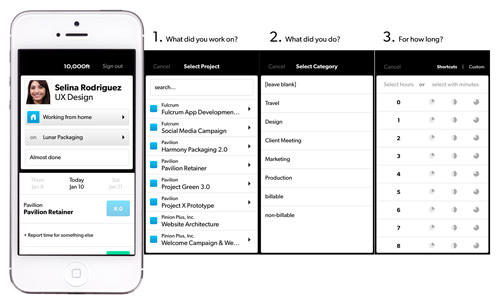
Our design sentence is represented here as separate screens that flow quickly one after another. (View large version)
To keep efficiency high, we made sure that users could choose all of the necessary information at each stage of the sentence and quickly move to the next screen, maintaining their flow through the process.
Anything in our design that deviated from the sentence or interrupted the user’s flow was deemed unnecessary friction and needed to be avoided.
We actually encountered this very point when inputting a time. Up until that point in the design flow, the user is able to choose “Project,” “Phase” and “Category” from lists with a single tap, which moves them to the next stage. But recording the time introduced a stumbling block that we didn’t expect.
The most obvious way to enter time on a mobile device is to use the number pad. When we tried adding the default controls to our design, they felt cumbersome after experiencing the speed of what came before. The process became this:
- Tap into the time-entry box.
- Tap on the “1.”
- Tap on the decimal point (“.”) (which would introduce confusion in countries that use the comma as a separator).
- Tap “Done” to confirm the entry.
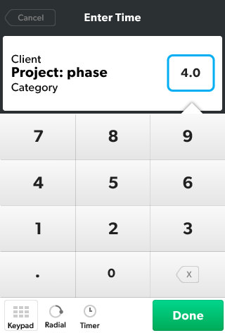
Adding the number pad to the flow introduced a new UI paradigm that interrupts the user’s momentum.
Obviously, everyone knows how to use the number pad on a mobile device. But introducing this into our design sentence consistently brought up a stutter. The user felt like they were flying along, inputting their project, phase and category, when suddenly — boom! — the number pad came up. This different UI paradigm required multiple steps to complete. Even though the user could enter time without a problem, this unnecessary friction impeded their momentum.
Preserving Momentum: The Time-Entry Grid
Introducing a new UI paradigm mid-interaction is a sure way to create cognitive friction that interrupts momentum. The default control, a number pad, derailed the user’s flow and motivated us to rethink how users enter numerical information in our app.
One avenue we explored was using a radial dial to enter time. Up to this point in the design sentence, users would input information by selecting from lists. Adding a dial that required users to hold and drag did not eliminate the stutter. Visually, it added an interesting element to our UI, but in the end, the dial still introduced a different UI paradigm. We decided that, to avoid going over our threshold for deliberate friction, we needed to use the same interaction method for entering time. That decision led us to the time-entry grid.
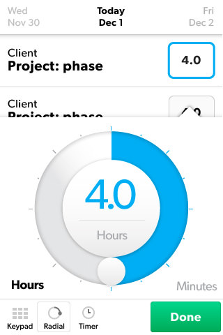
The radial dial was another iteration that we explored for entering time, but in the end, its different interaction model caused unnecessary friction.
The grid shows the number of hours that the user might spend on a certain project or phase in the far-left column and the corresponding quarter-hours across each row. This allows the user to select from a wide range of possibilities with a single tap, and it has a UI paradigm that is the same as what comes before. The time-entry grid maintains the user’s momentum, avoiding the unnecessary friction that an ordinary keypad would have added to the user’s flow.
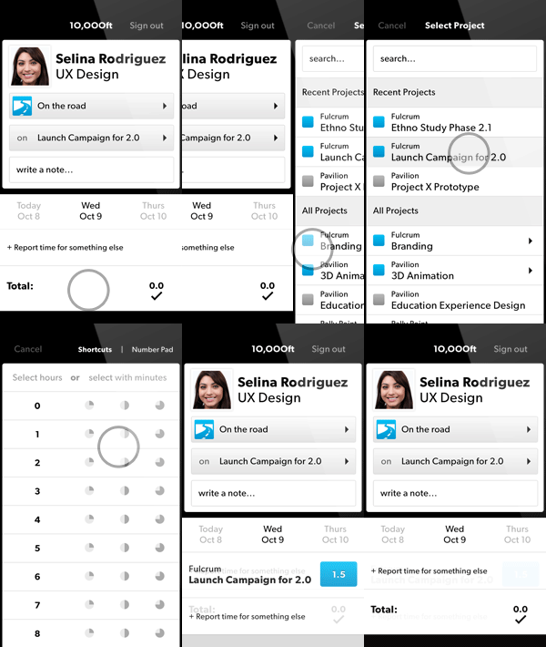
The time-entry grid has an interaction model that is the same as what comes before, and it maintains momentum.
We were able to validate that the time-entry grid was the best solution by keeping certain requirements in mind throughout the iteration process.
The ideal solution needed to fit the UI model that we created for the first half of the interaction. The keypad obviously deviated from this, so the first requirement was to come up with something that matches our UI.
Next, we knew that we wanted the design to set us apart. Rethinking common controls enabled us to create something that would stand out and set us apart from obvious solutions.
Finally, keeping in mind what we know about momentum and UI friction, we knew that the design needed to be innovative yet understandable. Our usability research showed that the grid introduces some initial confusion about what to do, but that the user easily overcomes it after failing the first time. So, to meet the other requirements — of matching our UI model and being strategically innovative — we knew that the time-entry grid had reached a level of deliberate friction that was appropriate to our design.
Suggestions For Maintaining Momentum
Designers can easily overlook momentum when creating a mobile app. We think that as long as the user can achieve their goal, we have been successful. To have a UI that is truly innovative, we must keep the user’s momentum in mind. Here are some suggestions for maintaining momentum and designing an enjoyable experience.
Know How To Create Friction
Sometimes friction appears in a design without your realizing it. Additionally, measuring it can be challenging. Using a design sentence, as discussed above, is a good way to visualize the friction in your UI. It enables you to identify any unnecessary steps and to look for ways to optimize the user’s flow.
Also, watch how users react to certain design decisions in your usability testing, and see whether it matches your expectations. Here are some common design decisions that create friction:
- Adding taps to the flow. Breaking up a larger goal into small individual tasks is a good way to focus the user on one thing at a time. But too many taps or screens might slow down their momentum.
- Adding additional instruction. Clear instructions and explanatory text are important for less frequent interactions, but obviously text becomes too much at a certain point. Use icons judiciously because they are almost always hard to understand at first glance and will add unnecessary friction if used heavily.
- Changing the UI model. In almost all cases, this causes unnecessary friction and will confuse the user, impeding their momentum.
Find Your Goldilocks Friction
Once you are aware of what creates friction, be deliberate in adding it to your UI to make sure you have the right amount. Outlining the design flow in a sentence is a good way to visualize the flow and to stay focused while you iterate.
Ask yourself, is the interaction faithful to the sentence? Does something impede the user that could be corrected by a redesign? If your sentence becomes overly complicated or long, then you might have exceeded the threshold for deliberate friction.
Don’t Assume That Common Controls Are The Only Option
The obvious method for entering time is to use the number pad. But by keeping the user’s flow in mind and recognizing when unnecessary friction entered our design sentence, we were able to look past the obvious answer and keep the friction in our design deliberate. Using the operating system’s controls is the cheapest solution, but not always the right one.
Be Strategic About Innovation
Other times, the cheapest solution is the right one. Designers constantly look for ways to push the limits of what is expected and acceptable. But sometimes you can’t afford the risk of introducing a new concept. Time-tracking is a low-risk activity: If someone enters the wrong time on their first attempt, it is easily corrected. If you allow enough leeway for the user to make a mistake and easily correct it, then you’ll have more opportunities to push the limit.
Additionally, investing time and energy in coming up with something unique makes sense when it helps your product stand out. For us, time entry is such a core component of 10,000ft that looking for ways to optimize it made sense.
Understand The Risks Of Being Innovative
There is a risk in rethinking default controls. Users might misunderstand the design and not know what to do, which would add unnecessary friction. In our case, the risk was worth it because the up-front cost of increasing the user’s cognitive load is won back through efficiency over time.
In our research, we observed some users taking a bit of time to understand the time-entry grid at first. They had the keypad model in mind and wanted to first enter hours and then minutes. But after failing once, they immediately figured out what was going on and did not make the same mistake twice. The UI is optimized for frequent use.
Final Thoughts
Regardless of your scenario, a UI design has to maintain momentum in order to be effective. Consumers have little patience for confusing designs that include unnecessary steps or not enough instructional cues.
If the user will be interacting with your UI frequently, then their need to quickly move through the interaction will be higher. If the interaction opportunities are low or infrequent, then speeding through the process is not as important as understanding how to interact with the design.
Be deliberate about the friction that you add, to slow down the user and help them better understand. Conversely, if you add too much friction, the user will lose momentum and be left to struggle through an inefficient design or, worse, be frustrated enough to abandon the app.
Controlling momentum with deliberate friction enables you to create more effective designs and presents more opportunities to be innovative and to differentiate your work from the rest.
Further Reading
- Efficient Responsive Design Process
- The Thumb Zone: Designing For Mobile Users
- Mobile-First Is Just Not Good Enough: Meet Journey-Driven Design
- How To Enable Collaboration In A Multiparty Setting


 Try ProtoPie AI free →
 Register Free Now
 SurveyJS: White-Label Survey Solution for Your JS App
 Celebrating 10 million developers


