How To Create Your Own Front-End Website Testing Plan
So, your designers and developers have created a fantastic front-end design, which the client is delighted with, and your job now is to test it. Your heart begins to sink: Think of all the browsers, all the devices and all of these web pages you’ve got to test, not to mention the iterations and bug fixes. You need a front-end testing plan.
This article shows you what to consider when creating a front-end testing plan and how to test efficiently accross browsers, devices and web pages.
Benefits Of A Front-End Testing Plan
- Clarity on project’s scope Knowing which browsers and devices are within the project’s specification will help you to focus and will reduce development time and costs.
- Reduced client friction. This is done by showing detailed reports of completed test plans.
- Confidence in deploying the project. This comes from knowing you’ve thoroughly tested the project.
In my experience, front-end website mockups are not extensively tested before they are handed over to the back-end development team, the reason being time and budget constraints. They’re usually tested in the front-end developer’s browser of choice and maybe on their smartphone. So, when we came up against a monster of a project, Dad Info, which has a ton of responsive page types, we needed a plan to methodically and efficiently test functionality and performance across platforms and across devices.
Dad Info is a not-for-profit website, built on Joomla, that aims to help fathers in need, whatever their situation. Last year, it helped over 500,000 dads and delivered 220,000 pages of information every month. I will be using Dad Info as a case study throughout to demonstrate how to create and complete your own front-end testing plan.
Let’s Tool Up
Before getting started, you’re going to need to tool up. In this article, I’ll use the following toolkit to complete the testing process:
- Asana Used for bug-tracking and team management
- Chrome Developer Tools Used for inspecting, debugging and profiling
- Windows’ Snipping Tool (or
Shift + Command + 4on a Mac) - BrowserStack Used to test cross-browser functionality on multiple virtual machines and emulators
- Devices Ideally, you’ll want real devices. We have iPhone 4, 5 and 6; HTC One M8; Samsung Galaxy S5; Nokia Lumia 1520; Google Nexus 5; BlackBerry Curve; iPad 2; and Asus VivoTab Smart. If you don’t have these, you can use BrowserStack’s emulators.
- Google’s PageSpeed Insights
- Pingdom Website Speed Test
- Screenr Web-based screen recording, with sharing capabilities
What Are We Testing?
Because we’re front-end testers, our job is to know exactly what we are testing. We might not always find bugs per se; rather, we might find that something isn’t working as expected or that the developer has misunderstood the functionality requirements. Having a detailed specification up front that all stakeholders have agreed too will help to avoid some of these problems entirely. Later on in the Dad Info case study, we will go through a front-end specification to test the home page.
Who Are We Testing For?
First of all, you will need to understand your audience and how they will be consuming the website. Here are a few quick questions you should always ask:
- What are the most popular devices your audience uses?
- What operating system and browser combinations are most popular among your audience?
- What connection speeds do they have (3G, 4G, broadband/fibre)?
- How tech-savvy are they? We can make a judgment call here based on the topic of the website, their devices and their demographics.
For our Dad Info case study, the answers would be as follows:
- iPhone 5, iPad 2+, desktop (1024 pixels and up)
- Windows 7 Chrome, Windows 8 Chrome, Windows 8 Internet Explorer 10, OS X Safari, iOS 6 Safari
- Broadband and 4G (a lot of city workers)
- Our audience is mainly men between 18 and 35 years of age, fairly tech-savvy, with a smartphone in their pocket and an understanding of social media applications such as Facebook and Twitter.
So, how does this help us carry out a front-end test plan?
Armed with this information, we can instantly break down our huge to-do list into segments that are relevant to our audience and that prioritize our testing methodology. For functionality, we know which devices and browser to test in; for performance, we know what connections to test on; and for usability, we know that our audience uses social media applications, so we can include interface elements that they would be familiar with.
Know Your Limits
Know the limits of your project. At some point, you’re going to have a “That’s good enough” conversation with yourself. Projects limits are usually controlled by a few factors:
- Budget. Remember that you should charge for testing. A lot of designers don’t, which is crazy. Testing is time-consuming — and, being designers and developers, our product is time.
- Timeline. Include testing in the project’s timeline. It’s often left off the list and, therefore, rushed.
- Scope. Not every website needs to work on hundreds of devices. Figure out the main use case, and focus on fulfilling that audience’s requirements.
Browser And Device Support Levels
To set the scope of browser and device support easily with clients and to avoid those “bad conversations,” we’ve found that being up front about our “levels of support” really helps. Below are some simple definitions that you can apply to each page type you test.
Support level 1: fully supported browsers and devices
- All content must be readable.
- All functionality must work.
- Deviation from approved graphic design must be minimized.
Support level 2: partially supported browsers and devices
- All content must be readable.
- Navigation must work.
- Business login functionality must degrade gracefully.
- Any degradation to presentation must not obscure content.
Support level 3: unsupported browsers and devices
- No support or testing is required.
Performance Support Levels
You might also want to agree with your client on a performance target. The quick and dirty method here is to agree on a score to reach in Google’s PageSpeed Insights and Pingdom’s Website Speed Test. Normally, we aim for at least 85 out of 100.
Tools For Managing Your Test Plan
It doesn’t matter what tools you use. I use Asana and BugHerd; you could use a simple spreadsheet. It comes down to what works best for you. At a minimum, your tool should be able to do the following:
- add bugs, issues and tasks in an ordered and segmented list, with the ability to tag (“priority, system critical, etc.);
- assign bugs, issues and tasks to members of your team (or to yourself), with due dates;
- comment on bugs, issues and tasks, with a date-ordered history thread;
- upload screenshots, videos and documents related to bugs, issues and tasks;
- mark a bug, issue or task as resolved or completed;
- report on completed versus remaining bugs, issues and tasks.
How To Describe Bugs And Issues
Ever got a bug report from your client that stated, “I clicked on the blog and it doesn’t work”? Useless, right! So, what does a well-written bug report look like?
- Be specific. Without being wordy, clearly summarize the problem. Do not combine multiple bugs into one report; rather, submit a separate report for each issue.
- Show how to replicate. Detail step by step exactly what you did and what issue occurred as a result.
- Limit pronouns. Descriptions like “I clicked it and the window didn’t appear” are very unclear. Instead, “I clicked the ‘Submit’ button and the window marked ‘Registration’ did not load” tells the developer exactly what you did and what happened.
- Read what you’ve written Does it make sense? Do you think it’s clear? Can you replicate the bug by following your own steps?
Setting Up Your Front-End Test Plan
So far, you have collected a bunch of useful information and data, but you’re going to need a proper testing plan to succeed as a front-end tester. Without one, you’re shooting in the dark. So, what exactly does a front-end testing plan look like? In its simplest form, it’s a to-do list, with a bunch of tasks for testing each of your web page types against a set of agreed criteria. The best way to explain this is through a case study.
Case Study: Front-End Test Plan For Dad Info’s Home Page
Test Plan Documentation
Here, we lay out an overview to give the tester some context about the project. And we let them know what we want tested, on which devices and browsers and how long they have to do it.
Budget:
- total of 10 days for testing
- use one and a half days for front-end testing of home page
Timeline:
- complete initial testing within one day, with feedback to front-end developers completed the same day
- three days for fixing bugs
- a further half day for retesting bugs
Scope:
- Support level 1 (browsers):
- Windows 8: IE 10+, Chrome (latest), Firefox (latest), Safari (latest)
- Mac OS X Mavericks: Chrome (latest), Firefox (latest), Safari (latest)
- Support level 1 (devices):
- iPhone 4 / 5, iPad 2, Asus VivoTab Smart
- Support level 2:
- Windows 7: IE 9+, Chrome (latest), Firefox (latest), Safari (latest)
- Windows XP: IE 8, Chrome (latest), Firefox (latest), Safari (latest)
- Support level 3:
- anything else
For this project, we require three reports to assure the client that the page has undergone and passed the testing process:
- browser and device report: support level 1 and 2
- responsive report: support level 1
- performance report: minimum 85 out of 100
Original Approved Design
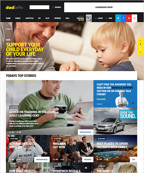
Having a visual representation of what you are working towards is important to ensuring that graceful degradation is within acceptable limits and that the presentation doesn’t change much between browsers. We’ve added this image to the test plan documentation:
Details Of Page Functionality
In the home page design, I’ve highlighted all of the functionality that needs to be tested, highlighting them with block overlays. This helps everyone involved to know exactly what to look for and puts us all on the same page. I’ve also added this to the test plan documentation.
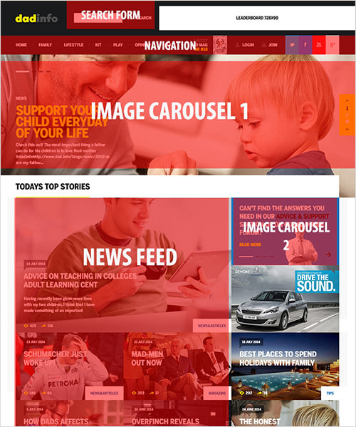
Based on these overlays, we can produce a full list of functionality.
Search Form
- Click or touch in the search box and then press the search icon to submit the form.
Navigation:
- Hover over navigation item to display white highlight.
- Hover over navigation item “Family” to show drop-down mega menu.
Image Carousel 1:
- Press the up and down arrows to browse the slides.
- Press the pagination elements to skip to a particular slide.
- Swipe through the slides on touch devices.
News Feed:
- Hover over the headings to change their color.
Image Carousel 2:
- Press the up and down arrows to browse the slides.
- Press the pagination elements to skip to a particular slide.
- Swipe through the slides on touch devices.
Call-To-Action Block 1:
- Hover over title to change it
Image Carousel 3:
- Press the up and down arrows to browse the slides.
Twitter:
- No special front-end functionality
Forum:
- No special front-end functionality
Topics:
- Hover over a support topic to reveal a picture to the right, with a description. Click “More” to go to a new page.
Footer Links:
- Hover over an icon to change its opacity.
Newsletter:
- Clicking in or touching the “Enter email address” box should work.
- Press “Subscribe” to submit the form.
Footer Bottom:
- No special front-end functionality
Browser And Device Report
Whether you decide to use a tool like Asana, BugHerd or Trello, your job as a tester is essentially to collect the following information to relay back to your front-end developers (or to use yourself if you’re solo). To quickly go through all of the browsers, I use BrowserStack, setting up virtual machines that run the OS and browser combinations that I require.
| Test Item | Browser/Device | Pass/Fail | Bug/Issue Description |
|---|---|---|---|
| search form 1.a | Windows 8 (IE 10) | pass | |
| navigation 1.a | Windows 8 (IE 10) | pass | |
| navigation 1.b | Windows 8 (IE 10) | fail | Cannot move mouse to mega menu area without it disappearing. See this Screenr recording. |
| image carousel 1 - 3.a | Windows 8 (IE 10) | fail | The left and right arrows in the yellow box do not scroll slide 4 back to slide 1. |
It’s a methodical job of working through all of the browser and device combinations until you have completed the same tests for each one.
Real Bug From Dad Info
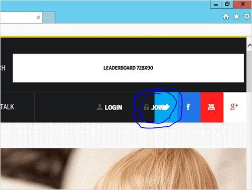
- item: navigation’s “Join” button
- browser/device: Windows 8, IE 10, 1024-pixel screen width
- pass/fail: fail
- bug description: The “Join” button overlaps the Twitter button, highlighted in blue. See attached screenshot.
Responsive Report
In the report on responsiveness, we are specifically testing elements and functionality that change as the screen’s canvas reduces in size. This includes navigation, page layout and images.
We have a few possible testing methods:
- Resize the browser’s window This is the quick and dirty method, grabbing your browser’s window by the corner and dragging across the break points to see what happens. This is a great way to quickly scan the overall responsiveness of a website to see which elements change.
- Use emulators. BrowserStack emulates the majority of popular devices, and in my experience it is good enough for testing.
- Use real devices. The expensive option! This entails thoroughly testing on actual devices in your hand. Getting a screenshot usually requires capturing a photo, emailing it to yourself and then annotating in Photoshop. There are some options for screen recording, including UX Recorder for the iPhone.
For the Dad Info project, we used a mixture of all three. The front-end developers resized their browser to get the gist of responsive elements, while the quality assurance team used emulators and real devices to complete the testing process to the client’s satisfaction.
Real Bug From Dad Info
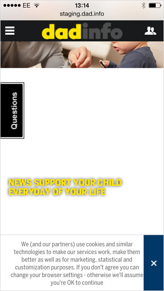
- Item: image carousel 1
- Browser/device: iPhone 5, iOS 7
- Pass/fail: fail
- Bug description: The margins set at the bottom of the carousel push the “News support your child…” title for the featured article too far down. Featured article title 1 should be 20 pixels below image carousel 1. See attached screenshot.
Performance Report
In the performance report, we are looking to score a minimum of 85 out of 100 in Google’s PageSpeed Insights. To get the client to sign off on the report, we’ve included a screenshot of the page speed analysis. Of course, if it doesn’t pass the agreed upon standard, then we provide feedback to the front-end development team using the bug-tracking report template.
Tip: We use boilerplates (stored in GitHub repositories, which we fork) for our content management system and Magento builds, whose performance is already optimized. This saves us a bunch of time.
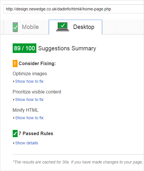
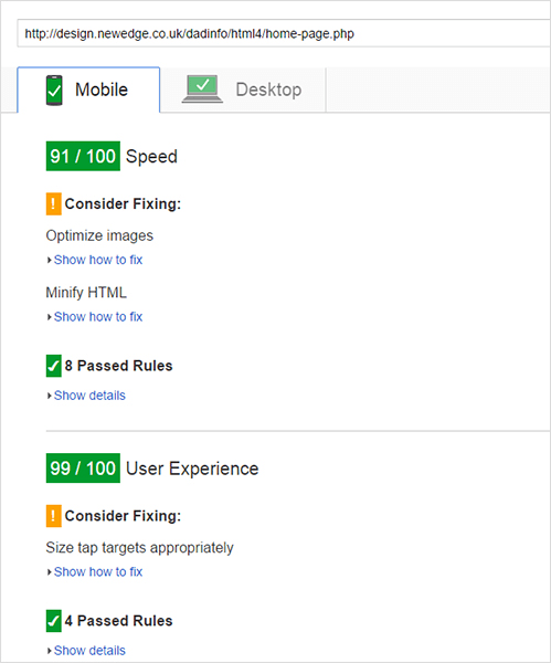
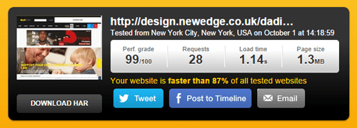
The reporting is complete. We have just a few issues to send back to the front-end developers to wrap up the front-end build. Once it gets to the quality assurance team, we will retest the elements that kept the project from getting a clean bill of health.
Automated Testing Tools For Visual Regression
One thing to consider is the need for visual regression testing post go live, allowing you to compare editions of pages to see if your new feature, css update or class rename has caused any problems.
Visual regression tests essentially do a DIFF on the two versions and outline (in varying ways) the differences between them, highlighting potential issues.
Here are some great resources to get you started:
Summing Up
Testing is a critical process that developers should integrate into their workflow to minimize the number of bugs that get caught in the quality assurance phase. Front-end testing also needs to be budgeted for — with time, resources and money. The process will appeal to methodical types because they don’t need to be creatively skilled to carry it out. Tools are out there to make your life a little easier, but they won’t do the work for you. Whichever tool you pick, stick with it, define a process and put the effort in. The result will be a better website, with significantly fewer bugs, which your client will love and which will reduce the number of “Why isn’t this working?” phone calls and emails on Sunday night.
Your Action Plan
Reading what you should do is one thing; actually doing it quite another. So, I suggest carrying out the following actions right now:
- List the devices you have on hand, or check out Open Device Lab to find devices near you.
- Create support levels for your chosen browsers and devices.
- Make time for testing in your timelines and quotations.
- Select a management tool (Asana, BugHerd, etc.), or set up a spreadsheet to track bugs, issues and tasks.
- Select the first project to apply your test plan to.
- Go do it!
Front-end testing will give you and your client confidence in the finished project. You’ll know the website has been thoroughly tested for bugs and is ready for the world to see.
Further Reading
- Where Are The World’s Best Open Device Labs?
- Noah’s Transition To Mobile Usability Testing
- The Basics Of Test Automation For Apps, Games And The Mobile Web
- High-Impact, Minimal-Effort Cross-Browser Testing


 Register Free Now
 Celebrating 10 million developers
 SurveyJS: White-Label Survey Solution for Your JS App
 Try ProtoPie AI free →


