Refining Your Mobile Onboarding Experience Using Visual Analytics
In the wonderful world of millions of mobile apps, many users suffer from ADD (app deluge disorder), and no aphorism looms larger for developers than “You only get one chance to make a first impression.” Once a large group of people are downloading your app, you’ve already won half the battle and have accomplished your primary goal. Now, keeping them engaged post-download is your next one. This is where onboarding takes center stage.
Being involved in a mobile analytics firm, I see firsthand what challenges app publishers experience. In this article, I will go over the importance of using visual mobile analytics to measure the user experience from day one, as well as provide examples and other insights, so that you can optimize your onboarding experience and increase your app’s retention rate.
I must stress that, while there is no magic bullet for creating a perfect onboarding experience, remaining focused and committed to monitoring your onboarding experience will get you further than any other strategy. This article will provide you with knowledge that you can apply to your own mobile app exploits, whether you are a developer or a mobile app publisher.
Inviting Users To Stay
Onboarding post-download could include a variety of techniques to keep users engaged during their first time using your app. Think of onboarding as building an entry ramp for people to use the app. Turning first-time users into active and engaged ones is at the core of creating the ultimate onboarding experience.
Things that usually work for a web-based application tend not to work for a hybrid or native app and vice versa. Thinking that it will is a big waste of time. For example, native apps that invite users to create an account through Facebook (one-click registration) by using their details stored on the device provide a smooth onboarding experience. Web-based apps, however, will redirect users to a Facebook page, with a different UI, and if the user is not logged in, they will be required to enter their email address and password and then return to the app’s page. Obviously, registering accounts using Facebook log-in details is less effective when onboarding in a web-based app.
You have so many elements to consider when designing an onboarding experience. Design mixed with psychology should be at the core, and you’ll need to identify your target audience, along with the devices they use, as well as detailed demographics such as age and language, and so much more.
Balance and harmony are not just for practicing the art of Zen, but also for designing your app’s onboarding experience. You need to wow them from the start. Otherwise, they might just say bye-bye to your app or, worse, delete it.
Onboarding The Right Way
Let’s look at a few examples of app onboarding experiences and the techniques used to grab users and keep them coming back.
Inline Hinting
YouTube Capture’s onboarding experience begins with a quick tutorial. It then uses inline hints to teach users the UI of the app. The app is simple, so indicating what to do next is very effective at bringing users on board.
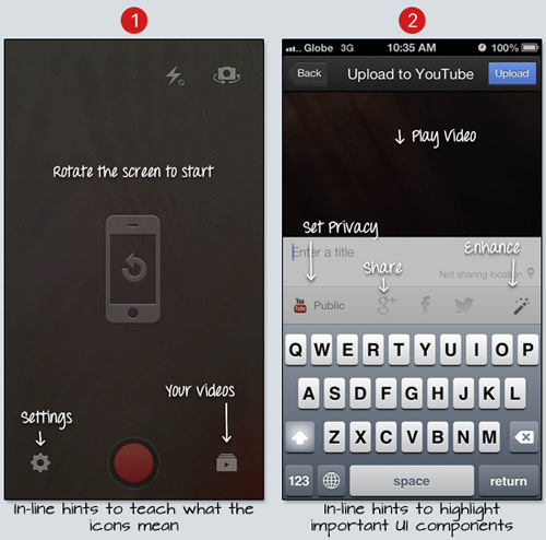
Think of a first-time user as someone who has landed on another planet. They’d like to explore. Inline hinting is a technique that gives them the freedom to do so, while progressively disclosing various features. It educates them during the exploration phase, thereby connecting them more closely to your app in an unobtrusive fashion. These users are essentially like newborns, needing guidance at every turn.
Tutorial Design
Mailbox uses a slick interactive tutorial to quickly tell users about the unique features of the app and how to use them.
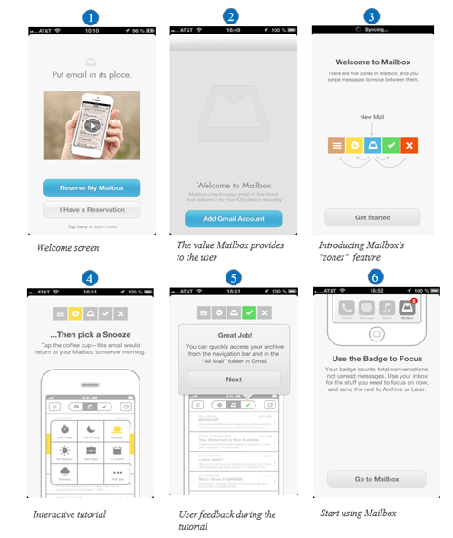
A tutorial, like the one above, guides the user in an orderly fashion and promotes interaction. It includes short and to-the-point messages that are easily comprehended by the user. This keeps them engaged in the onboarding process, while educating them on the key features, yet moving forward. This makes the experience frictionless and greatly reduces the bounce rate.
Onboarding The Wrong Way
Now that we’ve seen some good examples, let’s look at less effective ones.
Poor App Flow
Look at the Sochi Winter Olympics’ official app below. This is an example of an inadequate onboarding experience. When you launch the app, a screen opens telling you that it’s loading. The seven-step process to set up the app is a lesson in ineffective design. It doesn’t stop there. Once you get through setting it up, the app takes you to a page with really small text and images. The app is a maze, with no hints at all of where you should be going or what you should be doing.
It no doubt got a lot of use and frustrated many users, but if it was just a random app in the app store and not the official app for the Winter Olympics, then the deletions would mount. Take this unappealing design as an example of an ineffective onboarding experience. “Offboarding” would be a better term.
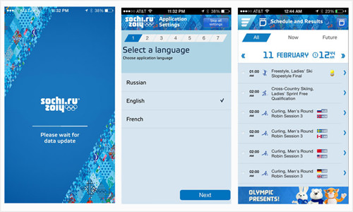
When a user launches your app, the last thing you want to do is tell them to wait. And if they must wait, figure out ways to engage them. Perhaps offer some content they can read while the process completes. Or perhaps the set-up process is way too long. Design it to be as short and to the point as possible. Give the user what they came for as quickly as possible.
Give them the option to sign in with one click through their Facebook account and to set their preferences. These screens should take no more than five seconds to complete. When they get to the app’s main content, ensure that the font sizes are proportional to each other and that people can read the text.
Using visual analytics, you will see whether there is any friction when users navigate the app… unless you’ve developed the official app for the Sochi Winter Olympics, in which case users won’t have much of a choice.
Overwhelming The User
The onboarding experience for Project, a magazine app, starts out simple enough with a few pages that introduce the experience, before getting into the nitty gritty. Then, it brings users to this page:
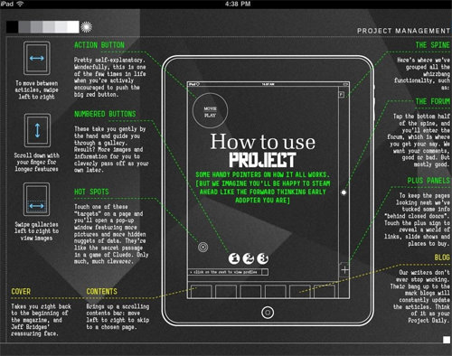
The massive amount of information shown to the user will just overwhelm them (especially on the first visit). Users will see that the content to consume is way too much and will bounce. Think of it like going to a diner with nothing in mind and being given a menu with hundreds of options. You will be sitting there for a long time trying to decide. This is no diner. You have a few seconds. Your users are hungry. Feed them. Fast!
This is a perfect example to learn from. It is precisely the opposite of progressive disclosure.
Overwhelming users is a big mistake. A mobile screen has tight limitations on the UX and UI. Don’t provide too many options. Keep it light, and you’ll see an increase in usage. The trick with onboarding is to show just what users need to know to get started — nothing more, nothing less.
Onboarding Best Practices
1. Give An Overview
Look at the magazine app Zinio, shown below. It showcases the most important areas of the app and uses arrows to keep the app’s context visible. This enables the user to see the areas they are looking for.
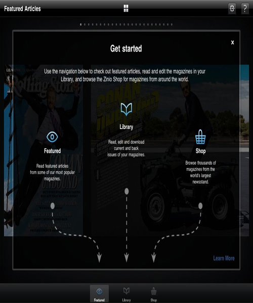
Make sure that the connection between the information you provide during onboarding and how the user applies that information in their day-to-day experience is as clear as possible.
2. Show The Value
Here is your chance to shine. You don’t get a second chance to make a first impression, so show them what your app’s got. Pinpoint the value of your app and explain it in a few screens. Show that your app will give users what they want. Nothing else matters. Once you’ve brought them onboard, you can optimize the experience and engage them in future.
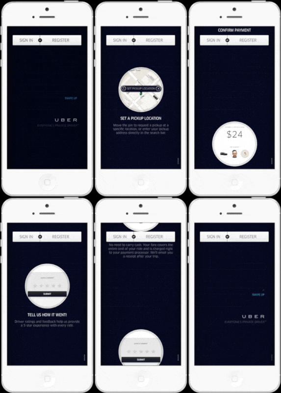
By the end of Uber’s onboarding, which takes up four screens, users know exactly what they’ll be getting and feel encouraged to start using the app.
3. Show What They Need To Get To The Next Step
Present users with just the information they need to get to the next step in the application. This will be their guide and will make for a smooth onboarding experience. Look at the following two screenshots of the Birdhouse app for iOS. It tells users right up front what the app is for and what they need to know in order to use it.
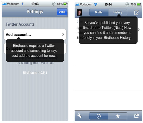
The first screen (on the left) explains what information is needed for the user to start using the app. The second screen explains, like clockwork, how the “History” function works, at precisely the moment users would need it (after posting their first tweet).
Tutorial Strategies For Different Types Of Apps
Below are a few types of tutorials that are commonly used for different types of apps.
Step-by-Step Tutorial: Gaming
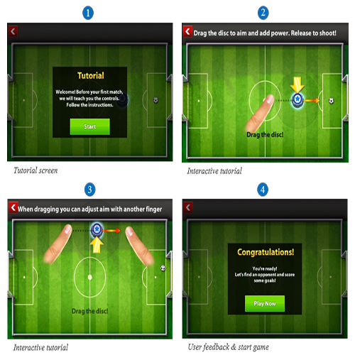
In the gaming space, this type of tutorial guides the user through the game, letting them know how to play and what the rules are.
A step-by-step tutorial is perfect for gaming because it teaches users the ins and the outs of the game. It replaces a manual, which would bore most users, and a video, which most users would not want to sit through in order to start playing. After all, gamers love interaction more than anything else.
An interactive step-by-step tutorial positively reinforces the user every step of the way. When the user is guided at each step of the game in an interactive way and is encouraged by messages such as “Awesome job!” and “Way to go!,” they will be inspired to play.
Habit-Forming Tutorial: Social Sharing
Among photo-sharing apps, Pinterest takes the lead by walking users through a tutorial on finding images to create their first pin. The goal of this type of tutorial is to give the user their first taste of success and to get them addicted to the habit of pinning.
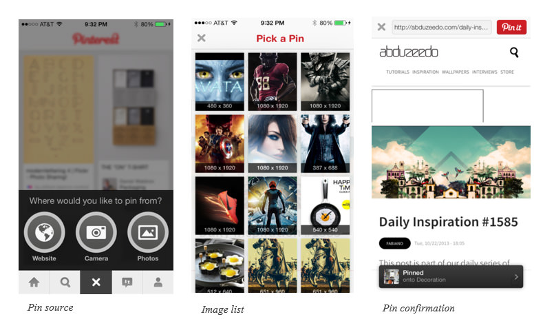
If users don’t understand the concept of an app, they won’t return. This is why Pinterest introduces the concept of pinning in its onboarding tutorial, not letting the user go off on their own until completing the tutorial. This is the best type of tutorial for a photo-sharing app.
The Value Tour Tutorial: M-Commerce
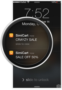
For m-commerce apps, you want to not only teach users how to use the app, but also demonstrate the value they will derive from it. As users explore what your app has to offer via the tutorial, you can demonstrate its value by presenting them with features that say, “Hey, customer! We care about you. After you’ve visited a few times, we’ll know what you like.” Going further, you could explain in the tutorial how enabling push notifications will enhance the mobile shopping experience. Show users how push notifications for products they like will come in the form of in-app messages such as, “Your favorite shoe brand is now on sale!” Implementing this strategy will make your onboarding more effective.
This value-oriented tutorial not only shows users how to use the app, but also engages them and communicates the app’s value.
Is Your Onboarding Experience Working?
Once you design what you feel is the ultimate onboarding experience, how do you gauge success? How do you know whether your techniques are working?
Are users signing up after enjoying one month of free content? How engaged are they with your interactive tutorial? Are they abandoning your app? At what rate? What is the user’s first experience with navigating the screen like? Are they spending too much time on a certain screen? Are users dropping off after reaching a certain screen? Where is the friction? OK. No more questions, but you get the idea.
The answers to some of these questions and many more can be found with a visual mobile analytics tool. Really delve into the “why,” not just the “what,” when studying your users’ actions, and gain insight into their mobile experience. You want to find out more than just the percentages and numbers that traditional tools such as Google Analytics provide.
Let’s look at how the features of such a tool empower you to optimize, to monitor how users use your app in the real world, and to see through their eyes.
Touch Heatmaps
This feature gives you an inside view of where users are engaging with your app. Visual touch heatmaps will help you to understand your users’ behavior, the reasons for their actions and which parts of the screen they are focusing on.
Take the log-in screen shown below. It includes three calls to action (CTAs). The second one is hardly being tapped on. So, you might consider removing it in order not to confuse users with too many CTAs and to make the experience more fluid.

You’ll notice that a lot of users are dropping off at this screen. Now, empowered with this knowledge, you can go back to the drawing board and eliminate the friction, and then monitor again. You will probably see that your drop-off rate in the onboarding process decreases as a result. Watch the video in the “User Recordings” section just below to learn what happens when users try to register via Facebook.
User Recordings
By reviewing user recordings, you can tell why users are taking a certain route to a particular screen. Perhaps you’ll notice that users are spending quite a bit of time on an intervening screen, with some dropping off shortly after. Investigating this, you see that that screen delivers no value to users and should be removed from the onboarding process entirely.
See the recording below, taken with Appsee’s App Analytics, showing a user who cannot create an account with Facebook due to a technical problem, as indicated by the popup message. This will give you insight into why users are dropping off the registration screen and don’t convert into active users. You can see the heatmap recordings in the “Touch Heatmaps” section above.
Real-Time Visual Analytics Reporting
The real-time feature is important to understanding why users do what they do at a particular time. With visual reporting, you will be presented with an aggregate of all user actions, which will provide insight into your mobile users’ behavior. You might see that, upon first launching the app, users are confused by the UI of a particular screen, such as an element that looks like a CTA but is really just an image. This will help you to refine the onboarding process and, in so doing, maximize the interface’s usability and make the UI conform to users’ expectations.
A/B Testing
Freemium third-party tools exist, such as Optimizely and Apptimize, and are well worth checking out. One of their advantages is that they enable you to make visual changes to an app without having to wait for approval from the app store. You can compare two versions of your onboarding process, distributing the traffic between the two versions evenly, and then select the best performing version.
Extract Data From Visual Mobile Analytics To Optimize The Onboarding Experience
When you analyze the onboarding experience, you’ll focus on new users’ first sessions and see how they interact with the app’s introductory screens.
The best way to optimize the onboarding experience is to combine the top-down and the bottom-up approaches explained below.
Top-Down Approach
Touch heatmaps and real-time in-app analytics provide aggregated data on all of your users. They enable you to optimize the onboarding process by analyzing the following factors:
- Drop-off rates
See which screens in the onboarding process have high drop-off rates. Analyze user behavior on these screens, and dig deeper into why users are quitting your app here. - User engagement
Study the amount of time new users spend on each screen. For example, more than a few seconds spent on a tutorial screen could indicate that users aren’t clear on what they need to do next. - Usability problems
Identify which screens do not respond to gestures (pinches, swipes, taps). Faced with an unresponsive app, users won’t proceed in the onboarding process and will get frustrated with the app. The problem could be the UI (users aren’t gesturing in the right area of the screen) or a technical issue (the app is unresponsive to gestures). Also, slow response times could hamper onboarding. - Crashing screens
Obviously, screens that crash the app will prevent users from completing the onboarding process, and those users probably won’t return. - Error popups
Analyze what happens when error popup messages appear (for example, “Error creating account”). This will help you to detect technical problems in the onboarding process that make users quit the app.
Bottom-Up Approach
Video recordings provide user-level data. By observing new users starting to use the app, you’ll see the onboarding experience through their eyes. You’ll witness the usability and technical problems they encounter, and you’ll understand how they interact with the onboarding screens and why they drop off. You will see the sequence of actions that result in a crash and be able to identify the specific UI element that is causing the crash. Then, you’ll refine and relaunch.
Visual Mobile Analytics In Action
We ran mobile analytics on a journal and diary app upon launch in order to identify hiccups in the onboarding experience. Let’s review the takeaways for this publisher.
The onboarding experience for this app includes a registration screen containing two fields, with no automatic registration through a social network. A mandatory three-screen tutorial explaining how to use the app follows registration.
Traditional mobile analytics merely showed that in 56% of the app’s sessions, users did not complete the onboarding process. Users were dropping off after hitting the third screen of the tutorial. This screen’s quit rate was high, 47%. However, this didn’t paint a full picture of why the quit rate was so high and why the onboarding experience was failing.
Upon analyzing the video recordings, the publisher noticed that the “Next” button on the third screen wasn’t showing up. Users were tapping all over the screen trying to complete the tutorial, but their taps were not registering. These users dropped off, most of them never to return. Diving into the touch heatmap recordings and UI reports showed that 77% of the taps on this screen were unresponsive.
Going back to the drawing board, the publisher fixed the technical problem, resulting in a 39% increase in users who complete the onboarding experience and a 27% increase in active users.
Getting Started With Mobile Analytics
Most traditional and visual mobile analytics tools require you to integrate an SDK with your app. The integration process is usually simple, taking only a few minutes. Visual mobile analytics will auto-detect screens, buttons and user actions, so predefining them is not necessary. Recording user sessions and aggregating all gestures (taps, swipes, pinches) into visual touch heatmaps are done automatically, so you simply need to integrate the SDK.
Most mobile analytics tools come with a free trial; only a few have a free package (for example, the traditional Google Analytics). Paid plans are usually priced by the number of user sessions or number of data points.
Integrating visual mobile analytics can be done in two easy steps. For an iOS app, first unzip the file and drag the Appsee.framework directory to the “Frameworks” folder in your Xcode project tree.
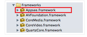
Secondly, add the following line to your application:
didFinishLaunchingWithOptions: method with your API key:
[Appsee start:@"YOUR API KEY"];
A couple of noteworthy tools have similar functionality (i.e. for monitoring the user experience) but are used on a desktop browser. Crazy Egg uses heatmap recordings to show where users are clicking most. Inspectlet goes further by recording user actions in detail, as if you are looking over their shoulder.
Such tools are a necessity in mobile due to the constraint of the screen’s size, the operating system and the potential to connect with users instantly.
The onboarding experience is absolutely critical to the success of your app. Without an effective one, all of your hard work will go to waste in a few seconds.
Through techniques such as inline hinting, we’ve seen how to impart value to the onboarding experience, thereby engaging users and teaching them how to navigate your app. We’ve also seen how you can overwhelm users with too much information and drive them away. And we’ve reviewed some best practices and considered how to choose a type of tutorial that best matches your app.
Given the importance of onboarding, monitoring the user experience as closely as possible through visual mobile analytics is a necessity. The tools are simple to integrate from day one, and they will give you the insight you need to optimize your app and maximize its potential.
Visual mobile analytics arm you with a high-pressure suit for diving deep into users’ experience in the onboarding phase. You probably won’t get wet, but you will discover treasures that equip you to maximize the onboarding experience and more besides.
If you have anything to share or you’d like to connect with me, feel free to use the comments section below.
Further Reading
- A Roadmap To Building A Delightful Onboarding Experience
- The Role Of Empty States In User Onboarding
- Smart Transitions In User Experience Design
- Phone Numbers For Web Designers


 See the full picture →
 SurveyJS: White-Label Survey Solution for Your JS App

 Celebrating 10 million developers


